 React
React iOS
iOS Android
 Flutter
 Angular
 JavaScript
 Unity
Unity Unreal
 Node
Node Python
 Ruby
Ruby PHP
PHP Java
Java .NET
.NET Go
Go REST
REST@Composable
fun MyCustomUi() {
Scaffold(
modifier = Modifier.fillMaxSize(),
bottomBar = { // 1 - Add the composer as a bottom bar
MessageComposer(
modifier = Modifier // 2 - customize the component
.fillMaxWidth()
.wrapContentHeight(),
viewModel = composerViewModel, // 3 - provide ViewModel
// 4 - customize actions
onAttachmentsClick = { attachmentsPickerViewModel.changeAttachmentState(true) },
onCancelAction = {
listViewModel.dismissAllMessageActions()
composerViewModel.dismissMessageActions()
}
)
}
) {
// 5 - the rest of your UI
...
}
}This is documentation for Stream Chat Android SDK v5, which is no longer actively maintained. For up-to-date documentation, see the latest version (v7).
MessageComposer
The MessageComposer is arguably one of the most important components when building the Chat experience. It allows users to participate in the chat by sending messages and attachments.
There are two versions of the composer that we provide:
- Bound: This version relies on a
ViewModelto set up all of its operations, like sending, editing and replying to a message, as well as handling UI state when the user performs different message actions. - Stateless: This is a stateless version of the composer that doesn't know about
ViewModels or business logic. It exposes several actions and customization options that let you override the behavior and UI of the component.
The bound version of the composer uses the stateless composer internally. That way, when providing the same state to either component, the behavior will be the same.
Additionally, we cannot provide a default ViewModel, as it requires the channelId to send data, so you'll have to build an instance yourself.
Let's see how to integrate the MessageComposer in your UI.
Usage
The easiest way to use the MessageComposer is by combining it with the rest of our components, like so:
Because it doesn't make sense to use the MessageComposer as a standalone component, this example shows how to add it in a Scaffold, with the rest of your UI.
In this example, you took the following steps:
- Step 1: You set up the
MessageComposeras abottomBarof aScaffold. This way you dedicate the space on the screen while fitting in the rest of your content. - Step 2: You customize the
MessageComposerusing a set ofModifiers to make it fill the parent width and wrap its height. - Step 3: You pass in the
ViewModelto bind the composer to. This helps it load all the info it needs to show various states. - Step 4: You customize some of the actions of the composer to propagate them to other parts of your business logic.
- Step 5: You can set up the rest of your UI in the
Scaffoldbody, which can be any of our other components or your custom UI.
Notice how our components allow you to customize the UI to whatever your needs may be as you can combine them with your custom UI or our other components.
You can also customize the behavior of our components to update the rest of your UI state accordingly.
The provided snippet, with the rest of the UI set up using our messages components, will render the following UI.
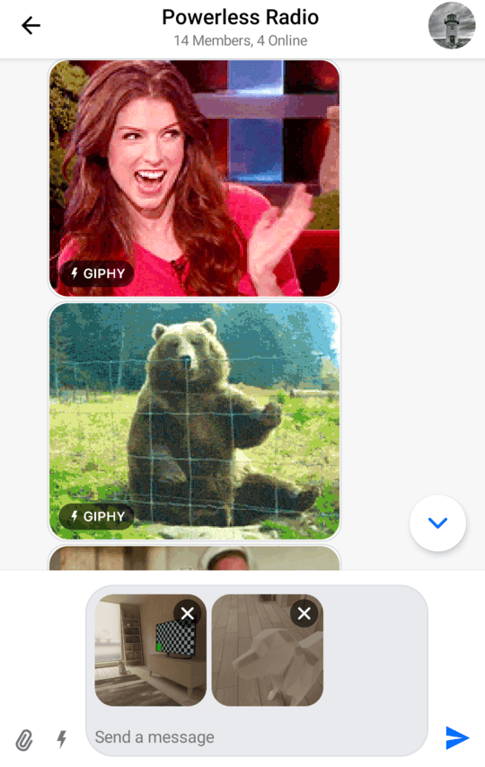
Notice how the composer shows the attachments we've selected in the input area, how it shows the label, as well as integrations on the left side and the send button on the right side.
Next, you'll want to handle and customize the actions of the MessageComposer.
Handling Actions
The composer offers these actions you can customize, as per the signature:
@Composable
fun MessageComposer(
    ..., // state and UI
    onSendMessage: (Message) -> Unit = { viewModel.sendMessage(it) },
    onAttachmentsClick: () -> Unit = {},
    onCommandsClick: () -> Unit = {},
    onValueChange: (String) -> Unit = { viewModel.setMessageInput(it) },
    onAttachmentRemoved: (Attachment) -> Unit = { viewModel.removeSelectedAttachment(it) },
    onCancelAction: () -> Unit = { viewModel.dismissMessageActions() },
    onMentionSelected: (User) -> Unit = { viewModel.selectMention(it) },
    onCommandSelected: (Command) -> Unit = { viewModel.selectCommand(it) },
    onAlsoSendToChannelSelected: (Boolean) -> Unit = { viewModel.setAlsoSendToChannel(it) },
)onSendMessage: Handler when the user taps on the Send button.onAttachmentsClick: Handler when the user taps on the default attachments integration.onCommandsClick: Handler when the user taps on the default commands integration.onValueChange: Handler that exposes text value changes in the composer.onAttachmentRemoved: Handler when the user removes an attachment from selected attachments, in the input area.onCancelAction: Handler when the user cancels the current message action, usuallyEditorReplyactions.onMentionSelected: Handler when the user selects a mention.onCommandSelected: Handler when the user selects an instant command.onAlsoSendToChannelSelected: Handler when the user toggles the checkbox for sending messages from thread to channels.
As you can see, most of these actions update the state in the MessageComposerViewModel, or are empty, by default.
To customize these actions, simply pass in a lambda function for each when building your custom UI with our MessageComposer, like in the example above.
Handling Typing Updates
Typing updates should be sent sparingly as a way of saving valuable API calls. Luckily, we offer such behavior out of the box.
MessageComposerViewModel contains MessageComposerController, which in turn uses DefaultTypingUpdatesBuffer in order to intelligently make start and stop typing API calls.
If you want to implement your own buffering mechanism you can pass in an implementation of the TypingUpdatesBuffer interface instead:
composerViewModel.setTypingUpdatesBuffer(
    // Your custom implementation of TypingUpdatesBuffer
)
Customization
MessageComposer offers the following options for UI customization:
@Composable
fun MessageComposer(
    modifier: Modifier = Modifier,
    headerContent: @Composable ColumnScope.(MessageComposerState) -> Unit = { ... },
    footerContent: @Composable ColumnScope.(MessageComposerState) -> Unit = { ... },
    mentionPopupContent: @Composable (List<User>) -> Unit = { ... },
    commandPopupContent: @Composable (List<Command>) -> Unit = { ... },
    integrations: @Composable RowScope.(MessageComposerState) -> Unit = { ... },
    label: @Composable () -> Unit = { DefaultComposerLabel() },
    input: @Composable RowScope.(MessageComposerState) -> Unit = { ... },
    trailingContent: @Composable (MessageComposerState) -> Unit = { ... },
)modifier: Modifier for root component styling. This is useful to set the composer alignment, size, padding and more.headerContent: Slot that's shown as the header. By defaultMessageInputOptionsthat show when a message is being edited, or we're replying to another message.footerContent: Slot that's shown as the footer. Present in the Thread mode and allows the user to also send messages from threads to channels.mentionPopupContent: Slot that acts as a popup. By default it shows theMentionSuggestionListwhen the user starts the mention action.commandPopupContent: Slot that acts as a popup. By default it shows theCommandSuggestionListwhen the user starts a slash command action.integrations: By default, we show the attachment picker and slash command integrations in our composer. You can override this to support custom integrations.label: Slot that represents the hint, or the label, where there is no user input.input: Slot that represents the core part of the composer, where the user can write new messages. It also displays pending attachments if the user chooses attachments for upload.trailingContent: Slot that represents the send button. The user can tap to send a new message, with or without attachments.
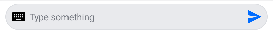
An example of customizing the MessageComposer component is the following:
@Composable
fun MyCustomComposer() {
    MessageComposer(
        modifier = Modifier
            .fillMaxWidth()
            .wrapContentHeight(),
        viewModel = composerViewModel,
        integrations = {},
        input = { inputState ->
            MessageInput(
                modifier = Modifier
                    .fillMaxWidth()
                    .weight(7f)
                    .padding(start = 8.dp),
                messageComposerState = inputState,
                onValueChange = { composerViewModel.setMessageInput(it) },
                onAttachmentRemoved = { composerViewModel.removeSelectedAttachment(it) },
                label = { // create a custom label with an icon
                    Row(
                        Modifier.wrapContentWidth(),
                        verticalAlignment = Alignment.CenterVertically
                    ) {
                        Icon(
                            imageVector = Icons.Default.Keyboard,
                            contentDescription = null
                        )

                        Text(
                            modifier = Modifier.padding(start = 4.dp),
                            text = "Type something",
                            color = ChatTheme.colors.textLowEmphasis
                        )
                    }
                },
                innerTrailingContent = { // add a send button inside the input
                    Icon(
                        modifier = Modifier
                            .size(24.dp)
                            .clickable(
                                interactionSource = remember { MutableInteractionSource() },
                                indication = rememberRipple()
                            ) {
                                val state = composerViewModel.messageComposerState.value

                                composerViewModel.sendMessage(
                                    composerViewModel.buildNewMessage(
                                        state.inputValue, state.attachments
                                    )
                                )
                            },
                        painter = painterResource(id = R.drawable.stream_compose_ic_send),
                        tint = ChatTheme.colors.primaryAccent,
                        contentDescription = null
                    )
                },
            )
        },
        trailingContent = { Spacer(modifier = Modifier.size(8.dp)) } // remove the outer send button
    )
}
Notice how you've removed the integrations by passing in an empty composable function, how you override the input parameter to provide a MessageInput that's more suitable to your needs, and how within the input you can customize the label and innerTrailingContent slots. You also replaced the outer trailingContent to remove the send button.
This snippet will provide the following UI. It was really easy to customize this and there are many things you can do with the MessageComposer to make it fit your design needs.