 React
React iOS
iOS Android
 Flutter
 Angular
 JavaScript
 Unity
Unity Unreal
 Node
Node Python
 Ruby
Ruby PHP
PHP Java
Java .NET
.NET Go
Go REST
RESToverride fun onCreate(savedInstanceState: Bundle?) {
super.onCreate(savedInstanceState)
setContent {
ChatTheme { // Theme wrapper
ChannelsScreen(
title = stringResource(id = R.string.app_name),
onItemClick = {
// On item clicked action
},
onHeaderActionClick = {
// Header header action clicks
},
onHeaderAvatarClick = {
// Handle header avatar clicks
},
onBackPressed = { finish() }
)
}
}
}This is documentation for Stream Chat Android SDK v5, which is no longer actively maintained. For up-to-date documentation, see the latest version (v7).
Component Architecture
The Jetpack Compose SDK exposes three types of components:
- Screen components: out-of-the-box, screen-sized
Composables. - Bound components:
Composables bound to our ViewModels for state handling. - Stateless components: low-level, stateless
Composables for full customizability.
Let's go through each type to see what the difference is and how to use them.
Screen Components
Complete screen solutions that connect all the operations you need to give users a Chat experience.
These components are very easy to use and they display entire screens for you with default behavior. They allow you to explore the SDK features in a breeze, however, they offer limited customization.
We have two screen components:
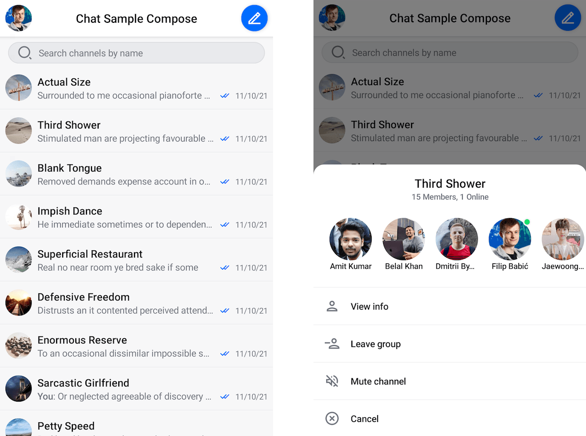
ChannelsScreen: Builds a screen that shows a header with user information, the list of channels for the current user and a search input to filter those channels by name.MessagesScreen: Builds a full chat experience with a header that shows information about the channel, list that supports messages (including attachments, reactions, replies, threads and more) and a message composer that lets you write messages and send attachments.
Usage
To use either the ChannelsScreen or the MessagesScreen component within your Activity or Fragment, you just need to call it within setContent():
This will give you a fully working screen:
You can learn more about ChannelsScreen and MessagesScreen on their respective pages.
Bound Components
These components serve a specific use-case and are bound to a ViewModel. The ViewModel provides the components with data and handles input events that the components receive.
These components display UI for a portion of the screen and are more customizable than Screen components.
They usually represent features on the screen like the header, input, search field, menu or a list of data. Some of these components are:
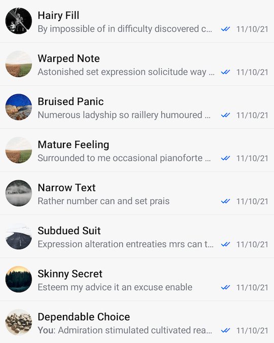
MessageList: Connects to the API using the ViewModel, shows a list of messages or empty or loading states, handles pagination, single and long item taps and more.ChannelList: Same as theMessageList, but for channels.MessageComposer: Holds an input field to write new messages in, allows you to send attachments and shows different states when replying to or editing a message.AttachmentsPicker: Allows you to pick and choose from system media, files or media capture to send attachments.
Usage
These components are great because you can combine them with any other UI you build to form custom screens. Again, to use the components, all you need to do is call them within setContent() in your Activity or Fragment:
override fun onCreate(savedInstanceState: Bundle?) {
    super.onCreate(savedInstanceState)

    // Your ViewModel instance
    val channelListViewModel: ChannelListViewModel by viewModels { ... }

    setContent {
        ChatTheme { // Theme wrapper
            ChannelList(
                modifier = Modifier.fillMaxSize(),
                viewModel = channelListViewModel,
                onChannelClick = {
                    // Open the MessagesScreen
                },
            )
        }
    }
}
You can build these components in two ways:
- Providing an instance of our
ViewModelyourself - this lets you control the lifecycle of the VM or customize the behavior of your UI, by calling functions directly on the VM. - Using the default argument for the
ViewModel- this is less work, but you can't control the lifecycle of the VM, nor can you call functions on it to support custom behavior.
Either way, these components connect all the required operations related to them and they expose more customization as you can override both behavior and UI, like the items in the list. The snippet above will produce the following screen:
You can combine this component with your custom UI, with other components from the SDK or use it on its own. You can learn more about each of these components in the Channel Components and Message Components sections.
Stateless Components
These are pure components that rely just on state and expose various events you can handle yourself. These components don't depend on a ViewModel, allowing you to decide where the data comes from.
They offer fully customizable behavior as well as customizable UI where it makes sense. Some of these components are:
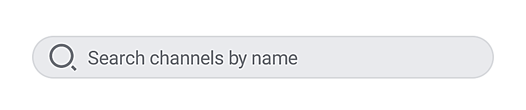
Avatar: Shows an image provided as a parameter in a shape defined by theChatTheme. Fully customizable in terms of size, shape, alignment and more.SearchInput: Shows a leading icon for search, an input field to write your query and a trailing icon to clear the input. The leading icon can be fully customized, as well as the listeners for state changes.MessageListandChannelList: We offer stateless alternatives to someViewModelpowered components if you don't want to use ourViewModeland want to customize the behavior, as well as the UI.MessageComposer: A stateless alternative not backed by aViewModel. Useful if you want more control over the component.
Usage
These components don't do much on their own and they require state to render. You can use them like before, by calling them in setContent(), but they require more parameters to set up:
override fun onCreate(savedInstanceState: Bundle?) {
    super.onCreate(savedInstanceState)

    setContent {
        var queryState by remember { mutableStateOf("") } // The query state

        SearchInput(
            query = queryState, // Connect the value to the state holder
            modifier = Modifier
                .fillMaxWidth()
                .padding(vertical = 32.dp, horizontal = 24.dp), // Customize the looks
            onValueChange = {
                queryState = it // Change the value when typing
            }
        )
    }
}
As you can see, these components are still fairly easy to use, but do require instructions on what state they show and how they look. This snippet will produce the following UI:
You can customize the component to add a background, touch event handlers, elevation and more.