 React
React iOS
iOS Android
 Flutter
 Angular
 JavaScript
 Unity
Unity Unreal
 Node
Node Python
 Ruby
Ruby PHP
PHP Java
Java .NET
.NET Go
Go REST
RESTChatTheme {
// The rest of your UI
if (selectedMessageState != null) {
val selectedMessage = selectedMessageState.message
if (selectedMessageState is SelectedMessageReactionsPickerState) {
ReactionsPicker(
modifier = Modifier
.align(Alignment.BottomCenter)
.heightIn(max = 400.dp)
.wrapContentHeight(),
message = selectedMessage,
onMessageAction = { action ->
// Handle message action
},
onDismiss = {
// Handle on dismiss
}
)
}
}
}This is documentation for Stream Chat Android SDK v5, which is no longer actively maintained. For up-to-date documentation, see the latest version (v7).
ReactionsPicker
The ReactionsPicker component allows you to display all of the reactions your app contains inside a simple menu. Normally it is displayed after clicking on the show more reactions button inside SelectedMessageMenu or SelectedReactionsMenu.
Usage
If you're using the MessagesScreen component, ReactionsPicker is automatically set up for you. To use it inside of your custom screens simply add it like so:
Adding the ReactionsPicker component is very simple, all you need to do is make sure that it is displayed when the selectedMessageState is SelectedMessageReactionsPickerState and pass in the selected Message. The reactions are drawn from the ChatTheme and the rest is done for you.
The code above will render the following UI:

The menu overlay has a darker background and tapping it will dismiss the component, as will pressing the system back button.
Handling Actions
ReactionsPicker exposes the following actions:
@Composable
public fun ReactionsPicker(
    ..., // State,
    onMessageAction: (MessageAction) -> Unit,
    onDismiss: () -> Unit = {},
    ... // Content
)onMessageAction: Handler used for triggering message actions such as reply, edit, delete, react and others.onDismiss: Handler used when the component is dismissed by clicking outside of the component UI or pressing the system back button.
ReactionsPicker(
    ..., // State
    onMessageAction = { action ->
        composerViewModel.performMessageAction(action)
        listViewModel.performMessageAction(action)
    },
    onDismiss = { listViewModel.removeOverlay() },
    ... // Content
)
In the snippet above, you propagate the action to the composerViewModel and listViewModel, for them to store the latest action. This will update the UI accordingly.
Alternatively, you call listViewModel.removeOverlay() to remove the overlay from the screen, in onDismiss(). It's important to note that onMessageAction() calls removeOverlay() internally, to hide the overlay.
Next, let's see how to customize ReactionsPicker.
Customization
ReactionsPicker allows you to customize the reactions you are showing:
@Composable
public fun ReactionsPicker(
    ..., // State,
    reactionTypes: Map<String, ReactionIcon> = ChatTheme.reactionIconFactory.createReactionIcons(),
    ... // Actions and content
)reactionTypes: Allows you to customize which reactions are shown. By default it usesreactionIconFactoryinside ofChatTheme.
The best way to customize this is by overriding ChatTheme.reactionIconFactory with your own implementation of ReactionIconFactory so that all of your components wrapped inside of ChatTheme draw from the same source.
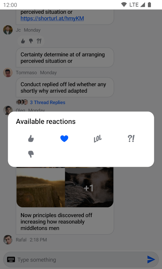
By default ReactionsPicker looks like a bottom sheet, however you can customize it to look like a completely different component, such as a dialog, a drawer or whatever helps you retain the look and feel of your app.
For example, you can it customize like so:
ReactionsPicker(
    modifier = Modifier
        .align(Alignment.Center)
        .padding(horizontal = 20.dp)
        .wrapContentSize(),
    shape = ChatTheme.shapes.attachment,
    message = selectedMessage,
    onMessageAction = { action ->
        composerViewModel.performMessageAction(action)
        listViewModel.performMessageAction(action)
    },
    onDismiss = { listViewModel.removeOverlay() },
    cells = GridCells.Fixed(4)
)
The code above will result in the following UI:
@Composable
public fun ReactionsPicker(
    ..., // State and actions
    headerContent: @Composable ColumnScope.() -> Unit = {},
    centerContent: @Composable ColumnScope.() -> Unit = {
        DefaultReactionsPickerCenterContent(
            message = message,
            onMessageAction = onMessageAction,
            cells = cells,
            reactionTypes = reactionTypes
        )
    },
)
Apart from customization through modifiers, the component provides these slots:
headerContent: Allows you to customize what content you show on the top part ofReactionsPicker. Empty by default.centerContent: Allows you to customize what content you show on the bottom part ofReactionsPicker. Shows reactions by default.
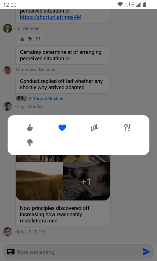
As an example, let's override the header content. First create a custom text label:
@Composable
fun TextLabel() {
    Text(
        modifier = Modifier.padding(start = 20.dp, top = 12.dp),
        text = "Available reactions",
        style = ChatTheme.typography.title3Bold,
        color = ChatTheme.colors.textHighEmphasis
    )
}
Then expand on the previous customization example by replacing the empty headerContent with the text label:
ReactionsPicker(
    ..., // State, actions and other content
    headerContent = { TextLabel() }
)
Doing so gives you the following UI: