 React
React iOS
iOS Android
 Flutter
 Angular
 JavaScript
 Unity
Unity Unreal
 Node
Node Python
 Ruby
Ruby PHP
PHP Java
Java .NET
.NET Go
Go REST
RESTval reactions = mapOf(
"thumbs_up" to SupportedReactions.ReactionDrawable(
inactiveDrawable = ContextCompat.getDrawable(this, R.drawable.ic_thumb_up)!!,
activeDrawable = ContextCompat.getDrawable(this, R.drawable.ic_thumb_up_selected)!!
),
"thumbs_down" to SupportedReactions.ReactionDrawable(
inactiveDrawable = ContextCompat.getDrawable(this, R.drawable.ic_thumb_down)!!,
activeDrawable = ContextCompat.getDrawable(this, R.drawable.ic_thumb_down_selected)!!
),
"mood_good" to SupportedReactions.ReactionDrawable(
inactiveDrawable = ContextCompat.getDrawable(this, R.drawable.ic_mood_good)!!,
activeDrawable = ContextCompat.getDrawable(this, R.drawable.ic_mood_good_selected)!!
),
"mood_bad" to SupportedReactions.ReactionDrawable(
inactiveDrawable = ContextCompat.getDrawable(this, R.drawable.ic_mood_bad)!!,
activeDrawable = ContextCompat.getDrawable(this, R.drawable.ic_mood_bad_selected)!!
),
)
ChatUI.supportedReactions = SupportedReactions(this, reactions)This is documentation for Stream Chat Android SDK v5, which is no longer actively maintained. For up-to-date documentation, see the latest version (v7).
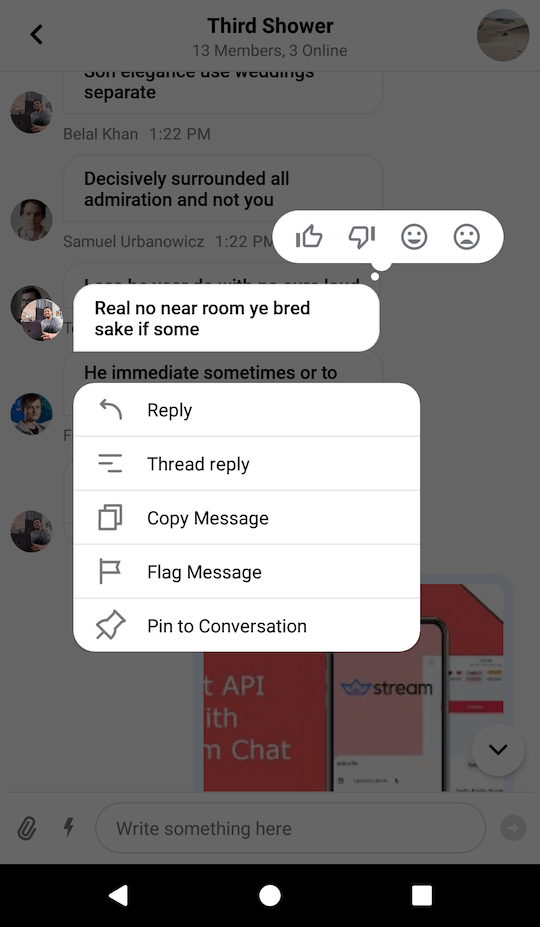
Providing Custom Reactions
By default, the UI Components SDK provides the following reaction options and corresponding icons for them:
likelovehahawowsad
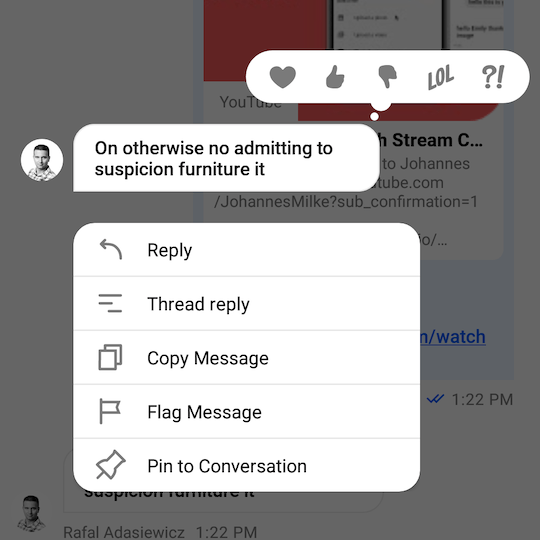
If you want to override the supported set of reactions, you'll need provide you custom set of reactions using the ChatUI.supportedReactions property.
In the example above, we defined a set of 4 custom reactions and provided corresponding icons for them. Notice that you need to provide icons for both normal and selected states.
The code above will produce the following UI:
| Message Options Overlay | Message List |
|---|---|
 |  |