 React
React iOS
iOS Android
 Flutter
 Angular
 JavaScript
 Unity
Unity Unreal
 Node
Node Python
 Ruby
Ruby PHP
PHP Java
Java .NET
.NET Go
Go REST
REST<io.getstream.chat.android.ui.message.composer.MessageComposerView
android:id="@+id/messageComposerView"
android:layout_width="match_parent"
android:layout_height="wrap_content" />This is documentation for Stream Chat Android SDK v5, which is no longer actively maintained. For up-to-date documentation, see the latest version (v7).
Message Composer
MessageComposerView replaces MessageInputView, addressing most of its pain-points, including
extensibility, maintainability, etc. Just like the original view, the revamped component allows
users to participate in the chat by sending messages and attachments.
It supports the following features:
- Emoticons
- Attachments
- Slash Commands
- Typing events
- Editing messages
- Threads
- Mentions
- Replies
Let's see how to integrate the new MessageComposerView in your UI.
Usage
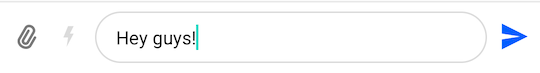
To use MessageComposerView, include it in your XML layout.
The recommended way of setting up MessageComposerView is by binding it to the MessageComposerViewModel. This will make it fully functional by setting up any necessary listeners and data handling.
// Create MessageComposerViewModel for a given channel
val factory = MessageListViewModelFactory(cid = "messaging:123")
val messageComposerViewModel: MessageComposerViewModel by viewModels { factory }

// Bind MessageComposerViewModel with MessageComposerView
messageComposerViewModel.bindView(messageComposerView, viewLifecycleOwner)Because it doesn't make sense to use the MessageComposerView as a standalone component, you also need to integrate it with the MessageListView:
<androidx.constraintlayout.widget.ConstraintLayout xmlns:android="http://schemas.android.com/apk/res/android"
    xmlns:app="http://schemas.android.com/apk/res-auto"
    android:layout_width="match_parent"
    android:layout_height="match_parent">

    <io.getstream.chat.android.ui.message.list.MessageListView
        android:id="@+id/messageListView"
        android:layout_width="0dp"
        android:layout_height="0dp"
        app:layout_constraintBottom_toTopOf="@+id/messageComposerView"
        app:layout_constraintEnd_toEndOf="parent"
        app:layout_constraintStart_toStartOf="parent"
        app:layout_constraintTop_toTopOf="parent" />

    <io.getstream.chat.android.ui.message.composer.MessageComposerView
        android:id="@+id/messageComposerView"
        android:layout_width="0dp"
        android:layout_height="wrap_content"
        app:layout_constraintBottom_toBottomOf="parent"
        app:layout_constraintEnd_toEndOf="parent"
        app:layout_constraintStart_toStartOf="parent" />

</androidx.constraintlayout.widget.ConstraintLayout>// Create ViewModels for MessageComposerView and MessageListView
val factory = MessageListViewModelFactory(cid = "messaging:123")
val messageComposerViewModel: MessageComposerViewModel by viewModels { factory }
val messageListViewModel: MessageListViewModel by viewModels { factory }
// Bind MessageComposerViewModel with MessageComposerView
messageComposerViewModel.bindView(messageComposerView, viewLifecycleOwner)
// Bind MessageListViewModel with MessageListView
messageListViewModel.bindView(messageListView, viewLifecycleOwner)
// Integrate MessageComposerView with MessageListView
messageListViewModel.mode.observe(viewLifecycleOwner) { mode ->
when (mode) {
is MessageMode.MessageThread -> {
messageComposerViewModel.setMessageMode(MessageMode.MessageThread(mode.parentMessage))
}
is MessageMode.Normal -> {
messageComposerViewModel.leaveThread()
}
}
}
messageListView.setMessageReplyHandler { _, message ->
messageComposerViewModel.performMessageAction(Reply(message))
}
messageListView.setMessageEditHandler { message ->
messageComposerViewModel.performMessageAction(Edit(message))
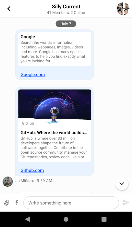
}In the snippet above, you initialize the message composer and integrate it with the MessageListView by passing actions from the message list to the composer.
This will produce a fully working solution, as shown in the image below.
Handling Actions
To handle actions supported by the MessageComposerView you can set the corresponding listeners:
messageComposerView.sendMessageButtonClickListener = {
    // Handle send button click
}
messageComposerView.textInputChangeListener = { text ->
    // Handle input text change
}
messageComposerView.attachmentSelectionListener = { attachments ->
    // Handle attachment selection
}
messageComposerView.attachmentRemovalListener = { attachment ->
    // Handle attachment removal
}
messageComposerView.mentionSelectionListener = { user ->
    // Handle mention selection
}
messageComposerView.commandSelectionListener = { command ->
    // Handle command selection
}
messageComposerView.alsoSendToChannelSelectionListener = { checked ->
    // Handle "also send to channel" checkbox selection
}
messageComposerView.dismissActionClickListener = {
    // Handle dismiss action button click
}
messageComposerView.commandsButtonClickListener = {
    // Handle commands button click
}
messageComposerView.dismissSuggestionsListener = {
    // Handle when suggestions popup is dismissed
}
messageComposerView.attachmentsButtonClickListener = {
    // Handle attachments button click
}If you don't set your custom listeners, the default listeners from the MessageComposerViewModel::bindView method will be used:
messageComposerView.sendMessageButtonClickListener = {
    messageComposerViewModel.sendMessage(messageComposerViewModel.buildNewMessage())
}
messageComposerView.textInputChangeListener = { text ->
    messageComposerViewModel.setMessageInput(text)
}
messageComposerView.attachmentSelectionListener = { attachments ->
    messageComposerViewModel.addSelectedAttachments(attachments)
}
messageComposerView.attachmentRemovalListener = { attachment ->
    messageComposerViewModel.removeSelectedAttachment(attachment)
}
messageComposerView.mentionSelectionListener = { user ->
    messageComposerViewModel.selectMention(user)
}
messageComposerView.commandSelectionListener = { command ->
    messageComposerViewModel.selectCommand(command)
}
messageComposerView.alsoSendToChannelSelectionListener = { checked ->
    messageComposerViewModel.setAlsoSendToChannel(checked)
}
messageComposerView.dismissActionClickListener = {
    messageComposerViewModel.dismissMessageActions()
}
messageComposerView.commandsButtonClickListener = {
    messageComposerViewModel.toggleCommandsVisibility()
}
messageComposerView.dismissSuggestionsListener = {
    messageComposerViewModel.dismissSuggestionsPopup()
}Now let's see how to customize the view.
Customization
MessageComposerView can be customized:
- Using XML Attributes
- Using style Transformations
- By overriding content Views
Using XML Attributes
Many attributes of this View can be configured, like changing its color, the border and the color of the message input, fonts, components visibility, and so on. The full list of available attributes can be found here.
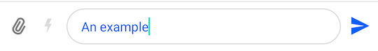
Here's an example of setting a custom attribute:
<io.getstream.chat.android.ui.message.composer.MessageComposerView
    android:id="@+id/messageComposerView"
    android:layout_width="match_parent"
    android:layout_height="wrap_content"
    app:streamUiMessageComposerMessageInputTextColor="#005AFF"
/>
This produces the following styling:
Different configurations can be used to achieve the desired appearance of MessageComposerView. If you don't need to change this View appearance at runtime, XML should be enough. But if you need to able to customize it at runtime, then you can use MessageComposerViewStyle as described in the next section.
Using Style Transformations
You can use TransformStyle to apply global style transformations to all MessageComposerView instances. For example, you can create a messageComposerStyleTransformer like this one to change the input text color:
TransformStyle.messageComposerStyleTransformer = StyleTransformer { viewStyle ->
    viewStyle.copy(
        messageInputTextStyle = viewStyle.messageInputTextStyle.copy(
            color = ContextCompat.getColor(context, R.color.stream_ui_accent_red)
        )
    )
}The transformer should be set before the View is rendered to make sure that the new style was applied.
Overriding Content Views
With the new MessageComposerView you can replace certain parts of the layout with custom content views. There are several parts available for customization.
- Leading content: Represents the left part with integration buttons.
- Center content: Represents the center part with the text input.
- Trailing content: Represents the right part with the send button.
- Header content: Represents the top part with the action mode title.
- Footer content: Represents the bottom part with the "also send to channel" checkbox.
- Command suggestions content: Represents the content inside the command suggestions popup.
- Mention suggestions content: Represents the content inside the mention suggestions popup.
The available methods with the default content view implementations are listed below:
messageComposerView.setLeadingContent(
    DefaultMessageComposerLeadingContent(context).also {
        it.attachmentsButtonClickListener = { messageComposerView.attachmentsButtonClickListener() }
        it.commandsButtonClickListener = { messageComposerView.commandsButtonClickListener() }
    }
)
messageComposerView.setCenterContent(
    DefaultMessageComposerCenterContent(context).also {
        it.textInputChangeListener = { text -> messageComposerView.textInputChangeListener(text) }
        it.attachmentRemovalListener = { attachment -> messageComposerView.attachmentRemovalListener(attachment) }
    }
)
messageComposerView.setTrailingContent(
    DefaultMessageComposerTrailingContent(context).also {
        it.sendMessageButtonClickListener = { messageComposerView.sendMessageButtonClickListener() }
    }
)
messageComposerView.setHeaderContent(
    DefaultMessageComposerHeaderContent(context).also {
        it.dismissActionClickListener = { messageComposerView.dismissActionClickListener() }
    }
)
messageComposerView.setFooterContent(
    DefaultMessageComposerFooterContent(context).also {
        it.alsoSendToChannelSelectionListener =
            { checked -> messageComposerView.alsoSendToChannelSelectionListener(checked) }
    }
)
messageComposerView.setCommandSuggestionsContent(
    DefaultMessageComposerCommandSuggestionsContent(context).also {
        it.commandSelectionListener =
            { command -> messageComposerView.commandSelectionListener(command) }
    }
)
messageComposerView.setMentionSuggestionsContent(
    DefaultMessageComposerMentionSuggestionsContent(context).also {
        it.mentionSelectionListener = { user -> messageComposerView.mentionSelectionListener(user) }
    }
)To create a custom content view you need to create an Android View that implements the MessageComposerContent interface:
class CustomMessageComposerLeadingContent : FrameLayout, MessageComposerContent {

    constructor(context: Context) : this(context, null)

    constructor(context: Context, attrs: AttributeSet?) : this(context, attrs, 0)

    constructor(context: Context, attrs: AttributeSet?, defStyleAttr: Int) : super(
        context,
        attrs,
        defStyleAttr
    )

    override fun attachContext(messageComposerContext: MessageComposerContext) {
        // Access the style if necessary
        val style = messageComposerContext.style
    }

    override fun renderState(state: MessageComposerState) {
        // Render the state of the component
    }
}Notice that you need to implement 2 methods from the MessageComposerContent interface:
attachContext()Called only once when the View has been attached to the hierarchy.renderState()Invoked when the state has changed and the UI needs to be updated accordingly.
Finally, you need to pass the created content view to the MessageComposerView:
messageComposerView.setLeadingContent(CustomMessageComposerLeadingContent(context))Here is an example of how the leading content can be customized to show a date picker button:
<?xml version="1.0" encoding="utf-8"?>
<ImageView
    xmlns:android="http://schemas.android.com/apk/res/android"
    android:id="@+id/datePickerButton"
    android:layout_width="24dp"
    android:layout_height="24dp"
    android:layout_marginHorizontal="8dp"
    android:layout_marginVertical="16dp"
android:src="@drawable/ic_calendar" />class CustomMessageComposerLeadingContent : FrameLayout, MessageComposerContent {
private lateinit var binding: CustomMessageComposerLeadingContentBinding
var datePickerButtonClickListener: () -> Unit = {}
constructor(context: Context) : this(context, null)
constructor(context: Context, attrs: AttributeSet?) : this(context, attrs, 0)
constructor(context: Context, attrs: AttributeSet?, defStyleAttr: Int) : super(
context,
attrs,
defStyleAttr
) {
binding = CustomMessageComposerLeadingContentBinding.inflate(LayoutInflater.from(context), this, true)
binding.datePickerButton.setOnClickListener { datePickerButtonClickListener() }
}
override fun attachContext(messageComposerContext: MessageComposerContext) {
// Access the style if necessary
val style = messageComposerContext.style
}
override fun renderState(state: MessageComposerState) {
// Render the state of the component
}
}messageComposerView.setLeadingContent(
CustomMessageComposerLeadingContent(context).also {
it.datePickerButtonClickListener = {
val datePickerDialog = MaterialDatePicker.Builder
.datePicker()
.build()
datePickerDialog.addOnPositiveButtonClickListener {
// Handle date selection
}
datePickerDialog.show(fragmentManager, null)
}
}
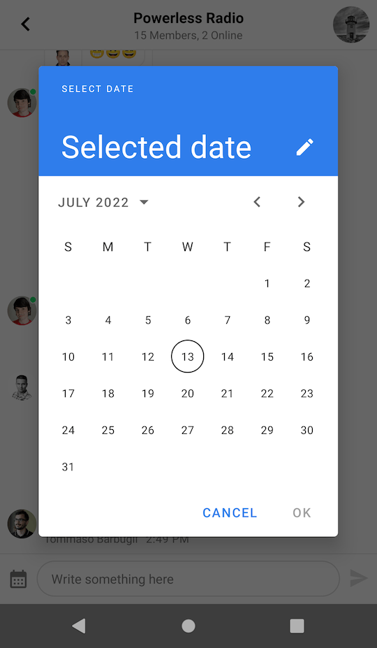
)In the example above, we inflated a simple layout with just one date picker button and defined a listener to handle clicks on the button. A dialog is shown when the button is clicked.
 |  |