 React
React iOS
iOS Android
 Flutter
 Angular
 JavaScript
 Unity
Unity Unreal
 Node
Node Python
 Ruby
Ruby PHP
PHP Java
Java .NET
.NET Go
Go REST
REST<merge xmlns:android="http://schemas.android.com/apk/res/android"
xmlns:tools="http://schemas.android.com/tools">
<androidx.appcompat.widget.LinearLayoutCompat
android:layout_width="wrap_content"
android:layout_height="match_parent"
android:gravity="bottom"
android:orientation="horizontal"
android:paddingHorizontal="4dp"
android:paddingVertical="12dp">
<!-- The new date picker button -->
<ImageView
android:id="@+id/calendarButton"
android:layout_width="32dp"
android:layout_height="32dp"
android:padding="4dp"
android:src="@drawable/ic_calendar"
tools:ignore="ContentDescription" />
<ImageView
android:id="@+id/attachmentsButton"
android:layout_width="32dp"
android:layout_height="32dp"
android:padding="4dp"
android:src="@drawable/stream_ui_ic_attach"
tools:ignore="ContentDescription" />
<ImageView
android:id="@+id/commandsButton"
android:layout_width="32dp"
android:layout_height="32dp"
android:padding="4dp"
android:src="@drawable/stream_ui_ic_command"
tools:ignore="ContentDescription" />
</androidx.appcompat.widget.LinearLayoutCompat>
</merge>This is documentation for Stream Chat Android SDK v5, which is no longer actively maintained. For up-to-date documentation, see the latest version (v7).
Adding Custom Attachments (MessageComposerView)
This version of the Adding Custom Attachments guide uses the new MessageComposerView which is still experimental.
Introduction
By default Stream Chat supports several built-in attachment types like image, video, file and Giphy. You can also add your own types of attachments such as location, contact, audio, sticker, etc.
In this guide, we'll demonstrate how to build a date sharing feature. Chat users will be able to pick a date from a calendar, preview their selection in the message input and see the sent attachment within a message in the message list.
This involves the following steps:
- Customizing the message composer so that it is capable of sending messages with
dateattachments. - Adding support for
dateattachments in the message list.
In this guide, we'll show only the main points concerning custom attachments. Smaller parts will be omitted for the sake of being concise.
You can find the full code from this guide on GitHub. To check the final result, clone the repository, select the stream-chat-android-ui-guides module on your Android Studio like the image below, and run the module. 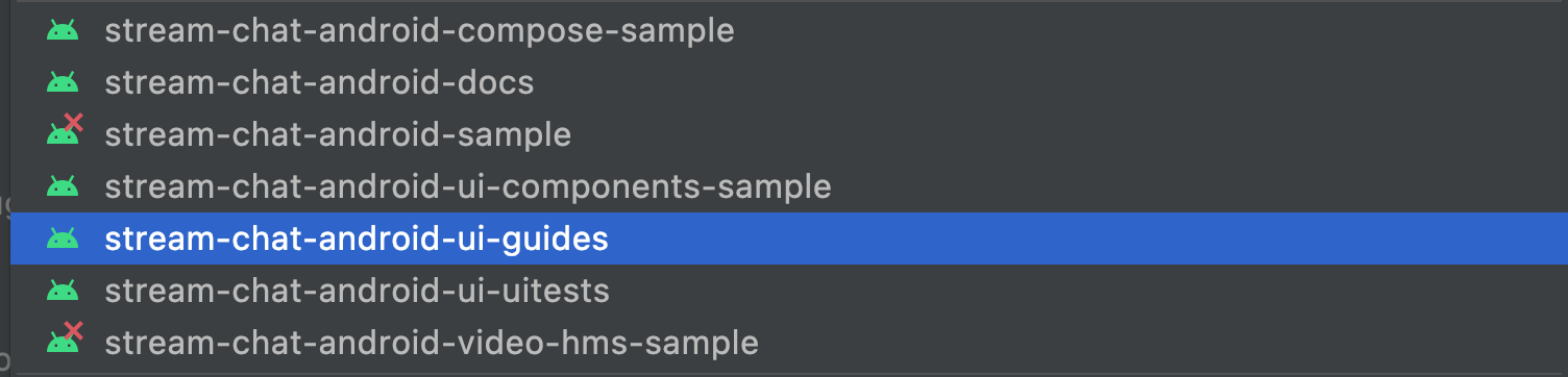
Sending Date Attachments
First of all, you'll need to customize the leading content of MessageComposerView to let the user pick a date using the date picker button. We'll take the DefaultMessageComposerLeadingContent as a reference and add a new date picker button:
class CustomMessageComposerLeadingContent : FrameLayout, MessageComposerContent {

    private lateinit var binding: CustomMessageComposerLeadingContentBinding
    private lateinit var style: MessageComposerViewStyle

    var attachmentsButtonClickListener: () -> Unit = {}
    var commandsButtonClickListener: () -> Unit = {}

    // Click listener for the date picker button
    var calendarButtonClickListener: () -> Unit = {}

    constructor(context: Context) : this(context, null)

    constructor(context: Context, attrs: AttributeSet?) : this(context, attrs, 0)

    constructor(context: Context, attrs: AttributeSet?, defStyleAttr: Int) : super(
        context,
        attrs,
        defStyleAttr
    ) {
        binding = CustomMessageComposerLeadingContentBinding.inflate(LayoutInflater.from(context), this)
        binding.attachmentsButton.setOnClickListener { attachmentsButtonClickListener() }
        binding.commandsButton.setOnClickListener { commandsButtonClickListener() }

        // Set click listener for the date picker button
        binding.calendarButton.setOnClickListener { calendarButtonClickListener() }
    }

    override fun attachContext(messageComposerContext: MessageComposerContext) {
        this.style = messageComposerContext.style
    }

    override fun renderState(state: MessageComposerState) {
        val canSendMessage = state.ownCapabilities.contains(ChannelCapabilities.SEND_MESSAGE)
        val canUploadFile = state.ownCapabilities.contains(ChannelCapabilities.UPLOAD_FILE)
        val hasTextInput = state.inputValue.isNotEmpty()
        val hasAttachments = state.attachments.isNotEmpty()
        val hasCommandInput = state.inputValue.startsWith("/")
        val hasCommandSuggestions = state.commandSuggestions.isNotEmpty()
        val hasMentionSuggestions = state.mentionSuggestions.isNotEmpty()
        val isInEditMode = state.action is Edit

        binding.attachmentsButton.isEnabled = !hasCommandInput && !hasCommandSuggestions && !hasMentionSuggestions
        binding.attachmentsButton.isVisible =
            style.attachmentsButtonVisible && canSendMessage && canUploadFile && !isInEditMode

        binding.commandsButton.isEnabled = !hasTextInput && !hasAttachments
        binding.commandsButton.isVisible = style.commandsButtonVisible && canSendMessage && !isInEditMode
        binding.commandsButton.isSelected = hasCommandSuggestions
    }
}
// Set a custom leading content view
messageComposerView.setLeadingContent(
CustomMessageComposerLeadingContent(context).also {
it.attachmentsButtonClickListener = { messageComposerView.attachmentsButtonClickListener() }
it.commandsButtonClickListener = { messageComposerView.commandsButtonClickListener() }
it.calendarButtonClickListener = {
// Create an instance of a date picker dialog
val datePickerDialog = MaterialDatePicker.Builder
.datePicker()
.build()
// Add an attachment to the message input when the user selects a date
datePickerDialog.addOnPositiveButtonClickListener {
val date = DateFormat
.getDateInstance(DateFormat.LONG)
.format(Date(it))
val attachment = Attachment(
type = "date",
extraData = mutableMapOf("payload" to date)
)
messageComposerViewModel.addSelectedAttachments(listOf(attachment))
}
// Show the date picker
datePickerDialog.show(childFragmentManager, null)
}
}
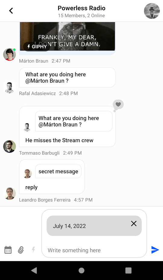
)This code will display the date picker dialog once the button is clicked:
 | 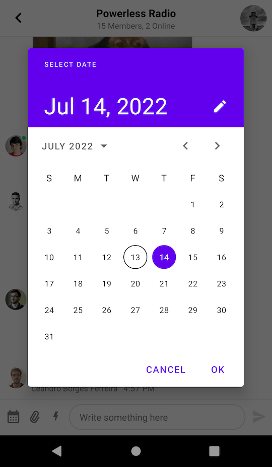 |
After the date has been selected, we create an instance of Attachment with the corresponding payload and add it to the composer with the MessageComposerViewModel::addSelectedAttachments method.
Next, we need to provide support for displaying custom attachment previews in the MessageComposerView by implementing the AttachmentPreviewFactory interface:
interface AttachmentPreviewFactory {

    fun canHandle(attachment: Attachment): Boolean

    fun onCreateViewHolder(
        parentView: ViewGroup,
        attachmentRemovalListener: (Attachment) -> Unit,
    ): AttachmentPreviewViewHolder
}
There are two methods that need to be implemented:
canHandle: Checks whether the factory can handle the given attachment.onCreateViewHolder: Represents the attachment preview UI within theMessageComposerView.
Let's create a layout for the ViewHolder and name it item_date_attachment_preview.xml:
<?xml version="1.0" encoding="utf-8"?>
<androidx.cardview.widget.CardView xmlns:android="http://schemas.android.com/apk/res/android"
    xmlns:app="http://schemas.android.com/apk/res-auto"
    xmlns:tools="http://schemas.android.com/tools"
    android:layout_width="match_parent"
    android:layout_height="wrap_content"
    android:layout_margin="8dp"
    app:cardBackgroundColor="#DBDBDB"
    app:cardCornerRadius="16dp"
    app:cardElevation="0dp">

    <TextView
        android:id="@+id/dateTextView"
        android:layout_width="wrap_content"
        android:layout_height="wrap_content"
        android:layout_gravity="center_vertical"
        android:layout_margin="16dp"
        android:textColor="#000000" />

    <ImageView
        android:id="@+id/deleteButton"
        android:layout_width="24dp"
        android:layout_height="24dp"
        android:layout_gravity="top|end"
        android:layout_margin="8dp"
        android:src="@drawable/ic_close"
        tools:ignore="ContentDescription" />

</androidx.cardview.widget.CardView>
class DateAttachmentPreviewFactory : AttachmentPreviewFactory {
override fun canHandle(attachment: Attachment): Boolean {
return attachment.type == "date"
}
override fun onCreateViewHolder(
parentView: ViewGroup,
attachmentRemovalListener: (Attachment) -> Unit,
): AttachmentPreviewViewHolder {
return ItemDateAttachmentPreviewBinding
.inflate(LayoutInflater.from(parentView.context), parentView, false)
.let { DateAttachmentPreviewViewHolder(it, attachmentRemovalListener) }
}
class DateAttachmentPreviewViewHolder(
private val binding: ItemDateAttachmentPreviewBinding,
private val attachmentRemovalListener: (Attachment) -> Unit,
) : AttachmentPreviewViewHolder(binding.root) {
private lateinit var attachment: Attachment
init {
binding.deleteButton.setOnClickListener {
attachmentRemovalListener(attachment)
}
}
override fun bind(attachment: Attachment) {
this.attachment = attachment
binding.dateTextView.text = attachment.extraData["payload"].toString()
}
}
}Finally, provide the factory via ChatUI:
ChatUI.attachmentPreviewFactoryManager = AttachmentPreviewFactoryManager(
listOf(
// The new factory
DateAttachmentPreviewFactory(),
// The default factories
ImageAttachmentPreviewFactory(),
FileAttachmentPreviewFactory(),
)
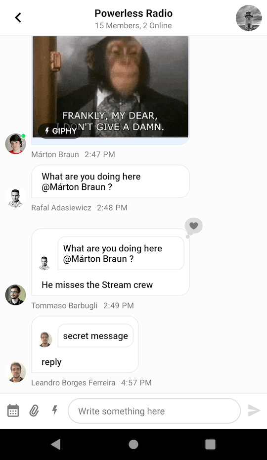
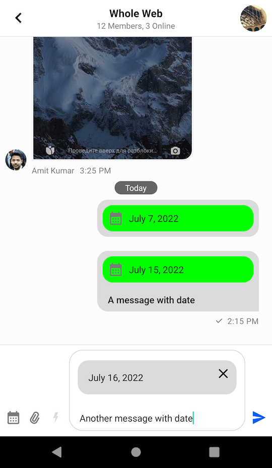
)Now we are ready to send a custom attachment of type date to the chat. The resulting UI will look like this:
Next, you'll need to build a custom attachment factory to render the item in the message list.
Rendering Date Attachments
To render a custom attachment in the MessageListView you'll have to implement the AttachmentFactory interface:
interface AttachmentFactory {

    fun canHandle(message: Message): Boolean

    fun createViewHolder(
        message: Message,
        listeners: MessageListListenerContainer?,
        parent: ViewGroup,
    ): InnerAttachmentViewHolder
}
There are two methods that need to be implemented:
canHandle: Checks whether the factory can handle the given attachments.createViewHolder: Represents the attachment UI within theMessageListView.
Let's see how to create an AttachmentFactory that is capable of handling date attachments.
Add a new layout called item_date_attachment.xml:
<?xml version="1.0" encoding="utf-8"?>
<androidx.cardview.widget.CardView xmlns:android="http://schemas.android.com/apk/res/android"
    xmlns:app="http://schemas.android.com/apk/res-auto"
    xmlns:tools="http://schemas.android.com/tools"
    android:layout_width="match_parent"
    android:layout_height="wrap_content"
    android:layout_margin="8dp"
    app:cardBackgroundColor="#00FF00"
    app:cardCornerRadius="16dp"
    app:cardElevation="0dp">

    <ImageView
        android:layout_width="24dp"
        android:layout_height="24dp"
        android:layout_gravity="center_vertical"
        android:layout_margin="8dp"
        android:src="@drawable/ic_calendar"
        tools:ignore="ContentDescription" />

    <TextView
        android:id="@+id/dateTextView"
        android:layout_width="wrap_content"
        android:layout_height="wrap_content"
        android:layout_gravity="center_vertical"
        android:layout_marginStart="40dp"
        android:textColor="#000000" />

</androidx.cardview.widget.CardView>
class DateAttachmentFactory : AttachmentFactory {
override fun canHandle(message: Message): Boolean {
// Use the factory only for date attachments
return message.attachments.any { it.type == "date" }
}
override fun createViewHolder(
message: Message,
listeners: MessageListListenerContainer?,
parent: ViewGroup,
): InnerAttachmentViewHolder {
// Create an inner ViewHolder with the attachment content
return ItemDateAttachmentBinding
.inflate(LayoutInflater.from(parent.context), parent, false)
.let { DateAttachmentViewHolder(it, listeners) }
}
class DateAttachmentViewHolder(
private val binding: ItemDateAttachmentBinding,
listeners: MessageListListenerContainer?,
) : InnerAttachmentViewHolder(binding.root) {
private lateinit var message: Message
init {
// Handle clicks on the attachment content
binding.dateTextView.setOnClickListener {
listeners?.attachmentClickListener?.onAttachmentClick(
message,
message.attachments.first()
)
}
binding.dateTextView.setOnLongClickListener {
listeners?.messageLongClickListener?.onMessageLongClick(message)
true
}
}
override fun onBindViewHolder(message: Message) {
this.message = message
// Display the date from the attachment extras
binding.dateTextView.text = message.attachments
.first { it.type == "date" }
.extraData["payload"]
.toString()
}
}
}What's really exciting here is the ability to fetch custom attachment data using attachment.extraData["payload"]. You can format the data in any way you want here, which makes our attachments very powerful.
To complete the date sharing feature you just need to provide DateAttachmentFactory via ChatUI:
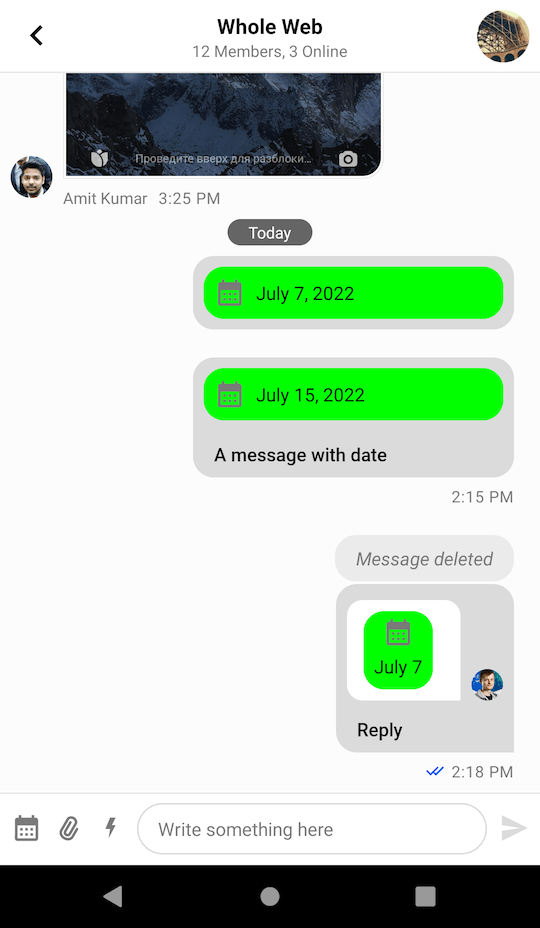
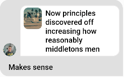
ChatUI.attachmentFactoryManager = AttachmentFactoryManager(listOf(DateAttachmentFactory()))Date attachments should now be correctly rendered in the message input and in the message list like in the screenshot below:
Quoted Messages
Stream SDK supports quoting or replying to messages, even if they contain attachments. These quoted messages are shown inside the message bubble above the text you wrote when quoting, which is a common pattern in various chat services.
Since the quoted content is nested inside a regular message, it has less space available and requires a different layout. For this reason, the UI Components SDK provides separate attachment factories just for the quoted content. This allows you to provide a different UI for attachments that are displayed as a part of the quoted content.
Attachment factories used for displaying quoted content use the QuotedAttachmentFactory. The factory generates a View class so if you don't provide a quoted factory that can render the custom attachment we will use the itemView from the ViewHolder generated from your custom attachmentFactory.
Let's see how to build a custom quoted attachment factory.
Rendering Quoted Date Attachments
To render a custom quoted attachment in the MessageListView you'll have to implement the QuotedAttachmentFactory interface:
interface QuotedAttachmentFactory {

    fun canHandle(message: Message): Boolean

    fun generateQuotedAttachmentView(
        message: Message,
        parent: ViewGroup,
    ): View
}
The two methods that you need to implement are similar to the ones from AttachmentFactory:
canHandle: Checks whether the factory can handle the given attachments.generateQuotedAttachmentView: Generates the view to render the attachment.
Let's see how to create a QuotedAttachmentFactory.
First, create the view that you're going to render for the attachment and call it view_quoted_date_attachment.xml:
<?xml version="1.0" encoding="utf-8"?>
<merge xmlns:android="http://schemas.android.com/apk/res/android"
    xmlns:app="http://schemas.android.com/apk/res-auto"
    xmlns:tools="http://schemas.android.com/tools"
    tools:parentTag="android.widget.FrameLayout">

    <androidx.cardview.widget.CardView
        android:layout_width="wrap_content"
        android:layout_height="wrap_content"
        app:cardBackgroundColor="#00FF00"
        app:cardCornerRadius="16dp"
        app:cardElevation="0dp">

        <LinearLayout
            android:layout_width="wrap_content"
            android:layout_height="wrap_content"
            android:gravity="center"
            android:orientation="vertical">

            <ImageView
                android:layout_width="24dp"
                android:layout_height="24dp"
                android:layout_margin="4dp"
                android:src="@drawable/ic_calendar"
                tools:ignore="ContentDescription" />

            <TextView
                android:id="@+id/dateTextView"
                android:layout_width="wrap_content"
                android:layout_height="wrap_content"
                android:layout_marginStart="8dp"
                android:layout_marginEnd="8dp"
                android:layout_marginBottom="8dp"
                android:gravity="center"
                android:textColor="#000000"
                tools:text="1982\nMay 21" />

        </LinearLayout>

    </androidx.cardview.widget.CardView>

</merge>
And the view class QuotedDateAttachmentView:
class QuotedDateAttachmentView(context: Context): FrameLayout(context) {

    private val binding = ViewQuotedDateAttachmentBinding.inflate(LayoutInflater.from(context), this)

    fun showDate(attachment: Attachment) {
        binding.dateTextView.text = parseDate(attachment)
    }

    private fun parseDate(attachment: Attachment): String {
        val date = attachment.extraData["payload"].toString()
        return StringBuilder().apply {
            val dateTime = SimpleDateFormat("MMMMM dd, yyyy", Locale.getDefault()).parse(date) ?: return@apply
            val year = Calendar.getInstance().apply {
                timeInMillis = dateTime.time
            }.get(Calendar.YEAR)
            if (Calendar.getInstance().get(Calendar.YEAR) != year) {
                append(year).append("\n")
            }
            append(date.replace(", $year", ""))
        }.toString()
    }
}
As before, you fetch the custom data from attachment.extraData["payload"]. You format it so that you don't show the year if it's the current one, and you show the month in a new line.
Now that you've built the custom view for quoted content, for your custom attachments, the QuotedAttachmentFactory will look like this:
class QuotedDateAttachmentFactory: QuotedAttachmentFactory {
    override fun canHandle(message: Message): Boolean {
        return message.attachments.any { it.type == "date" }
    }

    override fun generateQuotedAttachmentView(message: Message, parent: ViewGroup): View {
        return QuotedDateAttachmentView(parent.context).apply {
            showDate(message.attachments.first())
        }
    }
}
To complete the quoted attachment feature and show it inside the UI you need to provide the QuotedDateAttachmentFactory via ChatUI alongside the DefaultQuotedAttachmentFactory to show the rest of the attachments:
ChatUI.quotedAttachmentFactoryManager = QuotedAttachmentFactoryManager(listOf(
    QuotedDateAttachmentFactory(),
    DefaultQuotedAttachmentMessageFactory()
))
Quoted messages with a date attachment should now be rendered inside the message list, like in the screenshot below: