// The state if we need to show the picker or not
val isShowingAttachments = attachmentsPickerViewModel.isShowingAttachments

if (isShowingAttachments) {
    AttachmentsPicker( // Add the picker to your UI
        attachmentsPickerViewModel = attachmentsPickerViewModel,
        modifier = Modifier
            .align(Alignment.BottomCenter)
            .height(350.dp),
        onAttachmentsSelected = { attachments ->
            // Handle selected attachments
        },
        onDismiss = {
            // Handle dismiss
        }
    )
}AttachmentsPicker
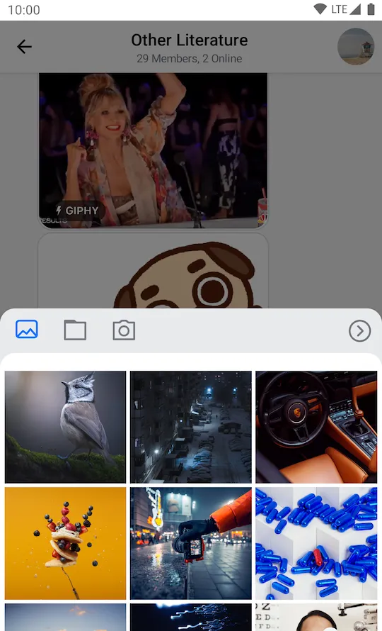
The AttachmentsPicker component allows users to pick media, file or media capture attachments to send to the chat. The picker is a bound component that loads all the data and prepares it for the user.
Internally, it sets up the following components:
- Picker options: The header in the picker that shows different types of attachment options people can choose from, media, files or media capture, as well as the Confirm selection button.
- Image picker: Shows a gallery of images to choose from the device.
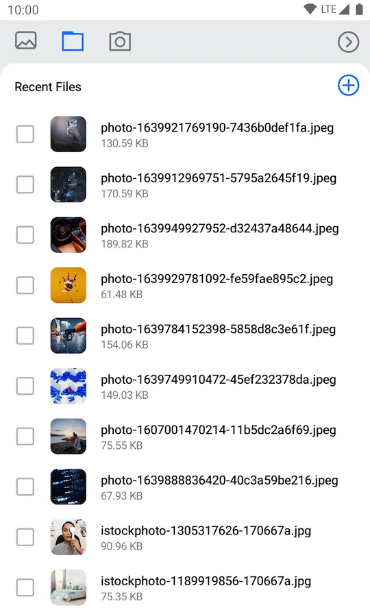
- File picker: Shows a list of files to choose from the device. Also allows the user to open the file browser and pick more files from the system.
- Media capture: Shows the media capture option to the user and opens a media capture
Activity.
The picker also handles required permissions for browsing files and capturing images.
Let's see how to use it.
Usage
If you're using screen components, like the MessagesScreen, you don't have to do any setup for the AttachmentsPicker. If you're building custom screens, you can add the AttachmentPicker to the rest of your UI:
Because the AttachmentsPicker is a bound component, you should rely on the AttachmentsPickerViewModel's state, to know if you should show the picker or not. To make sure the picker is shown only when it should be, wrap the component call in an if statement.
The code above will show the following UI:

As you can see, the picker is really easy to add to the UI, and it lets your users choose from different types of attachments when sending their messages.
Handling Actions
The AttachmentsPicker exposes these actions for customization, as per the signature:
@Composable
fun AttachmentsPicker(
    onAttachmentsSelected: (List<Attachment>) -> Unit,
    onDismiss: () -> Unit,
)onAttachmentsSelected: Handler when the user selects attachments and confirms the selection by clicking on the Confirm selection button.onDismiss: Handler when the picker is dismissed by clicking outside of the picker area or by pressing the system back button.
To customize the behavior of the picker, simply override these actions to fit your UI needs, like in the following example:
AttachmentsPicker(
    ..., // State and UI customization
    onAttachmentsSelected = { attachments ->
        // Dismiss the picker and store the attachments
        attachmentsPickerViewModel.changeAttachmentState(showAttachments = false)
        composerViewModel.addSelectedAttachments(attachments)
    },
    onDismiss = { // Reset the UI state and dismiss the picker
        attachmentsPickerViewModel.changeAttachmentState(showAttachments = false)
        attachmentsPickerViewModel.dismissAttachments()
    }
)
In the example above, when onAttachmentsSelected() is triggered, you call onShowAttachments() and dismiss the picker from the UI, but you also store the selected attachments in the MessageComposerViewModel, so that you can show them in the MessageInput component.
Alternatively, in onDismiss(), you hide the picker again and you call attachmentsPickerViewModel.onDismiss() to reset the picker state, such as the loaded files or images and the AttachmentPickerMode.
This is a very simple way to customize the behavior and connect the AttachmentPicker to the rest of your components.
Customization
You can customize the AttachmentsPicker using the following parameters:
fun AttachmentsPicker(
    ..., // ViewModel and action handlers
    modifier: Modifier = Modifier,
    tabFactories: List<AttachmentsPickerTabFactory> = ChatTheme.attachmentsPickerTabFactories,
    shape: Shape = ChatTheme.shapes.bottomSheet,
)modifier: Allows you to customize the root content component of the picker and change its size, padding and more.tabFactories: Used to customize the tabs shown in the picker.shape: Allows you to override theAttachmentsPickershape.
Here's an example of a full screen AttachmentsPicker dialog:
AttachmentsPicker(
    attachmentsPickerViewModel = attachmentsPickerViewModel,
    modifier = Modifier.fillMaxSize(), // Fill all the available space
    shape = RectangleShape, // Use a shape without rounded corners
    onAttachmentsSelected = { attachments ->
        // Handle selected attachments
    },
    onDismiss = {
        // Handle dismiss
    }
)
This snippet will provide the following UI:

As you can see, the AttachmentsPicker component now occupies the whole screen.
Now let's see how to use the tabFactories parameter to replace the media capture tab in the picker with a custom one.
We'll need to create a custom AttachmentsPickerTabFactory for our custom tab and implement the methods to render the icon and the content of the tab:
class AttachmentsPickerCustomTabFactory: AttachmentsPickerTabFactory {

    override val attachmentsPickerMode: AttachmentsPickerMode
        get() = CustomPickerMode()

    @Composable
    override fun pickerTabIcon(isEnabled: Boolean, isSelected: Boolean) {
        Icon(
            painter = painterResource(id = R.drawable.ic_custom_tab),
            contentDescription = "Custom tab",
            tint = when {
                isSelected -> ChatTheme.colors.primaryAccent
                isEnabled -> ChatTheme.colors.textLowEmphasis
                else -> ChatTheme.colors.disabled
            },
        )
    }

    @Composable
    override fun pickerTabContent(
        attachments: List<AttachmentPickerItemState>,
        onAttachmentsChanged: (List<AttachmentPickerItemState>) -> Unit,
        onAttachmentItemSelected: (AttachmentPickerItemState) -> Unit,
        onAttachmentsSubmitted: (List<AttachmentMetaData>) -> Unit,
    ) {
        Box(
            modifier = Modifier.fillMaxSize(),
            contentAlignment = Alignment.Center
        ) {
            Text(
                style = ChatTheme.typography.title3Bold,
                text = "Custom tab",
                color = ChatTheme.colors.textHighEmphasis,
            )
        }
    }
}
Next, we'll remove the factory for the media capture tab, add a factory for our custom tab and pass the resulting factory list to the picker:
val defaultTabFactories = AttachmentsPickerTabFactories.defaultFactories(mediaCaptureTabEnabled = false)
val customTabFactories = listOf(AttachmentsPickerCustomTabFactory())
val tabFactories = defaultTabFactories + customTabFactories

AttachmentsPicker(
    ...
    tabFactories = tabFactories
)
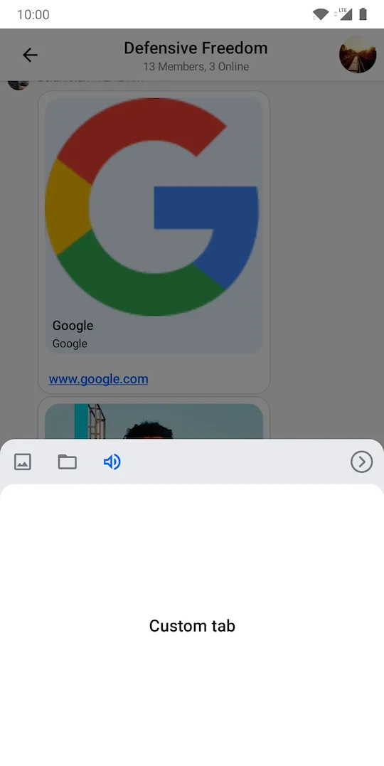
The code above will produce the following UI:

As you can see, the media capture option is removed and the custom tab is visible on the screen, but it only shows a small text element. Our example is very simple, but you can create custom tabs that handle audio recordings, location sharing, calendar invites and much more.