Version: v3

Channel

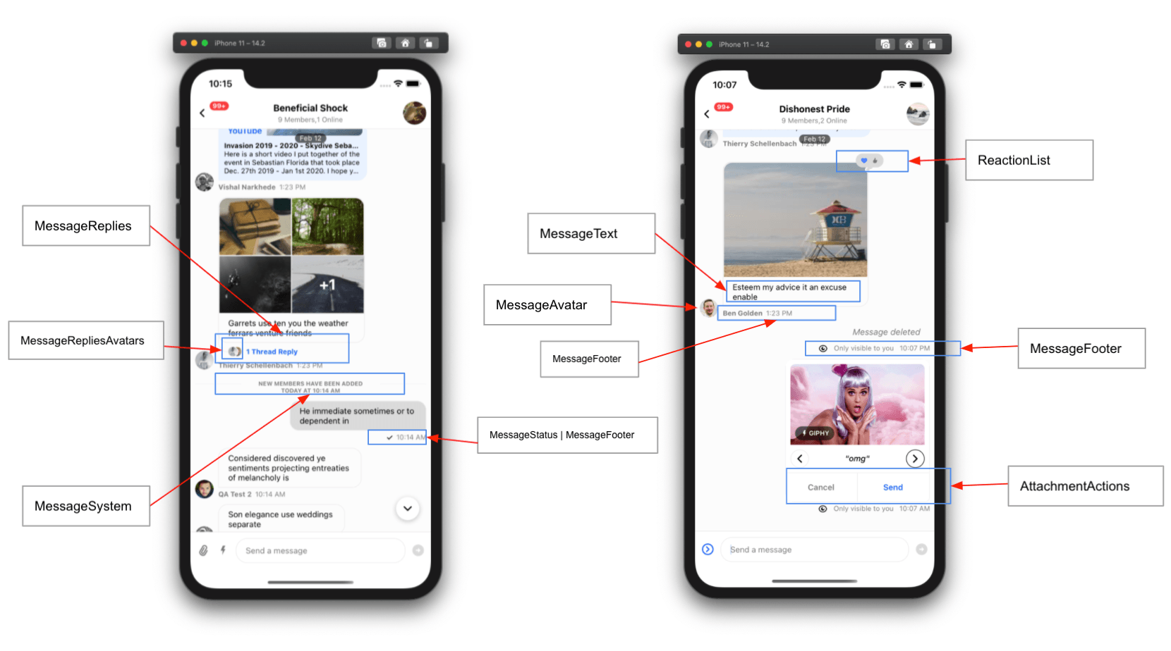
The Channel component is the main entry point for many Stream Chat customizations and contains the majority of the content providers and a significant amount of the logic utilized by Stream Chat for React Native. Components, custom and out of the box, channel information, and UI integrated chat functions are disseminated by the contexts contained in Channel. MessageList, MessageInput, and Thread all rely on Channel to function correctly.

Basic Usage

Channel takes an instance of a StreamChat channel as a prop. You can create a channel, or if you are navigating from the ChannelList, access the selected channel via the parameter passed to the onSelect function.

import { StreamChat } from 'stream-chat';
import { Channel, Chat, MessageInput, MessageList, OverlayProvider } from 'stream-chat-react-native';

const client = StreamChat.getInstance('api_key');

export const App = () => {
const [channel, setChannel] = useState();

useEffect(() => {
const createAndWatchChannel = async () => {
const newChannel = client.channel('messaging', 'channel_id');
await newChannel.watch();
setChannel(newChannel);
};

createAndWatchChannel();
}, []);

return (
<OverlayProvider>
<Chat client={client}>
<Channel channel={channel}>
<MessageList />
<MessageInput />
</Channel>
</Chat>
</OverlayProvider>
);
};

Context Providers

Channel contains providers for the ChannelContext, KeyboardContext, MessageInputContext, MessagesContext, PaginatedMessageListContext, SuggestionsContext, ThreadContext, and TypingContext. These can be accessed using the corresponding hooks.

ContextHook
ChannelContextuseChannelContext
KeyboardContextuseKeyboardContext
MessageInputContextuseMessageInputContext
MessagesContextuseMessagesContext
PaginatedMessageListContextusePaginatedMessageListContext
SuggestionsContextuseSuggestionsContext
ThreadContextuseThreadContext
TypingContextuseTypingContext

UI Customizations

Channel is the entry point for customizing the majority of the Stream Chat for React Native SDK. The UI can be tailored to your design by replacing any number of components with custom components. Custom components provided as props to Channel will be utilized throughout the SDK where appropriate.

Customizing the message avatar can be done easily by providing a custom component to the appropriate prop.

import { Image } from 'react-native';
import { Channel, useMessageContext } from 'stream-chat-react-native';

const CustomAvatar = () => {
const { message } = useMessageContext();

return <Image source={{ uri: message.user?.image }} />;
};

<Channel MessageAvatar={CustomAvatar} />;

Props

channel

Channel instance from the StreamChat client.

Type
Channel

keyboardVerticalOffset

Distance between top of the screen and top of Channel component. This is often the header height.

Type
number

additionalKeyboardAvoidingViewProps

Additional props provided to the underlying KeyboardAvoidingView.

Type
object

additionalTextInputProps

Additional props provided to the underlying TextInput within MessageInput.

Type
object

animatedLongPress

Animate with a pop the long-press action on the message bubble.

TypeDefault
booleaniOS: true
Android: false

additionalTouchableProps

Additional props provided to the underlying TouchableOpacity used by components within a message such as MessageContent.

Type
object

allowThreadMessagesInChannel

Display the Show thread message in channel button inside the thread MessageInput.

TypeDefault
booleantrue

autoCompleteSuggestionsLimit

Maximum number of suggestions to display as part of autocomplete feature within input box.

TypeDefault
number10

autoCompleteTriggerSettings

Function that returns the trigger settings for the auto complete input.

TypeDefault
functionACITriggerSettings

blockUser

Override of the Block User MessageAction shown when a user long presses a message. The blockUser function receives as a parameter the relevant message and must return a MessageAction. Please refer to the guide on customizing message actions for details.

Type
function | null
ParameterDescription
messagemessage the action is called on

closeSuggestions

Function called when the AutoCompleteInput stops tracking suggestions.

Type
function

compressImageQuality

Image compression quality prior to uploading.

note

On iOS values of 0.8 and above don't reduce the quality noticeably in most images. A value of 0.8 will reduce the file size in iOS by approximately half compared to a value of 1.

TypeDefault
number 0 to 1
(1 is best quality)
iOS: 0.8
Android: 1

copyMessage

Override of the Copy Message MessageAction shown when a user long presses a message. The copyMessage function receives as a parameter the relevant message and must return a MessageAction. Please refer to the guide on customizing message actions for details.

Type
function
ParameterDescription
messagemessage the action is called on

deleteMessage

Override of the Delete Message MessageAction shown when a user long presses a message. The deleteMessage function receives as a parameter the relevant message and must return a MessageAction. Please refer to the guide on customizing message actions for details.

Type
function | null
ParameterDescription
messagemessage the action is called on

disableIfFrozenChannel

Disable all interaction with the Channel component if the channel is frozen.

TypeDefault
booleantrue

disableKeyboardCompatibleView

Enable or disable the underlying KeyboardAvoidingView.

TypeDefault
booleanfalse

disableTypingIndicator

Disable typing indicator in MessageList.

TypeDefault
booleanfalse

dismissKeyboardOnMessageTouch

Dismiss the keyboard when a user touches any of the messages in the list.

TypeDefault
booleanfalse

doDocUploadRequest

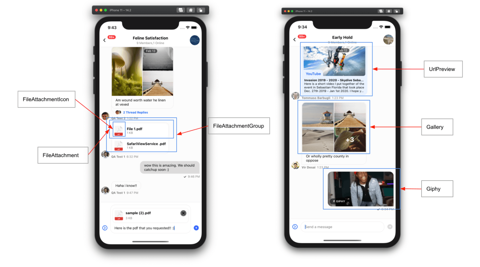
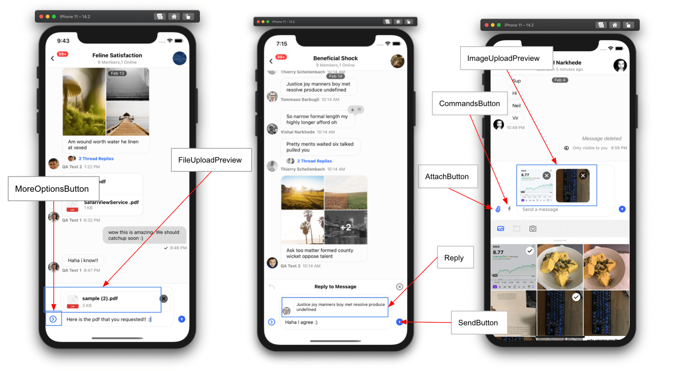
Override of the file upload request when a user selects a file from the file picker. The function must return a Promise that is resolved to an object with the key file that is the URL of the uploaded file.

note

This can be used to store file attachments in your own custom CDN.

Type
function
ParameterDescription
file{ name, size, type, uri }
channelcurrent channel instance

doImageUploadRequest

Override of the image upload request when a user selects an image from the image picker. The function must return a Promise that is resolved to an object with the key file that is the URL of the uploaded image.

note

This can be used to store image attachments in your own custom CDN.

Type
function
ParameterDescription
image{ name, uri }
channelcurrent channel instance

doMarkReadRequest

Override the mark read request.

note

This prop should only be used for advanced functionality in which you want to conditionally allow mark-read requests.

Don not use this function to disable the read-receipts feature. If you would like to disable read-receipts, this can be done via Read Events on the dashboard.

Example

const doMarkReadRequest = (channel) => {
if (/** Some custom logic here */) {
channel.markRead();
}
};
Type
function
ParameterDescription
channelchannel instance

doSendMessageRequest

Override the send message request. This function must return a Promise equivalent to client.sendMessage.

note

This prop should only be used for advanced functionality in which you want to alter the message object before sending.

Example

const doSendMessageRequest = (channelId, messageObject) => {
if (/** Some custom logic here */) {
messageObject.isSpecial = true;
}
return channel.sendMessage(messageObject);
}
Type
function
ParameterDescription
channelIdstring
messageObjectobject

doUpdateMessageRequest

Override the update message request. This function must return a Promise equivalent to client.updateMessage.

note

This prop should only be used for advanced functionality in which you want to alter the message object before updating it.

const doUpdateMessageRequest = (channelId, messageObject) => {
const numberOfUpdates = (messageObject.numberOfUpdates ?? 0) + 1;
const messageToSend = { ...messageObject, numberOfUpdates };
return client.updateMessage(messageToSend);
};
Type
function
ParameterDescription
channelIdstring
messageObjectobject

editMessage

Override of the Edit Message MessageAction shown when a user long presses a message. The editMessage function receives as a parameter the relevant message and must return a MessageAction. Please refer to the guide on customizing message actions for details.

Type
function | null
ParameterDescription
messagemessage the action is called on

enableMessageGroupingByUser

Note: This prop is available only in SDK version >= v3.9.0

If false, consecutive messages from same user won't be grouped together.

TypeDefault
booleantrue

enforceUniqueReaction

Limits reactions to one per user. If a user selects another reaction, their previous reaction will be replaced. This is similar to reaction UX of iMessage.

TypeDefault
booleanfalse

flagMessage

Override of the Flag Message MessageAction shown when a user long presses a message. The flagMessage function receives as a parameter the relevant message and must return a MessageAction. Please refer to the guide on customizing message actions for details.

Type
function | null
ParameterDescription
messagemessage the action is called on

forceAlignMessages

Forces alignment of messages in the list to either the left or right side of the screen. By default, received messages are aligned on the left side of the screen, and sent messages are aligned on the right.

TypeDefault
'left' | 'right' | falsefalse

formatDate

Format function that returns a string to be used for the date in the message status and delete message component.

Type
function
ParameterDescription
datedate to format provided as a string, Date, or number (Unix Timestamp)

giphyEnabled

Enable Giphy commands feature on the MessageInput component.

TypeDefault
booleantrue

globalUnreadCountLimit

Maximum number of unread messages to show as a count on a channel before adding a +. The max allowable is 255, which when reached displays as 255+.

TypeDefault
number255

handleBlock

Function called when the Block User action is invoked from message actions list. This function does not override the default behavior of the Block User action. Please refer to the guide on customizing message actions for details.

Type
function
ParameterDescription
messagemessage the action is called on

handleCopy

Function called when the Copy Message action is invoked from message actions list. This function does not override the default behavior of the Copy Message action. Please refer to the guide on customizing message actions for details.

Type
function
ParameterDescription
messagemessage the action is called on

handleDelete

Function called when the Delete Message action is invoked from message actions list. This function does not override the default behavior of the Delete Message action. Please refer to the guide on customizing message actions for details.

Type
function
ParameterDescription
messagemessage the action is called on

handleEdit

Function called when the Edit Message action is invoked from message actions list. This function does not override the default behavior of the Edit Message action. Please refer to the guide on customizing message actions for details.

Type
function
ParameterDescription
messagemessage the action is called on

handleFlag

Function called when the Flag Message action is invoked from message actions list. This function does not override the default behavior of the Flag Message action. Please refer to the guide on customizing message actions for details.

Type
function
ParameterDescription
messagemessage the action is called on

handleMute

Function called when the Mute User action is invoked from message actions list. This function does not override the default behavior of the Mute User action. Please refer to the guide on customizing message actions for details.

Type
function
ParameterDescription
messagemessage the action is called on

handleReaction

Function called when a reaction is selected in the message overlay, this is called on both the add and remove action. This function does not override the default behavior of the reaction being selected. Please refer to the guide on customizing message actions for details.

Type
function
ParameterDescription
messagemessage the action is called on
reactionTypestring designating the type of reaction

handleQuotedReply

Function called when the Reply action is invoked from message actions list. This function does not override the default behavior of the Reply action. Please refer to the guide on customizing message actions for details.

Type
function
ParameterDescription
messagemessage the action is called on

handleRetry

Function called when the Retry action is invoked from message actions list. This function does not override the default behavior of the Retry action. Please refer to the guide on customizing message actions for details.

Type
function
ParameterDescription
messagemessage the action is called on

handleThreadReply

Function called when the Thread Reply action is invoked from message actions list. This function does not override the default behavior of the Thread Reply action. Please refer to the guide on customizing message actions for details.

Type
function
ParameterDescription
messagemessage the action is called on

hasCommands

Enable commands on the MessageInput component.

TypeDefault
booleantrue

hasFilePicker

Enable the file picker on the MessageInput component.

TypeDefault
booleantrue

hasImagePicker

Enable the image picker on the MessageInput component.

TypeDefault
booleantrue

hideDateSeparators

Hide inline date separators in MessageList component.

TypeDefault
booleanfalse

hideStickyDateHeader

Note: This prop is available only in SDK version >= v3.9.0

Hide sticky date header in MessageList component.

TypeDefault
booleanfalse

initialScrollToFirstUnreadMessage

Load messages in a channel at the first unread message.

TypeDefault
booleanfalse

initialValue

The initial value for the MessageInput component.

Type
string

keyboardBehavior

Behavior for the keyboard passed to the underlying KeyboardAvoidingView.

Type
'height' | 'position' | 'padding'

legacyImageViewerSwipeBehaviour

Note: This prop is available only in SDK version >= v3.9.0

Enables/disables the legacy image viewer behavior.

By default, when you open (press) an image attachment it opens the image in a full-screen image viewer. Within the viewer, you can keep swiping left to scroll through all the images that have been loaded within a channel so far. This creates quite a lot of extra work for the JS thread to keep track of image attachments loaded in a channel and pre-populating them in the viewer for smooth transitions.

For performance reason, you can switch to an alternate UX for the image viewer where image attachments are only loaded for the selected messages in a viewer, by setting this prop to false.

TypeDefault
booleantrue

loadingMore

Override the loadingMore value supplied by the channel query logic.

Type
boolean

loadingMoreRecent

Override the loadingMoreRecent value supplied by the channel query logic.

Type
boolean

markdownRules

Object specifying rules defined within simple-markdown.

Type
object

maxMessageLength

Maximum length of the message text. The default value is supplied by the channel config.

Type
number

maxNumberOfFiles

Maximum number of files (documents & images), that can be attached per message.

TypeDefault
number10

maxTimeBetweenGroupedMessages

Maximum time in milliseconds between consecutive messages from the same user to still consider them grouped together.

TypeDefault
numberinfinite

mentionAllAppUsersEnabled

Allows any of the app users to be mentioned in a message, as part of autocomplete feature within input box. By default only members of channel can be mentioned while composing a message.

TypeDefault
booleanfalse

mentionAllAppUsersQuery

Query to be used for searching users as part of autocomplete mention feature within input box. Please check the Querying Users docs for more details on filters/sort/options.

mentionAllAppUsersQuery={{
filters: {
id: {
$in: ['vishal', 'lucas']
}
},
sort: {},
options: {}
}}
Type
object

messageId

Load the channel at a specified message instead of the most recent message.

Type
string

messageActions

An array of, or function that returns and array of, actions that can be performed on a message shown in the message overlay. Please refer to the guide on customizing message actions for details.

TypeDefault
array | functionmessageActions
ParameterDescription
actionInfoan object containing the original actions and relevant message data

messageContentOrder

Order in which to render the content of a message.

TypeDefault
array['quoted_reply', 'gallery', 'files', 'text', 'attachments']

mutesEnabled

Note: This prop is available only in SDK version >= v3.7.0

Allow user to be muted via message action. The default value is supplied by the channel config.

Type
boolean

muteUser

Override of the Mute User MessageAction shown when a user long presses a message. The muteUser function receives as a parameter the relevant message and must return a MessageAction. Please refer to the guide on customizing message actions for details.

Type
function | null
ParameterDescription
messagemessage the action is called on

myMessageTheme

Theme applied to messages of the current user.

Type
object

newMessageStateUpdateThrottleInterval

Note: This prop is available only in SDK version >= v3.9.0

Throttling interval (in milliseconds) for react state update for channel, when new messages arrive in chat. By default state updates are throttled at 500 ms, but for high concurrency application this prop should be adjusted to 1000 ms to avoid excessive overload on JS thread.

TypeDefault
number500

numberOfLines

Maximum number of lines that underlying TextInput component within MessageInput should expand to.

TypeDefault
number5

onChangeText

Callback that is called when the text input's text changes.

Type
function
ParameterDescription
textchanged text

onDoubleTapMessage

Function called when a user double taps a message.

note

The double tap reaction guide can be used as a reference for implementing other double tap actions.

Type
function
ParameterDescription
payload{ actionHandlers, message }

onLongPressMessage

Function called when a user long presses a message. The default opens the message actions overlay.

Type
function
ParameterDescription
payload{ actionHandlers, message }

onPressMessage

Function called when a user presses a message.

caution

The default handler for message press interactions acts differently when pressing on reactions and attachments. You will have to handle these cases when overriding this function.

Type
function
ParameterDescription
payload{ actionHandlers, message }

onPressInMessage

Function called immediately when a touch is engaged on a message, before onPressMessage.

Type
function
ParameterDescription
payload{ actionHandlers, message }

quotedRepliesEnabled

Allow messages to be replied to using inline quotation.

TypeDefault
booleantrue

quotedReply

Override of the Reply MessageAction shown when a user long presses a message. The quotedReply function receives as a parameter the relevant message and must return a MessageAction. Please refer to the guide on customizing message actions for details.

Type
function | null
ParameterDescription
messagemessage the action is called on

reactionsEnabled

Allow reactions on messages. The default value is supplied by the channel config.

Type
boolean

readEventsEnabled

Enable read receipts. The default value is supplied by the channel config.

Type
boolean

retry

Override of the Resend Message MessageAction shown when a user long presses a message. The retry function receives as a parameter the relevant message and must return a MessageAction. Please refer to the guide on customizing message actions for details.

Type
function | null
ParameterDescription
messagemessage the action is called on

selectReaction

Full override of the reaction function on a message. This function must return a function that takes as a parameter the reactionType as a string. Please refer to the guide on customizing message actions for details.

Type
function | null
ParameterDescription
messagemessage the action is called on

sendImageAsync

Sends a message with attachments in asynchronous way. By default, a message can't be sent until all the image/file attachments have been uploaded. If this prop is set to true, every attachment will be sent as a separate message, as soon as the upload is complete.

TypeDefault
booleanfalse

setInputRef

Callback function to set the ref on the underlying TextInput in MessageInput.

Type
function
ParameterDescription
refref of the TextInput

stateUpdateThrottleInterval

Note: This prop is available only in SDK version >= v3.9.0

Throttling interval (in milliseconds) for react state update for channel, (except new messages). By default state updates are throttled at 500 ms, but for high concurrency application this prop should be adjusted to 1000 ms to avoid excessive overload on JS thread.

TypeDefault
number500

supportedReactions

List of reactions which can be added on message. Please refer to the guide on customizing reactions for details.

TypeDefault
arrayreactionData

thread

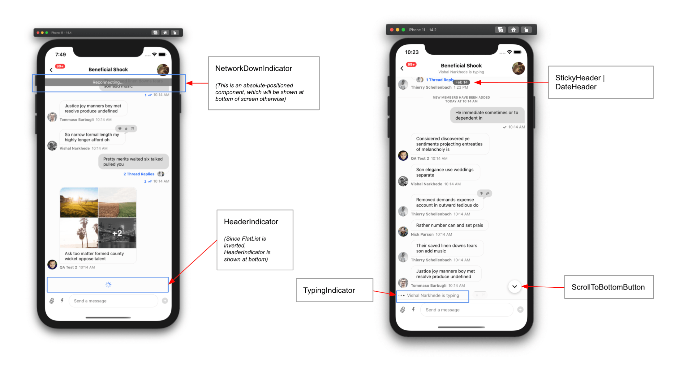
A message object that when set indicates a thread is open. When used with the Thread component this will display the thread. When used with the standard MessageList component this will prevent any singleton components in the OverlayProvider form getting out of sync.

note

thread should be set on all Channel components when a thread is open.

Type
object

threadReply

Override of the Thread Reply MessageAction shown when a user long presses a message. The threadReply function receives as a parameter the relevant message and must return a MessageAction. Please refer to the guide on customizing message actions for details.

Type
function | null
ParameterDescription
messagemessage the action is called on

threadRepliesEnabled

Allow messages to be replied to in a thread. The default value is supplied by the channel config.

Type
boolean

typingEventsEnabled

Enable typing events, and typing indicators to be shown. The default value is supplied by the channel config.

Type
boolean

uploadsEnabled

Allow attachments on messages, including images. The default value is supplied by the channel config.

Type
boolean

AttachButton

Component to render the attach button next to input box.

TypeDefault
componentAttachButton

Attachment

Component for rendering attachments in MessageList.

Available props:

  • attachment {object}
TypeDefault
componentAttachment

AttachmentActions

Component to render additional actions on attachment. for example send, shuffle, cancel in case of Giphy.

TypeDefault
componentAttachmentActions

Card

Component to render any custom type of attachment. Please check the guides for Custom Attachment

TypeDefault
componentCard

CardCover

Component to render main body for Card component which renders custom type of attachment. Please check the guides for Custom Attachment.

Type
component

CardFooter

Component to render footer for Card component which renders custom type of attachment. Please check the guides for Custom Attachment.

Type
component

CardHeader

Component to render header for Card component which renders custom type of attachment. Please check the guides for Custom Attachment.

Type
component

CommandsButton

Component to render button next to input box, which when pressed opens commands list.

TypeDefault
componentCommandsButton

DateHeader

Component to render sticky date header within enclosed MessageList component.

TypeDefault
componentDateHeader

EmptyStateIndicator

Component to render, when channel has no messages.

TypeDefault
componentEmptyStateIndicator

FileAttachmentIcon

Component to render file icon for file type attachment.

TypeDefault
componentFileIcon

FileAttachment

Component to render 'file' type attachment in MessageList.

TypeDefault
componentFileAttachment

FileAttachmentGroup

Component to render group of file type attachments, when there are multiple file type attachments in message.

TypeDefault
componentFileAttachmentGroup

FileUploadPreview

Component to render preview of attached file, within enclosed MessageInput component.

TypeDefault
componentFileUploadPreview

FlatList

FlatList component for underlying MessageList component.

TypeDefault
componentflat-list-mvcp

Component to render 'image' type attachments in the MessageList.

TypeDefault
componentGallery

Giphy

Component to render Giphy type attachments in MessageList.

TypeDefault
componentGiphy

ImageUploadPreview

Component to render preview of attached images, within enclosed MessageInput component

TypeDefault
componentImageUploadPreview

InlineDateSeparator

Component to render inline date separators between messages which were created at a difference of more than a day.

TypeDefault
componentInlineDateSeparator

InlineUnreadIndicator

Component to render inline separator in MessageList, to indicate the position of last read message in list.

TypeDefault
componentInlineUnreadIndicator

Input

Component to render UI part of enclosed MessageInput component. Please read section in guides about Customizing Message Input.

Type
component

InputButtons

Component to render action buttons (CommandsButton and AttachButton) on left side of input box, within enclosed MessageInput component.

TypeDefault
componentInputButtons

KeyboardCompatibleView

Component to override underlying default KeyboardCompatibleView. Generally you won't need to use this prop at all, you can simply use following props instead:

TypeDefault
componentKeyboardCompatibleView

LoadingErrorIndicator

Component to render full screen error indicator, when channel fails to load.

TypeDefault
componentLoadingErrorIndicator

LoadingIndicator

Component to render full screen error indicator, when channel fails to load.

TypeDefault
componentLoadingIndicator

Message

MessageAvatar

Component to render avatar of sender for message, within MessageList. This component is only rendered for messages from other users.

TypeDefault
componentMessageAvatar

MessageContent

Component to render content of message including status, attachments, reactions etc., within MessageList.

TypeDefault
componentMessageContent

MessageDeleted

Component to render deleted message.

TypeDefault
componentMessageDeleted

MessageFooter

Component to render footer for message, within MessageList.

TypeDefault
componentMessageFooter

MessageHeader

Component to render header for message, within MessageList.

Type
component

MessageReplies

Component to show number of thread replies and avatars of members who replied on message

TypeDefault
componentMessageReplies

MessageRepliesAvatars

Component to show avatars of members who thread replied on message.

TypeDefault
componentMessageRepliesAvatars

MessageSimple

Component to render a message within MessageList.

Please check guides section for Customizing Message UI for details.

TypeDefault
componentMessageSimple

MessageStatus

Component to render status of message, which includes time and read-receipts.

TypeDefault
componentMessageStatus

MessageSystem

Component to render system type messages. Purpose of system messages is to inform user about changes to channel. System messages are part of message history, and have a property type set as system. You can add system messages within message history in following scenarios:

TypeDefault
componentMessageSystem

MessageText

Component to render text of message. By default, we use Simple Markdown package to render the text content of message. If you decide to use this prop, please be aware that you will need to handle the markdown rendering yourself.

TypeDefault
componentrenderText

MoreOptionsButton

Component to render a button within enclosed MessageInput, which when pressed shows more options such as AttachButton, CommandsButton.

TypeDefault
componentMoreOptionsButton

NetworkDownIndicator

Component to render an indicator at top of the channel, which shows up when there is some issue with network or connection.

TypeDefault
componentNetworkDownIndicator

OverlayReactionList

Reaction selector component displayed within the message overlay when user long presses a message.

TypeDefault
componentOverlayReactionList

ReactionList

Component to render list of reactions at top of message bubble.

TypeDefault
componentReactionList

Reply

Component to render preview of parent of message for quoted reply.

TypeDefault
componentReply

ScrollToBottomButton

Component to render a button which when pressed, scrolls the message list to bottom.

TypeDefault
componentScrollToBottomButton

SendButton

Component to render a send message button, within enclosed MessageInput component.

TypeDefault
componentSendButton

ShowThreadMessageInChannelButton

Component to render a checkbox within enclosed Thread component, which when checked sets a show_in_channel property to true on a message.

TypeDefault
componentShowThreadMessageInChannelButton

TypingIndicator

Component to render typing indicator within enclosed MessageList component.

TypeDefault
componentTypingIndicator

TypingIndicatorContainer

Component to render container in which typing indicator gets rendered within enclosed MessageList component.

TypeDefault
componentTypingIndicatorContainer

UploadProgressIndicator

Component to render upload progress indicator as an overlay above ImageUploadPreview and FileUploadPreview.

TypeDefault
componentUploadProgressIndicator

UrlPreview

Component to render preview of URLs in MessageList.

TypeDefault
componentCard

Did you find this page helpful?