 React
React iOS
iOS Android
 Flutter
 Angular
 JavaScript
 Unity
Unity Unreal
 Node
Node Python
 Ruby
Ruby PHP
PHP Java
Java .NET
.NET Go
Go REST
REST<OverlayProvider bottomInset={bottom} i18nInstance={streami18n}>
<Chat client={chatClient} i18nInstance={streami18n}>
<Channel
channel={channel}
keyboardVerticalOffset={headerHeight}
Message={CustomMessageComponent}
>
<View style={{ flex: 1 }}>
<MessageList />
<MessageInput />
</View>
</Channel>
</Chat>
</OverlayProvider>This is documentation for Stream Chat React Native SDK v3, which is no longer actively maintained. For up-to-date documentation, see the latest version (v9).
Customize Message UI
Overview
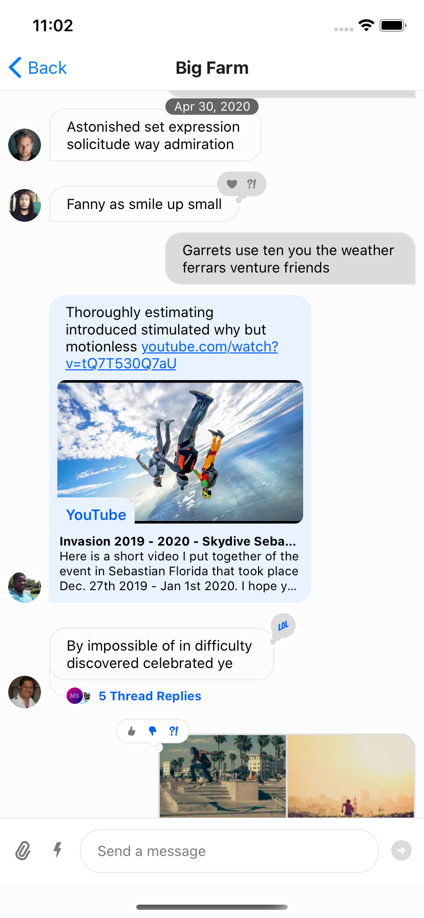
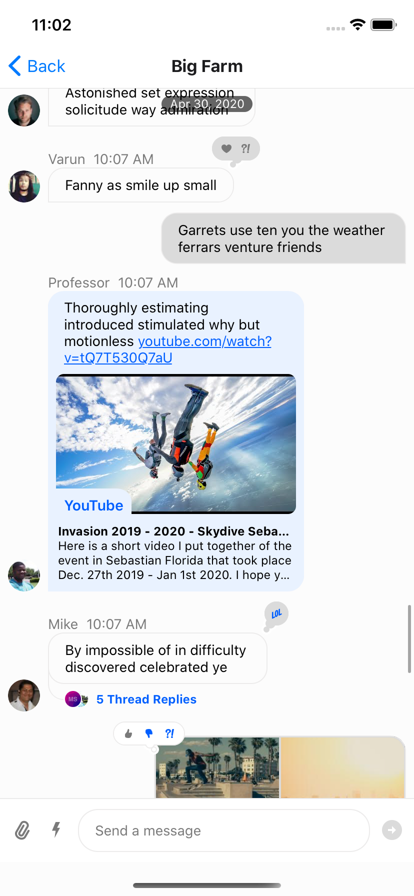
Channel component accepts following props, for which you can provide your own components:
Message
This is a higher order component, that wraps the UI component (MessageSimple) for message bubble. This component provides underlying UI component with all the handlers necessary.
Mostly you shouldn't need to customize this component, unless you want to write your own handlers for message actions, gesture etc. Using the Message Component as an example can be helpful to understand what props and hooks provide different information to the component. It is also suggested you optimize the component for rendering using memoization as is the standard suggested practice for FlatList items.
MessageSimple
This is the actual UI component for message bubble. You can still get access to all the handlers defined in Message HOC via useMessageContext
import {
  OverlayProvider,
  Chat,
  Channel,
  MessageList,
  MessageInput,
  useChannelContext,
  useMessagesContext,
  useMessageContext,
} from "stream-chat-react-native";

const CustomMessageUIComponent = () => {
  const { channel, members, watchers, error, loading } = useChannelContext();
  const { handleDeleteMessage, handleResendMessage, message, reactions } =
    useMessageContext();

  /** Custom implementation */
};

<OverlayProvider bottomInset={bottom} i18nInstance={streami18n}>
  <Chat client={chatClient} i18nInstance={streami18n}>
    <Channel
      channel={channel}
      keyboardVerticalOffset={headerHeight}
      MessageSimple={CustomMessageUIComponent}
    >
      <View style={{ flex: 1 }}>
        <MessageList />
        <MessageInput />
      </View>
    </Channel>
  </Chat>
</OverlayProvider>;
If you want to customize only a specific part of MessageSimple component, you can add your own custom UI components, by providing following props on Channel component:
- MessageHeader
- MessageFooter
- MessageAvatar
- MessageStatus
- MessageText
- MessageSystem
- MessageContent
- Attachment
- Giphy
- Card
- FileAttachmentGroup
- FileAttachment
- Gallery
- UrlPreview
<Channel
  channel={channel}
  keyboardVerticalOffset={headerHeight}
  MessageAvatar={CustomAvatarComponent}
  MessageText={CustomTextComponent}
>
Message bubble with custom text styles & fonts
We use react-native-simple-markdown library internally in the Message component to render markdown content of the text. Thus styling text in the Message component requires a slightly different approach than styling just a single standard Text component in React Native.
In the theme there are multiple text types such as replies and emoji-only messages that have the associated type MarkdownStyle, for the main message text this falls in messageSimple -> content -> markdown within theme. To modify the style of the markdown, text styles can be provided for each of the markdown sub-components that are applied based on text parsing.
const themeStyle = {
  messageSimple: {
    content: {
      markdown: {
        heading1: {
          color: "pink",
        },
        inlineCode: {
          fontSize: 10,
        },
      },
    },
  },
};

<Chat style={themeStyle}>...</Chat>;
Following markdown keys are available for styling:
export type MarkdownStyle = Partial<{
  autolink: TextStyle;
  blockQuoteBar: ViewStyle;
  blockQuoteSection: ViewStyle;
  blockQuoteSectionBar: ViewStyle;
  blockQuoteText: TextStyle | ViewStyle;
  br: TextStyle;
  codeBlock: TextStyle;
  del: TextStyle;
  em: TextStyle;
  heading: TextStyle;
  heading1: TextStyle;
  heading2: TextStyle;
  heading3: TextStyle;
  heading4: TextStyle;
  heading5: TextStyle;
  heading6: TextStyle;
  hr: ViewStyle;
  image: ImageStyle;
  inlineCode: TextStyle;
  list: ViewStyle;
  listItem: ViewStyle;
  listItemBullet: TextStyle;
  listItemNumber: TextStyle;
  listItemText: TextStyle;
  listRow: ViewStyle;
  mailTo: TextStyle;
  mentions: TextStyle;
  newline: TextStyle;
  noMargin: TextStyle;
  paragraph: TextStyle;
  paragraphCenter: TextStyle;
  paragraphWithImage: ViewStyle;
  strong: TextStyle;
  sublist: ViewStyle;
  table: ViewStyle;
  tableHeader: ViewStyle;
  tableHeaderCell: TextStyle;
  tableRow: ViewStyle;
  tableRowCell: ViewStyle;
  tableRowLast: ViewStyle;
  text: TextStyle;
  u: TextStyle;
  view: ViewStyle;
}>;
Message bubble with full width
Because of richness of default message bubble (reactions, attachments, etc), we didn't want to add support this feature OOTB for the simplicity of maintenance. This is something that needs to themed on app level. Here is how you can implement full width message:
import { vw } from "stream-chat-react-native";

const maxWidth = vw(100) - 72;
const themeStyle = {
  messageSimple: {
    card: {
      container: {
        width: maxWidth,
      },
    },
    content: {
      container: {
        width: maxWidth,
      },
      textContainer: {
        width: maxWidth,
        maxWidth: maxWidth,
      },
      wrapper: { width: maxWidth },
    },
    gallery: {
      // -2 because of the 2px border
      width: maxWidth - 2,
    },
    giphy: {
      container: {
        width: maxWidth,
      },
    },
  },
  // Override reply so the reuse of message style does not overflow text in the message input
  reply: {
    textContainer: {
      maxWidth: undefined,
      width: undefined,
    },
  },
};

<Chat style={themeStyle}>...</Chat>;
Message bubble without border
Simple style customization using theme object, does the trick:
const themeStyle = {
  messageSimple: {
    content: {
      container: {
        borderWidth: 0,
      },
      containerInner: {
        borderWidth: 0,
      },
      deletedContainerInner: {
        borderWidth: 0,
      },
      textContainer: {
        borderWidth: 0,
      },
    },
  },
};

<Chat style={themeStyle}>...</Chat>;
Message with custom reactions
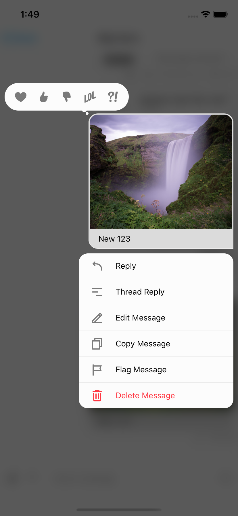
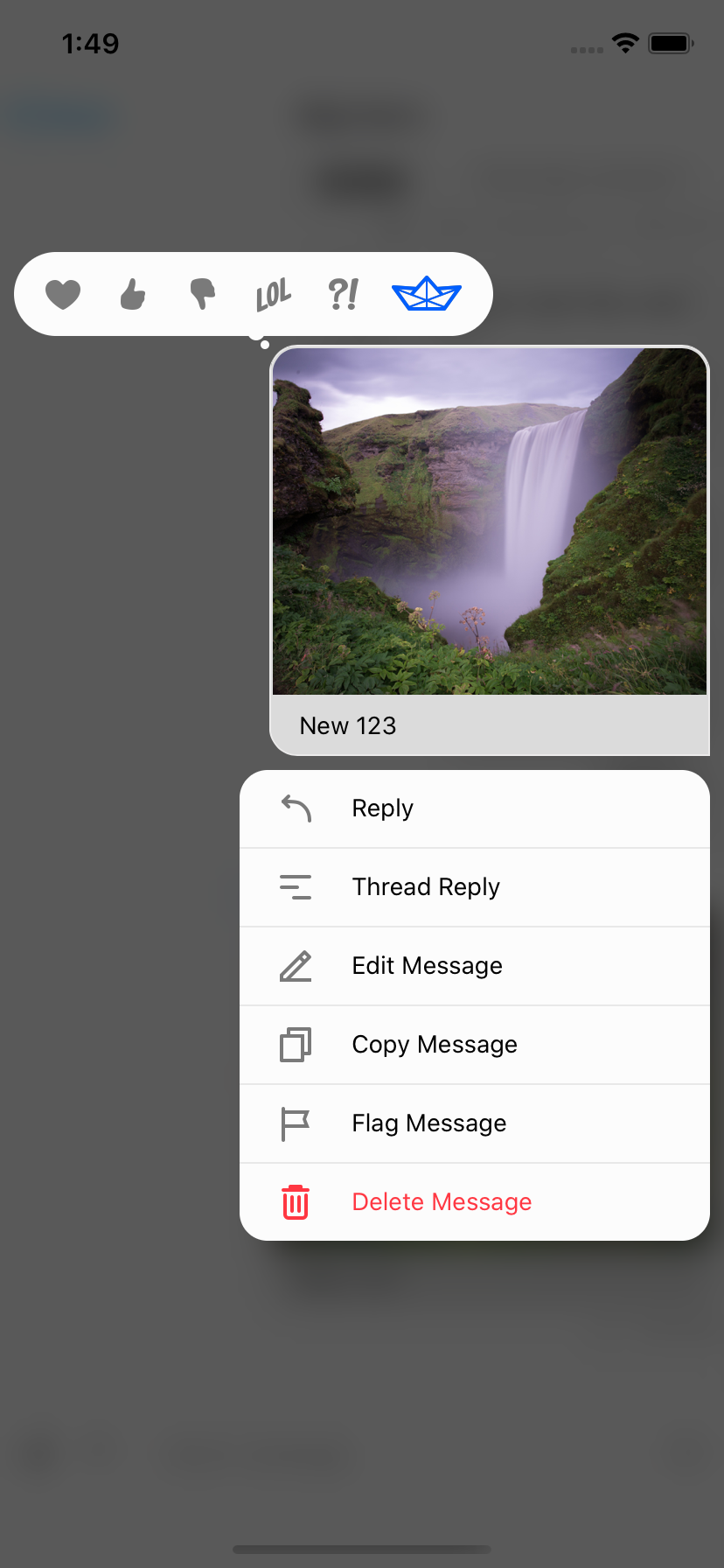
To add custom reactions you need to use the supportedReactions prop on Channel. supportedReactions is an array of ReactionData. The default supportedReactions array contains 5 reactions.
export const reactionData: ReactionData[] = [
  {
    Icon: LoveReaction,
    type: "love",
  },
  {
    Icon: ThumbsUpReaction,
    type: "like",
  },
  {
    Icon: ThumbsDownReaction,
    type: "sad",
  },
  {
    Icon: LOLReaction,
    type: "haha",
  },
  {
    Icon: WutReaction,
    type: "wow",
  },
];
To create your own reaction you need both a type and Icon. The Icon is a component with IconProps it is suggested you take advantage of react-native-svg for scaling purposes. It is suggested you look at the default icons for examples of how to create your own that is able to properly use the theme and sizing that are provided via props. Using exported type from stream-chat-react-native a custom reaction can be created and added.
export const StreamReaction: React.FC<IconProps> = (props) => (
  <RootSvg height={21} width={42} {...props} viewBox="0 0 42 21">
    <RootPath
      d="M26.1491984,6.42806971 L38.9522984,5.52046971 C39.7973984,5.46056971 40.3294984,6.41296971 39.8353984,7.10116971 L30.8790984,19.5763697 C30.6912984,19.8379697 30.3888984,19.9931697 30.0667984,19.9931697 L9.98229842,19.9931697 C9.66069842,19.9931697 9.35869842,19.8384697 9.17069842,19.5773697 L0.190598415,7.10216971 C-0.304701585,6.41406971 0.227398415,5.46036971 1.07319842,5.52046971 L13.8372984,6.42816971 L19.2889984,0.333269706 C19.6884984,-0.113330294 20.3884984,-0.110730294 20.7846984,0.338969706 L26.1491984,6.42806971 Z M28.8303984,18.0152734 L20.5212984,14.9099734 L20.5212984,18.0152734 L28.8303984,18.0152734 Z M19.5212984,18.0152734 L19.5212984,14.9099734 L11.2121984,18.0152734 L19.5212984,18.0152734 Z M18.5624984,14.1681697 L10.0729984,17.3371697 L3.82739842,8.65556971 L18.5624984,14.1681697 Z M21.4627984,14.1681697 L29.9522984,17.3371697 L36.1978984,8.65556971 L21.4627984,14.1681697 Z M19.5292984,13.4435697 L19.5292984,2.99476971 L12.5878984,10.8305697 L19.5292984,13.4435697 Z M20.5212984,13.4435697 L20.5212984,2.99606971 L27.4627984,10.8305697 L20.5212984,13.4435697 Z M10.5522984,10.1082697 L12.1493984,8.31366971 L4.34669842,7.75446971 L10.5522984,10.1082697 Z M29.4148984,10.1082697 L27.8178984,8.31366971 L35.6205984,7.75446971 L29.4148984,10.1082697 Z"
      {...props}
    />
  </RootSvg>
);

const newReactionData = [
  ...reactionData,
  { type: "stream", Icon: StreamReaction },
];
Both the resulting reaction picker and reaction result can then utilize this additional option.
|
|
|
| Standard Reactions | Modified Reactions | Modified Reaction |
Instagram style double-tap reaction
stream-chat-react-native uses a combination of react-native-gesture-handler and standard react-native touchables to provide animations to the UI. Because of this there are conditions in which multiple interactions are taking place at once.
e.g. If you press on a message it begins to depress and after a long hold will present the context menu for the message. But release sooner and if you are pressing on an image, the image viewer will appear.
Therefore to allow for something like double-tap reactions three props are required, onPressInMessage, onLongPressMessage, and onDoubleTapMessage. The first is used to prevent the onPress of inner react-native touchable components from firing while waiting for the double press to be evaluated by react-native-gesture-handler. Using a timeout the original onPress can be called if a second press has not ocurred in the expected time for the double tap to fire.
To prevent this event from firing when a long press occurs onLongPressMessage should be set to a function that cancels the timeout.
The onDoubleTapMessage prop can then be used to add a reaction as it is a function that is provided the message for which it is double tapped. This uses react-native-gesture-handler to track double taps. For convenience, as this is a common design pattern, the function is also is passed the handleReactionDoubleTap function. If defined (this is undefined when there is an error message or the status of the message is failed), this function can be passed a string of the reaction type to add or remove a reaction.
To complete the Instagram feel, setting the OverlayReactionList component to an empty component and limiting the supportedReactions as shown allows only 1 type of reaction and limits the UI to double-tap only to add or remove it.
const lastTap = React.useRef<number | null>(null);
const timeOut = React.useRef<NodeJS.Timeout | null>(null);

const handleDoubleTap = ({
  defaultHandler,
}) => {
  const now = Date.now();
  console.log(now, lastTap.current)
  if (lastTap.current && now - lastTap.current < 510) {
    if (timeOut.current) {
      clearTimeout(timeOut.current);
    }
  } else {
    lastTap.current = now;
    timeOut.current = setTimeout(() => {
      if (defaultHandler) {
        defaultHandler();
      }
    }, 510);
  }
};

const onDoubleTapMessage = ({
  actionHandlers
}) => {
  actionHandlers?.toggleReaction('love')
};

const onLongPressMessage = ({
  defaultHandler,
}) => {
  console.log('onLongPress')
  if (timeOut.current) {
    clearTimeout(timeOut.current);
    defaultHandler()
  }
};

<Channel
  channel={channel}
  keyboardVerticalOffset={headerHeight}
  onDoubleTapMessage={onDoubleTapMessage}
  onPressInMessage={handleDoubleTap}
  onLongPressMessage={onLongPressMessage}
  OverlayReactionList={() => null}
  thread={thread}
>
Slack style messages all on the left side
By default, received messages are shown on left side of the MessageList and sent messages are shown on right side of the MessageList.
You can change this at the Message level via the prop forceAlignMessages or set the alignment for the entire Channel using the same forceAlignMessages prop.
<Channel
  channel={channel}
  forceAlignMessages='left'
  keyboardVerticalOffset={headerHeight}
  thread={thread}
>
Message bubble with name of sender
In group messaging it's important to show the name of the sender associated message bubble - similar to Slack or WhatsApp. By default this is done in the MessageFooter component. This component is fully replaceable via props on Channel and is provided a set of props itself, MessageFooterProps, that can be used for rendering. Any additional data for rendering a custom footer can be pulled from contexts such as the MessageContext via the useMessageContext hook.
If you wanted to move the information about the sender to the top of the message you can provide a MessageHeader component to Channel which is provided the same props, MessageHeaderProps, as the footer, MessageFooterProps, and again can utilize the contexts as needed.
<Channel
  channel={channel}
  keyboardVerticalOffset={headerHeight}
  MessageHeader={(props) =>
    props.message?.user?.id !== chatClient.userID ? (
      <View
        style={{ flexDirection: 'row' }}
      >
        {Object.keys(props.members).length > 2 &&
          props.message.user?.name ? (
            <Text style={[{ color: grey, marginRight: 8 }]}>
              {props.message.user.name}
            </Text>
          ) : null}
        <Text style={[{ color: grey, textAlign: props.alignment }]}>
          {props.formattedDate}
        </Text>
      </View>
    ) : null
  }
  MessageFooter={() => null}
  thread={thread}
>
|
|
|
| Standard Footer | No Footer | Header Added |
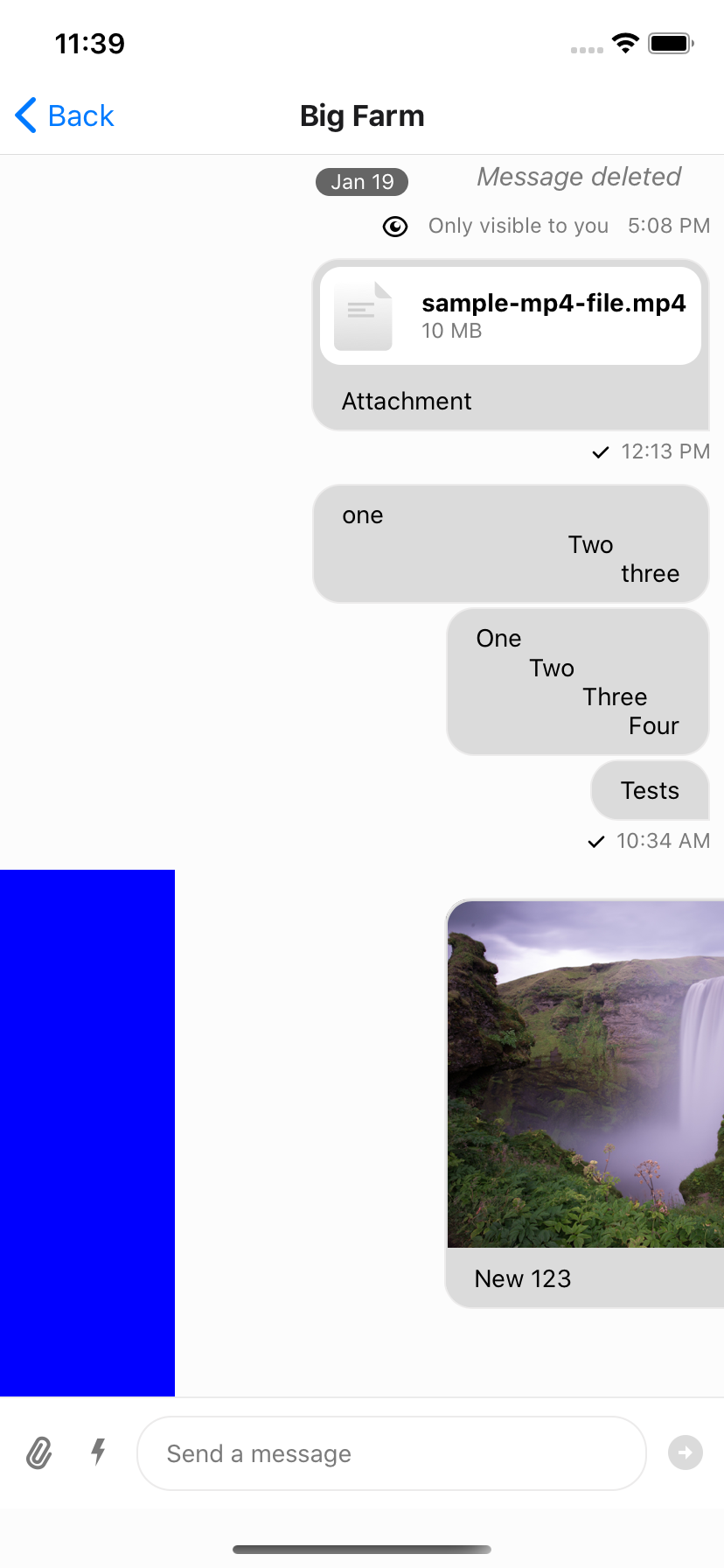
Swipe message left to delete and right to reply
To add swipe controls to your messages it is suggested that you create a custom Message component to replace the default one. An easy solution is to wrap the standard exported message component from stream-chat-react-native in a Swipeable from react-native-gesture-handler/Swipeable. You can then use the functions provided by Swipeable to fine tune to functionality to your liking.
You can add reply functionality by calling setQuotedMessageState, available from the useMessagesContext hook. Or you can delete the message using a combination of client.deleteMessage and updateMessage, the latter of which is also available from the useMessagesContext hook. You can find the internal implementation of these functions in the Message component; or you can add any other functionality you like. It is suggested to add custom logic when implementing swipe-able messages to ensure you only can swipe appropriate messages, that is you can only swipe to delete messages you have the ability to delete and have not yet been deleted. Using Message props and contexts this is easily achievable.
const SwipeableMessage = (
  props: MessageProps<
    AttachmentType,
    ChannelType,
    CommandType,
    EventType,
    MessageType,
    ResponseType,
    UserType
  >,
) => {
  return (
    <Swipeable
      onSwipeableLeftOpen={reply(props.message)}
      onSwipeableRightOpen={delete props.message}
      overshootLeft={false}
      overshootRight={false}
      renderLeftActions={(progress) => (
        <Animated.View
          style={{
            backgroundColor: "blue",
            transform: [
              {
                translateX: progress.interpolate({
                  inputRange: [0, 1],
                  outputRange: [-100, 0],
                }),
              },
            ],
            width: 100,
          }}
        />
      )}
      renderRightActions={(progress) => (
        <Animated.View
          style={{
            justifyContent: "center",
            opacity: progress.interpolate({
              inputRange: [0, 1],
              outputRange: [0, 1],
            }),
          }}
        >
          <StreamReaction />
        </Animated.View>
      )}
    >
      <Message {...props} />
    </Swipeable>
  );
};
|
|
|
| Swiping partially open (opacity partial) | Swiping all the way open | Swiping using transform -> translateX |
On this page: