 React
React iOS
iOS Android
 Flutter
 Angular
 JavaScript
 Unity
Unity Unreal
 Node
Node Python
 Ruby
Ruby PHP
PHP Java
Java .NET
.NET Go
Go REST
RESTimport type { DeepPartial, Theme } from "stream-chat-react-native";
const theme: DeepPartial<Theme> = {
messageSimple: {
file: {
container: {
backgroundColor: "red",
},
},
},
};This is documentation for Stream Chat React Native SDK v3, which is no longer actively maintained. For up-to-date documentation, see the latest version (v9).
Theming
The majority of components used in stream-chat-react-native can have custom styles applied to them via the theming system.
Creating a theme
To accurately create a theme we suggest utilizing our exported types to create your own theme. This will allow you to ensure the keys you are using in your theme object are correct.
When you provide a theme as a prop a deep merge of the theme and default theme is performed so only styles designated in the custom theme overwrite the defaults.
We provide a helper type DeepPartial that makes all of the keys at every depth optional, this is to account for the deep merge that is performed.
You can find the default theme object in theme.ts.
Applying a theme
There are two entry points for custom themes into the SDK, in the OverlayProvider and Chat components.
Chat takes a prop style which accepts a custom theme.
The OverlayProvider accepts the same style as a key on the prop value.
In practice you only need to provide you custom theme to the OverlayProvider as the theme is accessed via context.
Nested ThemeProvider components merge themes provided by higher level ThemeProvider components, so the theme provided to the OverlayProvider will be available from the ThemeProvider in the Chat component.
This allows you to provide a different theme at different levels of the application if you choose.
export const App = () => (
  <OverlayProvider value={{ style: theme }}>
    <Chat client={client}>
      <ChannelList />
    </Chat>
  </OverlayProvider>
);
Dark mode
If you would like to support dark mode in your application you can create and apply different themes depending on the current colorScheme provided by React Native.
To prevent unnecessary deep merges and re-renders we suggest keeping the current theme in state and only change it when theme colorScheme changes.
import { useEffect, useState } from "react";
import { useColorScheme } from "react-native";
import type { DeepPartial, Theme } from "stream-chat-react-native";

export const App = () => {
  const colorScheme = useColorScheme();
  const getTheme = (): DeepPartial<Theme> => ({
    colors:
      colorScheme === "dark" ? { black: "#FFFFFF" } : { black: "#000000" },
  });
  const [theme, setTheme] = useState(getTheme());

  useEffect(() => {
    setTheme(getTheme());
  }, [colorScheme]);

  return (
    <OverlayProvider value={{ style: theme }}>
      <Chat client={client}>
        <ChannelList />
      </Chat>
    </OverlayProvider>
  );
};
Using the theme
You can easily access the theme in any custom components you create using the useTheme hook.
To ensure any change to the theme is reflected within the UI it is not advised to pass theme variables through custom memoization checks.
const {
  theme: {
    colors: { black },
  },
} = useTheme();
Identifying theme paths
Where possible we have used displayName on components to expose the theme path to the style.
To view the displayName on a component.
- Open the in-app developer menu
- Turn on inspector by pressing
Show Inspectorbutton - Select the desired component and the
displayNamewill be shown in the inspector path
Not all theme styles are tied to high level components; but we have added this debugging strategy to help in locating the most common components easily.
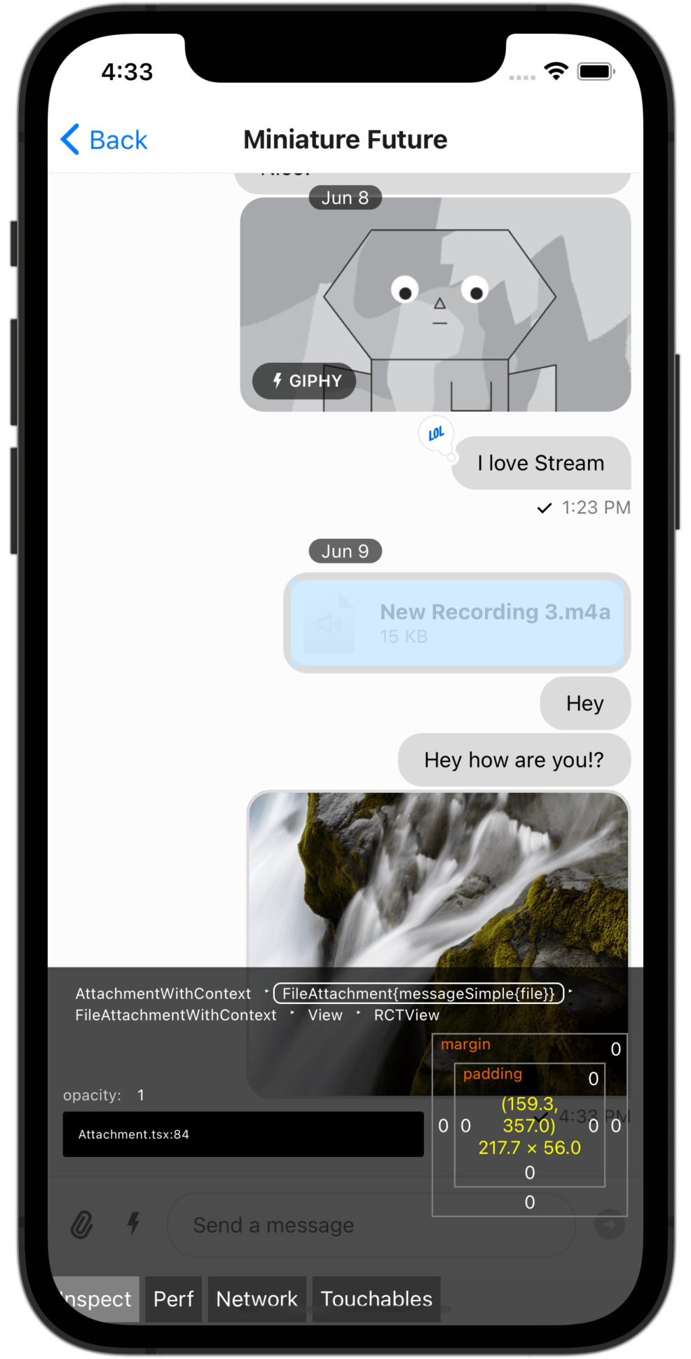
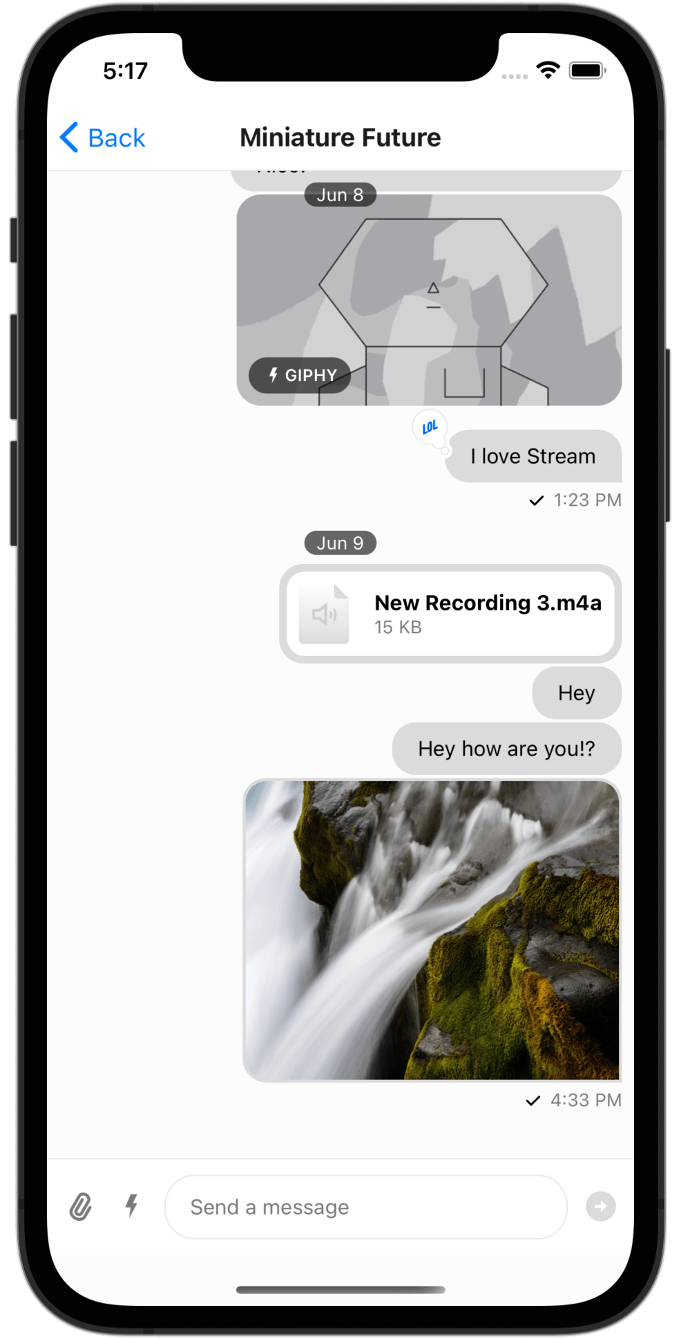
To find the path and customize the style on a file attachment for instance we locate the component using the inspector.
The displayName is listed as FileAttachment{messageSimple{file}}.
This syntax is indicating the component is named FileAttachment and the style keys are messageSimple -> file.
There are often multiple keys on a designated display name corresponding to different sub-components styles.
In this case file has five sub-component keys that can modify the styling.
The exported types and original theme in theme.ts can then be referenced to create a custom modification to the theme.
const theme: DeepPartial<Theme> = {
  messageSimple: {
    file: {
      container: {
        backgroundColor: "red",
      },
      icon: {
        height: 16,
        width: 16,
      },
    },
  },
};
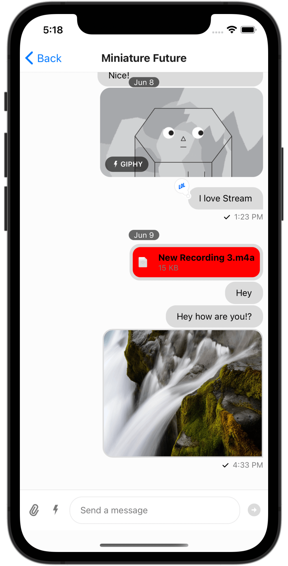
The resulting changes by applying the custom theme are easily seen in the change in icon size and background color of the file attachment.
Most of the styles are standard React Native styles, but some styles applying to SVG, Markdown, or custom components are numbers, strings, or other specified types.
The TypeScript documentation of Theme should help you in this regard.
Message text is an instance of an exception as it is rendered using react-native-markdown-package and the MarkdownStyle is added to the theme at key messageSimple -> content -> markdown.