 React
React iOS
iOS Android
 Flutter
 Angular
 JavaScript
 Unity
Unity Unreal
 Node
Node Python
 Ruby
Ruby PHP
PHP Java
Java .NET
.NET Go
Go REST
RESTyarn add @react-native-community/blur @react-native-community/cameraroll @react-native-community/netinfo @stream-io/flat-list-mvcp react-native-document-picker react-native-fs react-native-gesture-handler react-native-haptic-feedback react-native-haptic-feedback react-native-image-crop-picker react-native-image-resizer react-native-reanimated react-native-safe-area-context react-native-share react-native-svgThis is documentation for
Stream Chat React Native SDK v3, which is nolonger actively maintained. For up-to-date documentation, see the latest version (v8).
Upgrading from V2 to V3
For version 3.x of the Stream Chat React Native SDK, we focused on improving the speed and performance of our UI components to create a fast and responsive chat experience for the end user. Some of the key changes we made include, changes to the architecture of the SDK to provide better performance and improved
- Prominent use React Context to make passing data through the application easier.
- The addition of
OverlayProvidera new component that wraps the application and lets users interact with messages through long-clicks. - Better support for Typescript.
- Simpler UI Theming.
- The addition of new community libraries to improve performance and add more features to the end user’s experience.
To make these improvements, we made major architectural changes to the SDK. Because of this, upgrading will require some additional work. This page will walk you through the steps involved in upgrading the React Native SDK for Stream Chat from version 2 to version 3.
Before starting
Before you begin the upgrade, we recommend commenting-out all Stream Chat SDK v2 props related to theming and custom components for ChannelList, Channel, MessageList and MessageInput in your application.
This this will let you test the setup for the upgrade independently from customizations.
Add peer-dependencies
Stream Chat v3 includes new peer-dependencies for the package. You can use this script to install the dependencies:
After adding these dependencies, go through following links and follow any additional installation steps:
react-native- additional installation stepsreact-native-reanimated- additional installation steps.react-native-image-crop-picker- additional installation stepsreact-native-cameraroll- additional installation stepsreact-native-gesture-handler- additional installation steps@react-native-community/blur- additional installation steps
If you are using expo, the please install the corresponding dependencies instead.
expo install @react-native-community/netinfo expo-blur expo-document-picker expo-file-system expo-haptics expo-image-manipulator expo-image-picker expo-media-library expo-sharing react-native-gesture-handler react-native-reanimated react-native-safe-area-context react-native-svgRemove react-native-get-random-values
v2 required that you have react-native-get-random-values and import it into your application in your root file; Version 3 no longer uses this. As long as you aren’t using react-native-get-random-values for anything other than Stream Chat’s peer dependency, you can safely remove it by removing it from your package.json:
yarn remove react-native-get-random-valuesAnd deleting the import statement for react-native-get-random-values from your root (index.js/index.ts) file:
import * from r`eact-native-get-random-values; // <-- REMOVE THIS
import { AppRegistry } from 'react-native';

import App from './App';
import { name as appName } from './app.json';

AppRegistry.registerComponent(appName, () => App);
Import gesture handler dependency
v3 requires you to import the gesture handler dependency at the top of your application’s entry file (usually your App.tsx or index.js) before any other dependencies:
import "react-native-gesture-handler";
import { AppRegistry } from "react-native";

import App from "./App";
import { name as appName } from "./app.json";

AppRegistry.registerComponent(appName, () => App);
Add stream-chat@3.x.x dependency
The minimum supported version of stream-chat - v3.x.
Please check the Compatibility Table to ensure you are using
correct version of stream-chat dependency.
yarn add stream-chat@3.11.1Add OverlayProvider component
OverlayProvider component is new to version three and you will need to add it to your application. The OverlayProvider should wrap the entire chat screen in your application. If you are using react-navigation, this component
should wrap your stack provider. Please read more details in our Configuring Components docs
import { OverlayProvider } from "stream-chat-react-native";

export const Screen = () => (
  <OverlayProvider>{/** App components */}</OverlayProvider>
);
Theme changes
v2 of SDK used Styled Components for theming purpose, which we have abandoned in v3 in favor of using the default approach for React Native style sheets. We’ve published a separate guide for how to apply custom theme on chat components.
At this point if you launch the application, it should be working fine (assuming all the component customizations have been commented out) 🎉.
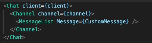
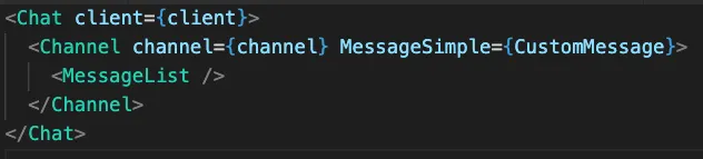
Message customization prop change
Message UI is the most common use-case for customization. In v2 of the library, you could provide a Message prop to MessageList component
to customize message UI. But in v3, you need to provide MessageSimple prop on the Channel component instead.
|
|
| Before upgrade to v3 | After upgrade to v3 |
Moving from prop drilling to context
As part of v3, we have tried to get rid of prop drilling pattern as much as possible. We are moving towards using React’s context based architecture.
Let’s take an example from v2 documentation which shows how to render message sender’s name at bottom of the message:
To customize MessageFooter, you had to create a separate component to render a MessageSimple component and then provide MessageFooter as a prop to MessageSimple. This is what the prop drilling looked like in v2 of the SDK. This approach was rigid and made updating components a chore.
In v3, we’re using React contexts to simplify this process. Now, thanks to contexts, you can customize each of these deeply nested components by providing a relevant prop to one of the following 3 core components (depending on which component needs to be customized). React contexts will provide the prop to all of the child components in nested in the core components as global-like data.
Additionally you have access to all the required values through contexts (props.message in this example).
Please check documentation of contexts for all the available contexts.
import {
  Chat,
  Channel,
  MessageList,
  MessageSimple,
} from "stream-chat-react-native";

const MessageWithSenderNameAtBottom = (props) => {
  return (
    <MessageSimple
      {...props}
      MessageFooter={(props) => <Text>{props.message.user.name}</Text>}
    />
  );
};

// In your rendering logic
<Chat client={client}>
  <Channel channel={channel}>
    <MessageList Message={MessageWithSenderNameAtBottom} />
  </Channel>
</Chat>;
import {
Chat,
Channel,
MessageList,
useMessageContext,
} from "stream-chat-react-native";
const FooterWithSenderName = () => {
const { message } = useMessageContext();
return <Text>{props.message.user.name}</Text>;
};
// In your rendering logic
<Chat client={client}>
<Channel channel={channel} MessageFooter={FooterWithSenderName}>
<MessageList />
</Channel>
</Chat>;Let’s check a similar example for ChannelList component. To customize avatar component of channel, within ChannelList, you had to
first customize Preview component which renders list item, and then provide avatar component on it. In v3, you can simply pass the PreviewAvatar
component on ChannelList without having to go through prop drilling. Additionally you have access to ChannelsContext
which provides access to all the necessary values and methods which ChannelList relies on.
import {
  Chat,
  Channel,
  ChannelList,
  ChannelPreviewMessenger,
} from "stream-chat-react-native";

const CustomAvatar = (props) => {
  /* custom component */
};
const PreviewWithCustomAvatar = (props) => {
  return <ChannelPreviewMessenger {...props} PreviewAvatar={CustomAvatar} />;
};

// In your rendering logic
<Chat client={client}>
  <ChannelList Preview={PreviewWithCustomAvatar} />
</Chat>;
import { Chat, Channel, ChannelList, useChannelsContext } from 'stream-chat-react-native';
const CustomAvatar = props => {
const { refreshing, reloadList } = useChannelsContext();
const { channel } = props;
return (/* custom component */)
};
// In your rendering logic
<Chat client={client}>
<ChannelList PreviewAvatar={CustomAvatar} />
</Chat>Message action changes
In v2 of the library, message actions such as “Copy Message” or “Edit Message” etc, were rendered in ActionSheet. In v3 of the library these
actions get rendered within the overlay when a user long-presses the message. Also, we have provided finer control over customizing these actions
according to your use case. Please take a look at guide for customizing message actions for reference.
Reaction customization changes
Rendering of reactions on message and reaction picker has changed as part of v3. There three major differences in reactions related UX.
- Reactions were rendered as simple text emojis in v2, while reactions get rendered as SVG icons in v3.
- Reaction picker used to show up as popup right above message in v2, on the other hand reaction picker will show up in overlay in v3.
Please check the guide on Message with custom reactions for details.
Additionally please take a look at following props to customize reactions related components:
Attachment picker changes
In v2 of the library, attachment picker was rendered as ActionSheet containing option for picking files from of native image and file picker.
We’ve modified this UX in v3. In the new version, attachment picker gets rendered as built-in BottomSheet.
Its possible to use ActionSheet based attachment picker (similar to v2 implementation). Please check the docs on implementation of native image picker