 React
React iOS
iOS Android
 Flutter
 Angular
 JavaScript
 Unity
Unity Unreal
 Node
Node Python
 Ruby
Ruby PHP
PHP Java
Java .NET
.NET Go
Go REST
REST


import {
  Channel,
  Chat,
  ImageUploadPreview,
  OverlayProvider,
  AutoCompleteInput,
  useMessageInputContext,
} from "stream-chat-react-native";

const client = StreamChat.getInstance("api_key");

const CustomInput = (props) => {
  const { sendMessage, text, toggleAttachmentPicker, openCommandsPicker } =
    useMessageInputContext();

  return (
    <View style={styles.fullWidth}>
      <ImageUploadPreview />
      <FileUploadPreview />
      <View style={[styles.fullWidth, styles.inputContainer]}>
        <AutoCompleteInput />
      </View>
      <View style={[styles.fullWidth, styles.row]}>
        <Button title="Attach" onPress={toggleAttachmentPicker} />
        <Button title="Commands" onPress={openCommandsPicker} />
        <Button title="Send" onPress={sendMessage} disabled={!text} />
      </View>
    </View>
  );
};

export const ChannelScreen = ({ channel }) => {
  const [channel, setChannel] = useState();

  return (
    <OverlayProvider>
      <Chat client={client}>
        {channel ? (
          <Channel channel={channel} Input={CustomInput}>
            {/** App components */}
          </Channel>
        ) : (
          <ChannelList onSelect={setChannel} />
        )}
      </Chat>
    </OverlayProvider>
  );
};

const styles = StyleSheet.create({
  flex: { flex: 1 },
  fullWidth: {
    width: "100%",
  },
  row: {
    flexDirection: "row",
    justifyContent: "space-between",
  },
  inputContainer: {
    height: 40,
  },
});This is documentation for Stream Chat React Native SDK v3, which is no longer actively maintained. For up-to-date documentation, see the latest version (v9).
Customize Message Input
We provide the MessageInput container out of the box in a fixed configuration with many customizable features. Similar to other components it accesses most customizations via context, specially the MessageInputContext which is instantiated in Channel, using props available on Channel component.
To customize the entire Input UI part of MessageInput component, you can add a custom UI component as Input prop on Channel component.
Changing layout of MessageInput
Let's take a look at a simple example with following requirements:
- Stretch input box to full width
- Button to send a message, open attachment picker and open commands picker - below input box
- Disable the send button, in case of empty input box.
|
|
|
| Disabled Send Button | Attached Image | Enabled Send Button |
You can also pass the same props as the context providers directly to the MessageInput component to override the context values.
The code above would render the red View and not null as the props take precedence over the context value.
<Channel
  channel={channel}
  Input={() => null}
  keyboardVerticalOffset={headerHeight}
  Message={CustomMessageComponent}
>
  <View style={{ flex: 1 }}>
    <MessageList />
    <MessageInput
      Input={() => <View style={{ height: 40, backgroundColor: "red" }} />}
    />
  </View>
</Channel>
You can modify MessageInput in a large variety of ways. The type definitions for the props give clear insight into all of the options.
You can replace the Input wholesale, as above, or create you own MessageInput component using the provided hooks to access context.
NOTE: The additionalTextInputProps prop of both Channel and MessageInput is passed the internal TextInput component from react-native. If you want to change the TextInput component props directly this can be done using this prop.
Customizing nested components within MessageInput
If you would like to only replace some internal UI component of MessageInput, you can do so by providing your own UI component for the default component which you want to replace, as a prop to Channel component.
Following images show the prop names for replacing corresponding components. Within your own custom UI implementation, you can access all the stateful information via available contexts

Custom Send Button
In following example, let's only replace a default SendButton with a custom implementation, without altering rest of layout of MessageInput
- Default send button should be replaced with Boat Icon
- This custom button should be disabled if user has not entered any text or attached any file
 |  |
| Send Button Disabled | Send Button Enabled |
import { TouchableOpacity } from "react-native";
import {
  RootSvg,
  RootPath,
  Channel,
  useMessageInputContext,
} from "stream-chat-react-native";

const StreamButton = () => {
  const { sendMessage, text, imageUploads, fileUploads } =
    useMessageInputContext();
  const isDisabled = !text && !imageUploads.length && !fileUploads.length;

  return (
    <TouchableOpacity disabled={isDisabled} onPress={sendMessage}>
      <RootSvg height={21} width={42} viewBox="0 0 42 21">
        <RootPath
          d="M26.1491984,6.42806971 L38.9522984,5.52046971 C39.7973984,5.46056971 40.3294984,6.41296971 39.8353984,7.10116971 L30.8790984,19.5763697 C30.6912984,19.8379697 30.3888984,19.9931697 30.0667984,19.9931697 L9.98229842,19.9931697 C9.66069842,19.9931697 9.35869842,19.8384697 9.17069842,19.5773697 L0.190598415,7.10216971 C-0.304701585,6.41406971 0.227398415,5.46036971 1.07319842,5.52046971 L13.8372984,6.42816971 L19.2889984,0.333269706 C19.6884984,-0.113330294 20.3884984,-0.110730294 20.7846984,0.338969706 L26.1491984,6.42806971 Z M28.8303984,18.0152734 L20.5212984,14.9099734 L20.5212984,18.0152734 L28.8303984,18.0152734 Z M19.5212984,18.0152734 L19.5212984,14.9099734 L11.2121984,18.0152734 L19.5212984,18.0152734 Z M18.5624984,14.1681697 L10.0729984,17.3371697 L3.82739842,8.65556971 L18.5624984,14.1681697 Z M21.4627984,14.1681697 L29.9522984,17.3371697 L36.1978984,8.65556971 L21.4627984,14.1681697 Z M19.5292984,13.4435697 L19.5292984,2.99476971 L12.5878984,10.8305697 L19.5292984,13.4435697 Z M20.5212984,13.4435697 L20.5212984,2.99606971 L27.4627984,10.8305697 L20.5212984,13.4435697 Z M10.5522984,10.1082697 L12.1493984,8.31366971 L4.34669842,7.75446971 L10.5522984,10.1082697 Z M29.4148984,10.1082697 L27.8178984,8.31366971 L35.6205984,7.75446971 L29.4148984,10.1082697 Z"
          pathFill={isDisabled ? "grey" : "blue"}
        />
      </RootSvg>
    </TouchableOpacity>
  );
};

// In your App

<Channel channel={channel} SendButton={StreamButton} />;
Storing image and file attachment to custom CDN
When you select an image or file from image picker or file picker, it gets uploaded to Stream's CDN by default. But you can choose to upload attachments to your own CDN using following two props on Channel component:
doImageUploadRequest: For images picked from image pickerdoDocUploadRequest: For files picked from file picker
<Channel
  doDocUploadRequest={(file, channel) =>
    chatClient?.sendFile(
      `${channel._channelURL()}/file`, // replace this with your own cdn url
      file.uri,
      "name_for_file",
    )
  }
  doImageUploadRequest={(file, channel) =>
    chatClient?.sendFile(
      `https://customcdnurl.com`, // replace this with your own cdn url
      file.uri,
      "name_for_file",
    )
  }
/>
Usage of chatClient?.sendFile is optional in above examples. You may choose to use any HTTP client for uploading the file.
But make sure to return a promise that is resolved to an object with the key file that is the URL of the uploaded file.
For example:
{
  file: "https://us-east.stream-io-cdn.com/62344/images/a4f988f5-6a9c-47b0-aab9-7a27b74d7515.60D6041A-D012-4721-B794-19267B8F352B.jpg";
}
Disabling File Uploads or Image Uploads
There are three ways to disable file or image uploads from RN app:
From Dashboard
This is recommended option, if you want to allow neither image or file uploads in your chat application. You can find a toggle to disable Uploads in Chat Overview page

On UI level
If you want to restrict uploads to either images or only files, you can do so by providing one of the following two props to Channel component:
hasFilePicker(boolean)hasImagePicker(boolean)
Disable autocomplete feature on input (mentions and commands)
The auto-complete trigger settings by default include /, @, and : for slash commands, mentions, and emojis respectively. These triggers are created by the exported function ACITriggerSettings, which takes ACITriggerSettingsParams and returns TriggerSettings. You can override this function to remove some or all of the trigger settings via the autoCompleteTriggerSettings prop on Channel. If you remove the slash commands it is suggested you also remove the commands button using the prop on Channel hasCommands. You can remove all of the commands by returning an empty object from the function given to autoCompleteTriggerSettings.
<Channel
  autoCompleteTriggerSettings={() => ({})}
  channel={channel}
  hasCommands={false}
  keyboardVerticalOffset={headerHeight}
  thread={thread}
>
Setting Additional Props on Underlying TextInput component
You can provide additionalTextInputProps prop to Channel or MessageInput component for adding additional props to underlying React Native's TextInput component.
Please make sure to memoize or pass static reference for this object. Please read our Performance Guide for details
const additionalTextInputProps = useMemo(() => {
  selectionColor: "pink";
});

// Render UI part
<Channel channel={channel} additionalTextInputProps={additionalTextInputProps}>
  ...
</Channel>;
Replacing AttachmentPicker With Native Image Picker
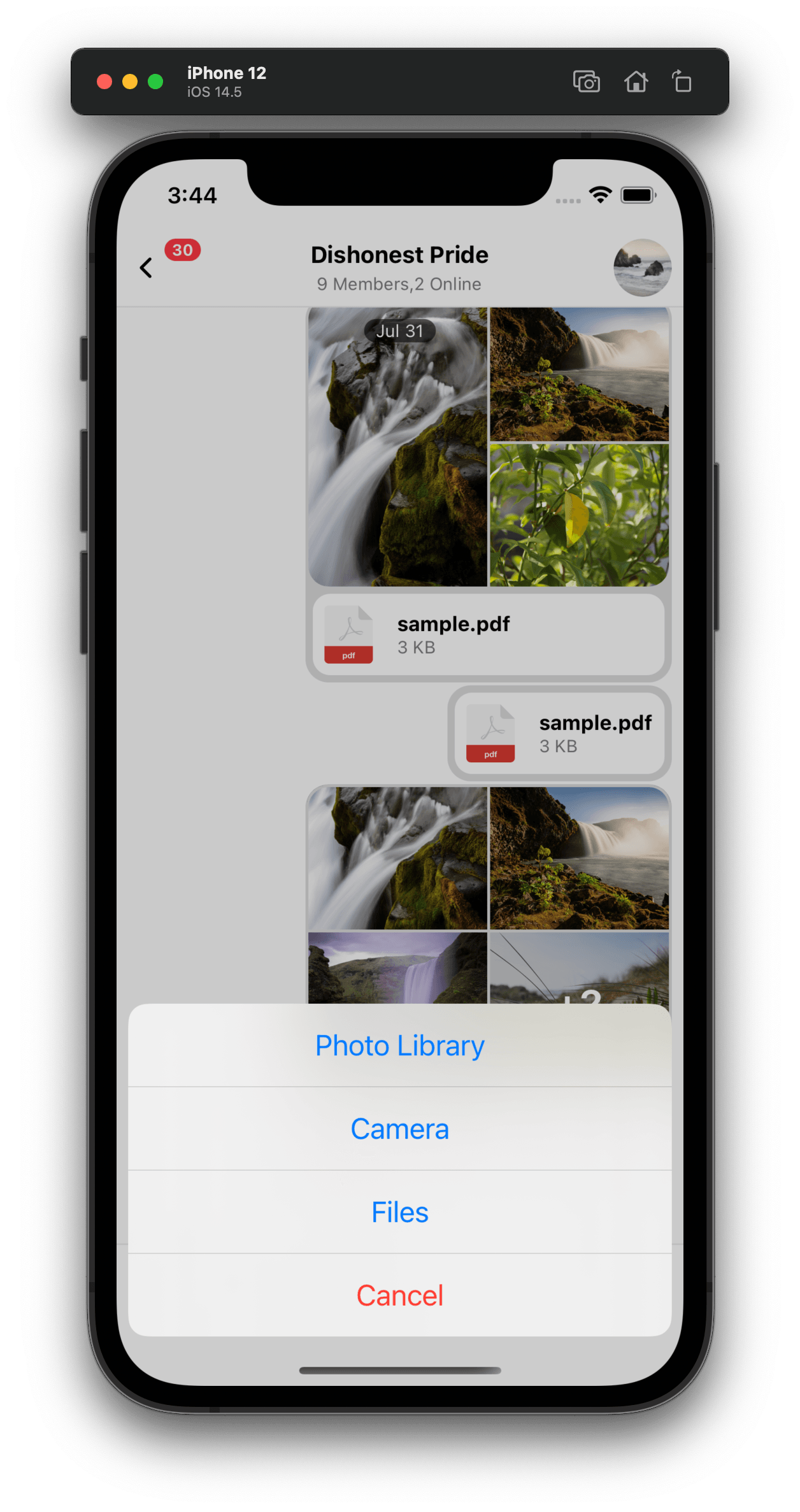
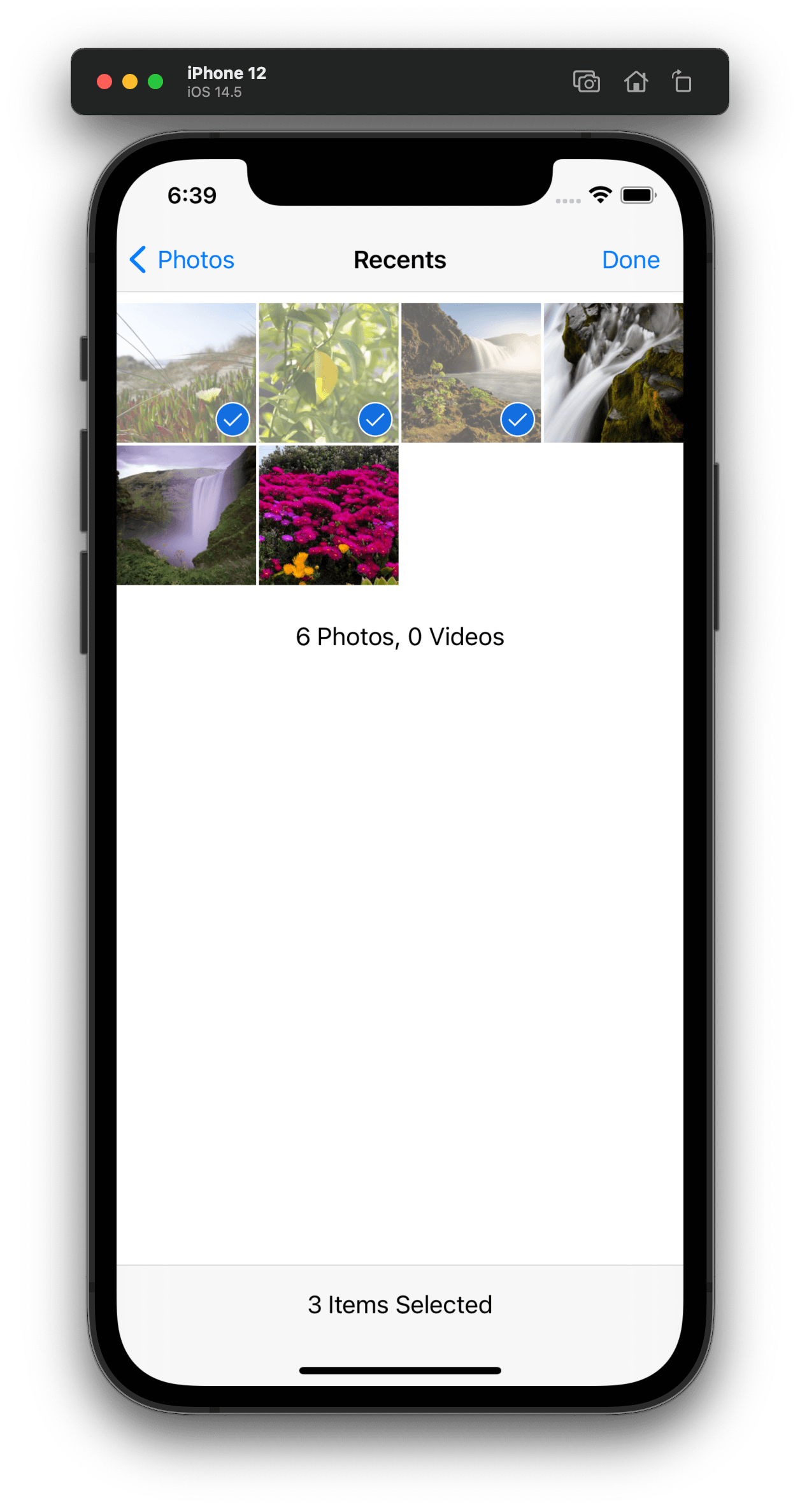
Attachment picker is rendered/displayed/opened inside of a bottom sheet by default. The default behavior can be easily replaced with the device's native image picker (as shown in screenshots below).
|
|
| Attachment Picker ActionSheet | Photo library |
Channel component receives a prop AttachButton,
which can be used to override the default attach button next to input box as following. This prop can be used to
override the default onPress handler for the AttachButton component.
import { AttachButton, Channel } from "stream-chat-react-native";

const CustomAttachButton = () => {
  const onPressHandler = () => {
    // Custom handling of onPress action on AttachButton
  };

  return <AttachButton handleOnPress={onPressHandler} />;
};

<Channel AttachButton={CustomAttachButton} />;
In order to make the onPressHandler open the ActionSheet and show the options to choose attachments from Photo Library, Camera or Files,
you can use @expo/react-native-action-sheet package for the action sheet implemented in this example.
yarn add @expo/react-native-action-sheetPlease read through the documentation of @expo/react-native-action-sheet for more details.
import { AttachButton, Channel } from "stream-chat-react-native";
import {
  ActionSheetProvider,
  useActionSheet,
} from "@expo/react-native-action-sheet";

const CustomAttachButton = () => {
  const { showActionSheetWithOptions } = useActionSheet();

  const onPressHandler = () => {
    // Same interface as https://facebook.github.io/react-native/docs/actionsheetios.html
    showActionSheetWithOptions(
      {
        cancelButtonIndex: 3,
        destructiveButtonIndex: 3,
        options: ["Photo Library", "Camera", "Files", "Cancel"],
      },
      (buttonIndex) => {
        switch (buttonIndex) {
          case 0:
            break;
          case 1:
            break;
          case 2:
            break;
          default:
            break;
        }
      },
    );
  };

  return <AttachButton handleOnPress={onPressHandler} />;
};

<ActionSheetProvider>
  <Channel AttachButton={CustomAttachButton} />
</ActionSheetProvider>;
Now let's hook the relevant action handlers for buttons within ActionSheet.
react-native-image-crop-picker provides an image picker functionality
with good support for configurable compression, multiple images and cropping. And selected images from image picker or camera can be wired in
with upload previews (ImageUploadPreview) within MessageInput component
by using a function uploadNewImage provided by MessageInputContext.
For file attachments, the SDK defaults to the native file picker. That can be reused by adding the pickFile function
provided by the MessageInputContext as action handler within ActionSheet.
import {
  AttachButton,
  Channel,
  useMessageInputContext,
} from "stream-chat-react-native";
import {
  ActionSheetProvider,
  useActionSheet,
} from "@expo/react-native-action-sheet";
import ImagePicker from "react-native-image-crop-picker";

const CustomAttachButton = () => {
  const { showActionSheetWithOptions } = useActionSheet();
  const { pickFile, uploadNewImage } = useMessageInputContext();

  const pickImageFromGallery = () =>
    ImagePicker.openPicker({
      multiple: true,
    }).then((images) =>
      images.forEach((image) =>
        uploadNewImage({
          uri: image.path,
        }),
      ),
    );

  const pickImageFromCamera = () =>
    ImagePicker.openCamera({
      cropping: true,
    }).then((image) =>
      uploadNewImage({
        uri: image.path,
      }),
    );

  const onPress = () => {
    // Same interface as https://facebook.github.io/react-native/docs/actionsheetios.html
    showActionSheetWithOptions(
      {
        cancelButtonIndex: 3,
        destructiveButtonIndex: 3,
        options: ["Photo Library", "Camera", "Files", "Cancel"],
      },
      (buttonIndex) => {
        switch (buttonIndex) {
          case 0:
            pickImageFromGallery();
            break;
          case 1:
            pickImageFromCamera();
            break;
          case 2:
            pickFile();
            break;
          default:
            break;
        }
      },
    );
  };

  return <AttachButton handleOnPress={onPress} />;
};

<ActionSheetProvider>
  <Channel AttachButton={CustomAttachButton} />
</ActionSheetProvider>;On this page:
- Changing layout of MessageInput
- Customizing nested components within MessageInput
- Storing image and file attachment to custom CDN
- Disabling File Uploads or Image Uploads
- Disable autocomplete feature on input (mentions and commands)
- Setting Additional Props on Underlying TextInput component
- Replacing AttachmentPicker With Native Image Picker