OverlayProvider
The OverlayProvider is the top level Stream Chat for React Native component and wraps all other components provided by the SDK.
The OverlayProvider allows users to interact with messages on long press above the underlying views, use the full screen image viewer, and use the AttachmentPicker as a keyboard-esk view.
Basic Usage
The OverlayProvider should wrap all other Stream Chat for React Native components and in most cases the majority of your application.
For detailed implementation instructions of the OverlayProvider with navigation please refer to the Stream Chat with Navigation.
import { StreamChat } from 'stream-chat';
import { ChannelList, Chat, OverlayProvider } from 'stream-chat-react-native';

const client = StreamChat.getInstance('api_key');

export const App = () => (
  <OverlayProvider>
    <Chat client={client}>
      <ChannelList />
    </Chat>
  </OverlayProvider>
);
Context Providers
OverlayProvider contains providers for the AttachmentPickerContext, ImageGalleryContext, MessageOverlayContext, OverlayContext, ThemeContext, and TranslationContext.
These can be accessed using the corresponding hooks.
| Context | Hook |
|---|---|
AttachmentPickerContext | useAttachmentPickerContext |
ImageGalleryContext | useImageGalleryContext |
MessageOverlayContext | useMessageOverlayContext |
OverlayContext | useOverlayContext |
ThemeContext | useTheme |
TranslationContext | useTranslationContext |
UI Customizations
You can override any of the components rendered in overlay using props on OverlayProvider or Channel.
Custom components provided to Channel are hoisted to the overlay for use in displaying messages within the OverlayProvider.
Customizing these components requires no interaction with the OverlayProvider.
Components only rendered within the overlay can be overridden and modified via props on the OverlayProvider.
Removing the OverlayReactionList can be done easily by replacing it with a function that returns null.
<OverlayProvider OverlayReactionList={() => null}>
- Message Overlay
- Image Picker
- Image Gallery
Props
The OverlayProvider can be used with no props provided but there are a plethora of props for customizing the components in the overlay.
attachmentPickerBottomSheetHandleHeight
Height of the image picker bottom sheet handle.
| Type | Default |
|---|---|
| number | 20 |
attachmentPickerBottomSheetHeight
Height of the image picker bottom sheet when closed.
| Type | Default |
|---|---|
| number | 308 |
attachmentPickerErrorButtonText
Text for the button within AttachmentPickerError that opens the apps OS level settings.
| Type | Default |
|---|---|
| string | "Allow access to your Gallery" |
attachmentPickerErrorText
Error text for AttachmentPickerError.
| Type | Default |
|---|---|
| string | "Please enable access to your photos and videos so you can share them." |
attachmentSelectionBarHeight
Height of the attachment selection bar displayed above the image picker.
| Type | Default |
|---|---|
| number | 52 |
bottomInset
Height of items located below the MessageInput when present.
This inset determines the underlying shift to the MessageList when it is opened.
This can also be set via the setBottomInset function provided by the useAttachmentPickerContext hook.
| Type | Default |
|---|---|
| number | 0 |
i18nInstance
Instance of Streami18n class used for internationalization.
Please read more in the translations docs for details on creation and customization.
| Type |
|---|
Streami18n |
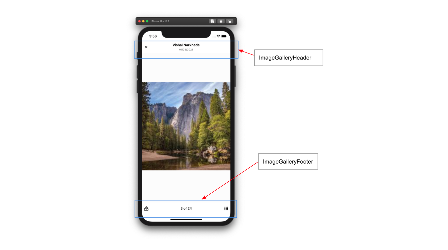
imageGalleryCustomComponents
Image gallery components. Each key in the object is spread as props onto its respective component. Each component has a number of sub-components it can receive in this manor.
footer-> ImageGalleryFootergrid-> ImageGridgridHandle-> ImageGridHandleheader-> ImageGalleryHeader
| Type |
|---|
| object |
imageGalleryGridHandleHeight
Height of the image gallery grid bottom sheet handle.
| Type | Default |
|---|---|
| number | 40 |
imageGalleryGridSnapPoints
SnapPoints for the image gallery grid bottom sheet.
| Type | Default |
|---|---|
| array | [0, (screenHeight * 9) / 10] |
numberOfAttachmentImagesToLoadPerCall
Number of images to load per call to CameraRoll.getPhotos.
| Type | Default |
|---|---|
| number | 60 |
numberOfAttachmentPickerImageColumns
Number of columns to render within the image picker.
| Type | Default |
|---|---|
| number | 3 |
numberOfImageGalleryGridColumns
Number of columns to render within the image gallery grid.
| Type | Default |
|---|---|
| number | 3 |
topInset
Distance from the top of the screen the attachment picker should open to when expanded. This is often set to the header height.
This can also be set via the setTopInset function provided by the useAttachmentPickerContext hook.
| Type | Default |
|---|---|
| number | 0 |
value
Partially overrides the value provided to the OverlayContext.
This prop can be used to set the theme via the style key.
const theme = {
  messageSimple: {
    file: {
      container: {
        backgroundColor: 'red',
      },
    },
  },
};

<OverlayProvider value={{ style: theme }}>...</OverlayProvider>;
| Type |
|---|
| object |
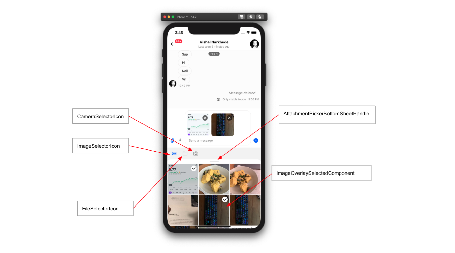
AttachmentPickerBottomSheetHandle
Bottom sheet handle component for image picker.
| Type | Default |
|---|---|
| component | AttachmentPickerBottomSheetHandle |
AttachmentPickerError
Error component displayed when the app doesn't have permissions to access photos on the device.
| Type | Default |
|---|---|
| component | AttachmentPickerError |
AttachmentPickerErrorImage
Image component within AttachmentPickerError.
| Type | Default |
|---|---|
| component | AttachmentPickerErrorImage |
CameraSelectorIcon
Camera selector component displayed in the attachment selector bar.
| Type | Default |
|---|---|
| component | CameraSelectorIcon |
FileSelectorIcon
File selector component displayed in the attachment selector bar.
| Type | Default |
|---|---|
| component | FileSelectorIcon |
ImageOverlaySelectedComponent
Indicator component used to designate an image as selected in the image picker.
| Type | Default |
|---|---|
| component | ImageOverlaySelectedComponent |
ImageSelectorIcon
Image selector component displayed in the attachment selector bar.
| Type | Default |
|---|---|
| component | ImageSelectorIcon |
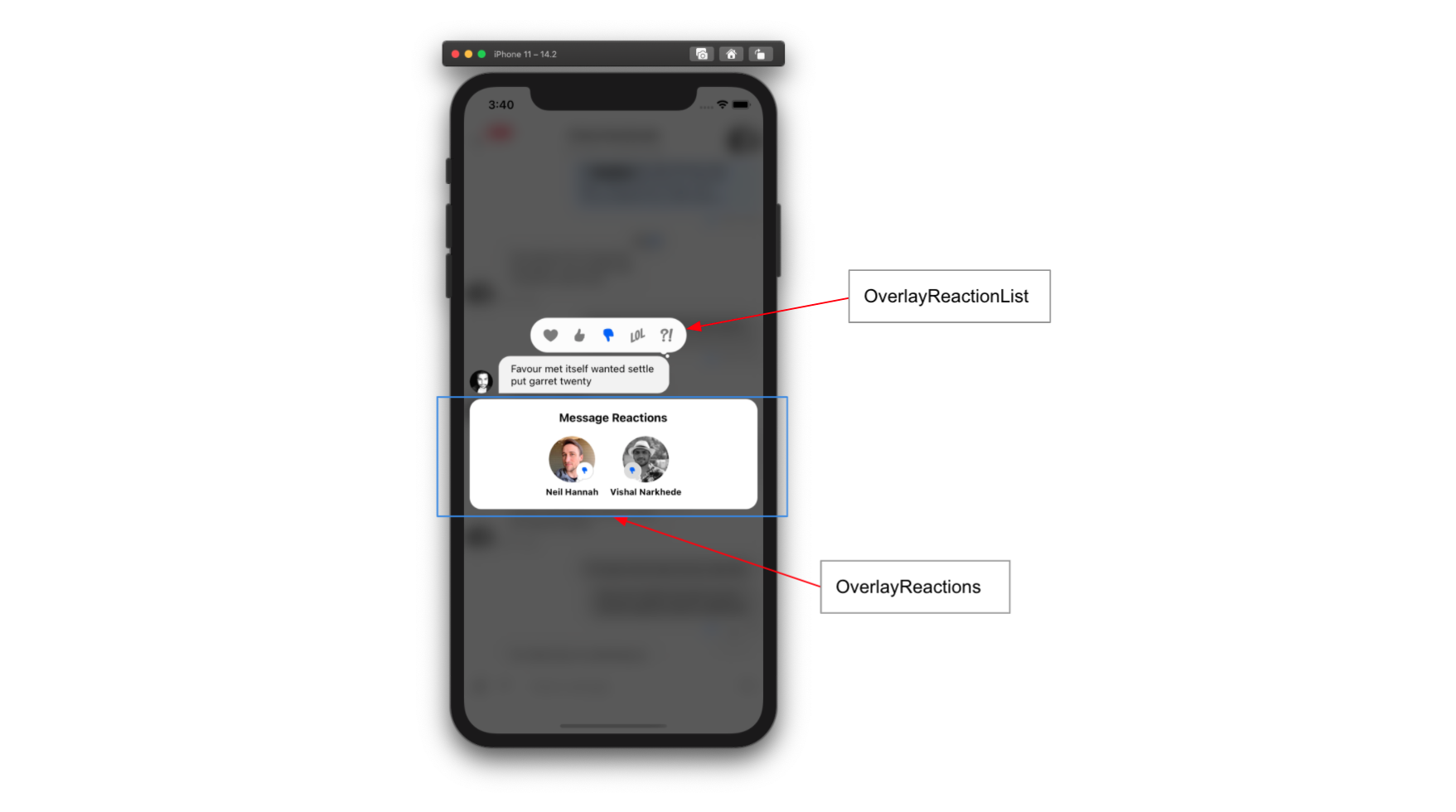
OverlayReactionList
Reaction selector component displayed within the message overlay when user long presses a message.
| Type | Default |
|---|---|
| component | OverlayReactionList |
OverlayReactions
List of reactions component within the message overlay.
| Type | Default |
|---|---|
| component | OverlayReactions |