 React
React iOS
iOS Android
 Flutter
 Angular
 JavaScript
 Unity
Unity Unreal
 Node
Node Python
 Ruby
Ruby PHP
PHP Java
Java .NET
.NET Go
Go REST
RESTimport React, { useState } from "react";
import { Button, StyleSheet, View } from "react-native";
import { StreamChat, TextComposerState } from "stream-chat";
import { useStateStore } from "stream-chat-react-native";
import { useMessageComposer } from "stream-chat-react-native";
import {
AttachmentUploadPreviewList,
Channel,
ChannelList,
Chat,
AutoCompleteInput,
MessageComposer,
MessageList,
OverlayProvider,
WithComponents,
useMessageInputContext,
} from "stream-chat-react-native";
const client = StreamChat.getInstance("api_key");
const textSelector = (state: TextComposerState) => ({ text: state.text });
const CustomInput = (props) => {
const { sendMessage, openAttachmentPicker } = useMessageInputContext();
const messageComposer = useMessageComposer();
const { text } = useStateStore(
messageComposer.textComposer.state,
textSelector,
);
return (
<View style={styles.fullWidth}>
<AttachmentUploadPreviewList />
<View style={[styles.fullWidth, styles.inputContainer]}>
<AutoCompleteInput />
</View>
<View style={[styles.fullWidth, styles.row]}>
<Button title="Attach" onPress={openAttachmentPicker} />
<Button title="Send" onPress={sendMessage} disabled={!text} />
</View>
</View>
);
};
export const ChannelScreen = () => {
const [activeChannel, setActiveChannel] = useState();
return (
<OverlayProvider>
<Chat client={client}>
{activeChannel ? (
<WithComponents overrides={{ Input: CustomInput }}>
<Channel channel={activeChannel}>{/** App components */}</Channel>
</WithComponents>
) : (
<ChannelList onSelect={setActiveChannel} />
)}
</Chat>
</OverlayProvider>
);
};
const styles = StyleSheet.create({
flex: { flex: 1 },
fullWidth: {
width: "100%",
},
row: {
flexDirection: "row",
justifyContent: "space-between",
},
inputContainer: {
height: 40,
},
});Custom Message Composer
MessageComposer ships with a default layout and many customization points. Most customization flows through contexts (especially MessageInputContext) provided by Channel. To replace the entire input UI, provide a custom Input component via the WithComponents wrapper.
Best Practices
- Start with theming and
WithComponentsoverrides before replacingInput. - Use
useMessageInputContextfor state and actions instead of re-creating logic. - Keep send/attach controls disabled when there is no sendable data.
- Prefer swapping subcomponents (e.g.,
SendButton) viaWithComponentsfor small UI changes. - Test custom layouts with attachments, commands, and thread replies to avoid regressions.
Changing layout of MessageComposer
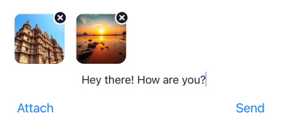
Let's take a look at an example with the following requirements:
- Stretch the input field to full width
- Button to send a message, to open an attachment picker, and to open a commands picker below the input field
- Disable the send button when the input field is empty
You can also pass component overrides directly to the MessageComposer component. Props passed directly to MessageComposer take precedence over values from WithComponents.
The code below would render the red View and not null as the MessageComposer prop takes precedence over the WithComponents override.
<WithComponents overrides={{ Input: () => null }}>
  <Channel
    channel={channel}
    keyboardVerticalOffset={headerHeight}
    topInset={headerHeight}
  >
    <View style={{ flex: 1 }}>
      <MessageList />
      <MessageComposer
        Input={() => <View style={{ height: 40, backgroundColor: "red" }} />}
      />
    </View>
  </Channel>
</WithComponents>
You can customize MessageComposer in many ways. You can replace Input entirely (as above) or build your own MessageComposer using hooks to access context.
NOTE: additionalTextInputProps on Channel or MessageComposer passes through to the internal TextInput.
<Channel
  channel={channel}
  additionalTextInputProps={{
    style: { color: "red" },
    placeholder: "Type a message",
    placeholderTextColor: "blue",
  }}
>
Customizing nested components within MessageComposer
To replace a specific internal UI component of MessageComposer, provide your component via the WithComponents wrapper. These components are resolved through ComponentsContext and can also be overridden directly on the MessageComposer component.
Within your custom UI implementation, you can access all the stateful information via the available contexts.
The following table lists all UI component props available for customization:
| Prop | Description |
|---|---|
AttachButton | Renders the attach button next to the input box. |
AttachmentPickerSelectionBar | Renders the attachment picker selection bar (image, file, camera icons). |
AttachmentUploadIndicator | Renders compact or overlay upload progress for pending attachments. |
AttachmentUploadPreviewList | Renders previews of attached files and images in MessageComposer. |
AudioAttachmentUploadPreview | Customizes the audio attachment upload preview in MessageComposer. |
AudioRecorder | Custom UI for audio recorder controls in MessageComposer. |
AudioRecordingInProgress | Custom UI for an in-progress audio recording (waveform, duration, etc.). |
AudioRecordingLockIndicator | Custom lock indicator shown when user drags upward during audio recording. |
AudioRecordingPreview | Custom UI to preview and play back a recorded audio clip. |
AudioRecordingWaveform | Custom waveform visualization for audio recording. |
AutoCompleteSuggestionHeader | Renders the header above the autocomplete suggestion list. |
AutoCompleteSuggestionItem | Renders an individual autocomplete suggestion item. |
AutoCompleteSuggestionList | Renders the autocomplete suggestion list (mentions, commands). |
CircularProgressIndicator | Renders the circular ring used by upload progress indicators. |
CooldownTimer | Renders a countdown timer when slow mode is enabled and the user has just sent a message. |
CreatePollContent | Renders the poll creation dialog content. |
FileAttachmentUploadPreview | Customizes the file attachment upload preview in MessageComposer. |
FileUploadInProgressIndicator | Renders a progress indicator for file uploads. |
FileUploadNotSupportedIndicator | Renders an indicator when file upload is not supported. |
FileUploadRetryIndicator | Renders a retry indicator for failed file uploads. |
ImageAttachmentUploadPreview | Customizes the image attachment upload preview in MessageComposer. |
ImageUploadInProgressIndicator | Renders a progress indicator for image uploads. |
ImageUploadNotSupportedIndicator | Renders an indicator when image upload is not supported. |
ImageUploadRetryIndicator | Renders a retry indicator for failed image uploads. |
Input | Renders the entire MessageComposer UI. Override this to fully replace the input layout. |
InputButtons | Renders action buttons (e.g., AttachButton) on the leading side of MessageComposer. |
MessageComposerLeadingView | Custom UI component to override the leading side of the composer container. |
MessageComposerTrailingView | Custom UI component to override the trailing side of the composer container. |
MessageInputHeaderView | Custom UI component to override the message input header content. |
MessageInputLeadingView | Custom UI component to override the leading side of the input row. |
MessageInputTrailingView | Custom UI component to override the trailing side of the input row. |
MediaUploadProgressOverlay | Renders the full-cover upload overlay used on image and video thumbnails. |
SendButton | Renders the send message button inside MessageComposer. |
SendMessageDisallowedIndicator | Renders an indicator when the current user is not allowed to send messages. |
ShowThreadMessageInChannelButton | Renders a checkbox in Thread that sets show_in_channel to true when checked. |
StartAudioRecordingButton | Custom mic button to start audio recording in MessageComposer. |
StopMessageStreamingButton | Renders a button that stops AI-generated message streaming. |
VideoAttachmentUploadPreview | Customizes the video attachment upload preview in MessageComposer. |
All of these can be provided as overrides via the WithComponents wrapper or passed directly as props to MessageComposer. For full details on each component, see the MessageInputContext reference.
Custom Send Button
Example: replace only the default SendButton without changing the rest of MessageComposer.
- The Boat icon should replace the default send button
- This custom button should be disabled if the user has not entered any text or attached any file
import { TouchableOpacity } from "react-native";
import {
  RootSvg,
  RootPath,
  Channel,
  WithComponents,
  useMessageComposerHasSendableData,
  useMessageInputContext,
} from "stream-chat-react-native";

const StreamButton = () => {
  const hasSendableData = useMessageComposerHasSendableData();
  const { sendMessage } = useMessageInputContext();

  return (
    <TouchableOpacity disabled={!hasSendableData} onPress={sendMessage}>
      <RootSvg height={21} width={42} viewBox="0 0 42 21">
        <RootPath
          d="M26.1491984,6.42806971 L38.9522984,5.52046971 C39.7973984,5.46056971 40.3294984,6.41296971 39.8353984,7.10116971 L30.8790984,19.5763697 C30.6912984,19.8379697 30.3888984,19.9931697 30.0667984,19.9931697 L9.98229842,19.9931697 C9.66069842,19.9931697 9.35869842,19.8384697 9.17069842,19.5773697 L0.190598415,7.10216971 C-0.304701585,6.41406971 0.227398415,5.46036971 1.07319842,5.52046971 L13.8372984,6.42816971 L19.2889984,0.333269706 C19.6884984,-0.113330294 20.3884984,-0.110730294 20.7846984,0.338969706 L26.1491984,6.42806971 Z M28.8303984,18.0152734 L20.5212984,14.9099734 L20.5212984,18.0152734 L28.8303984,18.0152734 Z M19.5212984,18.0152734 L19.5212984,14.9099734 L11.2121984,18.0152734 L19.5212984,18.0152734 Z M18.5624984,14.1681697 L10.0729984,17.3371697 L3.82739842,8.65556971 L18.5624984,14.1681697 Z M21.4627984,14.1681697 L29.9522984,17.3371697 L36.1978984,8.65556971 L21.4627984,14.1681697 Z M19.5292984,13.4435697 L19.5292984,2.99476971 L12.5878984,10.8305697 L19.5292984,13.4435697 Z M20.5212984,13.4435697 L20.5212984,2.99606971 L27.4627984,10.8305697 L20.5212984,13.4435697 Z M10.5522984,10.1082697 L12.1493984,8.31366971 L4.34669842,7.75446971 L10.5522984,10.1082697 Z M29.4148984,10.1082697 L27.8178984,8.31366971 L35.6205984,7.75446971 L29.4148984,10.1082697 Z"
          pathFill={hasSendableData ? "blue" : "grey"}
        />
      </RootSvg>
    </TouchableOpacity>
  );
};

// In your App

<WithComponents overrides={{ SendButton: StreamButton }}>
  <Channel channel={channel}>{/* ... */}</Channel>
</WithComponents>;
Storing image and file attachment to custom CDN
When you select an image or file from the image picker or file picker, it gets uploaded to Stream's CDN by default. You could, however, choose to upload attachments to your own CDN using the following prop on the Channel component:
doFileUploadRequest: For files picked and to be uploaded.
<Channel
  doFileUploadRequest={async (file) => {
    const result = await customCDN.upload(file);
    return { file: result.url };
  }}
/>
You may choose to use any HTTP client for uploading the file. Make sure to return a promise that resolves to an object with the key file that is the URL of the uploaded file.
For example:
{
  file: "https://us-east.stream-io-cdn.com/62344/images/a4f988f5-6a9c-47b0-aab9-7a27b74d7515.60D6041A-D012-4721-B794-19267B8F352B.jpg",
}
Disabling File Uploads or Image Uploads
There are three ways to disable file or image uploads from a React Native app:
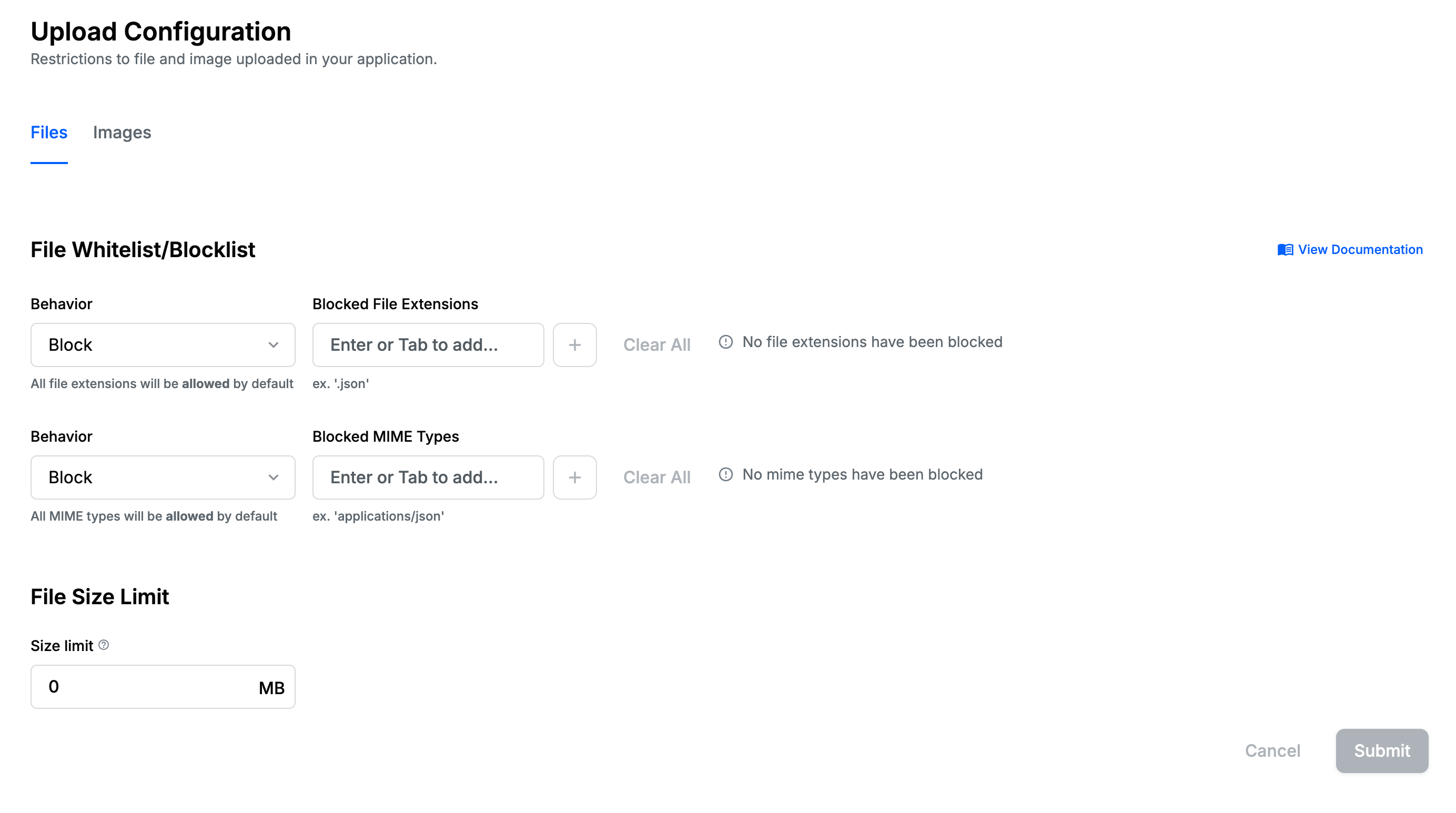
From the Dashboard
Disabling uploads from the Dashboard is the recommended option to disallow image and file uploads in your chat application. You can set the file and image types you don't want to allow in the File Upload Configuration section.
On the UI level
If you want to restrict uploads to either only images or only files, you can do so by providing one of the following props to the Channel component:
hasFilePicker(boolean)hasImagePicker(boolean)hasCameraPicker(boolean)
Disable autocomplete features on input (mentions and commands)
You can disable the autocomplete feature by overriding the AutoCompleteSuggestionList component to render nothing via WithComponents.
import { Channel, WithComponents } from "stream-chat-react-native";

<WithComponents overrides={{ AutoCompleteSuggestionList: () => null }}>
  <Channel channel={channel}>{/* The underlying components */}</Channel>
</WithComponents>;
Alternatively, you can customize the middlewares to disable the search source or not return any suggestions from the search source.
Follow the guide here.
Setting Additional Props on Underlying TextInput component
You can provide additionalTextInputProps prop to the Channel or MessageComposer component for adding additional props to underlying React Native's TextInput component.
const additionalTextInputProps = useMemo(
  () => ({
    selectionColor: "pink",
  }),
  [],
);

// Render UI part
<Channel channel={channel} additionalTextInputProps={additionalTextInputProps}>
  ...
</Channel>;
Customizing the slow mode CooldownTimer
Modifying styles through the theme
The default CooldownTimer can have its styles altered through the theme, using the following keys:
<ThemeProvider style={{
      {/* ... your other styles */}
      messageComposer: {
        cooldownTimer: {
          container: {
            {/* ViewStyle values */}
          },
          text: {
            {/* TextStyle values */}
          }
        }
      }
    }}>
    {/* Underlying components inside */}
    </ThemeProvider>
Creating a custom CooldownTimer
If a channel has slow mode enabled, the send button will be disabled when a user has sent a message, and a countdown will be displayed in its place. The built-in CooldownTimer component is styled to look like the disabled variant of the built-in send button, but you can replace the CooldownTimer to fit it to your needs.
To do so, first create your custom CooldownTimer component. The component takes no props; use the useCooldownRemaining hook to read the number of seconds left until the cool-down finishes.
import { Text } from "react-native";
import { useCooldownRemaining } from "stream-chat-react-native";

const CustomCooldownTimer = () => {
  const seconds = useCooldownRemaining();
  const isEven = seconds % 2 === 0;

  console.log(`There is an ${isEven ? "even" : "odd"} amount of seconds left`);

  return <Text>{seconds}</Text>;
};
You will then have to provide your CustomCooldownTimer component via the WithComponents wrapper in your application.
import { Channel, WithComponents } from "stream-chat-react-native";

<WithComponents overrides={{ CooldownTimer: CustomCooldownTimer }}>
  <Channel channel={channel}>...</Channel>
</WithComponents>;
Replacing AttachmentPicker With Native Image Picker
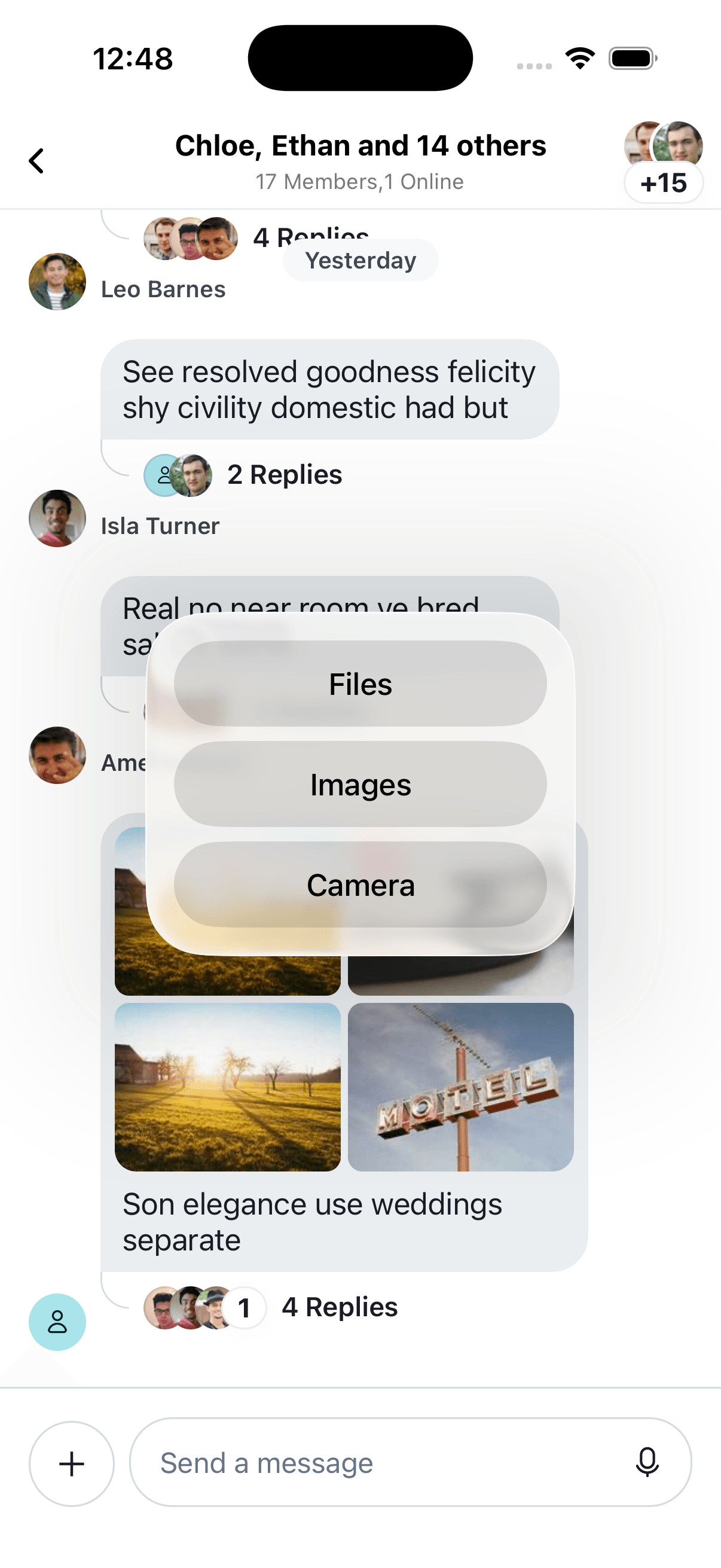
The attachment picker is rendered/displayed/opened inside of a bottom sheet by default. The default behavior can be easily replaced with the device's native image picker (as shown in screenshots below).
You can override the default attach button next to the input field using WithComponents. This lets you
override the default onPress handler for the AttachButton component.
import {
  AttachButton,
  Channel,
  WithComponents,
} from "stream-chat-react-native";

const CustomAttachButton = () => {
  const onPressHandler = () => {
    // Custom handling of onPress action on AttachButton
  };

  return <AttachButton handleOnPress={onPressHandler} />;
};

<WithComponents overrides={{ AttachButton: CustomAttachButton }}>
  <Channel channel={channel}>{/* ... */}</Channel>
</WithComponents>;
To make the onPressHandler open the action sheet and show the options to choose attachments from Photo Library, Camera, or Files,
you can use @expo/react-native-action-sheet package for the action sheet implemented in this example.
yarn add @expo/react-native-action-sheetPlease read through the documentation of @expo/react-native-action-sheet for more details.
import {
  AttachButton,
  Channel,
  WithComponents,
} from "stream-chat-react-native";
import {
  ActionSheetProvider,
  useActionSheet,
} from "@expo/react-native-action-sheet";

const CustomAttachButton = () => {
  const { showActionSheetWithOptions } = useActionSheet();

  const onPressHandler = () => {
    // Same interface as https://facebook.github.io/react-native/docs/actionsheetios.html
    showActionSheetWithOptions(
      {
        cancelButtonIndex: 3,
        destructiveButtonIndex: 3,
        options: ["Photo Library", "Camera", "Files", "Cancel"],
      },
      (buttonIndex) => {
        switch (buttonIndex) {
          case 0:
            break;
          case 1:
            break;
          case 2:
            break;
          default:
            break;
        }
      },
    );
  };

  return <AttachButton handleOnPress={onPressHandler} />;
};

<ActionSheetProvider>
  <WithComponents overrides={{ AttachButton: CustomAttachButton }}>
    <Channel channel={channel}>{/* ... */}</Channel>
  </WithComponents>
</ActionSheetProvider>;
Now let's hook the relevant action handlers for buttons within ActionSheet.
react-native-image-picker provides an image picker functionality with good support for multiple images. And selected images from image picker or camera can be wired in with upload previews (AttachmentUploadPreviewList) within MessageComposer component by using a function uploadNewFile provided by MessageInputContext.
For file attachments, the SDK defaults to the native file picker. That can be reused by adding the pickFile function
provided by the MessageInputContext as an action handler within the action sheet.
import {
  AttachButton,
  Channel,
  WithComponents,
  useMessageInputContext,
} from "stream-chat-react-native";
import {
  ActionSheetProvider,
  useActionSheet,
} from "@expo/react-native-action-sheet";
import ImagePicker from "react-native-image-picker";

const CustomAttachButton = () => {
  const { showActionSheetWithOptions } = useActionSheet();
  const { pickFile, uploadNewFile } = useMessageInputContext();

  const pickImageFromGallery = () =>
    ImagePicker.launchImageLibrary({
      selectionLimit: 0,
    }).then((images) =>
      images.forEach((image) =>
        uploadNewFile({
          uri: image.path,
          name: image.fileName || "image.jpg",
          type: image.type || "image/jpeg",
          size: image.fileSize || 0,
        }),
      ),
    );

  const pickImageFromCamera = () =>
    ImagePicker.launchCamera({}).then((image) =>
      uploadNewFile({
        uri: image.path,
        name: image.fileName || "image.jpg",
        type: image.type || "image/jpeg",
        size: image.fileSize || 0,
      }),
    );

  const onPress = () => {
    // Same interface as https://facebook.github.io/react-native/docs/actionsheetios.html
    showActionSheetWithOptions(
      {
        cancelButtonIndex: 3,
        destructiveButtonIndex: 3,
        options: ["Photo Library", "Camera", "Files", "Cancel"],
      },
      (buttonIndex) => {
        switch (buttonIndex) {
          case 0:
            pickImageFromGallery();
            break;
          case 1:
            pickImageFromCamera();
            break;
          case 2:
            pickFile();
            break;
          default:
            break;
        }
      },
    );
  };

  return <AttachButton handleOnPress={onPress} />;
};

<ActionSheetProvider>
  <WithComponents overrides={{ AttachButton: CustomAttachButton }}>
    <Channel channel={channel}>{/* ... */}</Channel>
  </WithComponents>
</ActionSheetProvider>;
Uploading attachments asynchronously
By default, the message composer uploads attachments synchronously, meaning that the message is sent only after the attachment is uploaded.
If you want to upload attachments asynchronously, you can override the message composer attachment middleware that is called when the user sends a message or composes a message (usually before send message) and the drafts middleware if you have the drafts feature enabled.
The new middleware can be something like this:
import {
  Attachment,
  FileReference,
  isLocalImageAttachment,
  LocalAttachment,
  MessageComposer,
  MessageComposerMiddlewareState,
  MessageCompositionMiddleware,
  MessageDraftComposerMiddlewareValueState,
  MessageDraftCompositionMiddleware,
  MiddlewareHandlerParams,
} from "stream-chat";

const localAttachmentToAttachment = (localAttachment: LocalAttachment) => {
  const { localMetadata, ...attachment } = localAttachment;

  if (isLocalImageAttachment(localAttachment)) {
    const isRemoteUri = !!attachment.image_url;

    if (isRemoteUri) return attachment as Attachment;

    return {
      ...attachment,
      image_url: localMetadata?.previewUri,
    } as Attachment;
  } else {
    const isRemoteUri = !!attachment.asset_url;
    if (isRemoteUri) return attachment as Attachment;

    return {
      ...attachment,
      asset_url: (localMetadata.file as FileReference).uri,
    } as Attachment;
  }
};

export const createAttachmentsCompositionMiddleware = (
  composer: MessageComposer,
): MessageCompositionMiddleware => ({
  handlers: {
    compose: ({
      state,
      next,
      forward,
    }: MiddlewareHandlerParams<MessageComposerMiddlewareState>) => {
      const { attachmentManager } = composer;
      if (!attachmentManager) return forward();

      const attachments = (state.message.attachments ?? []).concat(
        attachmentManager.attachments.map(localAttachmentToAttachment),
      );

      // prevent introducing attachments array into the payload sent to the server
      if (!attachments.length) return forward();

      return next({
        ...state,
        localMessage: {
          ...state.localMessage,
          attachments: [...attachments],
        },
        message: {
          ...state.message,
          attachments: [...attachments],
        },
      });
    },
  },
  id: "stream-io/message-composer-middleware/attachments",
});

export const createDraftAttachmentsCompositionMiddleware = (
  composer: MessageComposer,
): MessageDraftCompositionMiddleware => ({
  handlers: {
    compose: ({
      state,
      next,
      forward,
    }: MiddlewareHandlerParams<MessageDraftComposerMiddlewareValueState>) => {
      const { attachmentManager } = composer;
      if (!attachmentManager) return forward();

      const attachments = (state.draft.attachments ?? []).concat(
        attachmentManager.attachments.map(localAttachmentToAttachment),
      );

      return next({
        ...state,
        draft: {
          ...state.draft,
          attachments,
        },
      });
    },
  },
  id: "stream-io/message-composer-middleware/draft-attachments",
});
This middleware will take the local attachment, will allow the user to upload the attachment asynchronously, and make sure the asset_url and the image_url has the local file uri, if they aren't uploaded.
To replace these default middlewares, you can use the setMessageComposerSetupFunction method on the ChatClient instance to set up the new middlewares.
useEffect(() => {
  chatClient.setMessageComposerSetupFunction(({ composer }) => {
    composer.compositionMiddlewareExecutor.replace([
      createAttachmentsCompositionMiddleware(messageComposer),
    ]);

    composer.draftCompositionMiddlewareExecutor.replace([
      createDraftAttachmentsCompositionMiddleware(messageComposer),
    ]);
  });
}, [chatClient, emojisEnabled]);
Overriding the default send message behavior
To override the default send message behavior, you can use the sendMessage method prop of the SendButton component. This method can be used to send the message after the attachments are uploaded.
import {
  Channel,
  SendButton,
  WithComponents,
  useMessageComposer,
} from "stream-chat-react-native";

const CustomSendButton = () => {
  const messageComposer = useMessageComposer();

  const uploadAndSendMessage = async ({
    localMessage,
    message,
    sendOptions,
  }) => {
    // Your custom logic to upload attachments and send the message and update the UI optimistically.
    // For example, you can use a custom CDN or upload to a different service
    await customCDN.uploadAttachments(localMessage.attachments);
    await channel.sendMessage(message, sendOptions);
  };

  const handleSendMessage = async () => {
    const composition = await messageComposer.compose();
    if (!composition || !composition.message) return;

    const { localMessage, message, sendOptions } = composition;

    // Your custom logic to upload attachments, after it's sent and updating the message, can live inside this function
    await uploadAndSendMessage({ localMessage, message, sendOptions });
  };

  return <SendButton sendMessage={handleSendMessage} />;
};

<WithComponents overrides={{ SendButton: CustomSendButton }}>
  <Channel channel={channel}>{/* The underlying components */}</Channel>
</WithComponents>;On this page:
- Best Practices
- Changing layout of MessageComposer
- Customizing nested components within MessageComposer
- Storing image and file attachment to custom CDN
- Disabling File Uploads or Image Uploads
- Disable autocomplete features on input (mentions and commands)
- Setting Additional Props on Underlying TextInput component
- Customizing the slow mode CooldownTimer
- Replacing AttachmentPicker With Native Image Picker
- Uploading attachments asynchronously
- Overriding the default send message behavior