 React
React iOS
iOS Android
 Flutter
 Angular
 JavaScript
 Unity
Unity Unreal
 Node
Node Python
 Ruby
Ruby PHP
PHP Java
Java .NET
.NET Go
Go REST
REST@Component({
selector: "app-custom-message",
template: `
<stream-message-blocked
[isMyMessage]="isMine"
[message]="message"
></stream-message-blocked>
<!-- Other parts of the custom message component -->
<div>{{ message.text }}</div>
`,
})
export class CustomMessageComponent {
@Input() message: StreamMessage;
// set this when message changes
isMine: boolean;
}MessageBlockedComponent
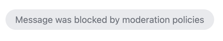
The MessageBlockedComponent component displays a placeholder when a message was blocked by moderation.
Example 1 - a message that was blocked:
Basic usage
A typical use case for the MessageBlockedComponent component would be to use in your custom components that will completely override the message component.
Customization
Displayed text
You can customize the text displayed in the placeholder using the StreamI18nService
this.streamI18nService.setTranslation("en", {
  "Message was blocked by moderation policies": "<your placeholder text>",
});
CSS
You can use theme variables of the message component to customize the blocked message placeholder:
- You can find message component theme variables on GitHub
- You can find more information about CSS variables in the theming guide
Custom component
You can provide your own custom template for theMessageBlockedComponent, using the messageBlockedTemplate$ of the CustomTemplatesService
Please note that, if you have date separators enabled, you shouldn't display an empty template (hiding message blocked component), because that can lead to unnecessary date separators in the message list.
Inputs and outputs
message
message: undefined | StreamMessage
The message that has been blocked.
Defined in
projects/stream-chat-angular/src/lib/message-blocked/message-blocked.component.ts:17
isMyMessage
isMyMessage: boolean = false
Whether the message is the current user's own message.
Defined in
projects/stream-chat-angular/src/lib/message-blocked/message-blocked.component.ts:21