 React
React iOS
iOS Android
 Flutter
 Angular
 JavaScript
 Unity
Unity Unreal
 Node
Node Python
 Ruby
Ruby PHP
PHP Java
Java .NET
.NET Go
Go REST
RESTng g c emoji-pickerEmoji picker
The SDK doesn't have a built-in emoji picker, but it has support for providing your own template. This guide shows you how to add an emoji picker to your chat application.
Create the emoji picker template
- Create a new component in your application
- Install
@ctrl/ngx-emoji-mart
You can use any emoji picker but this example will use @ctrl/ngx-emoji-mart
npm install @ctrl/ngx-emoji-martImport the emoji-mart stylesheet into your root stylesheet (for example styles.scss):
@use "@ctrl/ngx-emoji-mart/picker";Import the PickerModule:
import { Component } from "@angular/core";
import { PickerModule } from "@ctrl/ngx-emoji-mart";

@Component({
  selector: "app-emoji-picker",
  imports: [PickerModule],
  templateUrl: "./emoji-picker.component.html",
  styleUrl: "./emoji-picker.component.scss",
})
export class EmojiPickerComponent {}- Component class
Your emoji picker component should have an input with the type Subject<string> to emit the selected emojis. This input will be provided by the MessageInput component.
We also defined an isOpened property that tells if the emoji picker should be opened or closed.
The emoji picker will close on outside clicks.
Update your emoji-picker.component.ts file:
import { CommonModule } from "@angular/common";
import { Component, ElementRef, Input, ViewChild } from "@angular/core";
import { PickerModule } from "@ctrl/ngx-emoji-mart";
import { Subject } from "rxjs";

@Component({
  selector: "app-emoji-picker",
  templateUrl: "./emoji-picker.component.html",
  styleUrls: ["./emoji-picker.component.scss"],
  imports: [PickerModule, CommonModule],
})
export class EmojiPickerComponent {
  isOpened = false;
  @Input() emojiInput$: Subject<string> | undefined;
  @ViewChild("container") container: ElementRef<HTMLElement> | undefined;

  constructor() {}

  emojiSelected(event: any) {
    // eslint-disable-next-line @typescript-eslint/no-unsafe-member-access
    this.emojiInput$?.next(event.emoji.native);
  }

  eventHandler = (event: Event) => {
    // Watching for outside clicks
    if (!this.container?.nativeElement.contains(event.target as Node)) {
      this.isOpened = false;
      window.removeEventListener("click", this.eventHandler);
    }
  };

  toggled() {
    if (!this.container) {
      return;
    }
    this.isOpened = !this.isOpened;
    if (this.isOpened) {
      window.addEventListener("click", this.eventHandler);
    } else {
      window.removeEventListener("click", this.eventHandler);
    }
  }
}- Component template
We create a button that can be used to toggle the emoji picker.
The emoji-mart component has a lot of configuration options, feel free to explore those.
We set the color input to --str-chat__primary-color defined in the stream-chat-css theme.
The ngIf directive is used to hide/show the emoji picker.
The emojiSelect event is fired when a user selects an emoji, we emit the selected emoji using the emojiSelected method.
Update your emoji-picker.component.html file:
<div #container class="emoji-picker-container">
  <button (click)="toggled()">
    <svg
      viewBox="0 0 28 28"
      width="100%"
      preserveAspectRatio="xMinYMin"
      xmlns="http://www.w3.org/2000/svg"
    >
      <g clip-rule="evenodd" fill-rule="evenodd">
        <path
          d="M14 4.4C8.6 4.4 4.4 8.6 4.4 14c0 5.4 4.2 9.6 9.6 9.6c5.4 0 9.6-4.2 9.6-9.6c0-5.4-4.2-9.6-9.6-9.6zM2 14c0-6.6 5.4-12 12-12s12 5.4 12 12s-5.4 12-12 12s-12-5.4-12-12zM12.8 11c0 1-.8 1.8-1.8 1.8s-1.8-.8-1.8-1.8s.8-1.8 1.8-1.8s1.8.8 1.8 1.8zM18.8 11c0 1-.8 1.8-1.8 1.8s-1.8-.8-1.8-1.8s.8-1.8 1.8-1.8s1.8.8 1.8 1.8zM8.6 15.4c.6-.4 1.2-.2 1.6.2c.6.8 1.6 1.8 3 2c1.2.4 2.8.2 4.8-2c.4-.4 1.2-.6 1.6 0c.4.4.6 1.2 0 1.6c-2.2 2.6-4.8 3.4-7 3c-2-.4-3.6-1.8-4.4-3c-.4-.6-.2-1.2.4-1.8z"
        ></path>
      </g>
    </svg>
  </button>

  <emoji-mart
    class="picker"
    color="var(--str-chat__primary-color)"
    *ngIf="isOpened"
    title="Pick your emoji…"
    emoji="point_up"
    (emojiSelect)="emojiSelected($event)"
    [isNative]="true"
  ></emoji-mart>
</div>- Component styles
If you want to match the color of the emoji picker toggle button to the other tool buttons in the message input, you can use the --str-chat__message-input-tools-color to do that as defined in the stream-chat-css theme
Update your emoji-picker.component.scss file:
.emoji-picker-container {
  position: relative;
  width: 24px;
  height: 24px;

  button {
    background-color: transparent;
    border: none;
    cursor: pointer;
    padding: 0;
    margin: 0;

    svg {
      display: flex;
      width: 24px;
      height: 24px;

      path {
        fill: var(--str-chat__message-input-tools-color);
      }
    }
  }

  .picker {
    z-index: 3;
    position: absolute;
    bottom: 100%;
    transform: scale(0.8);
    right: 0;
    transform-origin: bottom right;
  }

  @media only screen and (min-device-width: 1024px) {
    .picker {
      transform: scale(1);
    }
  }
}
Provide your custom template
Let's create the template for the emoji picker (for example in your AppComponent):
<!-- The MessageInput component will provide the emojiInput$ to emit the selected emojis and insert them in the textarea -->
<ng-template #emojiPickerTemplate let-emojiInput$="emojiInput$">
  <app-emoji-picker [emojiInput$]="emojiInput$"></app-emoji-picker>
</ng-template>
Register the template in your TypeScript code (for example in your AppComponent).
These are the necessary steps:
- Create a reference to the custom template
- Import the CustomTemplatesService
- Register your custom template
Here is an example file:
import {
  AfterViewInit,
  Component,
  TemplateRef,
  ViewChild,
} from "@angular/core";
import { TranslateModule } from "@ngx-translate/core";
import {
  ChatClientService,
  ChannelService,
  StreamI18nService,
  StreamAutocompleteTextareaModule,
  StreamChatModule,
  CustomTemplatesService,
  EmojiPickerContext,
} from "stream-chat-angular";
import { EmojiPickerComponent } from "./emoji-picker/emoji-picker.component";

@Component({
  selector: "app-root",
  standalone: true,
  imports: [
    TranslateModule,
    StreamAutocompleteTextareaModule,
    StreamChatModule,
    EmojiPickerComponent,
  ],
  templateUrl: "./app.component.html",
  styleUrls: ["./app.component.scss"],
})
export class AppComponent implements AfterViewInit {
  // Create a reference to the custom template
  @ViewChild("emojiPickerTemplate")
  private emojiPickerTemplate!: TemplateRef<EmojiPickerContext>;

  constructor(
    private chatService: ChatClientService,
    private channelService: ChannelService,
    private streamI18nService: StreamI18nService,
    private customTemplatesService: CustomTemplatesService, // Import the customTemplatesService
  ) {
    void this.chatService.init(
      environment.apiKey,
      environment.userId,
      environment.userToken,
    );
    void this.channelService.init({
      type: "messaging",
      members: { $in: [environment.userId] },
    });
    this.streamI18nService.setTranslation();
  }

  ngAfterViewInit(): void {
    // Register your custom template
    this.customTemplatesService.emojiPickerTemplate$.next(
      this.emojiPickerTemplate,
    );
  }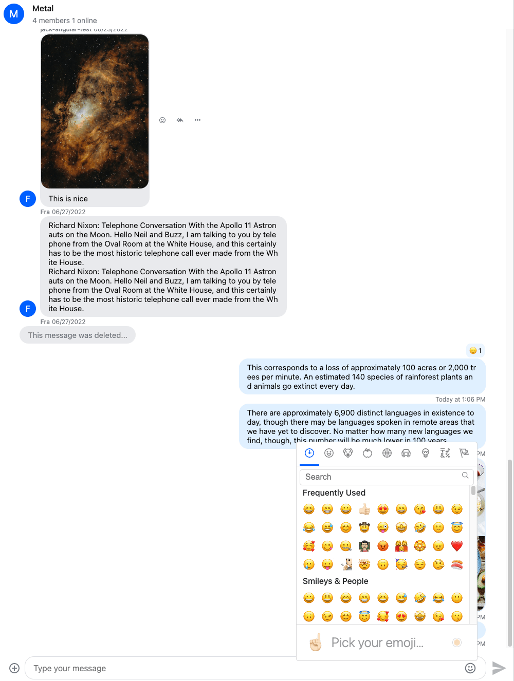
}This is how our emoji picker looks like:
Dark and light mode
If your application supports dark and light themes, here how you can toggle the theme on the emoji input component:
Add this to you emoji picker component class:
import { ThemeService } from "stream-chat-angular";

theme$: Observable<string>;

constructor(themeService: ThemeService) {
  this.theme$ = themeService.theme$;
}
And set the darkMode input on the emoji-mart component:
<emoji-mart
  class="picker"
  color="var(--str-chat__primary-color)"
  *ngIf="isOpened"
  title="Pick your emoji…"
  emoji="point_up"
  (emojiSelect)="emojiSelected($event)"
  [isNative]="true"
  [darkMode]="(theme$ | async) === 'dark'"
></emoji-mart>