 React
React iOS
iOS Android
 Flutter
 Angular
 JavaScript
 Unity
Unity Unreal
 Node
Node Python
 Ruby
Ruby PHP
PHP Java
Java .NET
.NET Go
Go REST
REST@Component({
selector: "app-custom-message-input",
template: `
<stream-attachment-preview-list></stream-attachment-list>
<!-- Other parts of the custom message input component -->
`,
})
export class CustomMessageInputComponent {}AttachmentPreviewListComponent
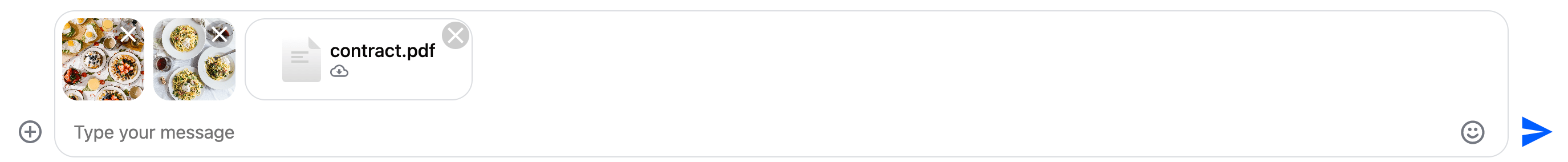
The AttachmentPreviewList component displays a preview of the attachments uploaded to a message. Users can delete attachments using the preview component, or retry upload if it failed previously.
The following attachment types are supported:
- Images - displayed inline
- Video files - no preview provided inside the message input, but displayed inline inside the message list
- Other files - no preview provided, users can download the uploaded files
Example 1 - attachment previews
Basic Usage
A typical use case for the AttachmentPreviewList component would be to use in your custom components that will completely override the message input component.
Example 1 - a basic example:
The AttachmentPreviewList uses the AttachmentService to display the attachment previews.
Customization
You can provide your own attachment preview list component by the CustomTemplatesService
Inputs and outputs
attachmentUploads$
attachmentUploads$: undefined | Observable<AttachmentUpload[]>
A stream that emits the current file uploads and their states
Defined in
projects/stream-chat-angular/src/lib/attachment-preview-list/attachment-preview-list.component.ts:28
retryAttachmentUpload
Readonly retryAttachmentUpload: EventEmitter<File>
An output to notify the parent component if the user tries to retry a failed upload
Defined in
projects/stream-chat-angular/src/lib/attachment-preview-list/attachment-preview-list.component.ts:32
deleteAttachment
Readonly deleteAttachment: EventEmitter<AttachmentUpload>
An output to notify the parent component if the user wants to delete a file
Defined in
projects/stream-chat-angular/src/lib/attachment-preview-list/attachment-preview-list.component.ts:36