 React
React iOS
iOS Android
 Flutter
 Angular
 JavaScript
 Unity
Unity Unreal
 Node
Node Python
 Ruby
Ruby PHP
PHP Java
Java .NET
.NET Go
Go REST
REST<div id="root">
<stream-channel-list class="channel-list"></stream-channel-list>
<stream-channel class="channel">
<stream-channel-header> </stream-channel-header>
<stream-message-list></stream-message-list>
<stream-notification-list></stream-notification-list>
<stream-message-input></stream-message-input>
<stream-thread class="thread" name="thread">
<stream-message-list mode="thread"></stream-message-list>
<stream-message-input mode="thread"></stream-message-input>
</stream-thread>
</stream-channel>
</div>Responsive layout
Our SDK gives you maximum control over the layout of your chat application. This tutorial shows you a simple example of creating a layout.
Channel list, channel, and thread layout
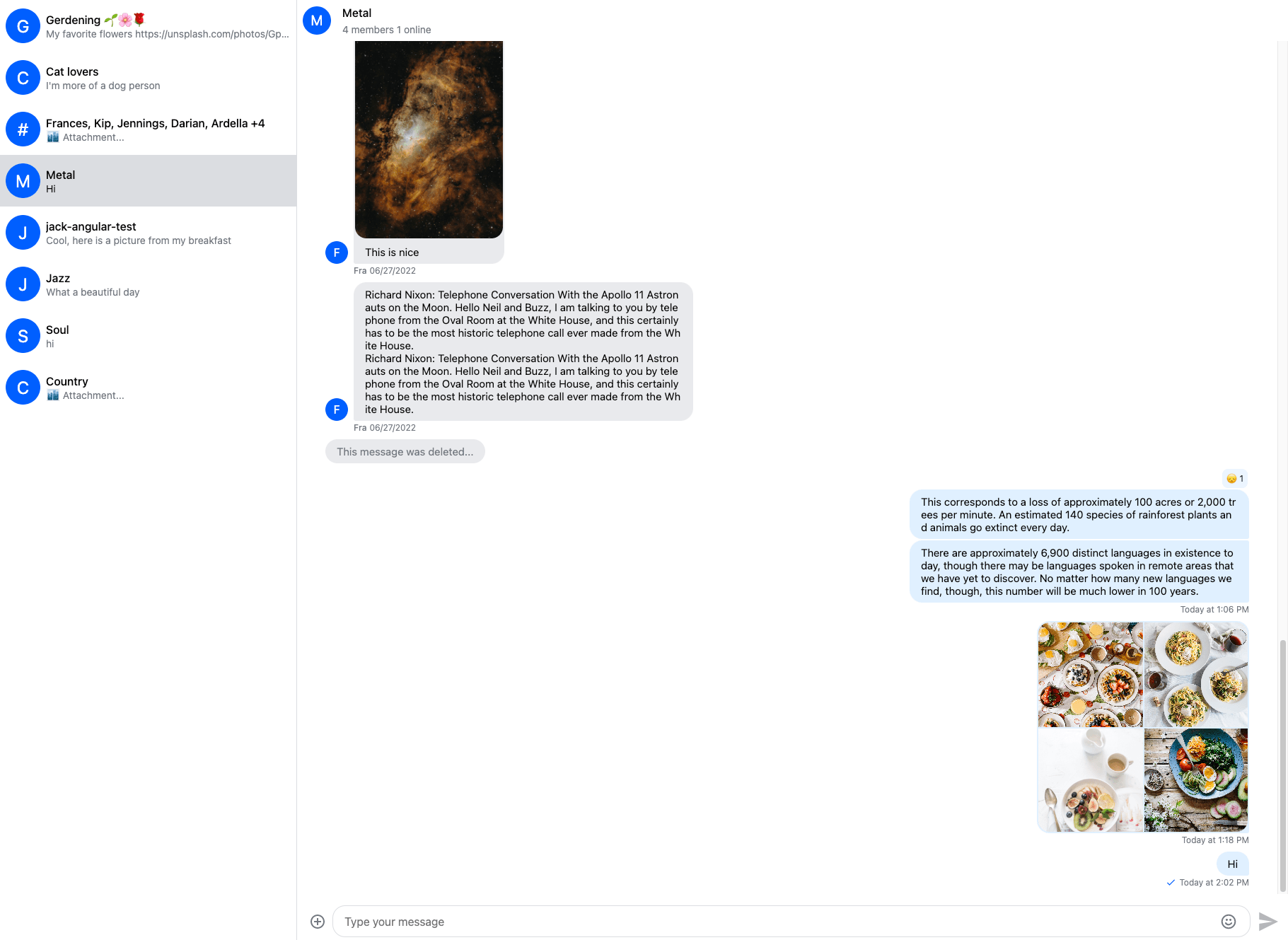
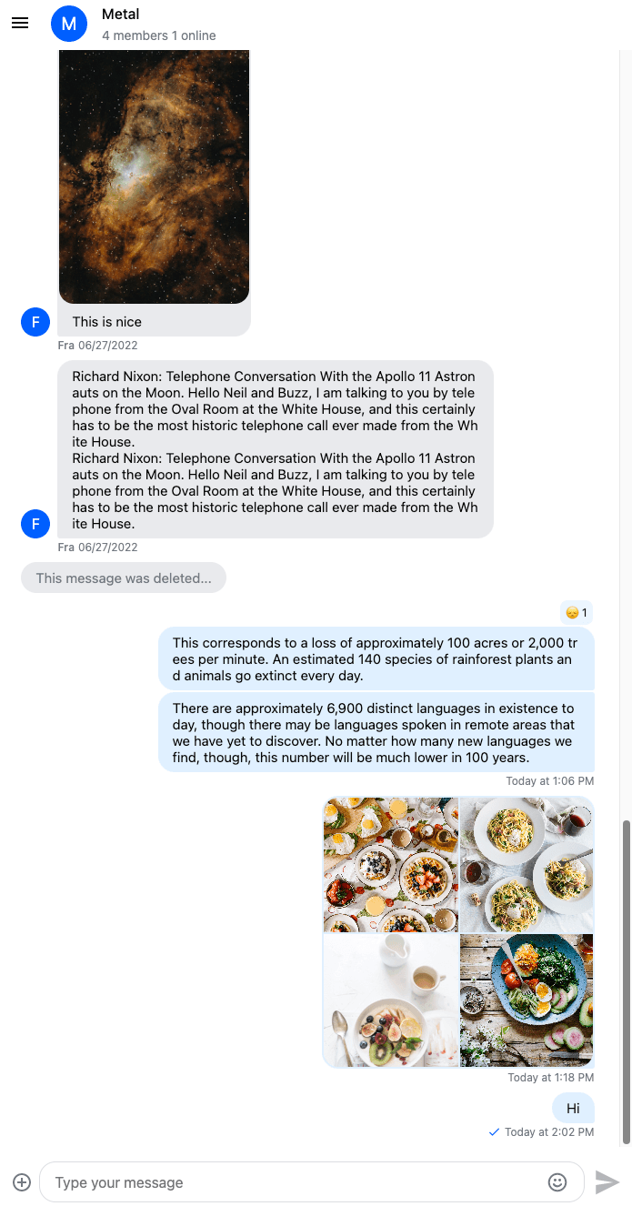
Let's create a simple chat application UI:
Let's add the layout for the channel list, channel and thread components:
#root {
  display: flex;
  height: 100%;

  .channel {
    width: 100%;
  }

  .channel-list {
    width: 30%;
  }

  .thread {
    width: 45%;
  }
}
This how our chat application looks like:
This layout works fine on bigger screens, but we should create a separate layout for mobile devices.
Mobile layout
On mobile screens, the thread and channel list components will overlay the channel component filling the whole screen.
Let's start with the thread component:
#root {
  display: flex;
  height: 100%;

  .channel {
    width: 100%;
  }

  // Overlay for thread
  .thread {
    width: 100%;
    height: 100%;
    position: fixed;
    z-index: 3;
  }

  @media screen and (min-width: 768px) {
    .channel-list {
      width: 30%;
    }

    .thread {
      width: 45%;
      position: initial;
      z-index: auto;
    }
  }
}
For the channel list component, we should add a menu button to toggle the channel list.
The ChannelHeader component has a slot where you can inject your own' menu button template:
<stream-channel-header>
  <button class="menu-button" (click)="isMenuOpen = !isMenuOpen">
    <svg
      width="24"
      height="24"
      viewBox="0 0 24 24"
      fill="none"
      xmlns="http://www.w3.org/2000/svg"
    >
      <path
        fill-rule="evenodd"
        clip-rule="evenodd"
        d="M3 8V6H21V8H3ZM3 13H21V11H3V13ZM3 18H21V16H3V18Z"
        [attr.fill]="(theme$ | async) === 'light' ? 'black' : 'white'"
      />
    </svg>
  </button>
</stream-channel-header>
.menu-button {
border: none;
background-color: transparent;
cursor: pointer;
width: 50px;
height: 50px;
}In your component class:
isMenuOpen = true;This is what the channel header looks like:
Let's add a class to the ChannelList component based on the menu state:
<stream-channel-list
  class="channel-list menu-{{ isMenuOpen ? 'open' : 'close' }}"
></stream-channel-list>
Provide the layout based on the menu state and hide the menu on bigger screens:
#root {
  display: flex;
  height: 100%;

  .menu-open {
    width: 100%;
    height: 100%;
    position: fixed;
    z-index: 3;
  }

  .menu-close {
    width: 0;
  }

  .menu-button {
    display: block;
  }

  .channel {
    min-width: 0;
    width: 100%;
  }

  .thread {
    width: 100%;
    height: 100%;
    position: fixed;
    z-index: 3;
  }

  @media screen and (min-width: 768px) {
    .menu-button {
      display: none;
    }

    .channel-list {
      width: 30%;
      max-width: 420px;
      position: initial;
      z-index: auto;
    }

    .thread {
      width: 45%;
      position: initial;
      z-index: auto;
    }
  }
}
Lastly, implement auto close behavior for the channel list:
<stream-channel-list
  (click)="closeMenu($event)"
  class="channel-list menu-{{ isMenuOpen ? 'open' : 'close' }}"
></stream-channel-list>closeMenu(event: Event) {
if ((event.target as HTMLElement).closest('stream-channel-preview')) {
this.isMenuOpen = false;
}
}