export type CustomAutocompleteItem = {
  /**
   * This is the text that will be inserted into the message input once a user selects an option (appended after the trigger character)
   */
  autocompleteLabel: string;
  // You can also add custom fields
};

export type CustomAutocomplete = {
  /**
   * The character that will trigger the autocomplete (for example #)
   *
   * The SDK supports @ and / by default, so you can't use those
   */
  triggerCharacter: string;
  /**
   * The HTML template to display an item in the autocomplete list
   */
  templateRef: TemplateRef<{ item: CustomAutocompleteItem }>;
  /**
   * Set to `true` if space characters can be part of the `autocompleteLabel`
   */
  allowSpace: boolean;
  /**
   * The options to choose from
   *
   * In case you want to use dynamic/server-side filtering, use `updateOptions` instead
   */
  options: CustomAutocompleteItem[];
  /**
   * If you want to have dynamic/server-side filtering provide a  method that will be called any time the autocomplete options should be filtered
   * @param searchTerm the text to filter by (without the trigger character), can be an empty string
   * @returns a promise that will resolve to the options, you should take care of error handling
   */
  updateOptions?: (searchTerm: string) => Promise<CustomAutocompleteItem[]>;
};Custom autocompletes
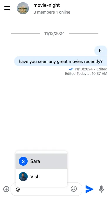
If you're using the StreamAutocompleteTextareaModule in your application, the AutocompleteTextarea component will provide out-of-the-box support for commands (like /giphy) and user mentions. More information about customizing these can be find in the AutocompleteTextarea documentation.

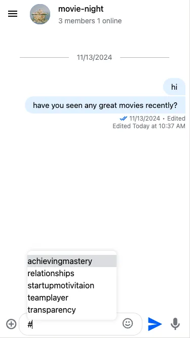
But it's also possible to add your own autocompletes (for example, to create hashtags).

This guide will show you step-by-step instructions on how to create custom autocompletes.
Autocomplete format
Let's see what is the format that your custom autocompletes should follow:
This already gives a good idea of how an autocomplete should work, but we will provide examples below.
Custom hashtags
Let's create a custom autocomplete data structure for hashtags:
@ViewChild('customAutocompleteItem')
  customAutocompleteItemTemplate!: TemplateRef<CustomAutocompleteItemContext>;

ngAfterViewInit(): void {
  const hashtagAutocomplete = {
    triggerCharacter: '#',
    options: [
      // the only required field is autocompleteLabel
      // but you can also add custom fields
      { autocompleteLabel: 'startupmotivitaion' },
      { autocompleteLabel: 'transparency' },
      { autocompleteLabel: 'achievingmastery' },
      { autocompleteLabel: 'relationships' },
      { autocompleteLabel: 'teamplayer' },
    ],
    allowSpace: false,
    templateRef: this.customAutocompleteItemTemplate,
};
}
This is what a very simple template could look like:
<ng-template #customAutocompleteItem let-item="item">
  {{ item.autocompleteLabel }}
</ng-template>
If you want to do something more complex, you can add custom fields to the options (like image), and display those fileds in your custom template.
The last step is to register the custom config to the MessageInputConfigService:
constructor(
  private messageInputConfig: MessageInputConfigService
) {}

ngAfterViewInit(): void {
  this.messageInputConfig.customAutocompletes$.next([hashtagAutocomplete]);
}
You can register multiple custom autocompletes.
Dynamic/server-side filtering
You might want to add dynamic (for example different options for different channels) or server-side (fetch options with an API call) filtering. It's possible by providing an updateOptions method:
const hashtagAutocomplete = {
  // Other config fields here

  // Leave options empty as we will fetch them from server
  options: [],
  updateOptions: (searchText: string) => {
    if (searchText.length === 0) {
      // search text can be empty; make sure to handle this as you see fit
    } else {
      try {
        const options: CustomAutocompleteItem[] = await; // your API call here
        return options;
      } catch (error) {
        // make sure to handle errors as you see fit
      }
    }
  },
};