override fun onCreate(savedInstanceState: Bundle?) {
    super.onCreate(savedInstanceState)
    // Load the ID of the channel you've opened
    val channelId = "messaging:123"

    setContent {
        ChatTheme {
            MessagesScreen(channelId = channelId)
        }
    }
}MessagesScreen
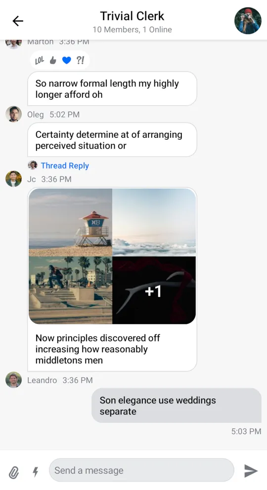
The MessagesScreen component is the second screen component in the SDK, out of the box it provides you with the following features:
- Header: Displays a back button, the name of the channel or thread and a channel avatar.
- Messages: Shows a paginated list of messages if the data is available, otherwise displays the correct empty or loading state. Sets up action handlers and displays a button for quick scroll to bottom action.
- Message composer: Handles message input, attachments and message actions like editing, replying and more.
- Attachment picker: Allows the user to select images, files and media capture.
- Message options: Shown when the user selects the message by long tapping. Allows the user to react to messages and perform different actions such as deleting, editing, replying, starting a thread and more.
- Reactions menu: Shown when the user taps on a reaction to a message. Displays all of the reactions left on the message along with the option to add or change yours.
Usage
The benefit of a screen component solution is easy integration. All you need to do to integrate MessagesScreen in your app is to call it within setContent() in your Activity or Fragment and pass in your channelId:
This small snippet of code will render the UI shown below:

Next, learn more about handling screen actions.
Handling Actions
The MessagesScreen component exposes two actions, as per the signature:
@Composable
fun MessagesScreen(
    ..., // State
    onBackPressed: () -> Unit = {},
    onHeaderActionClick: (channel: Channel) -> Unit = {},
)onBackPressed: Called when the user taps on the header back button.onHeaderActionClick: Called when the user taps on the header title. Useful for showing the channel information.
Here's an example of setting up custom behavior for the user tapping on the back button and the channel info:
MessagesScreen(
    ..., // State
    onBackPressed = { finish() }, // Navigation handler
    onHeaderActionClick = { channel ->
        // Show channel info
    },
)
Customization
Given that MessagesScreen is a screen level solution, it offers limited customization. Currently, the options offered in the signature are the following:
@Composable
fun MessagesScreen(
    messageLimit: Int = 30,
    showHeader: Boolean = true,
    enforceUniqueReactions: Boolean = true,
    showDateSeparators: Boolean = true,
    showSystemMessages: Boolean = true,
    deletedMessageVisibility: DeletedMessageVisibility = DeletedMessageVisibility.ALWAYS_VISIBLE,
    messageFooterVisibility: MessageFooterVisibility = MessageFooterVisibility.WithTimeDifference(),
    ... // action handlers and state
)messageLimit: The number of messages per query.showHeader: Controls whether the messages header is shown or not.enforceUniqueReactions: Controls whether the user can leave multiple reactions to a message.showDateSeparators: Controls if we show date separator items.showSystemMessages: Controls if we show system message items.deletedMessageVisibility: Controls the visibility of deleted messages. By default, all deleted messages are visible in the "deleted" state.messageFooterVisibility: Controls the visibility of the message footer. By default, determined by a time difference.
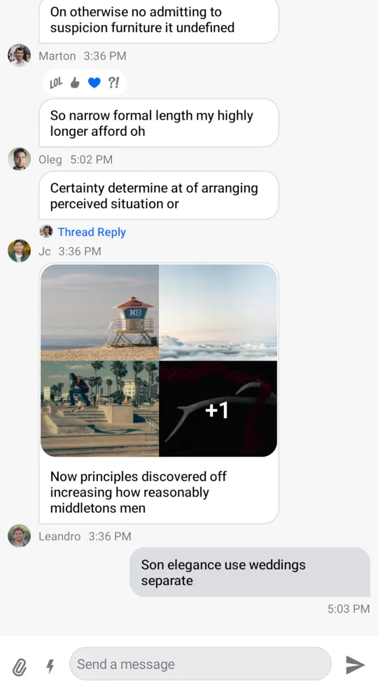
If you set showHeader to false you'll get the following UI:

As you can see, the header is removed from the screen, rendering only the list and the composer.
Even though MessagesScreen offers limited customization, you can still achieve a unique look and feel by modifying ChatTheme parameters.
For more information on how to do so read our ChatTheme page.