interface ReactionIconFactory {

    fun isReactionSupported(type: String): Boolean

    @Composable
    fun createReactionIcon(type: String): ReactionIcon

    @Composable
    fun createReactionIcons(): Map<String, ReactionIcon>
}Providing Custom Reactions
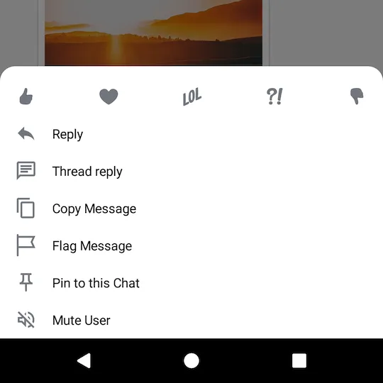
By default, the Compose SDK provides the following reaction options and corresponding icons for them:
likelovehahawowsad

If you want to override the supported set of reactions, you need to create your custom implementation of ReactionIconFactory and provide it via ChatTheme.
Creating a Custom Reaction Icon Factory
Let's have a closer look at the ReactionIconFactory interface:
As you can see, there are 3 methods in ReactionIconFactory that you need to implement:
isReactionSupported: Checks if the factory supports a reaction of the given type.createReactionIcon: Creates an instance ofReactionIconfor the given reaction type.createReactionIcons: CreatesReactionIcons for all the supported reaction types.
As an example, you'll implement a factory that supports several custom reaction types and loads icons for them from resources.
const val THUMBS_UP: String = "thumbs_up"
const val THUMBS_DOWN: String = "thumbs_down"
const val MOOD_GOOD: String = "mood_good"
const val MOOD_BAD: String = "mood_bad"

// 1
val supportedReactions = setOf(
    THUMBS_UP,
    THUMBS_DOWN,
    MOOD_GOOD,
    MOOD_BAD
)

class CustomReactionIconFactory : ReactionIconFactory {

    override fun isReactionSupported(type: String): Boolean {
        // 2
        return supportedReactions.contains(type)
    }

    @Composable
    override fun createReactionIcon(type: String): ReactionIcon {
        // 3
        return when (type) {
            THUMBS_UP -> ReactionIcon(
                painter = painterResource(R.drawable.ic_thumb_up),
                selectedPainter = painterResource(R.drawable.ic_thumb_up_selected)
            )
            THUMBS_DOWN -> ReactionIcon(
                painter = painterResource(R.drawable.ic_thumb_down),
                selectedPainter = painterResource(R.drawable.ic_thumb_down_selected)
            )
            MOOD_GOOD -> ReactionIcon(
                painter = painterResource(R.drawable.ic_mood_good),
                selectedPainter = painterResource(R.drawable.ic_mood_good_selected)
            )
            MOOD_BAD -> ReactionIcon(
                painter = painterResource(R.drawable.ic_mood_bad),
                selectedPainter = painterResource(R.drawable.ic_mood_bad_selected)
            )
            else -> throw IllegalArgumentException()
        }
    }

    @Composable
    override fun createReactionIcons(): Map<String, ReactionIcon> {
        // 4
        return supportedReactions.associateWith { createReactionIcon(it) }
    }
}
Here's what you're doing here, step-by-step:
- Creating a set of reactions, supported by this factory.
- Using the set to check if the reaction is supported. Note that unsupported reactions are ignored and are not shown in the UI.
- Creating an instance of
ReactionIconfor each supported reaction type. TheReactionIconclass encapsulatesPainters for normal and selected states of a reaction icon. - Creating
ReactionIcons for all the supported reactions.
Next, you need to make use of the factory you've created above.
Providing the Factory via ChatTheme
Finally, you just need to provide your newly created factory via ChatTheme:
class MessagesActivity : AppCompatActivity() {

    override fun onCreate(savedInstanceState: Bundle?) {
        super.onCreate(savedInstanceState)
        val channelId = requireNotNull(intent.getStringExtra(KEY_CHANNEL_ID))

        setContent {
            // Pass your factory to ChatTheme here
            ChatTheme(reactionIconFactory = CustomReactionIconFactory()) {
                MessagesScreen(
                    channelId = channelId,
                    onBackPressed = { finish() },
                    onHeaderActionClick = {}
                )
            }
        }
    }

    companion object {
        private const val KEY_CHANNEL_ID = "channelId"

        fun createIntent(context: Context, channelId: String): Intent {
            return Intent(context, MessagesActivity::class.java).apply {
                putExtra(KEY_CHANNEL_ID, channelId)
            }
        }
    }
}
The Resulting UI
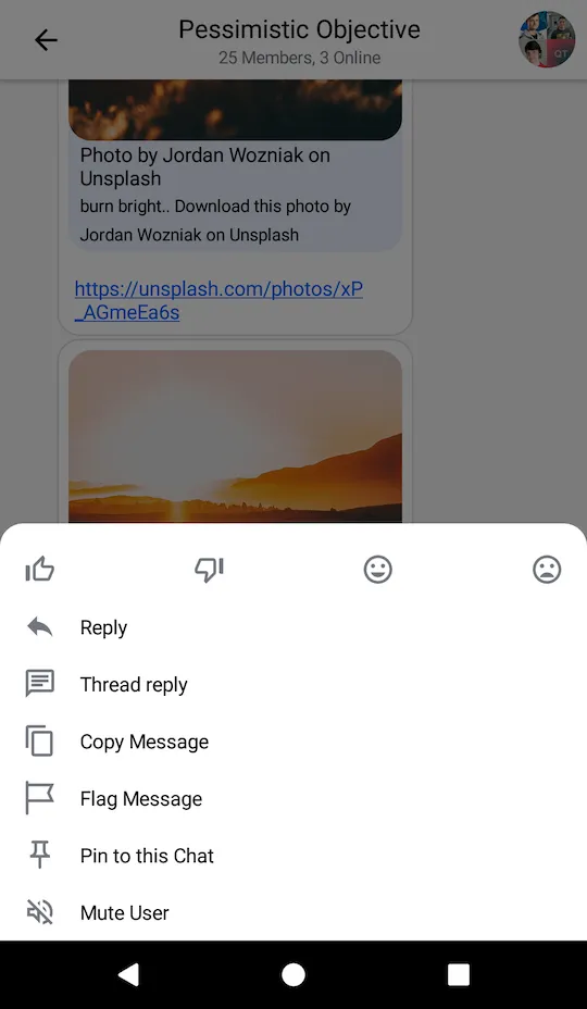
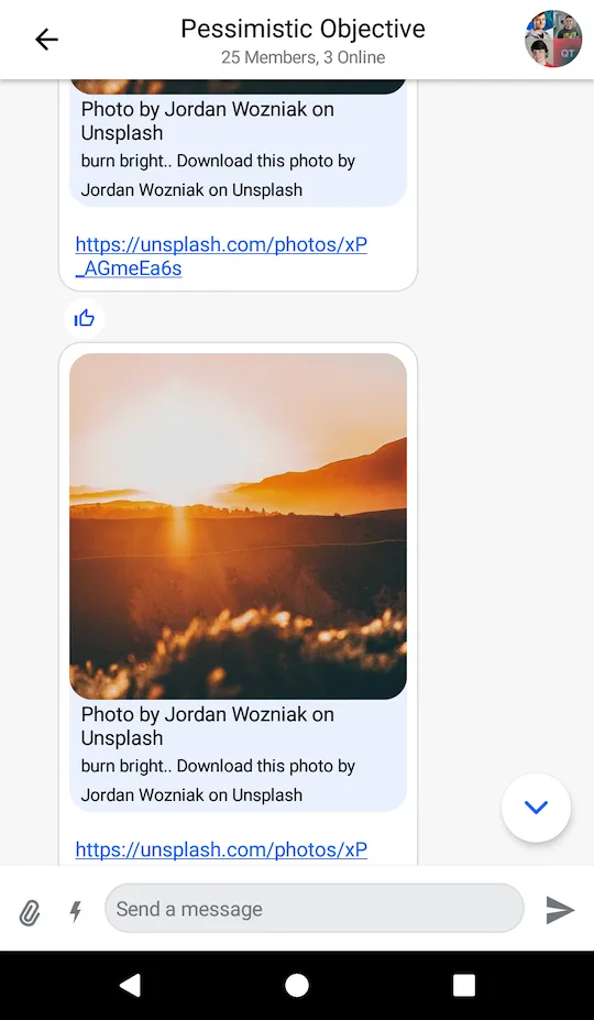
The code above will produce the following UI:
| Selected Message Menu | Message List |
|---|---|
 |  |