 React
React iOS
iOS Android
 Flutter
 JavaScript
 Unity
Unity ESP32
ESP32 Platform
 Vision Agents
import React from "react";
import { CallContent } from "@stream-io/video-react-native-sdk";
import { StyleSheet, View } from "react-native";

export const ActiveCall = () => {
  // other code omitted for brevity

  return (
    <View style={styles.container}>
      <CallContent />
    </View>
  );
};

const styles = StyleSheet.create({
  container: { flex: 1 },
});Safe Area Insets
Introduction
Mobile applications must avoid overlapping UI elements with system components: status bars, notches, home indicators, and navigation bars.
Best practices
- Always use safe area insets: Prevent content from being obscured by system UI
- Test on multiple devices: Different devices have varying safe area requirements
- Handle orientation changes: Safe areas differ between portrait and landscape
- Apply insets consistently: Use theme-level configuration for uniform spacing
The problem
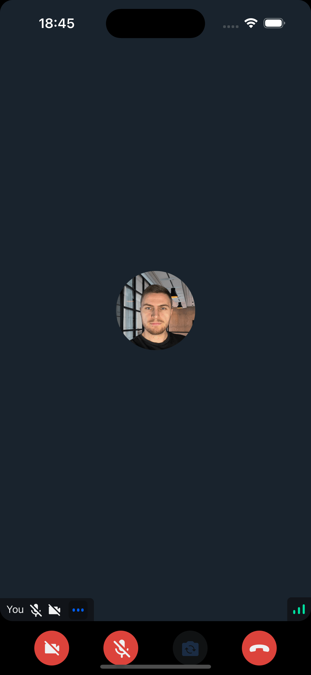
A basic CallContent component usage without safe area handling:
Result: UI elements overlap with system areas:
Recommended setup
Configure safe area handling once near your app root:
- Add
SafeAreaProvider - Enable Android edge-to-edge display
- Map safe area insets to the SDK theme
- Pass the theme to
StreamVideoorStreamTheme
Add SafeAreaProvider
Use insets from react-native-safe-area-context. This package automatically calculates padding values based on the device's notch, home indicator, and status bar.
react-native-safe-area-context is included by default in Expo. For non-Expo projects:
npm install react-native-safe-area-contextWrap your app root with SafeAreaProvider:
import { SafeAreaProvider } from "react-native-safe-area-context";

export const Root = () => (
  <SafeAreaProvider>
    <App />
  </SafeAreaProvider>
);
Enable Android edge-to-edge display
On Android, enable edge-to-edge display so the system bars and safe-area values match:
Set edgeToEdgeEnabled in your app config. This keeps the project explicit and enables edge-to-edge display on supported Android versions:
{
  "expo": {
    "android": {
      "edgeToEdgeEnabled": true
    }
  }
}Map insets to the SDK theme
Read the current insets and pass them to theme.variants.insets:
import { DeepPartial, Theme } from "@stream-io/video-react-native-sdk";
import { useSafeAreaInsets } from "react-native-safe-area-context";

export const useCustomTheme = (): DeepPartial<Theme> => {
  const { top, right, bottom, left } = useSafeAreaInsets();

  const variants: DeepPartial<Theme["variants"]> = {
    insets: {
      top,
      right,
      bottom,
      left,
    },
  };

  const customTheme: DeepPartial<Theme> = {
    variants,
  };

  return customTheme;
};
Pass the theme to the SDK
Provide the custom theme to the style prop of StreamVideo:
import {
  StreamVideo,
  StreamVideoClient,
} from "@stream-io/video-react-native-sdk";
import { useCustomTheme } from "../theme";

export const App = () => {
  const client = StreamVideoClient.getOrCreateInstance(/* ... */);
  const customTheme = useCustomTheme();

  return (
    <StreamVideo client={client} style={customTheme}>
      <MyUI />
    </StreamVideo>
  );
};
Alternatively, pass the prop to StreamTheme to wrap specific components:
import {
StreamTheme,
StreamVideo,
StreamVideoClient,
} from "@stream-io/video-react-native-sdk";
import { useCustomTheme } from "../theme";
export const App = () => {
const client = StreamVideoClient.getOrCreateInstance(/* ... */);
const customTheme = useCustomTheme();
return (
<StreamVideo client={client}>
<StreamTheme style={customTheme}>
<MyUI />
</StreamTheme>
</StreamVideo>
);
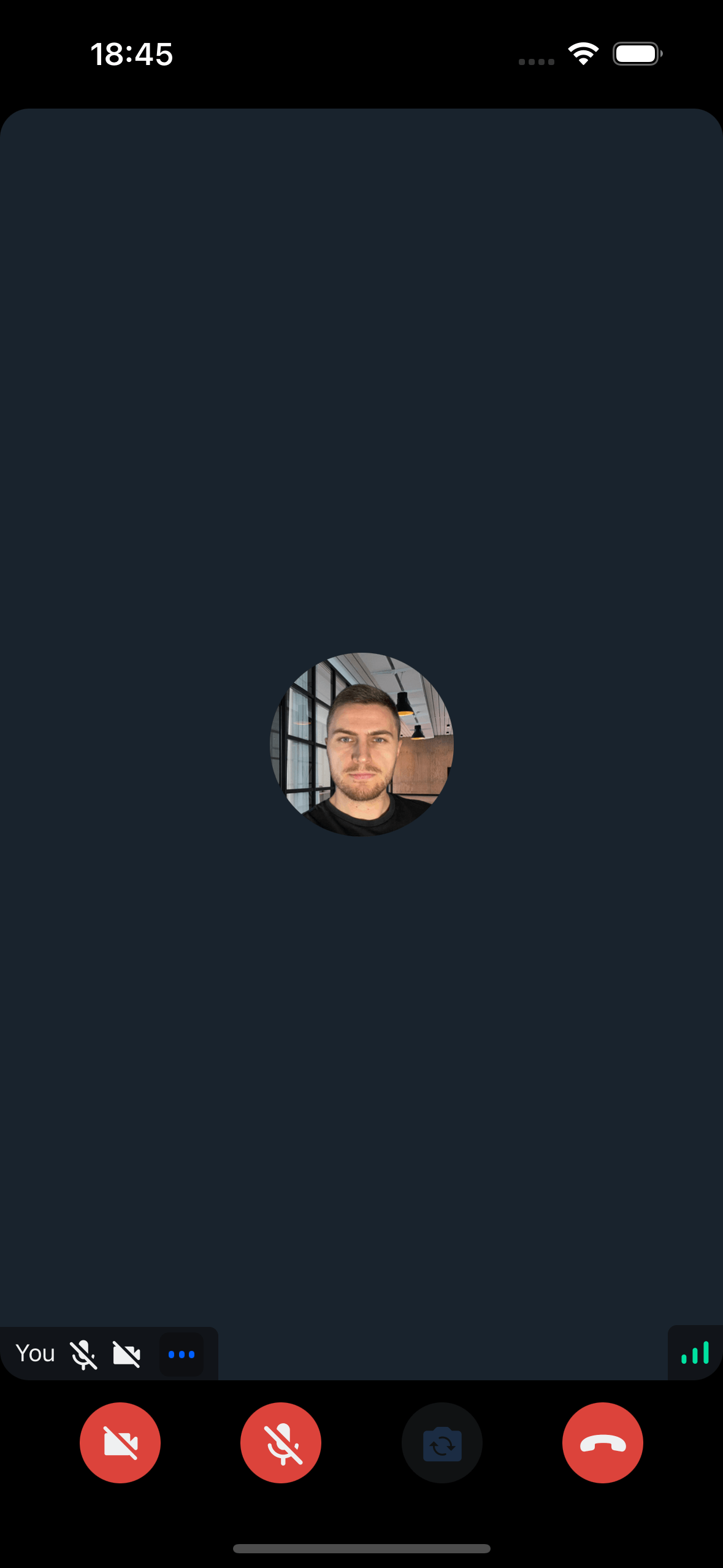
};Without additional code changes, the insets are properly applied:
Avoid double padding
After the SDK receives theme.variants.insets, full-screen SDK components apply those values internally. Avoid wrapping CallContent, RingingCallContent, HostLivestream, or ViewerLivestream in SafeAreaView, because that can add padding twice.
Custom controls and overlays
If you replace SDK controls with custom UI, keep the SDK's inset padding in mind.
When you render your own top bar outside CallContent, the SDK's default top padding can create extra space between your top bar and the video layout. Scope the override to that CallContent instance instead of changing your root theme:
import React, { PropsWithChildren } from "react";
import { StreamTheme, useTheme } from "@stream-io/video-react-native-sdk";

const CallContentWithoutTopInset = ({ children }: PropsWithChildren) => {
  const { theme } = useTheme();
  const themeOverride = {
    ...theme,
    callContent: {
      ...theme.callContent,
      container: {
        ...theme.callContent.container,
        paddingTop: 0,
      },
    },
  };

  return <StreamTheme theme={themeOverride}>{children}</StreamTheme>;
};<CustomTopBar />
<CallContentWithoutTopInset>
<CallContent CallControls={CustomBottomControls} />
</CallContentWithoutTopInset>When your custom bottom controls render absolute overlays, subtitles, or drawers, include the bottom inset in your positioning math. CallContent already adds bottom safe-area padding, so offsets measured from custom controls often need theme.variants.insets.bottom too:
const {
  theme: {
    variants: { insets },
  },
} = useTheme();

const subtitleBottom = controlsHeight + insets.bottom;
const drawerOffset = -controlsHeight - insets.bottom;On this page: