








FloatingParticipantView
Draggable floating view displaying local participant's video stream.

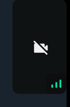
When the video is muted, the video muted icon is shown in a disabled background.
General Usage
Standalone usage:
import {
  FloatingParticipantView,
  useCallStateHooks,
} from "@stream-io/video-react-native-sdk";

const App = () => {
  const { useLocalParticipant } = useCallStateHooks();
  const localParticipant = useLocalParticipant();
  return <FloatingParticipantView participant={localParticipant} />;
};
Props
alignment
Determines where the floating participant video will be placed initially.
| Type | Default value |
|---|---|
top-left |top-right|bottom-left|bottom-right |
top-right |
participant
The participant to be rendered in the FloatingParticipantView.
| Type |
|---|
StreamVideoParticipant|undefined |
onPressHandler
Handler used to handle actions on click of the participant view in FloatingParticipantView.
| Type |
|---|
() => void | undefined |
participantViewStyle
Custom style to be merged with the container of the participant view.
| Type |
|---|
| ViewStyle |
draggableContainerStyle
Custom style to be merged with the absolute container of the floating participant view. This is the container that holds the participant view and the whole of its draggable area.
| Type |
|---|
| ViewStyle |
videoZOrder
The zOrder for the video that will be displayed.
| Type | Default Value |
|---|---|
number |
1 |
objectFit
Represents how the video view fits within the parent view.
| Type | Default Value |
|---|---|
'contain' | 'cover' |undefined |
cover |
mirror
Forces participant's video to be mirrored or unmirrored. By default, video track from the local participant is mirrored, and all other videos are not mirrored.
| Type |
|---|
boolean |
ParticipantLabel
Component to customize the Label of the participant.
| Type | Default Value |
|---|---|
ComponentType| undefined |
ParticipantLabel |
ParticipantReaction
Component to customize the participant reaction display.
| Type | Default Value |
|---|---|
ComponentType| undefined |
ParticipantReaction |
ParticipantNetworkQualityIndicator
Component to customize the network quality indicator of the participant.
| Type | Default Value |
|---|---|
ComponentType| undefined |
ParticipantNetworkQualityIndicator |
ParticipantVideoFallback
Component to customize the video fallback of the participant, when the video is disabled.
| Type | Default Value |
|---|---|
ComponentType| undefined |
ParticipantVideoFallback |
ParticipantView
Prop to customize the ParticipantView component entirely.
| Type | Default Value |
|---|---|
ComponentType| undefined |
ParticipantView |
VideoRenderer
Component to customize the participant video. Also displays the ParticipantVideoFallback.
The VideoRenderer accepts a mirror?: boolean prop to force mirroring on or off. When provided, it takes precedence over the default mirroring logic.
| Type | Default Value |
|---|---|
ComponentType| undefined |
VideoRenderer |
Props
| Prop | Type | Default Value | Description |
|---|---|---|---|
participant |
StreamVideoParticipant |
The participant whose video or screenshare should be rendered. | |
trackType |
videoTrack | screenShareTrack |
videoTrack |
The track to render. |
isVisible |
boolean |
true |
When false, the video stream is not shown even if it is available. |
objectFit |
'contain' | 'cover' | undefined |
undefined |
How the video fits within its container. When omitted, a default is computed from the track dimensions. |
videoZOrder |
number |
0 |
The z-order to apply to the underlying RTC view. |
mirror |
boolean | undefined |
undefined |
Forces mirroring on or off. When omitted, the default mirroring logic is used. |
ParticipantVideoFallback |
ComponentType | null | undefined |
ParticipantVideoFallback |
Component to render when video is unavailable. Use null to disable the fallback. |