 React
React iOS
iOS Android
 Flutter
 JavaScript
 Unity
Unity ESP32
ESP32 Platform
 Vision Agents
ParticipantsSpotlight(call = call)ParticipantsSpotlight
ParticipantsSpotlight is a Composable component that allows you to highlight one participant so that it takes up most of the screen, while the rest are rendered
either as a horizontal or vertical list, depending on orientation.
Let's see how to use the ParticipantsSpotlight component.
Usage
To use the ParticipantsSpotlight component in your app you can use it directly as a component or you can configure the ParticipantsLayout to display the spotlight.
Use it directly
The only mandatory parameter is call which represents the call for which the participants are being displayed.
Use it via ParticipantsLayout
If you are using the ParticipantsLayout you can use an enum value LayoutType with one of three options.
Those are:
//Automatically choose between Grid and Spotlight based on pinned participants and dominant speaker.
DYNAMIC
//Force a spotlight view, showing the dominant speaker or the first speaker in the list.
SPOTLIGHT
//Always show a grid layout, regardless of pinned participants.
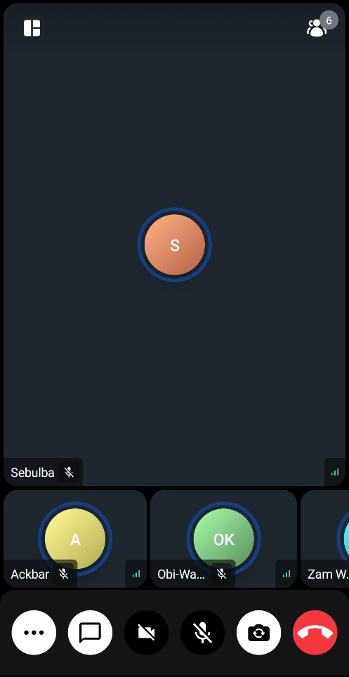
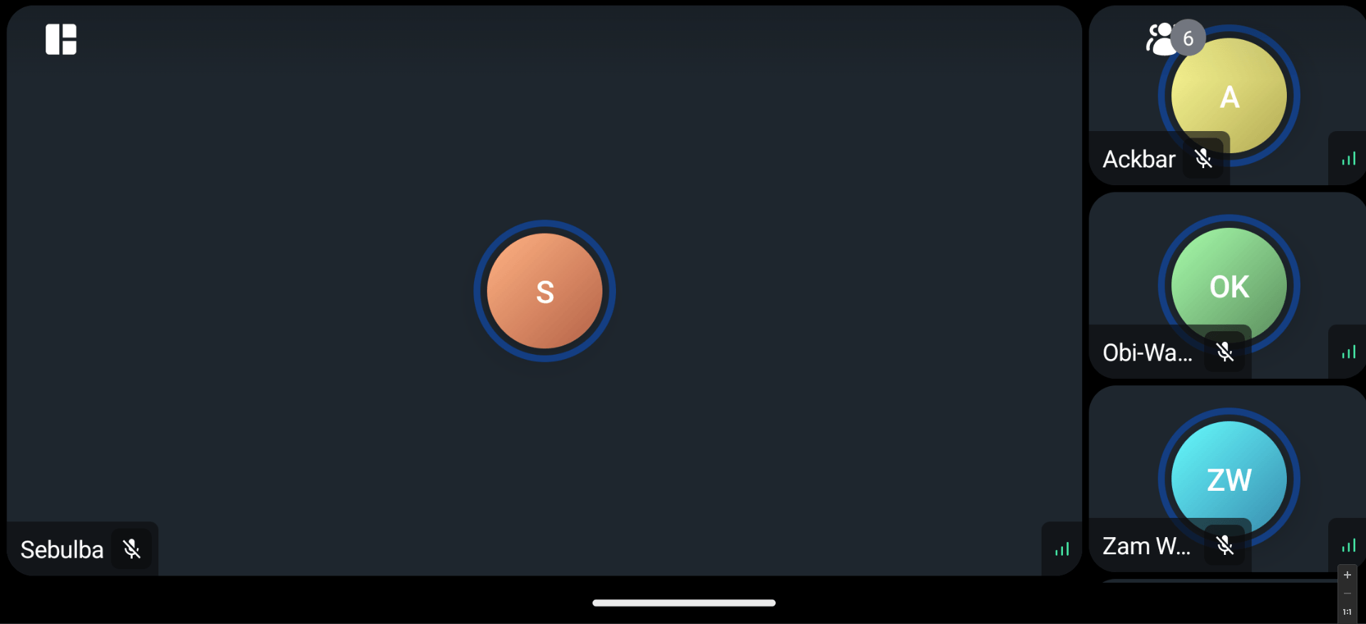
GRIDHere is how it looks in action:
ParticipantsLayout(
    layoutType = LayoutType.SPOTLIGHT,
    call = call
)
The ParticipantsLayout internally displays the ParticipantSpotlight in two cases.
- You have set the
layoutTypetoLayoutType.SPOTLIGHTin which case a participant is always spotlighted. The participant shown in the spotlight is chosen based on the following order:- is pinned
- is dominant speaker
- is first in the participants list
- You have set the
LayoutTypetoLayoutType.DYNAMICin which case if there is a pinned participant, the spotlight view will be chosen in favor of grid.
Note: ParticipantLayout will always prioritize screen sharing regardless of the LayoutType if there is a screen sharing session active.
Using this component, you'll likely see something similar to the following UI:
Let's see how to customize this component.
Customization
This is a very simple component so it doesn't have replaceable slots, but it still offers ways to customize its appearance.
modifier: Modifier for styling.isZoomable: Decide if this spotlight video renderer is zoomable or not.style: Defined properties for styling a single video call track.videoRenderer: A single video renderer that renders each individual participant. If you want to use your own video renderer, you can implement your own composable withvideoRenderer.
If you're looking for guides on how to override and customize this UI, we have various UI Cookbooks for you and we cover a portion of customization within the Video Android SDK Tutorial.