 React
React iOS
iOS Android
 Flutter
 JavaScript
 Unity
Unity ESP32
ESP32 Platform
 Vision Agents
@Composable
fun CustomCallScreen(call: Call) {
    val participants by call.state.participants.collectAsState()

    Column {
        participants.forEach { participant ->
            ParticipantVideo(
                modifier = Modifier.padding(16.dp),
                call = call,
                participant = participant,
                style = RegularVideoRendererStyle()
            )
        }
    }
}ParticipantVideo
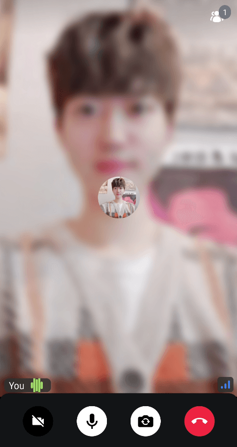
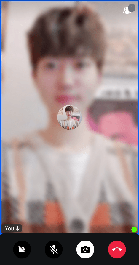
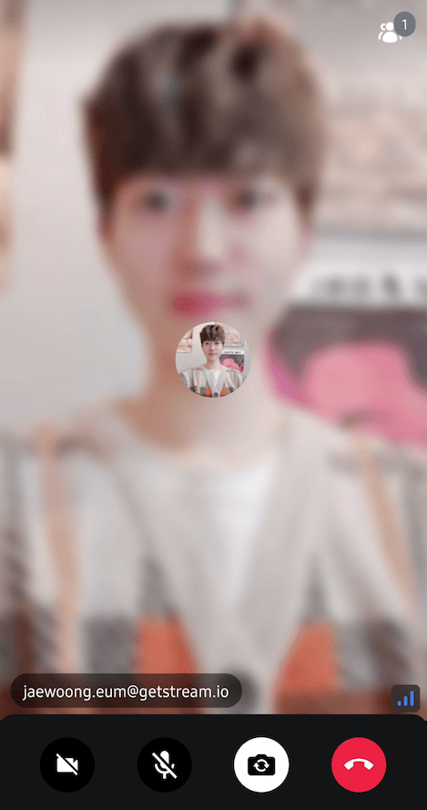
The ParticipantVideo component is used to render a participant based on ParticipantState in a call. It renders the participant video if their track is not null and is correctly published, or a user avatar if there is no video to be shown.
The component also renders the user label, which includes the user's name and call status, such as mute state. Additionally, if the user is focused, the component renders a border to indicate that the participant is the primary speaker.
What can you do with ParticipantVideo:
- Render a audio/video track from the given
ParticipantState. - Displays participant's information, such as name, audio level, microphone status, network connectivity quality, reactions, and more.
- Displays a border on the participant who is currently speaking.
Let's see how to use it.
Build a Custom Call Screen With ParticipantVideo
To use the ParticipantVideo component, embed it anywhere in your custom UI and pass in the necessary parameters:
You can fetch the state of all participants by using call.state and you can enrich it by exploring the dominantSpeaker. Using the participants, you can render any UI group of elements based on your use case - in this snippet a Column of items.
To render the participant, you need the following state:
call: Used to determine the rest of the information we represent in the UI, based on the call state.participant: The state of the call participant you want to render. It contains audio & video tracks, user information, screensharing sessions, reactions, and everything that should be needed to render each participant.style:VideoRendererStyleallows you to customize participant videos, such as displaying a focused border, a participant label, reactions, and more. There are two pre-defined styles, which areRegularVideoRendererStyleandScreenSharingVideoRendererStyle.
Each of the ParticipantVideo items should look something like this:

The users should have their video visible, or an avatar if there are no tracks available. On top of that, there is a label that has the name or ID laid out, as well as the current mute or speaking state, with the connection quality being on the side.
Let's see how to customize the actions or the UI of the component.
Customization
When it comes to customization, the ParticipantVideo items allow the following:
@Composable
public fun ParticipantVideo(
    call: Call,
    participant: ParticipantState,
    modifier: Modifier = Modifier,
    style: VideoRendererStyle = RegularVideoRendererStyle(),
    labelContent: @Composable BoxScope.(ParticipantState) -> Unit,
    connectionIndicatorContent: @Composable BoxScope.(NetworkQuality) -> Unit,
    scalingType: VideoScalingType = VideoScalingType.SCALE_ASPECT_FILL,
    videoFallbackContent: @Composable (Call) -> Unit,
    reactionContent: @Composable BoxScope.(ParticipantState) -> Unit,
    actionsContent: @Composable BoxScope.(List<ParticipantAction>, Call, ParticipantState) -> Unit,
)modifier: Used to apply styling to the component, such as extra borders, background, elevation, size or shape and more.style: Allows you to customize pre-built components, such as the label, the connection indicator, reactions, and everything that is built top on the video renderer.labelContent: Content that displays participant's name and device states. For more details, check out Participant Label to customize the participant's label.connectionIndicatorContent: Content that indicates the connection quality. For more details, check out Network Quality Indicator to customize the network quality indicator.scalingType: Configures how the video is scaled within its container. Default isSCALE_ASPECT_FILL.videoFallbackContent: Content that is shown when the video track has failed to load or not available. For more details, check out Video Fallback to customize the network quality indicator.reactionContent: Content that is shown for reactions.actionsContent: Content that displays participant actions (e.g., pin, mute). Provides a list of available actions, the call, and the participant state.
Use this to further customize the look and feel of participant video items in your UI. By using those custom styles above, you can build many different types of video renderers by your taste:
| Participant Label With a Volume Indicator | Network Quality Indicator | Custom Participant Label | Video Renderer Circular Shape |
|---|---|---|---|
 |  |  |  |
The ParticipantVideo is a crucial component in our SDK, used by many of our larger-scale and higher-level components, such as the ParticipantsLayout, which you'll explore next. ParticipantsLayout is just a group version that shows more than one participant and adjusts its UI accordingly.
For more customization of ParticipantVideo, check out Video Renderer UI Cookbook.