 React
React iOS
iOS Android
 Flutter
 JavaScript
 Unity
Unity ESP32
ESP32 Platform
 Vision Agents
import io.getstream.video.android.compose.ui.components.avatar.UserAvatar

@Composable
fun MyCustomAvatar(user: User) {
    UserAvatar(
        modifier = Modifier.size(56.dp),
        userImage = user.image,
        userName = user.name,
    )
    // ... rest of your code
}Avatar
In our Video SDK, we provide the UserAvatar component - a Jetpack Compose utility that renders an image or initials based on the user state. If the user has an image URL defined in their profile, the component renders the image. Otherwise, it shows the user's initials based on the userName.
Let's see how to use the component.
Usage
To add the UserAvatar component to your layout, you can use the UserAvatar composable function like this:
As mentioned, if the userImage is not null or empty, the component will try to render the image. Otherwise it will just show the user initials based on the userName, like so:
| With Image | With Initials |
|---|---|
 | 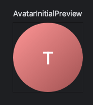 |
This component is very simple, but it allows different types of customization. Let's explore them.
Handling Actions
The UserAvatar component exposes the following behavior customization:
public fun UserAvatar(
    userImage: String? = null,
    userName: String? = null,
    onClick: (() -> Unit)? = null,
)userImage: The URL of the image to be displayed. If the image exists, it'll be rendered. Otherwise, the behavior of the component changes to render the initials.userName: Used as a fallback for theuserImagebeing empty or failing to load. The initials are derived from this name.onClick: Handler when the user clicks on the avatar.
You can pass these parameters when calling the UserAvatar component to customize what data it renders and how it behaves when clicked.
The UserAvatar component also offers extensive UI customization options.
Customization
The UserAvatar allows the following customization options for its UI:
public fun UserAvatar(
    modifier: Modifier = Modifier,
    userImage: String? = null,
    userName: String? = null,
    shape: Shape = VideoTheme.shapes.circle,
    imageScale: ContentScale = ContentScale.Crop,
    imageDescription: String? = null,
    imageRequestSize: IntSize = IntSize(DEFAULT_IMAGE_SIZE, DEFAULT_IMAGE_SIZE),
    loadingPlaceholder: Int? = LocalAvatarPreviewProvider.getLocalAvatarLoadingPlaceholder(),
    previewModePlaceholder: Int = LocalAvatarPreviewProvider.getLocalAvatarPreviewPlaceholder(),
    textStyle: TextStyle = VideoTheme.typography.titleM,
    textOffset: DpOffset = DpOffset(0.dp, 0.dp),
    isShowingOnlineIndicator: Boolean = false,
    onlineIndicatorAlignment: OnlineIndicatorAlignment = OnlineIndicatorAlignment.TopEnd,
    onlineIndicator: @Composable BoxScope.() -> Unit = { /* default indicator */ },
    onClick: (() -> Unit)? = null,
)modifier: Used for styling the base component. Helpful for defining thesizeof the component and adding extra decoration.userImage: The URL of the image to be displayed.userName: The name to be used for initials when the image is unavailable.shape: How the component is clipped. You can easily customize this component on a global SDK level, by changing theVideoTheme.shapes.circleproperty ofStreamShapes. Alternatively, you can pass in a custom shape for each instance of theUserAvatarcomponent you call.imageScale: Used to define the scale type for the image.imageDescription: Helps define accessibility attributes for easier navigation.imageRequestSize: The size of the image to request.loadingPlaceholder: Renders a placeholder image while the image is loading.previewModePlaceholder: Renders a placeholder on Android Studio to support Compose Previews.textStyle: Defines the style of text used for the initials avatar.textOffset: Padding offset for the initials avatar.isShowingOnlineIndicator: Flag to show/hide the online indicator.onlineIndicatorAlignment: Alignment of the online indicator.onlineIndicator: Custom composable for the online indicator.onClick: Handler when the user clicks on the avatar.
Using these parameters you can completely overhaul how the UserAvatar component looks and behaves. You can change the shape to be a square, squircle or a custom drawn shape, you can change its size, scale type and add placeholders.
The UserAvatar component automatically handles both image and initials rendering. If you want to force initials-only display, simply pass null for userImage:
import io.getstream.video.android.compose.ui.components.avatar.UserAvatar
@Composable
fun MyCustomAvatar(user: User) {
// Automatic: renders image if available, otherwise initials
UserAvatar(
modifier = Modifier.size(56.dp),
userImage = user.image,
userName = user.name,
)
// Force initials-only display
UserAvatar(
modifier = Modifier.size(56.dp),
userImage = null,
userName = user.name,
textStyle = VideoTheme.typography.titleM // custom text style
)
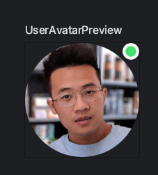
}UserAvatar with Online Indicator
The UserAvatar component can display an online indicator depending on the user's information.
UserAvatar(
    modifier = Modifier.size(56.dp),
    userImage = user.image,
    userName = user.name,
    isShowingOnlineIndicator = true,
    onlineIndicatorAlignment = OnlineIndicatorAlignment.TopEnd
)
The result looks like this:
You can also customize with your own online indicator by implementing your own composable inside onlineIndicator parameter like so:
UserAvatar(
    modifier = Modifier.size(56.dp),
    userImage = user.image,
    userName = user.name,
    isShowingOnlineIndicator = true,
    onlineIndicator = {
        Box(
            modifier = Modifier.align(Alignment.TopEnd)
                .size(12.dp)
                .background(VideoTheme.colors.baseSheetPrimary, CircleShape)
                .padding(2.dp)
                .background(VideoTheme.colors.brandPrimary, CircleShape)
        )
    }
)
Note that all of these components have several properties exposed in our VideoTheme, such as the initials text style, the color, shape and more.
Make sure to explore our VideoTheme guide to learn more.