 React
React iOS
iOS Android
 Flutter
 JavaScript
 Unity
Unity Platform
 Python AI
import type { DeepPartial, Theme } from "@stream-io/video-react-native-sdk";
const theme: DeepPartial<Theme> = {
callControls: {
container: {
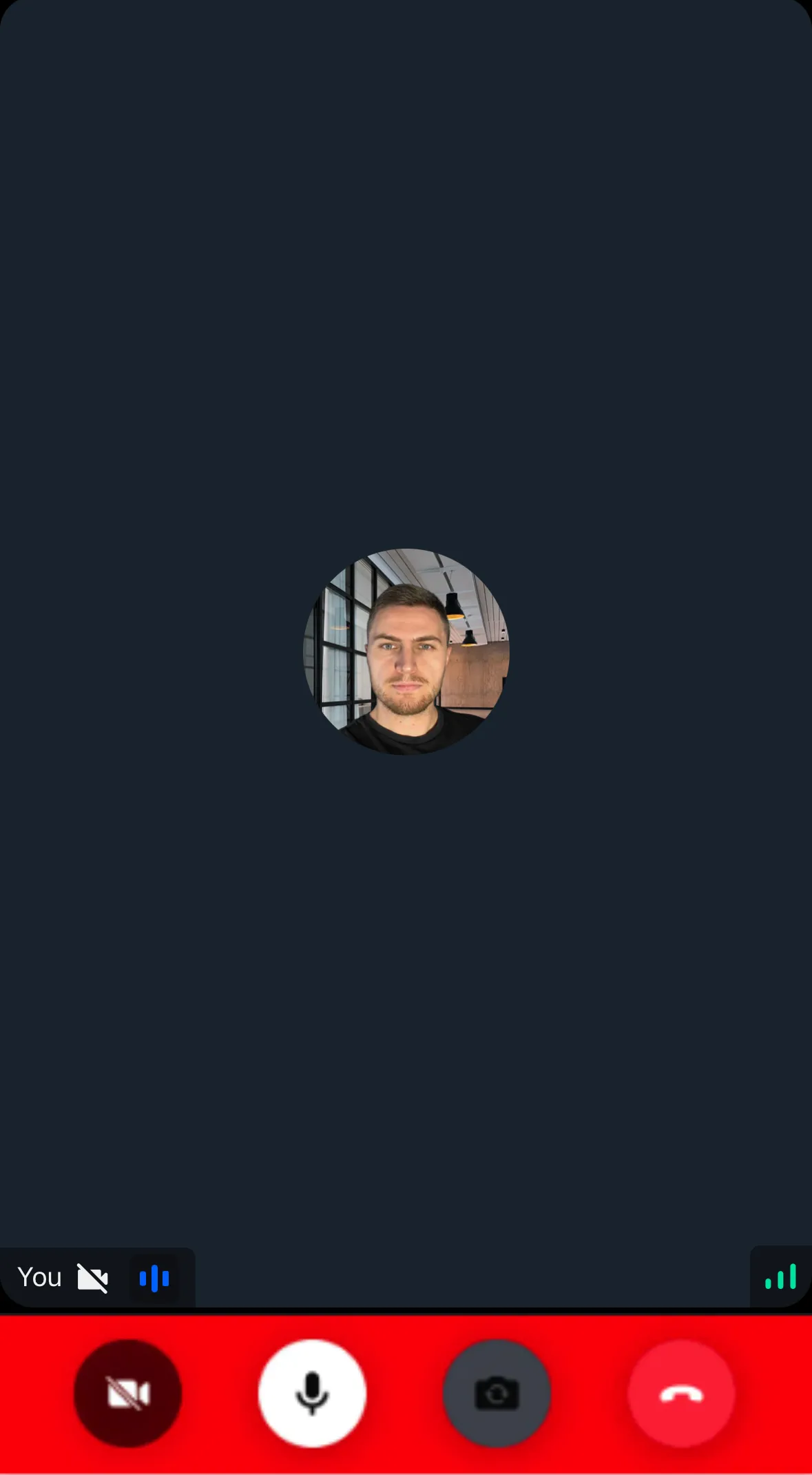
backgroundColor: "red",
},
},
};Theme
The React Native Video SDK includes a default UI theme. Customize it to match your app's design.
Best Practices
- Use exported types - Ensure correct theme object keys with TypeScript
- Override selectively - Deep merge only overwrites specified styles
- Use DeepPartial - All keys at every depth are optional
- Apply via StreamVideo - Pass theme to the
styleprop
See the default theme.
Usage
Use exported types for accurate theme creation. Theme props are deep merged with defaults:
Pass the theme to StreamVideo style prop:
import {
  StreamVideo,
  StreamVideoClient,
} from "@stream-io/video-react-native-sdk";

export const App = () => {
  const client = new StreamVideoClient(/* ... */);

  return (
    <StreamVideo client={client} style={theme}>
      <MyUI />
    </StreamVideo>
  );
};
Alternatively, you can pass the same prop to StreamTheme and then wrap any components that need the custom theme.
// ... same code

return (
  <StreamVideo client={client}>
    <StreamTheme style={theme}>
      <MyUI />
    </StreamTheme>
  </StreamVideo>
);
You can change the default button, icon and avatar variants using the buttonSizes, iconSizes and the avatarSizes under the variants property.
The font style and the colors can be changed as well for different font and color usages within the SDK using the typefaces and the colors property.