 React
React iOS
iOS Android
 Flutter
 JavaScript
 Unity
Unity ESP32
ESP32 Platform
 Vision Agents
import "@stream-io/video-react-sdk/dist/css/styles.css";
import {
  Call,
  CallControls,
  StreamCall,
  SpeakerLayout,
} from "@stream-io/video-react-sdk";

const MyCallUI = () => {
  let call: Call;

  return (
    <StreamCall call={call}>
      <SpeakerLayout />
      <CallControls />
    </StreamCall>
  );
};Call Control Actions
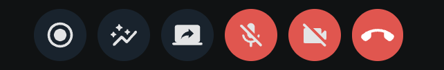
Call controls allow users to execute actions during a call (e.g., start recording) or before joining (e.g., mute/unmute). The built-in CallControls component displays controls based on user permissions. Each control is also available as a separate component.
Best Practices
- Use
CallControlsfor standard call UIs - it handles permissions automatically. - Use individual control components (e.g.,
ToggleAudioPublishingButton) for custom layouts. - Provide
onLeavecallback to handle post-call navigation.
General usage
CallControls displays available controls based on user permissions:
Props
onLeave
| Type |
|---|
(err?: Error) => void | undefined |
A callback invoked after leave attempt. On failure, it receives the thrown Error.
Built-in call controls
Each call control is available as a separate UI component. Each component takes care of authorization.
AcceptCallButton
This component is used in the ringing call component to accept an incoming call.
Props
| Name | Description | Type |
|---|---|---|
disabled | Set true to disable the button | boolean | undefined |
onClick | Event handler to override the default click behavior | MouseEventHandler<HTMLButtonElement> | undefined |
onAccept | Callback invoked after accept attempt (receives error on failure) | (err?: Error) => void | undefined |
CancelCallButton
This component can be used to leave a call or to reject an incoming/outgoing call.
Props
| Name | Description | Type |
|---|---|---|
disabled | Set true to disable the button | boolean | undefined |
onClick | Event handler to override the default click behavior | MouseEventHandler<HTMLButtonElement> | undefined |
onLeave | Callback invoked after leave attempt (receives error on failure) | (err?: Error) => void | undefined |
CancelCallConfirmButton
Use this component to leave a call or end it for all participants, only if the participant has OwnCapability.END_CALL.
Props
| Name | Description | Type |
|---|---|---|
disabled | Set true to disable the button | boolean | undefined |
onClick | Event handler to override the default click behavior | MouseEventHandler<HTMLButtonElement> | undefined |
onLeave | Callback invoked after leave/end attempt (receives error on failure) | (err?: Error) => void | undefined |
ReactionsButton
This component can be used to send reactions during a call. The following reactions are supported by default:
- like 👍
- raise hand ✋
- fireworks 🎉
Props
| Name | Description | Type |
|---|---|---|
reactions | Override or extend the default reactions/emojis | StreamReaction[] | undefined |
RecordCallButton
This component can be used to start/stop call recording. It's also used as a visual indicator to let participants know if there is an ongoing call recording.
Props
| Name | Description | Type |
|---|---|---|
caption | The explanatory text displayed under the control button | string | undefined |
RecordCallConfirmationButton
This component can be used to start/stop a call recording. A confirmation will be shown to let the participant cancel or confirm to ending the recording that is in progress.
Props
| Name | Description | Type |
|---|---|---|
caption | The explanatory text displayed under the control button | string | undefined |
ScreenShareButton
This component can be used to start/stop screen sharing. It's also used as a visual indicator to let participants know if there is an ongoing screen share. This component only allows a single ongoing screen share.
Props
| Name | Description | Type |
|---|---|---|
caption | The explanatory text displayed under the control button | string | undefined |
In addition to caption, all of the device-toggle buttons below (ToggleAudioPreviewButton, ToggleAudioPublishingButton, ToggleAudioOutputButton, ToggleVideoPreviewButton, ToggleVideoPublishingButton) accept the following device-selector menu props:
| Name | Description | Type | Default |
|---|---|---|---|
Menu | The device-selector menu rendered next to the button | ComponentType | ReactElement | null | The matching device selector |
menuPlacement | Where the menu is positioned relative to the button | Placement | 'top' |
onMenuToggle | Callback invoked when the menu is opened or closed | (shown: boolean) => void | undefined | undefined |
ToggleAudioPreviewButton
This component can be used to toggle the initial audio state in the lobby preview.
Props
| Name | Description | Type |
|---|---|---|
caption | The explanatory text displayed under the control button | string | undefined |
ToggleAudioPublishingButton
This component can be used to
- mute/unmute the microphone during a call
- select an audio input device during a call
Props
| Name | Description | Type |
|---|---|---|
caption | The explanatory text displayed under the control button | string | undefined |
ToggleAudioOutputButton
This component can be used to select the audio output device (if the currently used browser supports audio output selection).
Props
| Name | Description | Type |
|---|---|---|
caption | The explanatory text displayed under the control button | string | undefined |
ToggleVideoPreviewButton
This component can be used to toggle the initial video state in the lobby preview.
Props
| Name | Description | Type |
|---|---|---|
caption | The explanatory text displayed under the control button | string | undefined |
ToggleVideoPublishingButton
This component can be used to
- mute/unmute the camera during a call
- select a video input device during a call
Props
| Name | Description | Type |
|---|---|---|
caption | The explanatory text displayed under the control button | string | undefined |
CallStatsButton
The component can be used to show/hide the call statistics.
Props
None
Customization
You can create your own custom component using the built-in call controls as building blocks.
If you want to create custom call controls, follow the Call Controls UI Cookbook guide for more information.
On this page: