 React
React iOS
iOS Android
 Flutter
 JavaScript
 Unity
Unity ESP32
ESP32 Platform
 Vision Agents
import {
  PaginatedGridLayout,
  StreamVideo,
  StreamCall,
  useParticipantViewContext,
  type VideoPlaceholderProps,
} from "@stream-io/video-react-sdk";

const CustomParticipantViewUI = () => {
  const { participant } = useParticipantViewContext();

  return (
    <div className="participant-name">{participant.name || participant.id}</div>
  );
};

const CustomVideoPlaceholder = ({ style }: VideoPlaceholderProps) => {
  const { participant } = useParticipantViewContext();

  return (
    <div className="video-placeholder" style={style}>
      <img src={participant.image} alt={participant.id} />
    </div>
  );
};

const App = ({ client, callId }) => {
  return (
    <StreamVideo client={client}>
      <StreamCall callId={callId}>
        <PaginatedGridLayout
          VideoPlaceholder={CustomVideoPlaceholder}
          ParticipantViewUI={CustomParticipantViewUI}
        />
      </StreamCall>
    </StreamVideo>
  );
};General Customizations
Customize call layouts with custom video placeholder and UI components for ParticipantView. Use the SDK's ParticipantView component - it handles video rendering, quality updates, subscriptions, and visibility state automatically.
Best Practices
- Use
ParticipantViewUIprop to customize the overlay (name, mute states, etc.). - Use
VideoPlaceholderprop to customize what shows when video is off. - Always accept and pass the
styleprop in customVideoPlaceholderfor proper positioning. - Access participant data via
useParticipantViewContext()hook inside custom UI components.
ParticipantViewUI and VideoPlaceholder templates
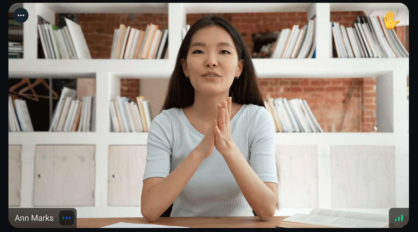
ParticipantView comes by default with certain participant information displayed in the "box" - such as mute states of either video or audio, quality indicator, participant's name, reactions, etc. which are displayed over the video element positioned absolutely (see picture). By using the ParticipantViewUI property, we can extend the ParticipantView component with custom UI elements specific to each participant. This allows us to tailor the visual representation of the participant based on our application's requirements and design.
The VideoPlaceholder property allows us to replace the default placeholder displayed over the video element when the video is not playing. This placeholder is positioned absolutely over the video element. It provides us with the flexibility to customize the placeholder's appearance and content according to our needs.
Our custom VideoPlaceholder component should be able to accept a style property coming from ParticipantView to allow for absolute positioning.
Customization in SDK provided layout components (preferred way)
We recommend using layout components provided by the SDK as it is possible to modify the ParticipantViewUI in these call layouts. You can follow this guide to build your own call layout.
PaginatedGridLayout
Call layout for large calls where ParticipantView elements are equally sized, you have the ability to customize the ParticipantViewUI and VideoPlaceholder components using their respective properties of this component.
SpeakerLayout
The SpeakerLayout component allows you to tweak participant UI in the spotlight and in the scrollable bar independently.
import {
  SpeakerLayout,
  StreamVideo,
  StreamCall,
  useParticipantViewContext,
  type VideoPlaceholderProps,
} from "@stream-io/video-react-sdk";

const CustomParticipantViewUIBar = () => {
  const { participant } = useParticipantViewContext();

  return (
    <div className="bar-participant-name">
      {participant.name || participant.id}
    </div>
  );
};

const CustomParticipantViewUISpotlight = () => {
  const { participant } = useParticipantViewContext();

  return (
    <div className="spotlight-participant-name">
      {participant.name || participant.id}
    </div>
  );
};

const CustomVideoPlaceholder = ({ style }: VideoPlaceholderProps) => {
  const { participant } = useParticipantViewContext();

  return (
    <div className="video-placeholder" style={style}>
      <img src={participant.image} alt={participant.id} />
    </div>
  );
};

const App = ({ client, callId }) => {
  return (
    <StreamVideo client={client}>
      <StreamCall callId={callId}>
        <SpeakerLayout
          VideoPlaceholder={CustomVideoPlaceholder}
          ParticipantViewUIBar={CustomParticipantViewUIBar}
          ParticipantViewUISpotlight={CustomParticipantViewUISpotlight}
        />
      </StreamCall>
    </StreamVideo>
  );
};
Non-mirrored video
By default, local participant video (video feed from the user's own camera) is mirrored, since people are generally more accustomed to seeing themselves that way. You can disable this behavior using the mirrorLocalParticipantVideo prop, which is supported by all built-in layout components:
<SpeakerLayout mirrorLocalParticipantVideo={false} />
// or
<PaginatedGridLayout mirrorLocalParticipantVideo={false} />
Standalone ParticipantView customization (in custom call layouts)
The ParticipantViewUI property accepts three possible values:
ReactElement- find out what's considered a ReactElement in the React documentation- component which can access
ParticipantViewrelated data throughuseParticipantViewContexthook nullif you wish to not render any UI
The following example shows the utilization of the ParticipantViewUI prop by passing down ReactElement:
import { type PropsWithChildren } from "react";
import {
  type VideoPlaceholderProps,
  ParticipantView,
  useCallStateHooks,
  useParticipantViewContext,
} from "@stream-io/video-react-sdk";

const CustomVideoPlaceholder = ({ style }: VideoPlaceholderProps) => {
  const { participant } = useParticipantViewContext();

  return (
    <div className="video-placeholder" style={style}>
      <img src={participant.image} alt={participant.id} />
    </div>
  );
};

const CustomParticipantViewUI = ({ children }: PropsWithChildren) => {
  return <div className="participant-name">{children}</div>;
};

const CustomCallLayout = () => {
  const { useParticipants } = useCallStateHooks();
  const participants = useParticipants();

  return (
    <div className="custom-call-layout">
      {participants.map((participant) => (
        <ParticipantView
          key={participant.sessionId}
          VideoPlaceholder={CustomVideoPlaceholder}
          ParticipantViewUI={
            <CustomParticipantViewUI>
              {participant.name || participant.id}
            </CustomParticipantViewUI>
          }
        />
      ))}
    </div>
  );
};On this page: