 React
React iOS
iOS Android
 Flutter
 JavaScript
 Unity
Unity ESP32
ESP32 Platform
 Vision Agents
import { Call, DeviceSettings, StreamCall } from "@stream-io/video-react-sdk";

const MyDevicePanel = () => {
  let call: Call;

  return (
    <StreamCall call={call}>
      <DeviceSettings />
    </StreamCall>
  );
};Device settings
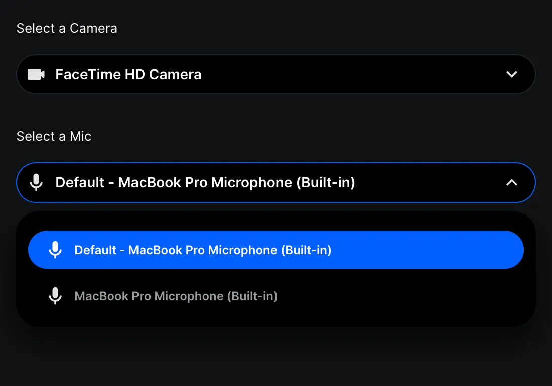
The SDK provides device settings components for audio and video selection:
DeviceSelectorVideo- camera selectionDeviceSelectorAudioInput- microphone selectionDeviceSelectorAudioOutput- speaker selectionAudioVolumeIndicator- visual audio level indicatorSpeakerTest- test speaker outputDeviceSettings- combines all selectors
Best Practices
- Use
DeviceSettingsfor a complete settings panel. - Use individual selectors for custom layouts.
- Show device settings in a lobby/preview screen before joining calls.
General usage
Or use the components individually:
import {
  Call,
  DeviceSelectorAudioInput,
  DeviceSelectorVideo,
  StreamCall,
} from "@stream-io/video-react-sdk";

const MyDevicePanel = () => {
  let call: Call;

  return (
    <StreamCall call={call}>
      <DeviceSelectorVideo />
      <DeviceSelectorAudioInput />
    </StreamCall>
  );
};
Props
DeviceSettings
| Name | Description | Type | Default |
|---|---|---|---|
visualType | Visually display a list or dropdown selector | list | dropdown | undefined | list |
DeviceSelectorVideo
| Name | Description | Type | Default |
|---|---|---|---|
title | Title is displayed at the top of the selector component | string | undefined | Select a Camera |
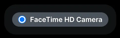
visualType | Display as a radio list, dropdown, or live device preview | list | dropdown | preview | list |
DeviceSelectorAudioInput
| Name | Description | Type | Default |
|---|---|---|---|
title | Title is displayed at the top of the selector component | string | undefined | Select a Mic |
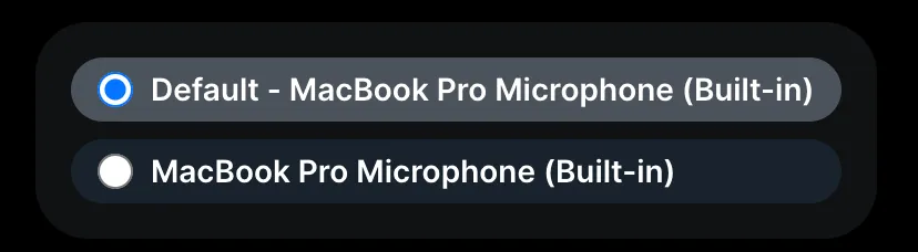
visualType | Display as a radio list, dropdown, or live device preview | list | dropdown | preview | list |
volumeIndicatorVisible | Show volume indicator | boolean | undefined | true |
DeviceSelectorAudioOutput
| Name | Description | Type | Default |
|---|---|---|---|
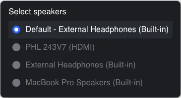
title | Title is displayed at the top of the selector component | string | undefined | Select a Speaker |
visualType | Visually display a list or dropdown selector | list | dropdown | undefined | list |
speakerTestVisible | Show speaker test button | boolean | undefined | true |
speakerTestAudioUrl | URL of the audio file to play when speaker test button is clicked | string | undefined | SDK provided audio test file |
AudioVolumeIndicator
This component does not accept any props.
SpeakerTest
| Name | Description | Type | Default |
|---|---|---|---|
audioUrl | URL of the audio file to play for the speaker test. | string | undefined | SDK provided audio test file |
Preview mode
Setting visualType to preview renders a live preview for each available device. For cameras, each option shows a real-time video feed. For microphones, each option shows an audio level indicator.
import {
  Call,
  DeviceSelectorAudioInput,
  DeviceSelectorVideo,
  StreamCall,
} from "@stream-io/video-react-sdk";

const MyDevicePreviewPanel = () => {
  let call: Call;

  return (
    <StreamCall call={call}>
      <DeviceSelectorVideo visualType="preview" />
      <DeviceSelectorAudioInput visualType="preview" />
    </StreamCall>
  );
};
Customization
If you want to create your own component, you can make use of Devices Management API to list and select devices.