CallContent(
  style = RegularVideoRendererStyle(
      isShowingParticipantLabel = true,
      labelPosition = Alignment.TopStart,
      isShowingConnectionQualityIndicator = true,
      reactionDuration = 500,
      reactionPosition = Alignment.Center
  ),
  ..
)Video Renderer
The video renderer is the essential UI component in a video call screen that renders participants in real-time. The easiest way to style the video renderer is using VideoRendererStyle. VideoRendererStyle provides several properties to customize each component of the video renderer like the below:
- isFocused: Represents whether the participant is focused or not.
- isScreenSharing: Represents whether the video renderer is about screen sharing.
- isShowingReactions: Represents whether display reaction comes from the call state.
- isShowingParticipantLabel: Represents whether display the participant label that contains the name and microphone status of a participant.
- isShowingConnectionQualityIndicator: Represents whether displays the connection quality indicator.
- labelPosition: The position of the participant label that contains the name and microphone status of a participant.
- reactionDuration: The duration of the reaction animation.
- reactionPosition: The position of the reaction.
You can create an instance of VideoRendererStyle using two pre-built styles with different default values:
- RegularVideoRendererStyle: A regular video renderer style, which displays the reactions, participant label, and connection quality indicator.
- ScreenSharingVideoRendererStyle: A screen sharing video renderer style, which displays the reactions, and participant label.
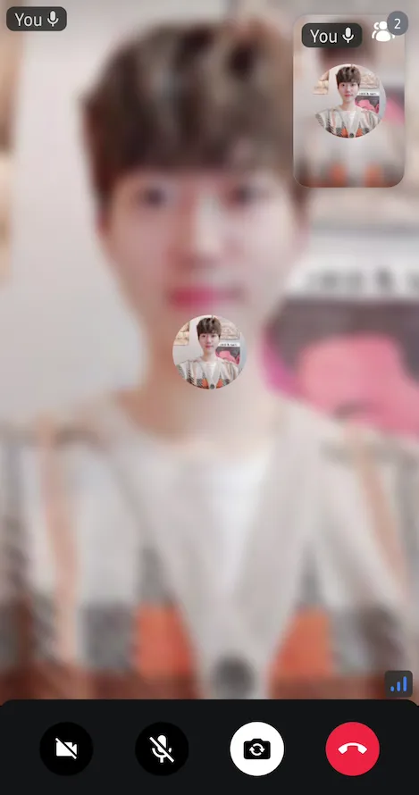
For example, if you want to change the position of the participant label to the top-start, you can simply change the labelPosition property in the CallContent, ParticipantsGrid, or ParticipantVideo.
Then you will see the result below:

Customization
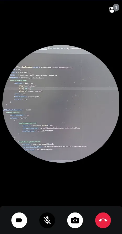
You can also fully customize the video renderer by implementing your own composable function. Let's say you want to implement a round-shaped video like Around. In this case, you can achieve it by implementing the videoRenderer parameter with the CallContent, or ParticipantsGrid components.
CallContent(
    modifier = Modifier.background(color = VideoTheme.colors.appBackground),
    videoRenderer = { modifier, call, participant, style ->
        Box(modifier = modifier) {
            ParticipantVideo(
                modifier = Modifier
                    .clip(CircleShape)
                    .size(390.dp)
                    .align(Alignment.Center),
                call = call,
                participant = participant,
                style = style,
            )
        }
    },
    ..
)
Then you will see the result below:

Custom Video Layout
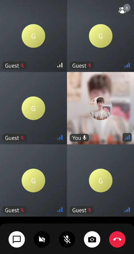
If you want to build your own lazy list or grid with the ParticipantVideo component, you can achieve it very simply like the sample below:
CallContent(
    modifier = Modifier.background(color = VideoTheme.colors.appBackground),
    callContent = {
        CallContent(
            modifier = Modifier.fillMaxSize(),
            call = call,
            videoContent = {
                val participants by call.state.participants.collectAsState()

                LazyVerticalGrid(columns = GridCells.Fixed(2)) {
                    items(participants, key = { it.sessionId }) { participant ->
                        ParticipantVideo(
                            modifier = Modifier
                                .fillMaxWidth()
                                .height(220.dp),
                            call = call,
                            participant = participant
                        )
                    }
                }

            }
        )
    },
    ..
)
Now, you'll see the custom participant grids below:
