








Call layout
The SDK provides built-in call layouts:
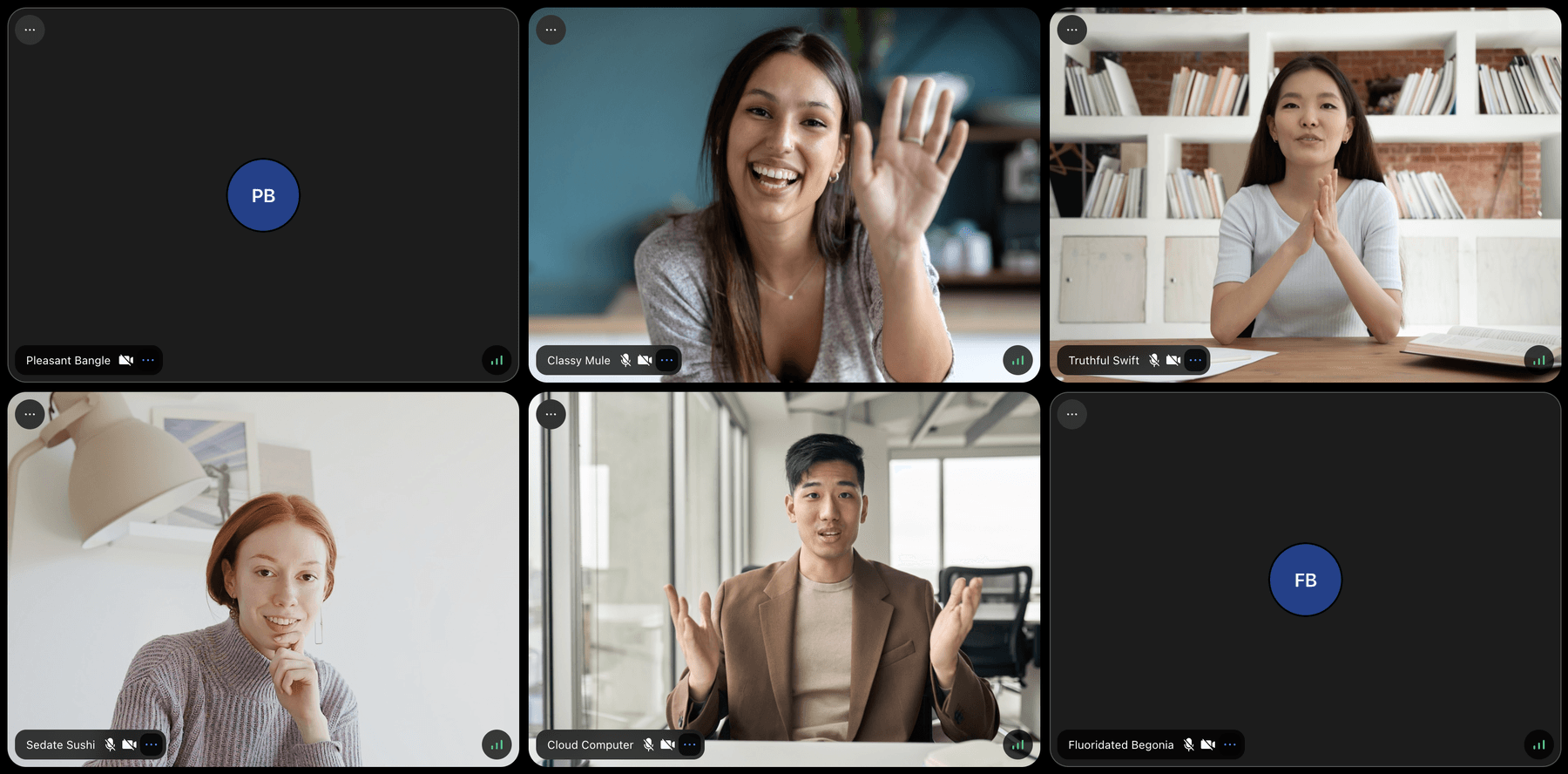
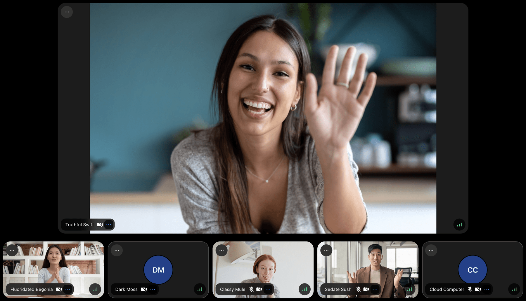
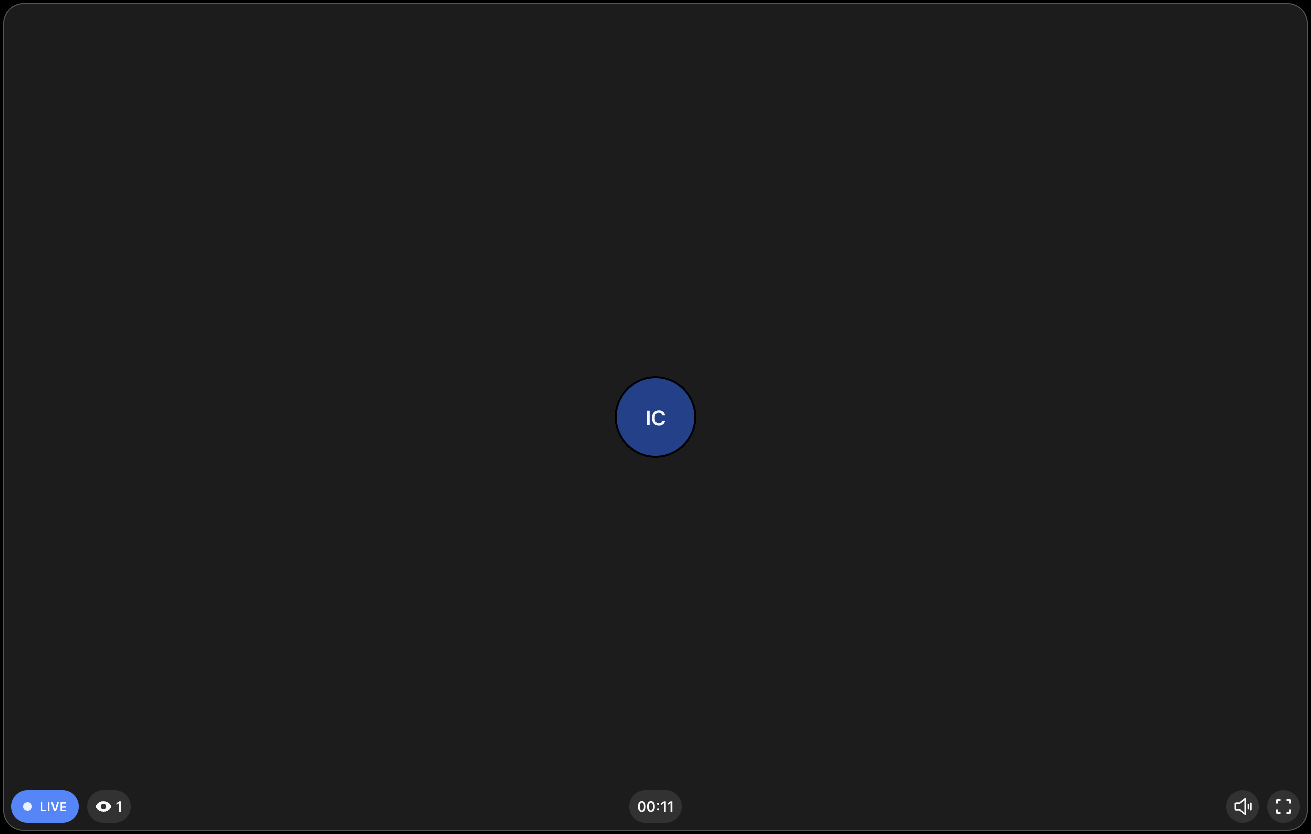
PaginatedGridLayout- displays participants in a paginated gridSpeakerLayout- dominant speaker/screen share in focus, others in a barLivestreamLayout- optimized for livestreaming with dominant speaker in large video
Best Practices
- Use
SpeakerLayoutfor meetings with screen sharing or presentations. - Use
PaginatedGridLayoutfor group calls where everyone is equal. - Use
LivestreamLayoutfor one-to-many broadcasts. - Use
filterParticipantsto show only relevant participants (e.g., by role). - Set
muted={true}only when rendering<ParticipantsAudio />separately.
General usage
Layouts gather state via hooks - no state-related props needed:
import "@stream-io/video-react-sdk/dist/css/styles.css";
import {
  CallControls,
  StreamCall,
  StreamTheme,
  StreamVideo,
  SpeakerLayout,
} from "@stream-io/video-react-sdk";

const MyApp = () => {
  return (
    <StreamVideo client={client}>
      <StreamTheme>
        <StreamCall call={call}>
          <SpeakerLayout />
          <CallControls />
        </StreamCall>
      </StreamTheme>
    </StreamVideo>
  );
};
import "@stream-io/video-react-sdk/dist/css/styles.css";
import {
CallControls,
StreamCall,
StreamTheme,
StreamVideo,
PaginatedGridLayout,
} from "@stream-io/video-react-sdk";
const MyApp = () => {
return (
<StreamVideo client={client}>
<StreamTheme>
<StreamCall call={call}>
<PaginatedGridLayout />
<CallControls />
</StreamCall>
</StreamTheme>
</StreamVideo>
);
};Built-in Layouts
PaginatedGridLayout
Props
| Name | Description | Type |
|---|---|---|
groupSize |
The number of participants to display per page | number | undefined |
excludeLocalParticipant |
Whether to exclude the local participant from the grid | boolean | undefined |
filterParticipants |
Optional predicate or filter object to determine whether a participant should be displayed in the grid | ParticipantPredicate | ParticipantFilter | undefined |
mirrorLocalParticipantVideo |
Whether to mirror the user's own video (default true) |
boolean | undefined |
pageArrowsVisible |
Turns on/off the pagination arrows | boolean | undefined |
muted |
Mutes all audio. Only use this if you render <Audio /> or <ParticipantsAudio /> manually somewhere else. |
boolean |
ParticipantViewUI |
See ParticipantView documentation |
See ParticipantView documentation |
VideoPlaceholder |
See ParticipantView documentation |
See ParticipantView documentation |
PictureInPicturePlaceholder |
See ParticipantView documentation |
See ParticipantView documentation |
Participant filtering
PaginatedGridLayout supports filtering displayed participants either with a predicate function:
// Display only participants with the role "student":
<PaginatedGridLayout
  filterParticipants={(p) => p.roles.includes("student")}
  /* ... */
/>
Or with a special filter object, which is similar in syntax to that of Mongoose:
// Display only participants with either the role "student",
// or that are currently pinned:
<PaginatedGridLayout
  filterParticipants={{
    $or: [{ roles: { $contains: "student" } }, { isPinned: true }],
  }}
/>
SpeakerLayout
Props
| Name | Description | Type |
|---|---|---|
participantsBarPosition |
The position of the participants who are not in focus, the default is bottom. Providing null will hide the bar |
top | bottom | left | right | null |
participantsBarLimit |
Limits the number of participants shown in the participants bar. Use 'dynamic' to compute the limit automatically from the available space |
'dynamic' | number | undefined |
excludeLocalParticipant |
Whether to exclude the local participant from the layout | boolean | undefined |
filterParticipants |
Optional predicate or filter object to determine whether a participant should be displayed in the layout | ParticipantPredicate | ParticipantFilter | undefined |
mirrorLocalParticipantVideo |
Whether to mirror the user's own video (default true) |
boolean | undefined |
pageArrowsVisible |
Turns on/off the pagination arrows | boolean | undefined |
muted |
Mutes all audio. Only use this if you render <Audio /> or <ParticipantsAudio /> manually somewhere else. |
boolean |
enableDragToScroll |
Whether to enable drag to scroll functionality on the participants list. | boolean |
ParticipantViewUISpotlight |
The participant UI for the spotlight view, see ParticipantView documentation |
See ParticipantView documentation |
ParticipantViewUIBar |
The participant UI for the participants in the bar, see ParticipantView documentation |
See ParticipantView documentation |
VideoPlaceholder |
See ParticipantView documentation |
See ParticipantView documentation |
PictureInPicturePlaceholder |
See ParticipantView documentation |
See ParticipantView documentation |
Participant filtering
SpeakerLayout supports filtering displayed participants either with a predicate function:
// Display only participants with the role "student":
<SpeakerLayout
  filterParticipants={(p) => p.roles.includes("student")}
  /* ... */
/>
Or with a special filter object, which is similar in syntax to that of Mongoose:
// Display only participants with either the role "student",
// or that are currently pinned:
<SpeakerLayout
  filterParticipants={{
    $or: [{ roles: { $contains: "student" } }, { isPinned: true }],
  }}
/>
LivestreamLayout
Props
| Name | Description | Type |
|---|---|---|
muted |
Mutes all audio | boolean |
enableFullScreen |
Will render a button to enable fullscreen mode | boolean |
showParticipantCount |
Will show the number of participants | boolean |
humanizeParticipantCount |
Will humanize the participant count. E.g.: 1200 -> 1.2k |
boolean |
showDuration |
Will show the duration of the livestream | boolean |
showLiveBadge |
Will show a badge whether the livestream is live or not | boolean |
showSpeakerName |
Will show the name of the speaker | boolean |
showMuteButton |
Will show the speaker mute button | boolean |
mirrorLocalParticipantVideo |
Whether to mirror the user's own video (default true) |
boolean |
ParticipantViewUI |
Custom UI rendered on top of the participant's video | ComponentType | ReactElement | null |
floatingParticipantProps |
Props to pass to the floating participant view | object |
floatingParticipantProps.position |
Position of the floating participant view (default top-right) |
'top-left' | 'top-right' | 'bottom-left' | 'bottom-right' |
PipLayout
A compound layout tuned for Picture-in-Picture rendering, exported from @stream-io/video-react-sdk. It exposes three sub-components:
PipLayout.Pip- the main PiP layout (acceptsfilterParticipantsplusParticipantViewUI/VideoPlaceholderfromParticipantView).PipLayout.Host- renders the host/dominant participant.PipLayout.Grid- renders participants in a grid.
import { PipLayout } from "@stream-io/video-react-sdk";

<PipLayout.Pip filterParticipants={(p) => p.roles.includes("student")} />;
Customization
If the built-in layouts aren't what you're looking for, it's also possible to create your own layout, see our Custom Call Layout guide for more information.