 React
React iOS
iOS Android
 Flutter
 JavaScript
 Unity
Unity ESP32
ESP32 Platform
 Vision Agents
import 'package:stream_video_flutter/stream_video_flutter.dart';Quickstart
The Flutter Video for Stream Video is a highly customizable SDK that facilitates adding calling (audio and video) support to your apps.
The SDK consists of four parts:
- Low-level client (stream_video): Responsible for establishing calls, built on top of WebRTC.
- UI SDK (stream_video_flutter): Flutter widgets for different types of call flows.
- VoIP SDK (stream_video_push_notification): Adds native calling interface support for Android and iOS (CallKit).
- Screen sharing SDK (stream_video_screen_sharing): Includes a native Swift implementation of
BroadcastSampleHandler, essential for thebroadcastscreen sharing mode on iOS.
In this guide, we will build a video calling app that shows how you can integrate the SDK in few simple steps.
If you haven't already, we recommend starting with the introduction and installation steps first, as this guide will build on the material covered in those sections.
Client Setup
Before we can create a new video client, we must first import the Stream Video package into our application.
Next, in our application’s main function, let’s add the following:
Future<void> main() async {
  // Ensure Flutter is able to communicate with Plugins
  WidgetsFlutterBinding.ensureInitialized();

	// Initialize Stream video and set the API key along with the user for our app.
  final client = StreamVideo(
    'REPLACE_WITH_API_KEY',
     user: User.regular(userId: 'REPLACE_WITH_USER_ID', name: 'Test User'),
     userToken: 'REPLACE_WITH_TOKEN',
  );

  // Set up our call object and pass it the call type and ID. The most common call type is `default`, which enables full audio and video transmission
  final call = client.makeCall(callType: StreamCallType.defaultType(), id: 'REPLACE_WITH_CALL_ID');
  // Connect to the call we created
  await call.join();

  runApp(
    DemoAppHome(
      call: call,
    ),
  );
}
In the code above, we are performing a few key steps:
- Initializing our SDK with the API key for our application.
- Defining the user we would like to connect as to participate in a call.
- Creating an object for our call, giving it the "default" call type and unique ID.
- Connecting to the call we defined.
Although it is not shown in the example above, users can choose to customize many different aspects of the SDK during initialization. Here are a few of the parameters which can be overridden during initialization:
| Parameter | Description |
|---|---|
| apiKey | Stream Video API key obtained from the Dashboard of your project. |
| latencySettings | Controls the number of rounds and timeout duration for measuring latency when first connecting to a call. |
| retryPolicy | Allows for custom handling of retries such as override the default number of max retries, passing in a custom backoff function and more. |
| sdpPolicy | Controls whether SDP Munging is enabled and gives access to functions supporting SDP Munging. |
| logPriority | Allows for customizing the level of logs displayed while developing or running your application. |
| logHandlerFunction | Can be overridden to intercept logs and perform custom actions such as sending device logs to a capture service. |
| muteVideoWhenInBackground | Indicates whether the SDK should disable the video track when the app moves from the foreground to background. We highly recommend you set this to true if your app does not support picture-in-picture mode. |
| muteAudioWhenInBackground | Indicates whether the SDK should disable the audio track when the app moves from the foreground to background. We highly recommend you set this to true if your app does not support picture-in-picture mode. |
Call UI
Stream ships with many pre-made components to make building your call UI as simple as possible. All of our UI components are designed to be flexible and customizable, meaning as a developer, you can control exactly how much (or how little) of Stream’s stock components you would like to have in your app.
With our Call object defined, let’s create the UI for our application. Since this is meant to be a quick-start guide, we can simply pass down the call defined earlier to our UI widget, but in a production scenario, you can define these calls in a repository or any other state layer of your choice.
class DemoAppHome extends StatelessWidget {
  const DemoAppHome({Key? key, required this.call}) : super(key: key);

  final Call call;

  @override
  Widget build(BuildContext context) {
    return Scaffold(
      body: StreamCallContainer( // Stream's pre-made component
        call: call,
      ),
    );
  }
}
Using our default StreamCallContainer along with the call created earlier, we can compile our sample application and examine the result.
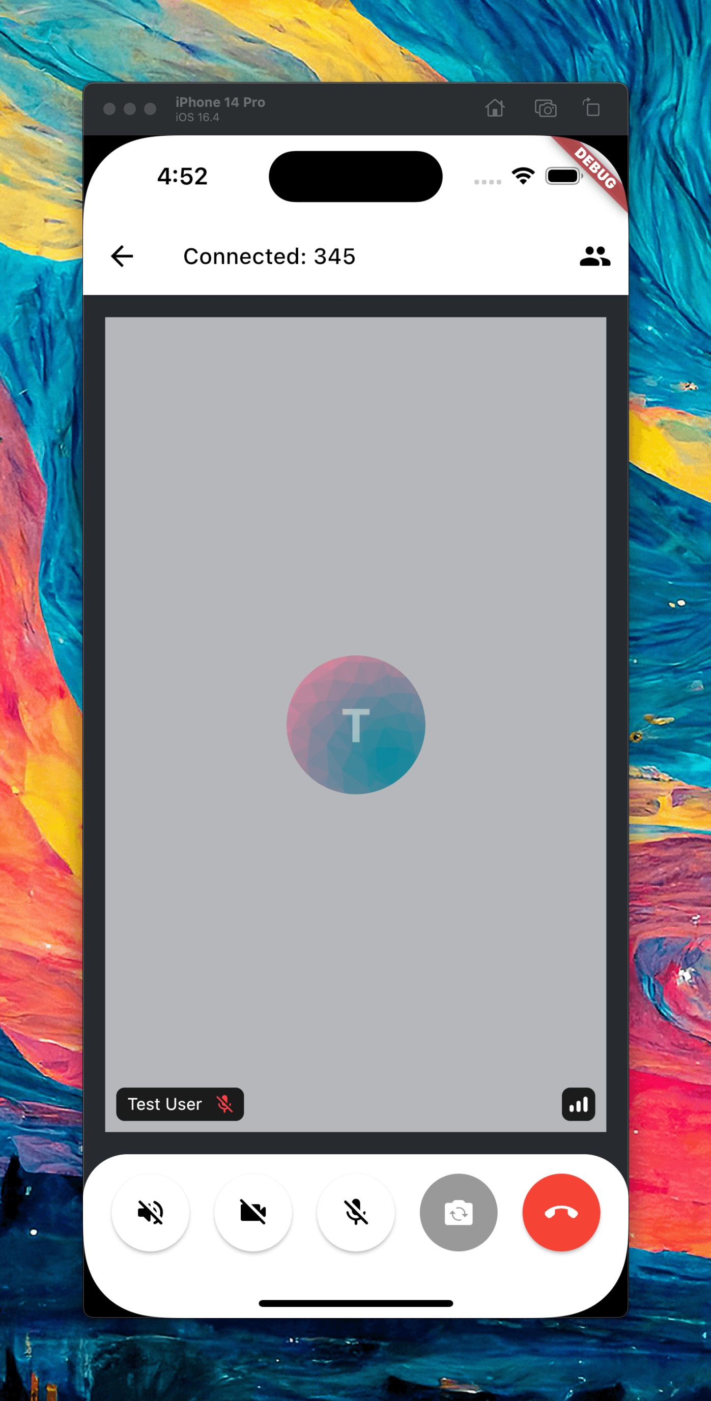
In just a few lines of code, we can have a fully functional call screen in our application. Out of the box, StreamCallContainer ships with an AppBar, Participant view, and Call Controls. These components can be themed to fit your app's style or be overridden entirely using a builder to allow for custom UIs and interactions.
Taking it one step further
For fun, let's take a look at customizing the UI of our application to include a custom icon in the control area.
Looking at our current UI code, we can make use of Flutter’s composition and builder pattern to override the default UI with our own.
@override
  Widget build(BuildContext context) {
    return Scaffold(
      body: StreamCallContainer(
        call: call,
        callContentWidgetBuilder: (context, call) {
        },
      ),
    );
  }
StreamCallContainer ships with many different builders that can be implemented to override the default UI and behavior. Since we are interested in changing the content/UI of our call, we can override the callContentWidgetBuilder as a starting point.
Please take a minute to explore and look at the other parameters you can customize. There are many options for changing colors, layouts, behaviour, etc.
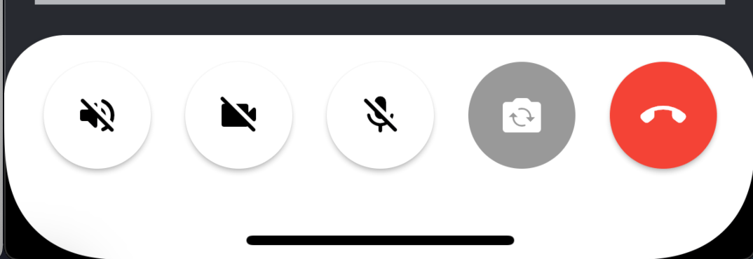
Next, we can use another Stream UI component, StreamCallContent to access the control area and add our custom button.
@override
  Widget build(BuildContext context) {
    return Scaffold(
      body: StreamCallContainer(
        call: call,
        callContentWidgetBuilder: (context, call) {
          return StreamCallContent(
            call: call,
            callControlsWidgetBuilder: (context, call) {
						    // Override the controls builder in StreamCallContent
            },
          );
        },
      ),
    );
  }
Finally, we can return the controls and options we would like to display to the user
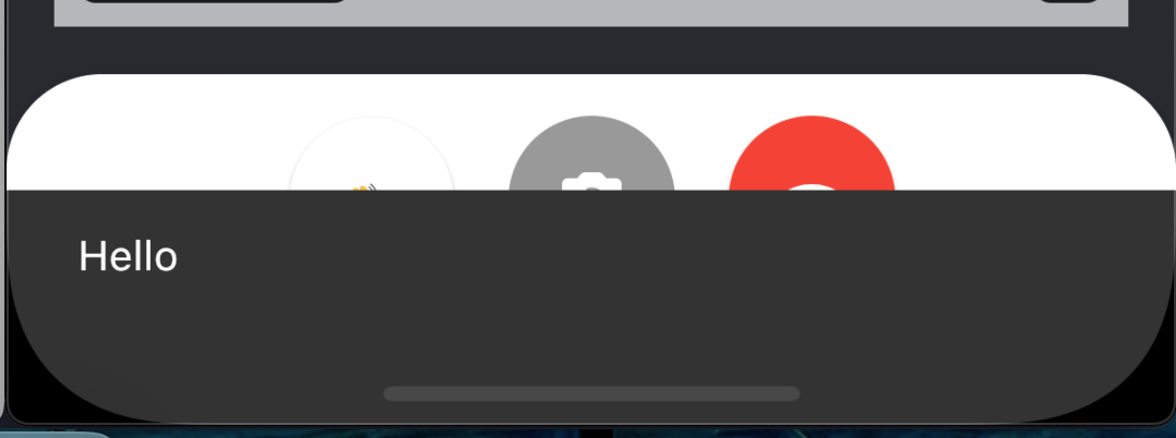
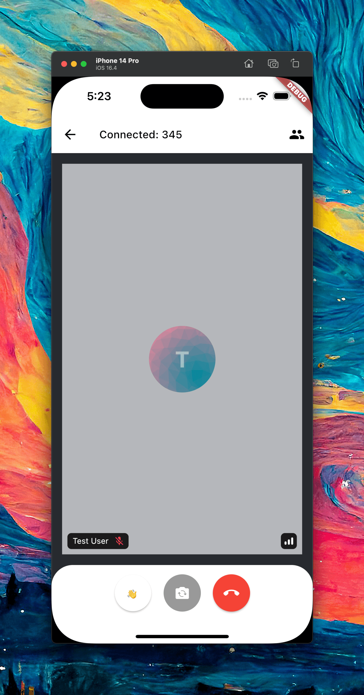
return StreamCallContent(
    call: call,
    callControlsWidgetBuilder: (context, call) {
      return StreamCallControls(
        options: [
          CallControlOption(
            icon: const Text('👋'),
            onPressed: () => ScaffoldMessenger.of(context).showSnackBar(
              const SnackBar(
                content: Text('Hello'),
              ),
            ),
          ),
          FlipCameraOption(
            call: call,
          ),
          LeaveCallOption(call: call, onLeaveCallTap: call.leave),
        ],
      );
    },
  );
When tapped: