















Channel
Channel is the main entry point for customization and hosts most of the contexts and logic used by the React Native SDK. MessageList, MessageInput, and Thread require it.
Best Practices
- Create and watch channels once, then reuse the instance across renders.
- Render
ChannelunderOverlayProviderandChatto ensure all contexts are available. - Customize UI by replacing specific components instead of re-implementing core logic.
- Keep custom components lightweight to avoid performance regressions in lists.
- Use channel props for behavior changes before reaching for custom overrides.
Basic Usage
Channel takes a StreamChat channel instance. Create one via creating channels or read it from ChannelList via the onSelect callback.
import { useEffect, useState } from "react";
import { StreamChat } from "stream-chat";
import {
  Channel,
  Chat,
  MessageInput,
  MessageList,
  OverlayProvider,
} from "stream-chat-react-native";

const client = StreamChat.getInstance("api_key");

export const App = () => {
  const [channel, setChannel] = useState();

  useEffect(() => {
    const createAndWatchChannel = async () => {
      const newChannel = client.channel("messaging", "channel_id");
      await newChannel.watch();
      setChannel(newChannel);
    };

    createAndWatchChannel();
  }, []);

  return (
    <OverlayProvider>
      <Chat client={client}>
        <Channel channel={channel}>
          <MessageList />
          <MessageInput />
        </Channel>
      </Chat>
    </OverlayProvider>
  );
};
Context Providers
Channel provides ChannelContext, KeyboardContext, MessageInputContext, MessagesContext, PaginatedMessageListContext, AttachmentPickerContext, MessageComposerContext, ThreadContext, and TypingContext via their hooks.
| Context | Hook |
|---|---|
ChannelContext |
useChannelContext |
KeyboardContext |
useKeyboardContext |
MessageInputContext |
useMessageInputContext |
MessagesContext |
useMessagesContext |
PaginatedMessageListContext |
usePaginatedMessageListContext |
AttachmentPickerContext |
useAttachmentPickerContext |
MessageComposerContext |
useMessageComposerAPIContext |
ThreadContext |
useThreadContext |
TypingContext |
useTypingContext |
UI Customizations
Channel is the entry point for most UI customization. Replace components via props and they will be used throughout the SDK where applicable.
Customizing the message avatar can be done easily by providing a custom component to the appropriate prop.
import { Image } from "react-native";
import { Channel, useMessageContext } from "stream-chat-react-native";

const CustomAvatar = () => {
  const { message } = useMessageContext();

  return <Image source={{ uri: message.user?.image }} />;
};

<Channel MessageAvatar={CustomAvatar} />;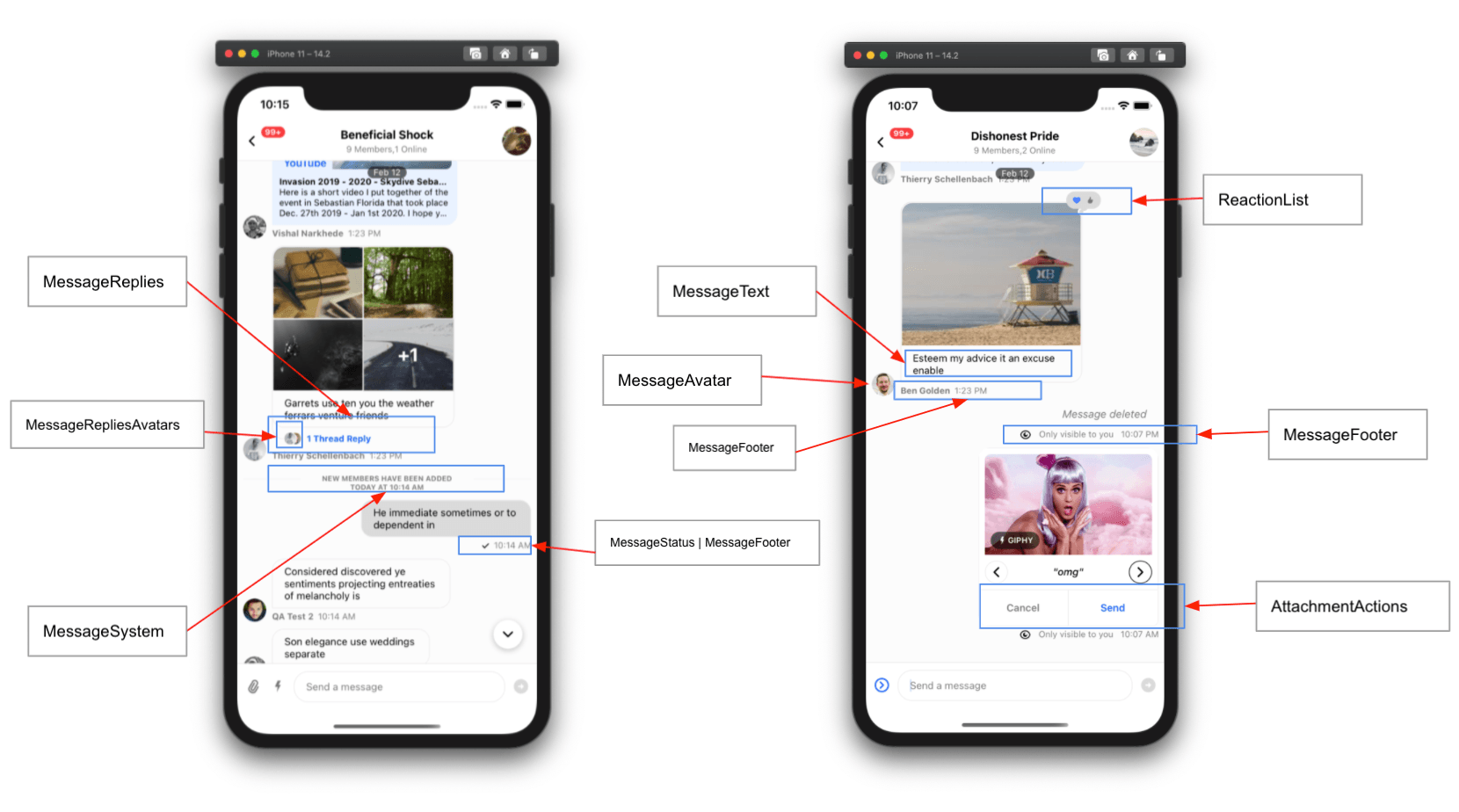
Props
channel
Channel instance from the Stream Chat client.
| Type |
|---|
| Channel |
keyboardVerticalOffset
Distance from the top of the screen to the top of the Channel component (often your header height).
| Type |
|---|
| number |
additionalKeyboardAvoidingViewProps
Extra props passed to KeyboardAvoidingView.
| Type |
|---|
| Object |
additionalTextInputProps
Extra props passed to the underlying TextInput in MessageInput.
| Type |
|---|
| object |
additionalPressableProps
Extra props passed to the underlying Pressable used in message components like MessageContent.
| Type |
|---|
| object |
allowConcurrentAudioPlayback
Allow multiple audio players to play at once. Disabled by default. Available since v8.9.0.
| Type |
|---|
| Boolean |
allowThreadMessagesInChannel
Show the Show thread message in channel button in thread MessageInput.
| Type | Default |
|---|---|
| boolean | true |
asyncMessagesLockDistance
Pixels the user must drag upward to lock recording and lift their finger without stopping it.
| Type | Default |
|---|---|
| Number | 50 |
asyncMessagesMinimumPressDuration
Minimum press duration (ms) on the record button to start voice recording.
| Type | Default |
|---|---|
| Number | 500 |
asyncMessagesMultiSendEnabled
When enabled, recordings don’t send immediately. They stack in the composer so users can send multiple voice recordings in one message.
| Type | Default |
|---|---|
| Boolean | true |
asyncMessagesSlideToCancelDistance
Pixels the user must drag toward the leading side to cancel voice recording.
| Type | Default |
|---|---|
| Number | 100 |
audioRecordingEnabled
Enable or disable audio recording.
| Type | Default |
|---|---|
| Boolean | false |
attachmentPickerErrorText
Error text for AttachmentPickerError.
| Type | Default |
|---|---|
| String | "Please enable access to your photos and videos so you can share them." |
attachmentPickerErrorButtonText
Button text in AttachmentPickerError that opens the app’s OS settings.
| Type | Default |
|---|---|
| String | "Allow access to your Gallery" |
attachmentPickerBottomSheetHeight
Height of the attachment picker bottom sheet when open.
| Type | Default |
|---|---|
| Number | 40% of Window Height |
attachmentSelectionBarHeight
Height of the attachment selection bar in the attachment picker.
| Type | Default |
|---|---|
| Number | 52 |
attachmentPickerBottomSheetHandleHeight
Height of the attachment picker bottom sheet handle.
| Type | Default |
|---|---|
| Number | 20 |
bottomInset
Height of items located below the MessageInput when present. This inset determines the underlying shift to the MessageList when it is opened.
This can also be set via the setBottomInset function provided by the useAttachmentPickerContext hook.
| Type | Default |
|---|---|
| Number | 0 |
compressImageQuality
Image compression quality before upload.
On iOS, values >= 0.8 usually keep quality while reducing size. A value of 0.8 can roughly halve file size vs 1.0.
| Type | Default |
|---|---|
| number 0 to 1 (1 is best quality) | iOS: 0.8, Android: 1 |
customMessageSwipeAction
Custom action executed when the user swipes a message.
| Type | Default |
|---|---|
({channel, message}: {channel: Channel, message: LocalMessage}) => void |
The default action is swipe to reply. |
deletedMessagesVisibilityType
Controls visibility of deleted messages in the channel.
always: Visible to both sender and receiver.never: Visible to no one.sender: Visible only to the sender.receiver: Visible only to the receiver.
| Type | Default |
|---|---|
| enum('always', 'never', 'receiver', 'sender') | 'both' |
disableKeyboardCompatibleView
Enable or disable the underlying KeyboardAvoidingView.
| Type | Default |
|---|---|
| boolean | false |
disableTypingIndicator
Disable the typing indicator in MessageList.
| Type | Default |
|---|---|
| boolean | false |
dismissKeyboardOnMessageTouch
Dismiss the keyboard when the user touches a message in the list.
| Type | Default |
|---|---|
| boolean | false |
doFileUploadRequest
Override the file upload request when a user selects a file. Must return a Promise.
Use this to store files in your own CDN.
| Type |
|---|
| Function |
This matches the definition of UploadRequestFn from the stream-chat package.
export type UploadRequestFn = (
  fileLike: FileReference | FileLike,
) => Promise<MinimumUploadRequestResult>;
doMarkReadRequest
Override the mark read request.
This prop should only be used for advanced functionality in which you want to conditionally allow mark-read requests.
Do not use this function to disable read receipts. If you would like to disable read-receipts, this can be done via Read Events on the dashboard.
Example
const doMarkReadRequest = (channel) => {
  if (/** Some custom logic here */) {
    channel.markRead();
  }
};| Type |
|---|
| Function |
| Parameter | Description |
|---|---|
channel |
channel instance |
setChannelUnreadUiState | undefined |
(state) =>void |
doSendMessageRequest
Override the send message request.
This function must return a Promise equivalent to client.sendMessage.
Use this only if you need to alter the message object before sending.
Example
const doSendMessageRequest = (channelId, messageObject) => {
  if (/** Some custom logic here */) {
    messageObject.isSpecial = true;
  }
  return channel.sendMessage(messageObject);
}| Type |
|---|
| function |
| Parameter | Description |
|---|---|
| channelId | string |
| messageObject | object |
| options | object | undefined |
doUpdateMessageRequest
Override the update message request.
This function must return a Promise equivalent to client.updateMessage.
Use this only if you need to alter the message object before updating.
const doUpdateMessageRequest = (channelId, messageObject) => {
  const numberOfUpdates = (messageObject.numberOfUpdates ?? 0) + 1;
  const messageToSend = { ...messageObject, numberOfUpdates };
  return client.updateMessage(messageToSend);
};| Type |
|---|
| function |
| Parameter | Description |
|---|---|
| channelId | string |
| messageObject | object |
| options | object | undefined |
enableMessageGroupingByUser
Note: Available in SDK version >= v3.9.0.
If false, consecutive messages from the same user won’t be grouped.
| Type | Default |
|---|---|
| boolean | true |
enableSwipeToReply
If true, users can swipe to reply to a message.
| Type | Default |
|---|---|
| Boolean | true |
enforceUniqueReaction
Limits reactions to one per user. Selecting a new reaction replaces the previous one (similar to iMessage).
| Type | Default |
|---|---|
| boolean | false |
forceAlignMessages
Forces all messages to align left or right. By default, received messages are left and sent messages are right.
| Type | Default |
|---|---|
| 'left' | 'right' | false | false |
formatDate
Format function for dates in message status and deleted message components.
| Type |
|---|
| function |
| Parameter | Description |
|---|---|
| date | date to format provided as a string, Date, or number (Unix Timestamp) |
getMessagesGroupStyles
Messages are grouped so UI elements like avatars only appear for the last message in a group. Messages are grouped when the same user sends them within a time window (controlled by MaxTimeBetweenGroupedMessages on Channel). Use getMessagesGroupStyles to override group position logic (top, bottom, middle, single), which affects UI like timestamps and avatars.
Default logic lives in getGroupStyles. Access the computed styles via MessageContext.groupStyles in custom components.
| Type |
|---|
| function |
globalUnreadCountLimit
Maximum number of unread messages to show as a count on a channel before adding a +.
The max allowable is 255, which when reached displays as 255+.
| Type | Default |
|---|---|
| number | 255 |
giphyVersion
Giphy image version to render. See the Image Object keys for options.
| Type | Default |
|---|---|
| string | 'fixed_height' |
handleAttachButtonPress
Customize behavior when the AttachButton is pressed in the message input.
| Type |
|---|
() => void |
handleBan
Called when the Ban User action is triggered. It does not override default behavior. See customize message actions.
| Type |
|---|
| function |
| Parameter | Description |
|---|---|
| message | message the action is called on |
handleCopy
Called when the Copy Message action is triggered. It does not override default behavior. See customize message actions.
| Type |
|---|
| function |
| Parameter | Description |
|---|---|
| message | message the action is called on |
handleDelete
Called when the Delete Message action is triggered. It does not override default behavior. See customize message actions.
| Type |
|---|
| function |
| Parameter | Description |
|---|---|
| message | message the action is called on |
handleDeleteForMe
Called when the Delete Message for me action is triggered. It does not override default behavior. See customize message actions.
| Type |
|---|
| function |
| Parameter | Description |
|---|---|
| message | message the action is called on |
handleEdit
Called when the Edit Message action is triggered. It does not override default behavior. See customize message actions.
| Type |
|---|
| function |
| Parameter | Description |
|---|---|
| message | message the action is called on |
handleFlag
Called when the Flag Message action is triggered. It does not override default behavior. See customize message actions.
| Type |
|---|
| function |
| Parameter | Description |
|---|---|
| message | message the action is called on |
handleMarkUnread
Called when the Mark Unread action is triggered. It does not override default behavior. See customize message actions.
| Type |
|---|
| function |
| Parameter | Description |
|---|---|
| message | message the action is called on |
handleMute
Called when the Mute User action is triggered from the message actions list. It does not override default behavior. See customize message actions.
| Type |
|---|
| function |
| Parameter | Description |
|---|---|
| message | message the action is called on |
handlePinMessage
Called when the Pin to Conversation or Unpin from Conversation action is triggered. It does not override default behavior. See customize message actions.
| Type |
|---|
| function |
| Parameter | Description |
|---|---|
| message | message the action is called on |
handleReaction
Called when a reaction is selected in the message menu (add or remove). It does not override default behavior. See customize message actions.
| Type |
|---|
| Function |
| Parameter | Description |
|---|---|
message |
Message the action is called on. |
reactionType |
String designating the type of reaction. |
handleQuotedReply
Called when the Reply action is triggered. It does not override default behavior. See customize message actions.
| Type |
|---|
| function |
| Parameter | Description |
|---|---|
| message | message the action is called on |
handleRetry
Called when the Retry action is triggered. It does not override default behavior. See customize message actions.
| Type |
|---|
| function |
| Parameter | Description |
|---|---|
| message | message the action is called on |
handleThreadReply
Called when the Thread Reply action is triggered. It does not override default behavior. See customize message actions.
| Type |
|---|
| function |
| Parameter | Description |
|---|---|
| message | message the action is called on |
hasCameraPicker
Enable the camera picker in MessageInput.
| Type | Default |
|---|---|
| Boolean | true |
hasCommands
Enable commands in MessageInput.
| Type | Default |
|---|---|
| boolean | true |
hasFilePicker
Enable the file picker in MessageInput.
| Type | Default |
|---|---|
| Boolean | true |
hasImagePicker
Enable the image picker in MessageInput.
| Type | Default |
|---|---|
| Boolean | true |
hideDateSeparators
Hide inline date separators in MessageList.
| Type | Default |
|---|---|
| boolean | false |
hideStickyDateHeader
Note: Available in SDK version >= v3.9.0.
Hide the sticky date header in MessageList.
| Type | Default |
|---|---|
| boolean | false |
initialScrollToFirstUnreadMessage
Load the channel starting at the first unread message.
| Type | Default |
|---|---|
| boolean | false |
isAttachmentEqual
Returns true if rendering nextAttachment would produce the same result as prevAttachment, otherwise false.
| Type |
|---|
| function |
| Parameter | Description |
|---|---|
| prevAttachment | previous message attachment to be compared |
| nextAttachment | next message attachment to be compared |
keyboardBehavior
Behavior for the keyboard passed to the underlying KeyboardAvoidingView.
| Type |
|---|
| 'height' | 'position' | 'padding' |
legacyImageViewerSwipeBehaviour
Note: Available in SDK version >= v3.9.0.
Enable/disable legacy image viewer behavior.
When true, the image viewer lets you swipe through all loaded images in the channel. This adds JS thread work to track and pre-populate images for smooth transitions.
| Type | Default |
|---|---|
| boolean | false |
loadingMore
Override the loadingMore value supplied by the channel query logic.
| Type |
|---|
| Boolean |
loadingMoreRecent
Override the loadingMoreRecent value supplied by the channel query logic.
| Type |
|---|
| Boolean |
markdownRules
Rules for simple-markdown.
| Type |
|---|
| object |
markReadOnMount
Enable/disable marking the channel as read when Channel mounts.
| Type |
|---|
| Boolean |
maxMessageLength
Maximum message length. The default comes from the channel config.
| Type |
|---|
| number |
maxTimeBetweenGroupedMessages
Maximum time (ms) between consecutive messages from the same user to keep them grouped.
| Type | Default |
|---|---|
| number | infinite |
messageId
Load the channel at a specified message instead of the most recent message.
| Type |
|---|
| string |
messageActions
An array of actions, or a function returning an array, shown in the message menu. See customize message actions.
| Type | Default |
|---|---|
| Array | Function | messageActions |
| Parameter | Description |
|---|---|
actionInfo |
An object containing the original actions and relevant message data |
messageContentOrder
Order for rendering message content.
| Type | Default |
|---|---|
| array | ['quoted_reply', 'gallery', 'files', 'text', 'attachments'] |
messageSwipeToReplyHitSlop
Defines the hitSlop area for the message swipe-to-reply gesture.
| Type | Default |
|---|---|
Object{ top: number, left: number, bottom: number, right: number } |
{left: screenWidth, right: screenWidth} |
messageTextNumberOfLines
Number of lines for message text in the Message Overlay.
| Type | Default |
|---|---|
| number | 5 |
myMessageTheme
Theme applied to the current user’s messages.
| Type |
|---|
| object |
Memoize this object or pass a stable reference.
newMessageStateUpdateThrottleInterval
Note: Available in SDK version >= v3.9.0.
Throttle interval (ms) for channel state updates when new messages arrive. Default is 500 ms. For high concurrency, increase (for example 1000 ms) to reduce JS thread load.
| Type | Default |
|---|---|
| number | 500 |
numberOfLines
Maximum number of lines the underlying TextInput in MessageInput can expand to.
| Type | Default |
|---|---|
| number | 5 |
numberOfAttachmentImagesToLoadPerCall
Number of images loaded per CameraRoll.getPhotos call.
| Type | Default |
|---|---|
| Number | 60 |
numberOfAttachmentPickerImageColumns
Number of columns in the image picker.
| Type | Default |
|---|---|
| Number | 3 |
onLongPressMessage
Called when a user long-presses a message. The default opens the message menu.
| Type |
|---|
| function |
| Parameter | Description |
|---|---|
| payload | { actionHandlers, message } |
onPressMessage
Called when a user presses a message.
The default handler behaves differently for reactions and attachments. Handle those cases if you override it.
| Type |
|---|
| function |
| Parameter | Description |
|---|---|
| payload | { additionalInfo, actionHandlers, message } |
additionalInfo provides extra data for certain emitters (for example, user details for textMention).
For example:
<Channel
      onPressMessage={({ additionalInfo, defaultHandler, emitter }) => {

          if (emitter === 'textMention') {
            console.log(additionalInfo?.user);
            return;
          }

          if (emitter === 'card' || emitter === 'textLink') {
            console.log(additionalInfo?.url);
            return;
          }

          if (emitter === 'fileAttachment') {
            console.log(additionalInfo?.attachment);
            return;
          }

          defaultHandler?.();
      }}
>additionalInfo may change as we add more emitter use cases.
onPressInMessage
Called on touch start, before onPressMessage.
| Type |
|---|
| function |
| Parameter | Description |
|---|---|
| payload | { actionHandlers, message } |
overrideOwnCapabilities
Override the current user’s capabilities (normally derived from permissions, channel type, and channel settings). These capabilities enable or disable UI features. See:
/chat/docs/javascript/chat_permission_policies/
Example:
<Channel
  overrideOwnCapabilities={{
    uploadFile: false,
    sendLinks: false
  }}
Available keys:
banChannelMembersWhen false, "Block User" is hidden in the message menu.deleteAnyMessageWhen false, "Delete Message" is hidden for received messages.deleteOwnMessageWhen false, "Delete Message" is hidden for own messages.flagMessageWhen false, "Flag Message" is hidden.pinMessageWhen false, "Pin Message" is hidden.quoteMessageWhen false, "Reply" is hidden.readEventsWhen false, read receipts aren’t rendered.sendLinksWhen false, users can’t send URLs.sendMessageWhen false,SendMessageDisallowedIndicatorreplaces the input.sendReactionWhen false, the reaction selector is hidden.sendReplyWhen false, "Thread Reply" is hidden.sendTypingEventsWhen false, typing events aren’t sent.updateAnyMessageWhen false, "Edit Message" is hidden for received messages.updateOwnMessageWhen false, "Edit Message" is hidden for own messages.uploadFileWhen false,AttachButtonis hidden inMessageInput.
| Type |
|---|
| object |
reactionListPosition
Position of the reaction list in the message component. Default is above the message content.
| Type | Default value |
|---|---|
top | bottom |
'top' |
selectReaction
Full override of the message reaction handler. It must return a function that accepts reactionType (string). See customize message actions.
| Type |
|---|
| function | null |
| Parameter | Description |
|---|---|
| message | message the action is called on |
setInputRef
Callback function to set the ref on the underlying TextInput in MessageInput.
| Type |
|---|
| function |
| Parameter | Description |
|---|---|
| ref | ref of the TextInput |
shouldShowUnreadUnderlay
Enable/disable the unread underlay background in the message list.
| Type | Default |
|---|---|
boolean|undefined |
true |
stateUpdateThrottleInterval
Note: Available in SDK version >= v3.9.0.
Throttle interval (ms) for channel state updates (excluding new messages). Default is 500 ms. For high concurrency, increase (for example 1000 ms) to reduce JS thread load.
| Type | Default |
|---|---|
| number | 500 |
supportedReactions
List of reactions users can add to messages. See customizing reactions.
| Type | Default |
|---|---|
| Array | reactionData |
thread
Can be a LocalMessage or ThreadType. Setting it indicates a thread is open. Both types are interchangeable.
With Thread, this displays the thread. With the standard MessageList, it keeps singleton components in OverlayProvider in sync.
Set thread on all Channel components when a thread is open.
| Type |
|---|
| object |
threadList
Indicates the Channel is rendering a thread. Used to avoid concurrency issues between the main channel and thread.
| Type |
|---|
| boolean |
openPollCreationDialog
Called when the poll creation button is clicked in the attachment picker. Use it to override the default modal UI.
If overridden, a payload is passed with sendMessage from MessageInputContext for use in CreatePoll.
| Type |
|---|
| function |
| Parameter | Description |
|---|---|
| payload | { sendMessage } |
closePollCreationDialog
Function called whenever the close button is pressed on the poll creation modal. Has no effect if PollCreateContent is custom.
| Type |
|---|
| function |
hasCreatePoll
Controls whether the poll creation button is visible.
| Type |
|---|
| boolean |
topInset
Distance from the top of the screen the attachment picker should open to when expanded. This is often set to the header height.
This can also be set via the setTopInset function provided by the useAttachmentPickerContext hook.
| Type | Default |
|---|---|
| Number | 0 |
maximumMessageLimit
This component is available since version 8.6.2 of the SDK.
A prop that limits how many messages are kept in memory.
Useful for high-traffic channels (for example, a livestream) where retaining every message in memory is unnecessary.
Behavior notes:
- It affects how the underlying
MessageListworks - When the limit is exceeded, the oldest messages are pruned (in memory only)
- Messages are not pruned if you are near the top of the
MessageList - Pagination still works for messages removed from memory
| Type |
|---|
| number |
UI Components Props
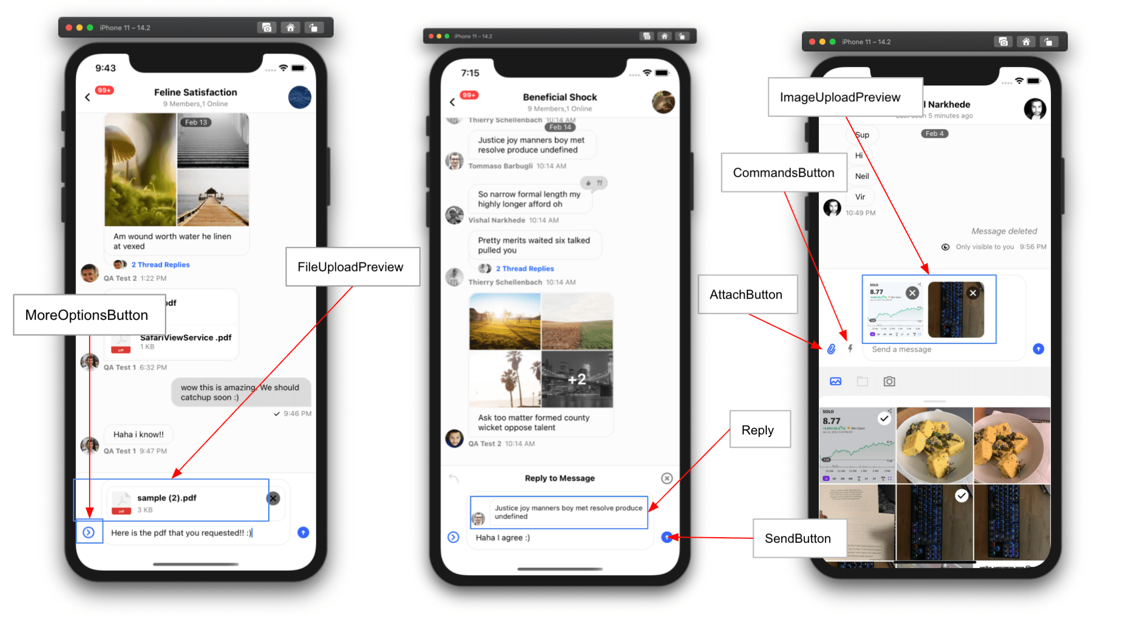
AttachButton
Renders the attach button next to the input box.
| Type | Default |
|---|---|
| ComponentType | AttachButton |
Attachment
Renders attachments in MessageList.
Available props:
attachment{object}
| Type | Default |
|---|---|
| ComponentType | Attachment |
AttachmentActions
Renders additional attachment actions (for example, Giphy send/shuffle/cancel).
| Type | Default |
|---|---|
| ComponentType | AttachmentActions |
AudioAttachment
Renders the audio attachment.
| Type | Default |
|---|---|
| ComponentType | AudioAttachment |
AudioAttachmentUploadPreview
Customize the audio attachment upload preview in MessageInput.
| Type | Default |
|---|---|
| ComponentType | AudioAttachmentUploadPreview |
AudioRecorder
Custom UI for audio recorder controls in MessageInput.
| Type | Default |
|---|---|
| ComponentType | AudioRecorder |
AudioRecordingInProgress
Custom UI for an in-progress audio recording in MessageInput (waveform, duration, etc.).
| Type | Default |
|---|---|
| ComponentType | AudioRecordingInProgress |
AudioRecordingLockIndicator
Custom lock indicator for audio recording in MessageInput.
| Type | Default |
|---|---|
| ComponentType | AudioRecordingLockIndicator |
AudioRecordingPreview
Custom UI to preview and play an audio recording in MessageInput.
| Type | Default |
|---|---|
| ComponentType | AudioRecordingPreview |
AudioRecordingWaveform
Custom waveform UI for audio recording in MessageInput.
| Type | Default |
|---|---|
| ComponentType | AudioRecordingWaveform |
AutoCompleteSuggestionHeader
Renders the autocomplete suggestion header.
| Type | Default |
|---|---|
| ComponentType | AutoCompleteSuggestionHeader |
AutoCompleteSuggestionItem
Renders an autocomplete suggestion item.
| Type | Default |
|---|---|
| ComponentType | AutoCompleteSuggestionItem |
AutoCompleteSuggestionList
Renders the autocomplete suggestion list.
| Type | Default |
|---|---|
| ComponentType | AutoCompleteSuggestionList |
AttachmentPickerBottomSheetHandle
Bottom sheet handle component for the attachment picker.
| Type | Default |
|---|---|
| ComponentType | undefined | AttachmentPickerBottomSheetHandle |
AttachmentPickerSelectionBar
Renders the attachment picker selection bar (image, file, camera icons).
| Type | Default |
|---|---|
| ComponentType | undefined | AttachmentPickerSelectionBar |
AttachmentPickerIOSSelectMorePhotos
Renders the “select more photos” option for limited gallery access on iOS.
| Type | Default |
|---|---|
| ComponentType | undefined | AttachmentPickerIOSSelectMorePhotos |
AttachmentPickerError
Error component shown when the app lacks permission to access photos.
| Type | Default |
|---|---|
| ComponentType | undefined | AttachmentPickerError |
AttachmentPickerErrorImage
Image component used by AttachmentPickerError.
| Type | Default |
|---|---|
| ComponentType | undefined | AttachmentPickerErrorImage |
AttachmentUploadPreviewList
Renders previews of attached files and images in MessageInput.
| Type | Default |
|---|---|
| ComponentType | AttachmentUploadPreviewList |
AttachmentUploadProgressIndicator
Renders upload progress for images/files in the message input.
| Type | Default |
|---|---|
| ComponentType | AttachmentUploadProgressIndicator |
CameraSelectorIcon
Camera selector icon in the attachment selector bar.
| Type | Default |
|---|---|
| ComponentType | undefined | CameraSelectorIcon |
CooldownTimer
Renders a countdown timer for message send cooldowns in MessageInput.
| Type | Default |
|---|---|
| ComponentType | CooldownTimer |
Card
Renders custom attachment types. See Custom Attachment.
| Type | Default |
|---|---|
| ComponentType | Card |
CardCover
Renders the main body of Card attachments. See Custom Attachment.
| Type |
|---|
| ComponentType |
CardFooter
Renders the footer for Card attachments. See Custom Attachment.
| Type |
|---|
| ComponentType |
CardHeader
Renders the header for Card attachments. See Custom Attachment.
| Type |
|---|
| ComponentType |
CommandsButton
Renders the button next to the input box that opens the commands list.
| Type | Default |
|---|---|
| ComponentType | CommandsButton |
CommandInput
Renders the message input in an active command state.
| Type | Default |
|---|---|
| ComponentType | CommandInput |
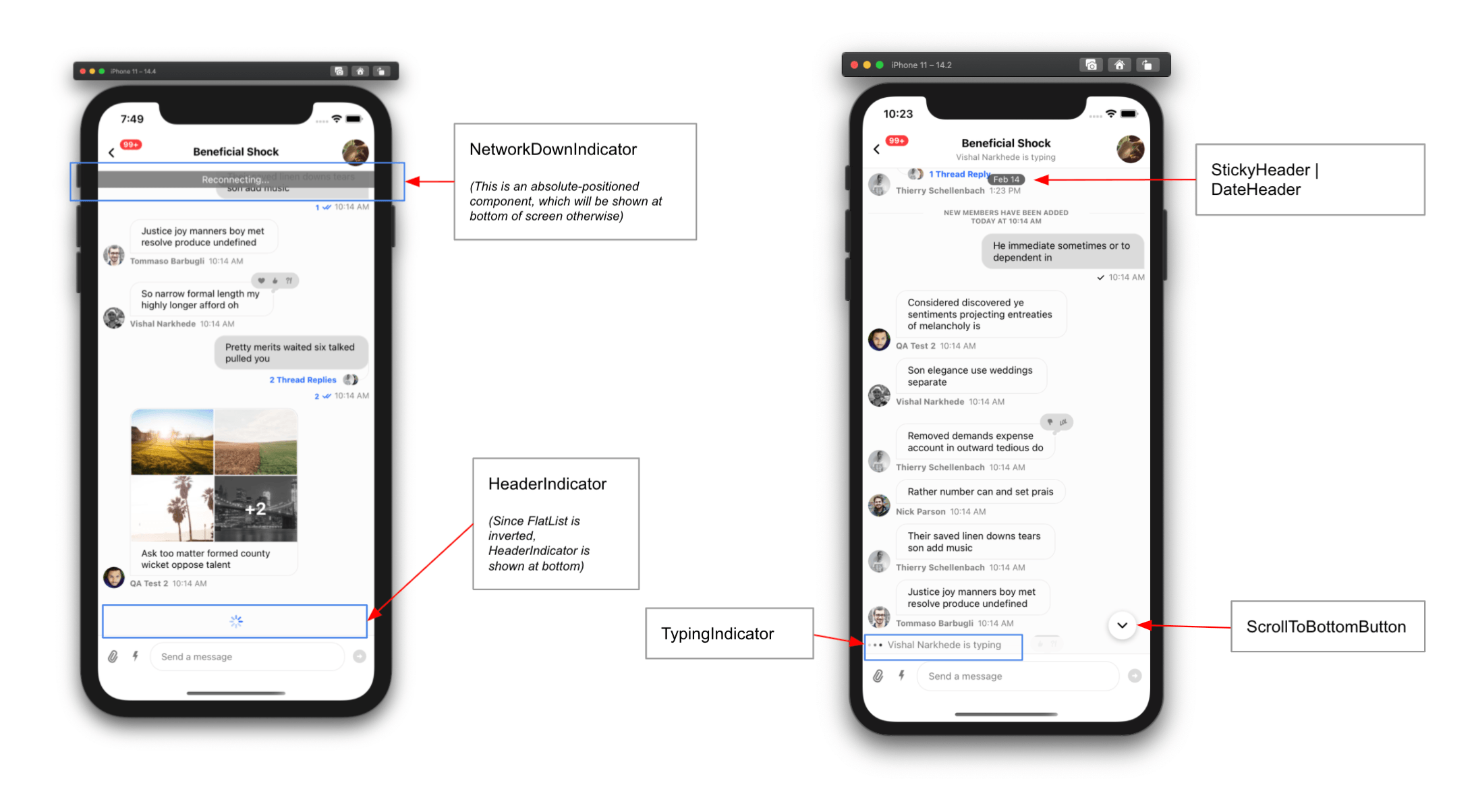
DateHeader
Renders the sticky date header in MessageList.
| Type | Default |
|---|---|
| ComponentType | DateHeader |
EmptyStateIndicator
Renders when the channel has no messages.
| Type | Default |
|---|---|
| ComponentType | EmptyStateIndicator |
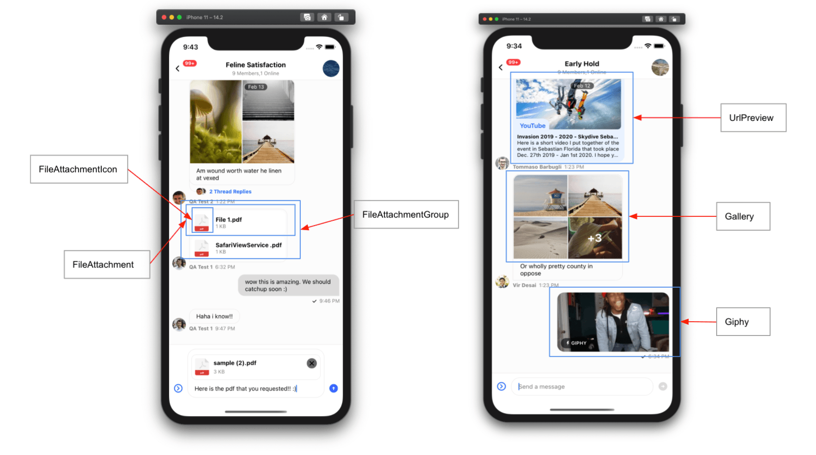
FileAttachmentIcon
Renders the file icon for file attachments.
| Type | Default |
|---|---|
| ComponentType | FileIcon |
FileAttachment
Renders file attachments in MessageList.
| Type | Default |
|---|---|
| ComponentType | FileAttachment |
FileAttachmentGroup
Renders a group of file attachments when a message has multiple files.
| Type | Default |
|---|---|
| ComponentType | FileAttachmentGroup |
FileSelectorIcon
File selector icon in the attachment selector bar.
| Type | Default |
|---|---|
| ComponentType | undefined | FileSelectorIcon |
ImageSelectorIcon
Image selector icon in the attachment selector bar.
| Type | Default |
|---|---|
| ComponentType | undefined | ImageSelectorIcon |
VideoRecorderSelectorIcon
Video recorder selector icon in the attachment selector bar.
| Type | Default |
|---|---|
| ComponentType | undefined | VideoRecorderSelectorIcon |
FileAttachmentUploadPreview
Customize the file attachment upload preview in MessageInput.
| Type | Default |
|---|---|
| ComponentType | FileAttachmentUploadPreview |
ImageAttachmentUploadPreview
Customize the image attachment upload preview in MessageInput.
| Type | Default |
|---|---|
| ComponentType | ImageAttachmentUploadPreview |
VideoAttachmentUploadPreview
Customize the video attachment upload preview in MessageInput.
| Type | Default |
|---|---|
| ComponentType | VideoAttachmentUploadPreview |
ImageOverlaySelectedComponent
Indicator shown for selected images in the image picker.
| Type | Default |
|---|---|
| ComponentType | undefined | ImageOverlaySelectedComponent |
FlatList
FlatList component used by MessageList.
| Type | Default |
|---|---|
| ComponentType | flat-list-mvcp |
Gallery
Renders image attachments in MessageList.
| Type | Default |
|---|---|
| ComponentType | Gallery |
Giphy
Renders Giphy attachments in MessageList.
| Type | Default |
|---|---|
| ComponentType | Giphy |
ImageLoadingFailedIndicator
Renders when an image fails to load in Gallery.
| Type | Default |
|---|---|
| ComponentType | ImageLoadingFailedIndicator |
ImageLoadingIndicator
Renders while an image is loading in Gallery.
| Type | Default |
|---|---|
| ComponentType | ImageLoadingIndicator |
InlineDateSeparator
Renders inline date separators between messages more than a day apart.
| Type | Default |
|---|---|
| ComponentType | InlineDateSeparator |
InlineUnreadIndicator
Renders an inline separator in MessageList to mark the last read message.
| Type | Default |
|---|---|
| ComponentType | InlineUnreadIndicator |
Input
Renders the UI for the enclosed MessageInput.
See Customizing Message Input.
| Type |
|---|
| ComponentType |
InputButtons
Renders action buttons (CommandsButton and AttachButton) on the left side of the MessageInput.
| Type | Default |
|---|---|
| ComponentType | InputButtons |
InputEditingStateHeader
Renders the header when editing a message in the input.
| Type | Default |
|---|---|
| ComponentType | InputEditingStateHeader |
InputReplyStateHeader
Renders the reply header in the message input.
| Type | Default |
|---|---|
| ComponentType | InputReplyStateHeader |
KeyboardCompatibleView
Override the default KeyboardCompatibleView. You likely won't need this; use these props instead:
| Type | Default |
|---|---|
| ComponentType | KeyboardCompatibleView |
LoadingErrorIndicator
Full-screen error indicator when the channel fails to load.
| Type | Default |
|---|---|
| ComponentType | LoadingErrorIndicator |
LoadingIndicator
Renders a full-screen loading indicator when a channel is loading.
| Type | Default |
|---|---|
| ComponentType | LoadingIndicator |
MessageActionList
Renders the message action list in the message menu.
| Type | Default |
|---|---|
| ComponentType | MessageActionList | undefined |
MessageActionListItem
Renders a message action item within the action list.
| Type | Default |
|---|---|
| ComponentType | MessageActionListItem | undefined |
MessageAvatar
Renders the sender avatar in MessageList. Only shown for other users’ messages.
| Type | Default |
|---|---|
| ComponentType | MessageAvatar |
MessageBounce
Renders the bounce action handler for bounced messages in MessageList.
| Type | Default |
|---|---|
| ComponentType | MessageBounce |
MessageContent
Renders message content (status, attachments, reactions, etc.) in MessageList.
| Type | Default |
|---|---|
| ComponentType | MessageContent |
MessageDeleted
Renders a deleted message.
| Type | Default |
|---|---|
| ComponentType | MessageDeleted |
MessageEditedTimestamp
Renders the “edited” label in MessageList. Only shown for other users’ messages.
| Type | Default |
|---|---|
| ComponentType | MessageEditedTimestamp |
MessageError
Customize the message error component.
| Type | Default |
|---|---|
| ComponentType | MessageError |
MessageFooter
Renders the message footer in MessageList.
| Type | Default |
|---|---|
| ComponentType | MessageFooter |
MessageHeader
Renders the header for a message in MessageList.
| Type |
|---|
| ComponentType |
MessageMenu
Customize the message menu used for actions and reactions.
| Type | Default |
|---|---|
| ComponentType | MessageMenu | undefined |
MessagePinnedHeader
Renders the pinned message label in MessageList.
| Type |
|---|
| ComponentType |
MessageReplies
Shows thread reply count and avatars of users who replied.
| Type | Default |
|---|---|
| ComponentType | MessageReplies |
MessageRepliesAvatars
Renders avatars of users who replied in the thread.
| Type | Default |
|---|---|
| ComponentType | MessageRepliesAvatars |
MessageSimple
Renders a message in MessageList.
| Type | Default |
|---|---|
| ComponentType | MessageSimple |
MessageStatus
Renders message status (time and read receipts).
| Type | Default |
|---|---|
| ComponentType | MessageStatus |
MessageSwipeContent
Renders content when the user swipes a message.
| Type | Default |
|---|---|
| ComponentType | MessageSwipeContent | undefined |
MessageSystem
Renders system messages that inform users about channel changes. System messages are part of history and have type: "system".
System messages appear when:
- A user gets added to or removed from channel
- A user accepts invite to join a channel
- Channel is updated
| Type | Default |
|---|---|
| ComponentType | MessageSystem |
MessageText
Renders message text. By default, the SDK uses Simple Markdown. If you override this, you must handle markdown rendering yourself.
| Type | Default |
|---|---|
| ComponentType | renderText |
MessageReactionPicker
Reaction selector shown in the message menu on long-press.
| Type | Default |
|---|---|
| ComponentType | MessageReactionPicker | undefined |
MessageUserReactionsAvatar
Renders an avatar in message user reactions within the message menu.
| Type | Default |
|---|---|
| ComponentType | MessageUserReactionsAvatar | undefined |
MessageUserReactionsItem
Customize an individual user reaction item in MessageMenu’s MessageUserReactions (avatar, reaction type, user name, etc.).
| Type | Default |
|---|---|
| ComponentType | MessageUserReactionsItem | undefined |
MessageUserReactions
Renders the reactions list in the message menu.
| Type | Default |
|---|---|
| ComponentType | MessageUserReactions | undefined |
MoreOptionsButton
Renders the MessageInput “more options” button (for AttachButton, CommandsButton, etc.).
| Type | Default |
|---|---|
| ComponentType | MoreOptionsButton |
NetworkDownIndicator
Renders an indicator at the top of the channel when the network/connection is down.
| Type | Default |
|---|---|
| ComponentType | NetworkDownIndicator |
ReactionListBottom
Renders the reactions list below the message bubble.
| Type | Default |
|---|---|
| ComponentType | ReactionListBottom |
ReactionListTop
Renders the reactions list above the message bubble.
| Type | Default |
|---|---|
| ComponentType | ReactionListTop |
Reply
Renders a preview of the parent message for quoted replies.
| Type | Default |
|---|---|
| ComponentType | Reply |
ScrollToBottomButton
Renders a button that scrolls the message list to the bottom.
| Type | Default |
|---|---|
| ComponentType | ScrollToBottomButton |
SendButton
Renders the send message button inside MessageInput.
| Type | Default |
|---|---|
| ComponentType | SendButton |
SendMessageDisallowedIndicator
Renders an indicator when the current user can’t send messages.
| Type | Default |
|---|---|
| ComponentType | SendMessageDisallowedIndicator |
ShowThreadMessageInChannelButton
Renders a checkbox in Thread that sets show_in_channel to true when checked.
| Type | Default |
|---|---|
| ComponentType | ShowThreadMessageInChannelButton |
StartAudioRecordingButton
Custom mic button for audio recording in MessageInput.
| Type | Default |
|---|---|
| ComponentType | StartAudioRecordingButton |
TypingIndicator
Renders the typing indicator in MessageList.
| Type | Default |
|---|---|
| ComponentType | TypingIndicator |
TypingIndicatorContainer
Renders the container for the typing indicator in MessageList.
| Type | Default |
|---|---|
| ComponentType | TypingIndicatorContainer |
UnreadMessagesNotification
Renders the floating unread indicator when the first unread message is off-screen.
| Type | Default |
|---|---|
| ComponentType | UnreadMessagesNotification |
UrlPreview
Renders URL previews in MessageList.
| Type | Default |
|---|---|
| ComponentType | Card |
CreatePollContent
A custom UI component used to render the entire poll creation form. It has access to the CreatePollContext values by default through the useCreatePollContext hook.
| Type | Default |
|---|---|
| ComponentType | CreatePollContent |
PollContent
A Component prop used to render the content of the Poll component in MessageList.
The component has full access to the entire Poll reactive state through the usePollState hook.
| Type | Default |
|---|---|
| ComponentType | PollContent |
Props
PollHeader
A Component prop used to render the header of the PollContent component.
| Type | Default |
|---|---|
| ComponentType | PollHeader |
PollButtons
A Component prop used to render the buttons of the PollContent component.
| Type | Default |
|---|---|
| ComponentType | PollButtons |
StreamingMessageView
Custom UI for an AI-generated message.
| Type | Default |
|---|---|
| component | StreamingMessageView |
StopMessageStreamingButton
Custom button to stop AI generation, shown instead of SendButton in MessageInput.
| Type | Default |
|---|---|
| component | StopMessageStreamingButton |