 React
React iOS
iOS Android
 Flutter
 Angular
 JavaScript
 Unity
Unity Unreal
 Node
Node Python
 Ruby
Ruby PHP
PHP Java
Java .NET
.NET Go
Go REST
RESTMaterialApp(
home: StreamChat(
client: client,
child: const MyHomePage(),
),
)Theming
Background
Stream's UI SDK makes it easy for developers to add custom styles and attributes to widgets. Starting with the design-refresh release, Stream uses StreamTheme — a Flutter ThemeExtension — instead of a dedicated wrapper widget.
StreamTheme is read via Theme.of(context) like any other ThemeExtension. You typically pass a customized instance through MaterialApp.theme.extensions (or MaterialApp.darkTheme.extensions); if you don't, StreamChat resolves a default for you (see below).
Setting Up StreamTheme
For the default look, you don't need to wire anything — just drop StreamChat into your tree. On build, StreamChat reads StreamTheme.of(context), falling back to a light or dark default based on the surrounding Theme.of(context).brightness, and appends it to the ambient Theme so every descendant Stream widget can resolve it via the standard theme lookup.
Customizing StreamTheme
To customize, construct a StreamTheme and pass it through MaterialApp.theme.extensions (and darkTheme.extensions for dark mode). StreamChat picks it up via StreamTheme.of(context) and propagates it to descendants.
The most common customization is the color scheme. Supply your own brand and chrome swatches to StreamColorScheme.light() or StreamColorScheme.dark() and pass the result to StreamTheme. Those two swatches drive the accent, text, background, and border tokens automatically inside the factory, so the palette stays cohesive.
Always build the color scheme through StreamColorScheme.light() / StreamColorScheme.dark(), not copyWith. copyWith overrides a single field without re-running the derivation, so changing brand or chrome through it leaves the dependent tokens on their defaults.
MaterialApp(
  theme: ThemeData(
    brightness: Brightness.light,
    extensions: [
      StreamTheme(
        brightness: Brightness.light,
        colorScheme: StreamColorScheme.light(
          brand: StreamColorSwatch.fromColor(Colors.indigo),
          chrome: StreamColorSwatch.fromColor(Colors.blueGrey),
        ),
        avatarTheme: const StreamAvatarThemeData(
          // Customize avatar defaults...
        ),
      ),
    ],
  ),
  darkTheme: ThemeData(
    brightness: Brightness.dark,
    extensions: [
      StreamTheme(
        brightness: Brightness.dark,
        colorScheme: StreamColorScheme.dark(
          brand: StreamColorSwatch.fromColor(
            Colors.indigo,
            brightness: Brightness.dark,
          ),
          chrome: StreamColorSwatch.fromColor(
            Colors.blueGrey,
            brightness: Brightness.dark,
          ),
        ),
      ),
    ],
  ),
  home: StreamChat(
    client: client,
    child: const MyHomePage(),
  ),
)
Reading the Theme in Widgets
There are three ways to read theme values. Pick whichever reads cleanest at the call site.
1. The aggregate themes — StreamTheme.of(context) and StreamChatTheme.of(context)
StreamTheme.of(context) returns the core aggregate (primitives, semantic tokens, and core component themes). StreamChatTheme.of(context) returns the chat aggregate (chat-specific component themes like messageListViewTheme, channelListItemTheme, threadListTileTheme). Reach for one of these when you need several values at once.
final theme = StreamTheme.of(context);
final color = theme.colorScheme.accentPrimary;
final pad = theme.spacing.md;
2. Per-component StreamFooTheme.of(context)
Every component theme is also an InheritedTheme with its own static .of that merges any nearest-ancestor subtree override (StreamButtonTheme(data: ..., child: ...)) with the aggregate value. Use this form inside any widget that might be wrapped in a scoped theme override — it picks up the override automatically. Works for both core and chat component themes.
final buttonTheme = StreamButtonTheme.of(context);            // core
final listTheme   = StreamMessageListViewTheme.of(context);   // chat
3. BuildContext extensions (core only)
stream_core_flutter exposes a getter on BuildContext for every value in StreamTheme — context.streamTheme, context.streamColorScheme, context.streamSpacing, context.streamButtonTheme, and so on. The component-theme getters are equivalent to calling the matching StreamFooTheme.of(context), so they pick up subtree overrides the same way. Chat component themes don't have extensions; use their static .of(context) accessor.
Container(
  color: context.streamColorScheme.backgroundPrimary,
  padding: EdgeInsets.all(context.streamSpacing.md),
)
Brand Color
The most basic customization you can do is to change the brand color. Set the brand and chrome swatches on StreamColorScheme when creating your StreamTheme. UI elements such as the send button, active borders, outgoing message bubbles, and text links automatically inherit the new brand color. The chrome swatch controls the neutral palette — timestamps, placeholders, and borders — so giving it a tint that complements your brand keeps the entire UI cohesive.
StreamColorSwatch
Both brand and chrome are a StreamColorSwatch which extends Flutter's ColorSwatch and represents a full palette of shades derived from a single base color. The factory StreamColorSwatch.fromColor generates the complete range automatically using HSL color space:
- Shade
0— lightest (white in light mode) - Shade
500— the exact color you supply - Shade
1000— darkest (black in light mode)
In light mode the scale runs light-to-dark (lower numbers are lighter). For dark mode, pass brightness: Brightness.dark and the scale inverts — shade 0 becomes the darkest and shade 1000 the lightest — so the palette integrates naturally with dark backgrounds.
For example, switching the brand and chrome to red in both light and dark mode:
MaterialApp(
  theme: ThemeData(
    extensions: [
      StreamTheme(
        brightness: Brightness.light,
        colorScheme: StreamColorScheme.light(
          brand: StreamColorSwatch.fromColor(const Color(0xFFE91E63)),
          chrome: StreamColorSwatch.fromColor(const Color(0xFFC9A8A8)),
        ),
      ),
    ],
  ),
  darkTheme: ThemeData(
    brightness: Brightness.dark,
    extensions: [
      StreamTheme(
        brightness: Brightness.dark,
        colorScheme: StreamColorScheme.dark(
          brand: StreamColorSwatch.fromColor(
            const Color(0xFFE91E63),
            brightness: Brightness.dark,
          ),
          chrome: StreamColorSwatch.fromColor(
            const Color(0xFFC9A8A8),
            brightness: Brightness.dark,
          ),
        ),
      ),
    ],
  ),
  themeMode: ThemeMode.system,
  home: MyHomePage(),
)| Before | After |
|---|---|
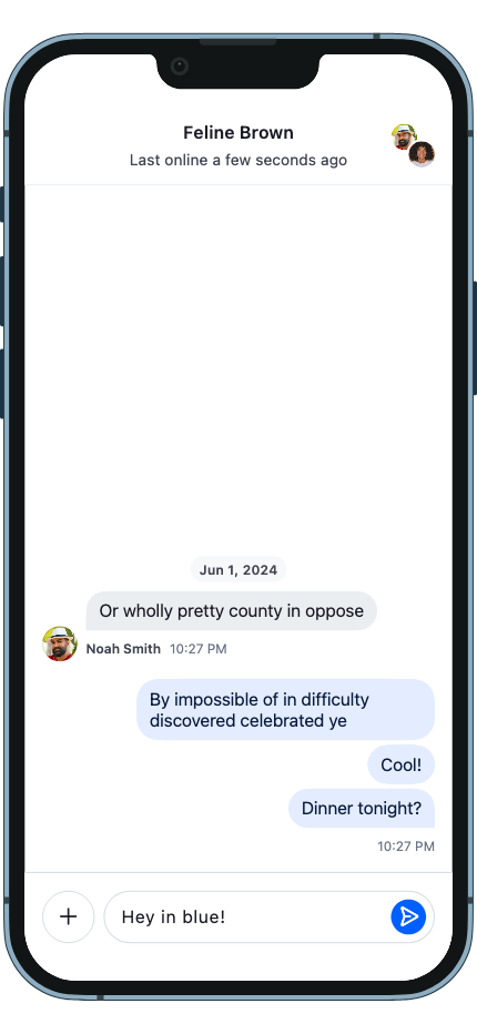 | 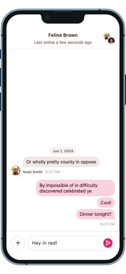 |
Color Tokens
StreamColorScheme defines the semantic color palette used throughout the Stream SDK. All tokens are accessible via StreamTheme.of(context).colorScheme.
Brand and Chrome
brand and chrome are StreamColorSwatch objects — multi-shade palettes that serve as the source of truth for all derived semantic tokens. You typically override these two instead of individual tokens, and the SDK derives the rest automatically.
| Token | Description |
|---|---|
brand | The primary brand color swatch with shades from 50 to 900. Drives accentPrimary, textLink, borderActive, and focus states. Defaults to Stream blue. |
chrome | The neutral chrome color swatch with shades from 0 (white) to 1000 (black). Drives most text, background, and border tokens. Defaults to a neutral gray scale. |
Each swatch exposes named shades via shade50, shade100, …, shade900 (and shade0 / shade1000 for chrome). Pass a custom swatch when creating StreamColorScheme.light() or StreamColorScheme.dark():
StreamColorScheme.light(
  brand: StreamColorSwatch.fromColor(Colors.indigo),
  chrome: StreamColorSwatch.fromColor(Colors.blueGrey),
)
See the Brand Color section above for a working example overriding brand and chrome together, with a before/after screenshot.
Accent
| Token | Description |
|---|---|
accentPrimary | The main brand color. Used for interactive elements, buttons, links, and primary actions. Override this to apply your brand color across the SDK. |
accentSuccess | Indicates a positive or completed state. Used for confirmations and success feedback. |
accentWarning | Indicates a cautionary state. Used for warnings and non-critical alerts. |
accentError | Indicates a failure or destructive state. Used for failed messages, validation errors, and deletions. |
accentNeutral | A mid-tone gray for de-emphasized UI elements. |
Background — Surface
| Token | Description |
|---|---|
backgroundApp | The outermost application background. Sits behind all surfaces and is generally not overridden directly. |
backgroundSurface | Background for sectioned content areas. Used for grouped containers and distinct content regions. |
backgroundSurfaceSubtle | A slightly receded background. Used for secondary containers or to create soft visual separation. |
backgroundSurfaceCard | Background for contained, card-style elements. Matches the surface in light mode but lifts slightly in dark mode to maintain visual separation. |
backgroundSurfaceStrong | A more prominent background. Used for elements that need to stand out from the main surface. |
backgroundInverse | The opposite of the primary surface. Used for tooltips, snackbars, and high-contrast floating elements. |
backgroundOnAccent | Background for elements placed on an accent-colored surface. Ensures legibility against brand colors. |
backgroundHighlight | A tint for drawing attention to content. Used for highlights and pinned messages. |
backgroundOverlayLight | A light semi-transparent layer. Used to lighten surfaces and for hover states on dark backgrounds. |
backgroundOverlayDark | A dark semi-transparent layer. Used for image overlays. |
backgroundScrim | A heavy semi-transparent layer. Used behind sheets, drawers, and modals to separate them from content. |
backgroundDisabled | Background for non-interactive elements. Flattens the element visually to signal unavailability. |
Background — State
| Token | Description |
|---|---|
backgroundHover | A subtle overlay applied on hover. Provides feedback on interactive elements on pointer devices. |
backgroundPressed | A slightly stronger overlay applied during an active press or tap. Provides tactile feedback. |
backgroundSelected | Indicates an active or selected state. Used for selected messages, active list items, and controls. |
Text
| Token | Description |
|---|---|
textPrimary | Main body text. Used for message content, titles, and any text that carries primary meaning. |
textSecondary | Supporting metadata text. Used for timestamps, subtitles, and secondary labels. |
textTertiary | De-emphasized text. Used for hints, placeholders, and lowest-priority supporting information. |
textOnInverse | Text on inverse-colored surfaces. Flips between light and dark to maintain legibility when the background inverts. |
textOnAccent | Text on accent-colored surfaces. Stays white in both light and dark mode since the accent background does not invert. |
textDisabled | Text for non-interactive or unavailable states. Communicates that an element cannot be interacted with. |
textLink | Hyperlinks and inline actions. Uses the brand color to signal interactivity within text content. |
Border — Core
| Token | Description |
|---|---|
borderDefault | Standard border for surfaces and containers. Used for input fields, cards, and dividers on neutral backgrounds. |
borderSubtle | A lighter border for minimal separation. Used where a full-strength border would feel too heavy. |
borderStrong | An emphatic border for elements that need clear definition. Used for focused containers and prominent dividers. |
borderOnAccent | Border on accent-colored surfaces. Stays white in both light and dark mode since the accent background does not invert. |
borderOnInverse | Border on inverse-colored surfaces. Stays legible when the background flips between light and dark mode. |
borderOnSurface | Border for elements placed on a surface background. |
borderOpacitySubtle | A very light transparent border. Used as a frame treatment on images and media attachments. |
borderOpacityStrong | A stronger transparent border for elements on colored or dark backgrounds. Used for waveform bars and similar treatments. |
Border — Utility
| Token | Description |
|---|---|
borderFocus | Focus ring applied to interactive elements when focused via keyboard or accessibility tools. |
borderDisabled | Border for non-interactive elements. Matches the disabled surface to visually flatten the element. |
borderDisabledOnSurface | Border for disabled elements on elevated surfaces. Stays visually distinct from the surface without drawing attention. |
borderHover | Border overlay applied on hover. Used for interactive containers on pointer devices. |
borderPressed | Border overlay applied during an active press or tap. |
borderActive | Border indicating the active or focused state of an input or control. |
borderError | Border indicating a validation error or failure state. |
borderWarning | Border indicating a cautionary or warning state. |
borderSuccess | Border indicating a successful or confirmed state. |
borderSelected | Border indicating a selected state. |
Avatar
The avatar palette is a list of StreamAvatarColorPair objects, each with a backgroundColor and foregroundColor. Colors are assigned deterministically based on the user's name or ID.
| Property | Description |
|---|---|
backgroundColor | Background color for the avatar circle. |
foregroundColor | Color for the avatar initials or icon. |
Elevation
The Stream design system uses a single elevation scale (0–4) to express vertical hierarchy. Higher levels sit visually closer to the user. Each level pairs two things: a surface color (read from the color scheme) and a drop shadow (rendered by Flutter's Material(elevation:), mapped to the same dp value Material uses).
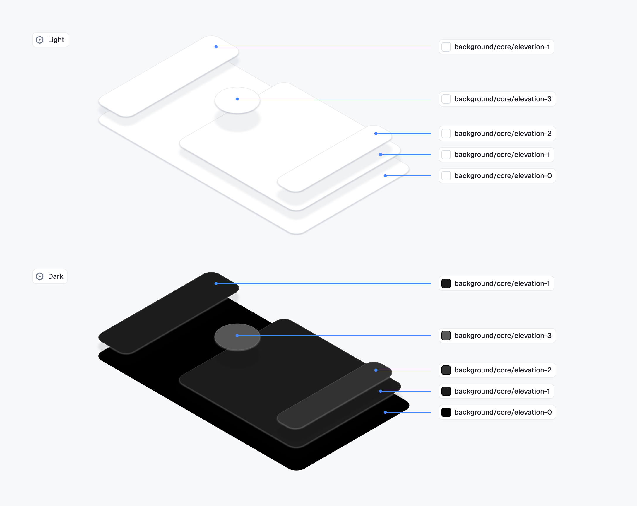
| Level | Material dp | Surface color token | Usage |
|---|---|---|---|
0 | 0 | backgroundElevation0 | Base surfaces — screen background, main content plane. No shadow. |
1 | 1 | backgroundElevation1 | Subtle separation within content — small contained components, the message list, channel list. |
2 | 3 | backgroundElevation2 | Raised surfaces — sticky headers, contained toolbars, badge counts. |
3 | 6 | backgroundElevation3 | Floating, non-blocking overlays — context menus, reaction picker, floating composer, snackbars. |
4 | 6–8 | (uses surface tokens) | Blocking overlays and modal surfaces — sheets. Combine with backgroundScrim behind the sheet. |
In light mode, levels 0–3 all resolve to white and the depth cue is the shadow alone. In dark mode, the surface tokens step progressively lighter so depth is communicated by background tint as well as shadow.
To apply a level to a Stream component, set its theme's elevation field — e.g. StreamSheetThemeData.elevation, StreamContextMenuThemeData.elevation, StreamReactionPickerThemeData.elevation. The integer flows straight into the underlying Material widget. For a custom widget, wrap it in Material(elevation: N) with the matching integer and read the surface color from the matching backgroundElevationN on context.streamColorScheme.
See Material 3 elevation for the underlying shadow algorithm.
Icon Assets
StreamIcons holds the IconData for every icon used across Stream widgets. Each icon is a standard Flutter IconData, so you can substitute any icon from Material Icons, Cupertino Icons, or your own icon font.
Pass a custom StreamIcons to StreamTheme via the icons parameter:
MaterialApp(
  theme: ThemeData(
    extensions: [
      StreamTheme(
        brightness: Brightness.light,
        icons: const StreamIcons(
          send: Icons.reply_rounded,
        ),
      ),
    ],
  ),
  home: MyHomePage(),
)| Before | After |
|---|---|
 | 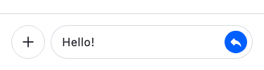 |
If the same icon is used in multiple places, replacing it in StreamIcons updates every occurrence across all Stream widgets at once.
You can also read icons from anywhere in the widget tree:
final sendIcon = context.streamIcons.send;Two-Layer Theme Architecture
Stream Chat uses two complementary theme layers:
StreamTheme(design-system tokens) — shared across all Stream products. Controls color scheme, typography, avatar sizing, badges, reaction picker appearance, and other low-level primitives. Provided as aThemeExtensiononMaterialApp.theme.StreamChatThemeData(chat-specific themes) — controls styling for chat components like message bubbles, channel list items, message input, polls, and galleries. Passed toStreamChat.themeData.
Both are optional — sensible defaults are applied automatically.
Per-Component Theme Objects
Each component has its own theme data class. Depending on which layer it belongs to, you configure it differently:
Design-system themes (via StreamTheme):
| Component | Theme Class |
|---|---|
| Message items | StreamMessageItemThemeData |
| Reaction picker | StreamReactionPickerThemeData |
| Avatars | StreamAvatarThemeData |
| Badges | StreamBadgeNotificationThemeData |
| Text inputs | StreamTextInputThemeData |
Chat-specific themes (via StreamChatThemeData):
| Component | Theme Class |
|---|---|
| Channel list items | StreamChannelListItemThemeData |
| Channel header | StreamAppBarThemeData |
| Polls | StreamPollCreatorThemeData, StreamPollInteractorThemeData |
| Thread list | StreamThreadListTileThemeData |
| Voice recording | StreamVoiceRecordingAttachmentThemeData |
Example — customizing channel list items globally:
MaterialApp(
  theme: ThemeData(
    extensions: [
      StreamTheme.light(),
    ],
  ),
  home: StreamChat(
    client: client,
    themeData: StreamChatThemeData(
      channelListItemTheme: StreamChannelListItemThemeData(
        titleStyle: const TextStyle(fontWeight: FontWeight.bold),
        subtitleStyle: const TextStyle(color: Colors.grey),
        timestampStyle: const TextStyle(fontSize: 12),
      ),
    ),
    child: const MyHomePage(),
  ),
)
Subtree Theme Overrides
StreamTheme and the per-component theme classes are InheritedWidgets — they follow the same nearest-ancestor-wins rule as Flutter's built-in Theme. Place the root StreamTheme once via MaterialApp.theme.extensions, then drop a per-component theme widget anywhere in the tree to scope an override to that subtree. The nearest ancestor wins, so a nested StreamChannelListItemTheme (for example, around a single StreamChannelListView) overrides the global value without affecting the rest of the app.
StreamChannelListItemTheme(
  data: StreamChannelListItemThemeData(
    titleStyle: const TextStyle(color: Colors.blue),
  ),
  child: StreamChannelListView(controller: controller),
)
Light and Dark Mode
Pass different StreamTheme instances to MaterialApp.theme and MaterialApp.darkTheme to support both modes:
MaterialApp(
  theme: ThemeData(
    extensions: [StreamTheme.light()],
  ),
  darkTheme: ThemeData(
    brightness: Brightness.dark,
    extensions: [StreamTheme.dark()],
  ),
  themeMode: ThemeMode.system,
  home: MyHomePage(),
)
Global Configuration
For global configuration options, use StreamChatConfigurationData passed to StreamChat.configData. This controls behavioral and structural settings that are independent of theming:
StreamChat(
  client: client,
  configData: StreamChatConfigurationData(
    reactionIconResolver: const MyReactionIconResolver(),
    enforceUniqueReactions: true,
    draftMessagesEnabled: true,
    imageCDN: const StreamImageCDN(),
    attachmentBuilders: [
      MyCustomAttachmentBuilder(),
      ...StreamAttachmentWidgetBuilder.defaultBuilders(message: message),
    ],
  ),
  child: MyHomePage(),
)| Property | Description |
|---|---|
reactionIconResolver | Maps reaction types to emoji/widgets. Defaults to DefaultReactionIconResolver |
enforceUniqueReactions | Whether a new reaction replaces the existing one. Defaults to true |
draftMessagesEnabled | Enables draft message support. Defaults to false |
imageCDN | Image CDN for generating resized URLs and cache keys. Defaults to StreamImageCDN |
attachmentBuilders | Custom attachment renderers prepended to the defaults |
reactionType | null by default; StreamMessageReactions falls back to StreamReactionsType.segmented. |
reactionPosition | null by default; falls back to StreamReactionsPosition.header. header overlaps the bubble edge; footer sits flush below it. |
messagePreviewFormatter | Formatter for message previews in channel lists |
On this page: