 React
React iOS
iOS Android
 Flutter
 Angular
 JavaScript
 Unity
Unity Unreal
 Node
Node Python
 Ruby
Ruby PHP
PHP Java
Java .NET
.NET Go
Go REST
RESTStreamMessageListView(
messageBuilder: (context, details, messageList, defaultImpl) {
return defaultImpl.copyWith(
...
);
},
),Message
Customizing Text Messages with the StreamMessageWidget
Introduction
Every application provides a unique look and feel to their own messaging interface including and not limited to fonts, colors, and shapes.
This guide details how to customize the StreamMessageWidget in the Stream Chat Flutter UI SDK.
Building Custom Messages
This guide goes into detail about the ability to customize the StreamMessageWidget. However, if you want
to customize the default StreamMessageWidget in the StreamMessageListView provided, you can use the .copyWith() method
provided inside the messageBuilder parameter of the StreamMessageListView like this:
Providing Custom Reaction Icons
By default the StreamReactionIcon widgets provided by the SDK are love, like, sad, haha, and wow.
However, you can provide your own custom reaction icons by providing a reactionIcons parameter to the StreamChatConfigurationData.
StreamChat(
  client: client,
  streamChatConfigData: StreamChatConfigurationData(
    reactionIcons: [
      StreamReactionIcon(
        type: 'custom',
        builder: (context, isHighlighted, iconSize) {
          return Icon(
            Icons.star,
            size: iconSize,
            color: isHighlighted ? Colors.red : Colors.black,
          );
        },
      ),
    ]
  ),
  child: //Your widget here
)
Theming
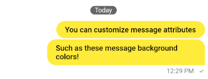
You can customize the StreamMessageWidget using the StreamChatTheme class, so that you can change the
message theme at the top instead of creating your own StreamMessageWidget at the lower implementation level.
There are several things you can change in the theme including text styles and colors of various elements.
You can also set a different theme for the user's own messages and messages received by them.
Theming allows you to change minor factors like style while using the widget directly allows you much more customization such as replacing a certain widget with another. Some things can only be customized through the widget and not the theme.
Here is an example:
StreamChatThemeData(

  /// Sets theme for user's messages
  ownMessageTheme: StreamMessageThemeData(
    messageBackgroundColor: colorTheme.textHighEmphasis,
  ),

  /// Sets theme for received messages
  otherMessageTheme: StreamMessageThemeData(
    avatarTheme: StreamAvatarThemeData(
      borderRadius: BorderRadius.circular(8),
    ),
  ),

)
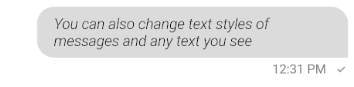
Change message text style
The StreamMessageWidget has multiple Text widgets that you can manipulate the styles of. The three main
are the actual message text, user name, message links, and the message timestamp.
StreamMessageThemeData(
  messageTextStyle: TextStyle(...),
  createdAtStyle: TextStyle(...),
  messageAuthorStyle: TextStyle(...),
  messageLinksStyle: TextStyle(...),
)
Change avatar theme
You can change the attributes of the avatar (if displayed) using the avatarTheme property.
StreamMessageThemeData(
    avatarTheme: StreamAvatarThemeData(
      borderRadius: BorderRadius.circular(8),
    ),
)
Changing Reaction theme
You also customize the reactions attached to every message using the theme.
StreamMessageThemeData(
  reactionsBackgroundColor: Colors.red,
  reactionsBorderColor: Colors.redAccent,
  reactionsMaskColor: Colors.pink,
),
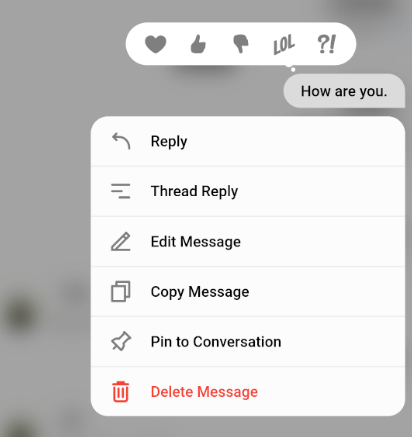
Changing Message Actions
When a message is long pressed, the StreamMessageActionsModal is shown.
The StreamMessageWidget allows showing or hiding some options if you so choose.
StreamMessageWidget(
    ...
    showUsername = true,
    showTimestamp = true,
    showReactions = true,
    showDeleteMessage = true,
    showEditMessage = true,
    showReplyMessage = true,
    showThreadReplyMessage = true,
    showResendMessage = true,
    showCopyMessage = true,
    showFlagButton = true,
    showPinButton = true,
    showPinHighlight = true,
),
Building attachments
The attachmentBuilders property allows you to build any kind of attachment (inbuilt or custom)
in your own way. While a separate guide is written for this, it is included here because of relevance.
class LocationAttachmentBuilder extends StreamAttachmentWidgetBuilder {
  @override
  bool canHandle(
    Message message,
    Map<String, List<Attachment>> attachments,
  ) {
    final imageAttachments = attachments['location'];
    return imageAttachments != null && imageAttachments.length == 1;
  }

  @override
  Widget build(
    BuildContext context,
    Message message,
    Map<String, List<Attachment>> attachments,
  ) {
    final attachmentWidget = Image.network(
      _buildMapAttachment(
        attachments[0].extraData['latitude'],
        attachments[0].extraData['longitude'],
      ),
    );

    return WrapAttachmentWidget(
      attachmentWidget: attachmentWidget,
      attachmentShape: RoundedRectangleBorder(borderRadius: BorderRadius.circular(8)),
    );
  }
}

StreamMessageListView(
  messageBuilder: (context, details, messages, defaultMessage) {
    return defaultMessage.copyWith(
        attachmentBuilders: const [
            LocationAttachmentBuilder(),
        ],
    );
  },
),
Widget Builders
Some parameters allow you to construct your own widget in place of some elements in the StreamMessageWidget.
These are:
userAvatarBuilder: Allows user to substitute their own widget in place of the user avatar.editMessageInputBuilder: Allows user to substitute their own widget in place of the input in edit mode.textBuilder: Allows user to substitute their own widget in place of the text.bottomRowBuilder: Allows user to substitute their own widget in the bottom of the message when not deleted.deletedBottomRowBuilder: Allows user to substitute their own widget in the bottom of the message when deleted.
StreamMessageWidget(
    ...
    textBuilder: (context, message) {
        // Add your own text implementation here.
    },
),