








ViewerLivestream
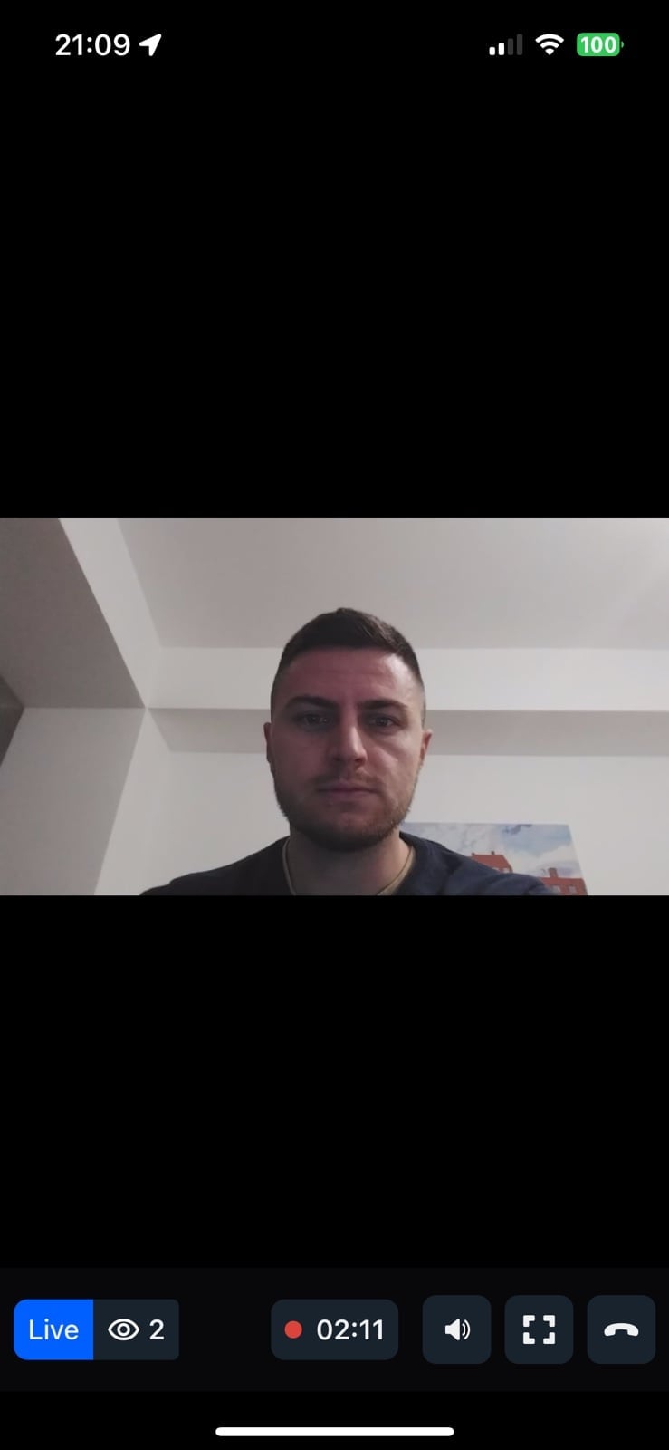
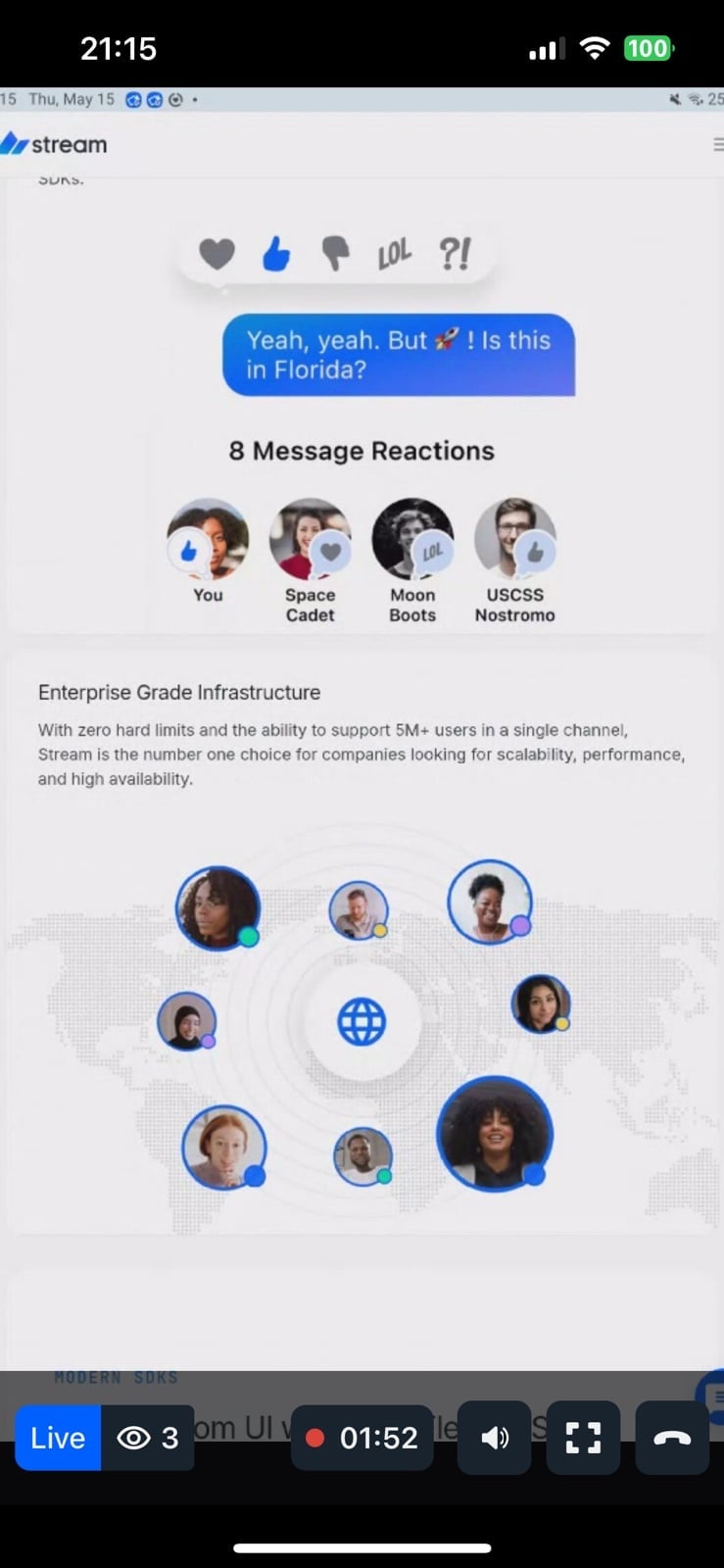
Viewer-side livestream UI component with minimal setup. Features:
- Full viewer UI - View stream video content
- Duration display - Real-time duration with live indicator
- Viewer count - Live status and active viewer count
- Interactive controls - Play/pause, audio, show/hide controls, leave
General usage
Show ViewerLivestream UI:
import {
  Call,
  StreamCall,
  ViewerLivestream,
} from "@stream-io/video-react-native-sdk";

const VideoCallUI = () => {
  let call: Call;
  // your logic to create a new call or get an existing call

  return (
    <StreamCall call={call}>
      <ViewerLivestream />
    </StreamCall>
  );
};
Props
ViewerLivestreamTopView
Component to customize the top view at the viewer's live stream.
| Type | Default Value |
|---|---|
ComponentType| undefined |
ViewerLivestreamTopView |
LivestreamLayout
Component to customize the live stream video layout.
| Type | Default Value |
|---|---|
ComponentType| undefined |
LivestreamLayout |
ViewerLivestreamControls
Component to customize the bottom view controls at the viewer's live stream.
| Type | Default Value |
|---|---|
ComponentType| undefined |
ViewerLivestreamControls |
DurationBadge
Component to customize the duration badge on the viewer's livestream top view.
| Type | Default Value |
|---|---|
ComponentType| undefined |
DurationBadge |
FollowerCount
Component to customize the follower count indicator on the viewer's livestream top view.
| Type | Default Value |
|---|---|
ComponentType| undefined |
FollowerCount |
LiveIndicator
Component to customize the live indicator on the viewer's livestream top view.
| Type | Default Value |
|---|---|
ComponentType| undefined |
LiveIndicator |
ViewerLeaveStreamButton
Component to customize the leave stream button for the viewer.
| Type | Default Value |
|---|---|
ComponentType| undefined |
ViewerLeaveStreamButton |
FloatingParticipantView
Prop to customize the FloatingParticipantView component.
| Type | Default Value |
|---|---|
ComponentType| undefined |
FloatingParticipantView |
Props
| Prop | Type | Default Value | Description |
|---|---|---|---|
participant |
StreamVideoParticipant | undefined |
The participant to render in the floating view. | |
alignment |
top-left | top-right | bottom-left | bottom-right |
top-right |
Determines where the floating participant video will be placed initially. |
onPressHandler |
() => void | undefined |
Handler invoked when the floating participant view is pressed. | |
participantViewStyle |
ViewStyle | Style override for the participant view container. | |
draggableContainerStyle |
ViewStyle | Style override for the draggable container. | |
videoZOrder |
number |
1 |
The z-order for the video view. |
objectFit |
'contain' | 'cover' | undefined |
undefined |
How the video fits within its container. |
mirror |
boolean | undefined |
undefined |
Forces mirroring on or off. When omitted, the default mirroring logic is used. |
supportedReactions |
StreamReactionType[] |
Reactions to enable for the floating participant view. | |
ParticipantView |
ComponentType | undefined |
ParticipantView |
Custom participant view component. |
ParticipantLabel |
ComponentType | undefined |
ParticipantLabel |
Custom label component. |
ParticipantReaction |
ComponentType | undefined |
ParticipantReaction |
Custom reaction component. |
ParticipantVideoFallback |
ComponentType | null | undefined |
ParticipantVideoFallback |
Fallback when video is unavailable. Use null to disable. |
ParticipantNetworkQualityIndicator |
ComponentType | undefined |
ParticipantNetworkQualityIndicator |
Custom network quality indicator. |
VideoRenderer |
ComponentType | undefined |
VideoRenderer |
Custom video renderer component. |
onLeaveStreamHandler
Handler to be called when the leave stream button is pressed by the viewer.
| Type |
|---|
() => void | undefined |
joinBehavior
Determines when the viewer joins the call. Can have one of these two values: "asap" (by default) or "live".