








CallParticipantsList
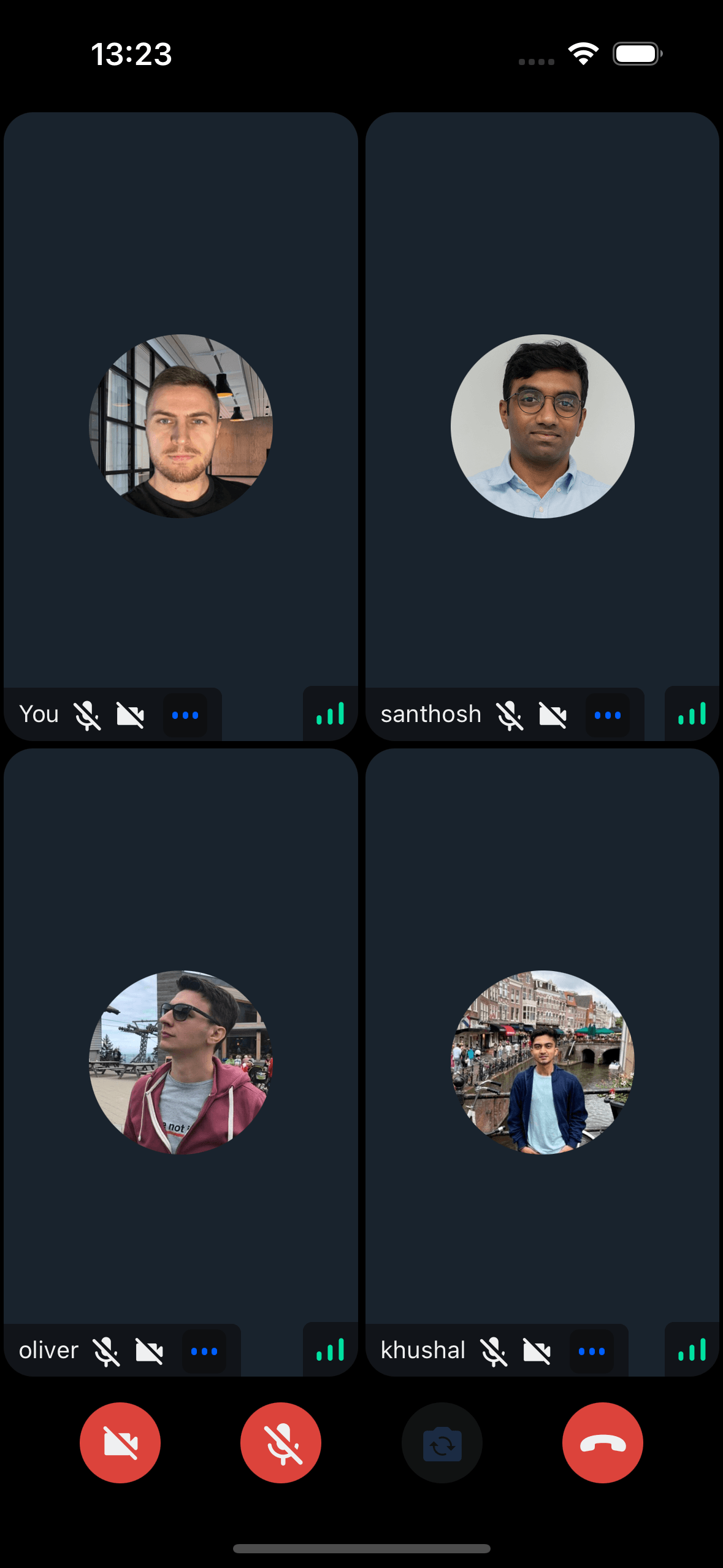
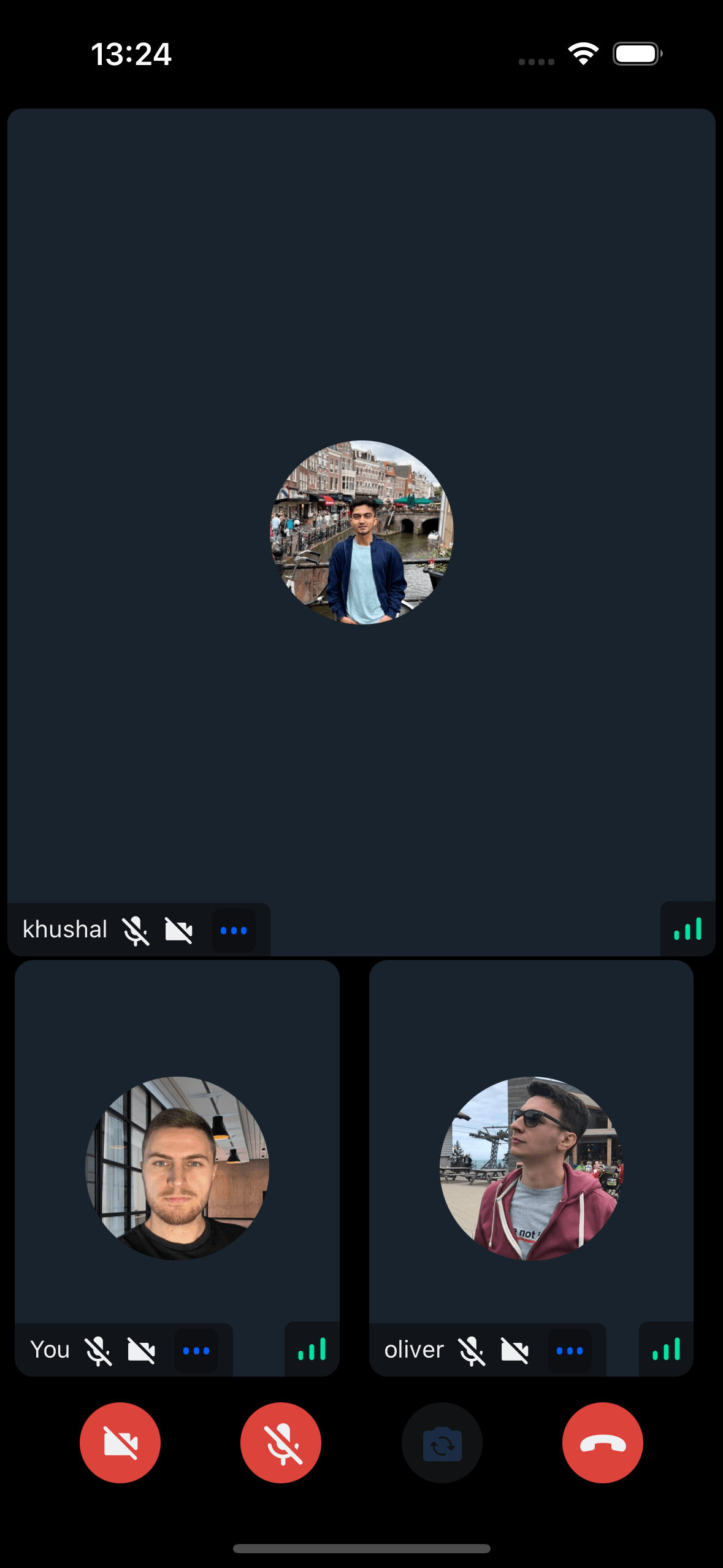
Display participants in a FlatList with vertical or horizontal scrolling.
This component depends on a flex container to calculate the width and height of the participant view, hence it should be used only in a flex parent container
Our CallContent component internally uses CallParticipantsList inside Call layouts components (CallParticipantsGrid and CallParticipantsSpotlight).
General Usage
Display all participants as a FlatList. Default: vertical layout with 2 participants per row (customizable via props).
import {
  Call,
  CallParticipantsList,
  StreamCall,
  useParticipants,
} from "@stream-io/video-react-native-sdk";

const VideoCallUI = () => {
  let call: Call;
  const allParticipants = useParticipants();

  return (
    <StreamCall call={call}>
      <CallParticipantsList participants={allParticipants} />
    </StreamCall>
  );
};
Props
participants
| Type |
|---|
StreamVideoParticipant[] |
The list of participants to list in the view.
numberOfColumns
| Type | Default Value |
|---|---|
number | undefined |
2 |
The number of participants to be displayed in a single row. This property is only used when there are more than 2 participants.
horizontal
| Type | Default Value |
|---|---|
boolean | undefined |
false |
This decides whether the participants should be listed vertically or horizontally.
landscape
Applies the landscape mode styles to the component, if true.
| Type |
|---|
boolean | undefined |
mirror
Forces participant's video to be mirrored or unmirrored. By default, video track from the local participant is mirrored, and all other videos are not mirrored.
| Type |
|---|
boolean |
ParticipantLabel
Component to customize the Label of the participant.
| Type | Default Value |
|---|---|
ComponentType| undefined |
ParticipantLabel |
ParticipantReaction
Component to customize the participant reaction display.
| Type | Default Value |
|---|---|
ComponentType| undefined |
ParticipantReaction |
ParticipantVideoFallback
Component to customize the video fallback of the participant, when the video is disabled.
| Type | Default Value |
|---|---|
ComponentType| undefined |
ParticipantVideoFallback |
ParticipantNetworkQualityIndicator
Component to customize the network quality indicator of the participant.
| Type | Default Value |
|---|---|
ComponentType| undefined |
ParticipantNetworkQualityIndicator |
VideoRenderer
Component to customize the participant video. Also displays the ParticipantVideoFallback.
The VideoRenderer accepts a mirror?: boolean prop to force mirroring on or off. When provided, it takes precedence over the default mirroring logic.
| Type | Default Value |
|---|---|
ComponentType| undefined |
VideoRenderer |
Props
| Prop | Type | Default Value | Description |
|---|---|---|---|
participant |
StreamVideoParticipant |
The participant whose video or screenshare should be rendered. | |
trackType |
videoTrack | screenShareTrack |
videoTrack |
The track to render. |
isVisible |
boolean |
true |
When false, the video stream is not shown even if it is available. |
objectFit |
'contain' | 'cover' | undefined |
undefined |
How the video fits within its container. When omitted, a default is computed from the track dimensions. |
videoZOrder |
number |
0 |
The z-order to apply to the underlying RTC view. |
mirror |
boolean | undefined |
undefined |
Forces mirroring on or off. When omitted, the default mirroring logic is used. |
ParticipantVideoFallback |
ComponentType | null | undefined |
ParticipantVideoFallback |
Component to render when video is unavailable. Use null to disable the fallback. |
ParticipantView
Prop to customize the ParticipantView component entirely.
| Type | Default Value |
|---|---|
ComponentType| undefined |
ParticipantView |