 React
React iOS
iOS Android
 Flutter
 JavaScript
 Unity
Unity ESP32
ESP32 Platform
 Vision Agents
import React, { useState } from "react";
import { Call, CallContent } from "@stream-io/video-react-native-sdk";
import { StyleSheet, View } from "react-native";

const VideoCallUI = () => {
  const { selectedLayout } = useLayout();
  let call: Call;
  // your logic to create a new call or get an existing call

  return (
    <StreamCall call={call}>
      <CallContent layout={selectedLayout} />
    </StreamCall>
  );
};Runtime layout switching
Runtime layout switching allows users to change participant layouts during calls. The SDK supports grid and spotlight layout modes.
Best Practices
- Persist user preference - Save the selected layout for future sessions
- Provide clear UI - Use recognizable icons for each layout option
- Consider participant count - Grid works better for few participants; spotlight for many
- Handle orientation changes - Layouts may need adjustment in landscape mode
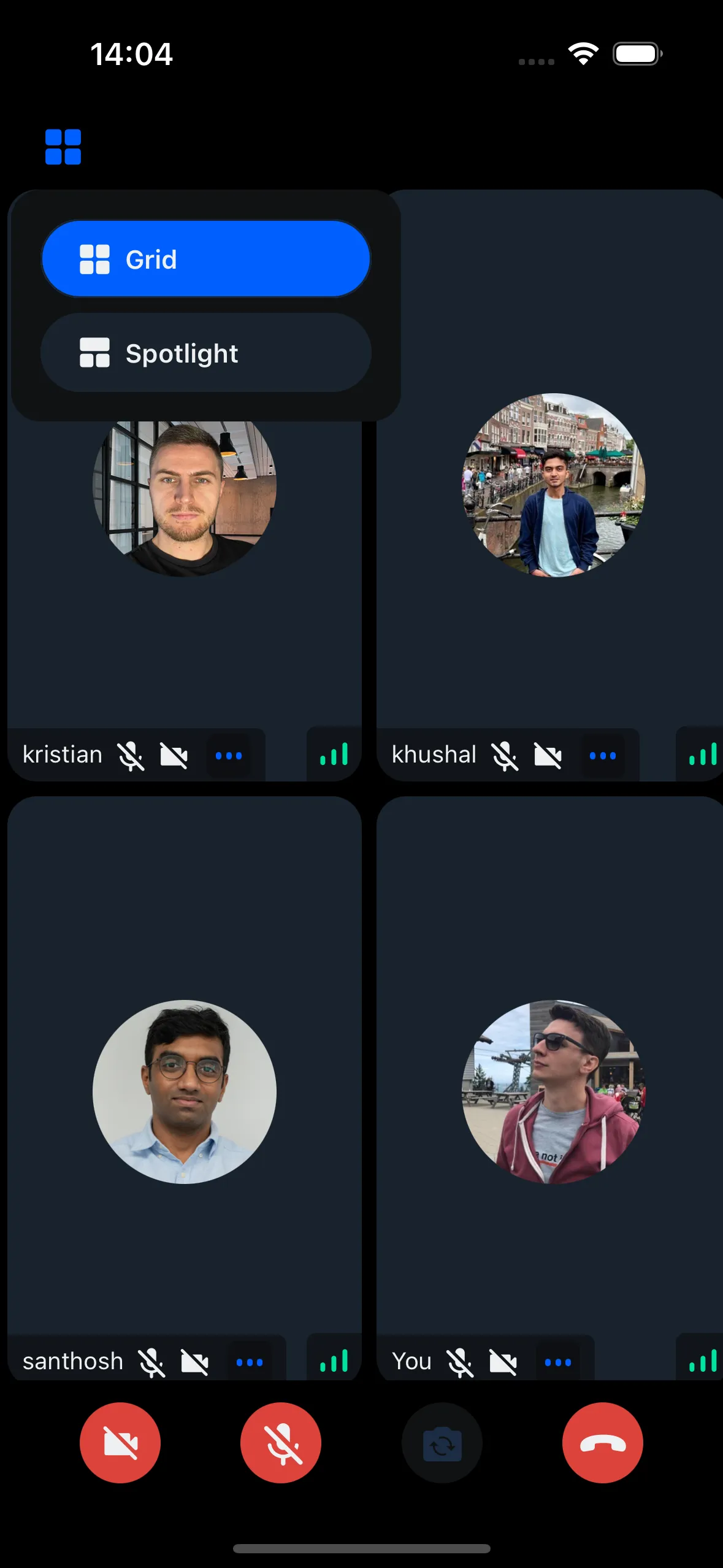
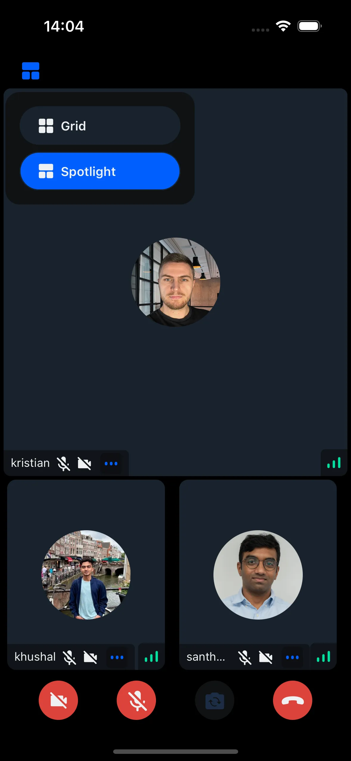
Switching the layout from the App
Use the layout prop of CallContent to switch layouts.
Create a state variable to track the current layout and pass it to the layout prop:
Creating the CallHeader with Layout switching Modal/Component
Create a button that opens a modal for layout selection. Selecting a layout updates the selectedLayout state.
Example:
import React, { useState } from "react";
import {
  CallControlsButton,
  useTheme,
} from "@stream-io/video-react-native-sdk";
import { IconWrapper } from "@stream-io/video-react-native-sdk/src/icons";
import LayoutSwitcherModal from "./LayoutSwitcherModal";
import { ColorValue } from "react-native";
import { Grid } from "../../assets/Grid";
import { SpotLight } from "../../assets/Spotlight";
import { useLayout } from "../../contexts/LayoutContext";

export type LayoutSwitcherButtonProps = {
  /**
   * Handler to be called when the layout switcher button is pressed.
   * @returns void
   */
  onPressHandler?: () => void;
};

const getIcon = (selectedButton: string, color: ColorValue, size: number) => {
  switch (selectedButton) {
    case "grid":
      return <Grid color={color} size={size} />;
    case "spotlight":
      return <SpotLight color={color} size={size} />;
    default:
      return "grid";
  }
};

/**
 * The layout switcher Button can be used to switch different layout arrangements
 * of the call participants.
 */
export const LayoutSwitcherButton = ({
  onPressHandler,
}: LayoutSwitcherButtonProps) => {
  const {
    theme: { colors, variants },
  } = useTheme();

  const { selectedLayout } = useLayout();
  const [isModalVisible, setIsModalVisible] = useState(false);
  const [anchorPosition, setAnchorPosition] = useState<{
    x: number;
    y: number;
    width: number;
    height: number;
  } | null>(null);

  const buttonColor = isModalVisible
    ? colors.iconSecondary
    : colors.iconPrimary;

  const handleOpenModal = () => setIsModalVisible(true);
  const handleCloseModal = () => setIsModalVisible(false);

  const handleLayout = (event: any) => {
    const { x, y, width, height } = event.nativeEvent.layout;
    setAnchorPosition({ x, y: y + height, width, height });
  };

  return (
    <CallControlsButton
      size={variants.roundButtonSizes.md}
      onLayout={handleLayout}
      onPress={() => {
        handleOpenModal();
        if (onPressHandler) {
          onPressHandler();
        }
        setIsModalVisible(!isModalVisible);
      }}
      color={colors.sheetPrimary}
    >
      <IconWrapper>
        {getIcon(selectedLayout, buttonColor, variants.iconSizes.lg)}
      </IconWrapper>
      <LayoutSwitcherModal
        isVisible={isModalVisible}
        anchorPosition={anchorPosition}
        onClose={handleCloseModal}
      />
    </CallControlsButton>
  );
};
import React, { useEffect, useState, useMemo } from "react";
import {
View,
TouchableOpacity,
Text,
StyleSheet,
Dimensions,
Modal,
} from "react-native";
import { useTheme } from "@stream-io/video-react-native-sdk";
import { Grid } from "../../assets/Grid";
import { SpotLight } from "../../assets/Spotlight";
import { Layout, useLayout } from "../../contexts/LayoutContext";
interface AnchorPosition {
x: number;
y: number;
height: number;
}
interface PopupComponentProps {
anchorPosition?: AnchorPosition | null;
isVisible: boolean;
onClose: () => void;
}
const LayoutSwitcherModal: React.FC<PopupComponentProps> = ({
isVisible,
onClose,
anchorPosition,
}) => {
const { theme } = useTheme();
const styles = useStyles();
const [popupPosition, setPopupPosition] = useState({ top: 0, left: 0 });
const { selectedLayout, onLayoutSelection } = useLayout();
const topInset = theme.variants.insets.top;
const leftInset = theme.variants.insets.left;
useEffect(() => {
if (isVisible && anchorPosition) {
const windowHeight = Dimensions.get("window").height;
const windowWidth = Dimensions.get("window").width;
let top = anchorPosition.y + anchorPosition.height / 2 + topInset;
let left = anchorPosition.x + leftInset;
// Ensure the popup stays within the screen bounds
if (top + 150 > windowHeight) {
top = anchorPosition.y - 150;
}
if (left + 200 > windowWidth) {
left = windowWidth - 200;
}
setPopupPosition({ top, left });
}
}, [isVisible, anchorPosition, topInset, leftInset]);
if (!isVisible || !anchorPosition) {
return null;
}
const onPressHandler = (layout: Layout) => {
onLayoutSelection(layout);
onClose();
};
return (
<Modal
transparent
visible={isVisible}
onRequestClose={onClose}
supportedOrientations={["portrait", "landscape"]}
>
<TouchableOpacity style={styles.overlay} onPress={onClose}>
<View
style={[
styles.modal,
{ top: popupPosition.top, left: popupPosition.left },
]}
>
<TouchableOpacity
style={[
styles.button,
selectedLayout === "grid" && styles.selectedButton,
]}
onPress={() => onPressHandler("grid")}
>
<Grid
size={theme.variants.iconSizes.md}
color={theme.colors.iconPrimary}
/>
<Text style={styles.buttonText}>Grid</Text>
</TouchableOpacity>
<TouchableOpacity
style={[
styles.button,
selectedLayout === "spotlight" && styles.selectedButton,
]}
onPress={() => onPressHandler("spotlight")}
>
<SpotLight
size={theme.variants.iconSizes.md}
color={theme.colors.iconPrimary}
/>
<Text style={styles.buttonText}>Spotlight</Text>
</TouchableOpacity>
</View>
</TouchableOpacity>
</Modal>
);
};
// styles omitted for brevity
export default LayoutSwitcherModal;Layout context
Create a context to manage layout state across components:
import React, {
  createContext,
  useContext,
  useState,
  ReactNode,
  useCallback,
} from "react";

export type Layout = "grid" | "spotlight";

interface LayoutContextState {
  selectedLayout: Layout;
  onLayoutSelection: (layout: Layout) => void;
}

const LayoutContext = createContext<LayoutContextState | null>(null);

interface LayoutProviderProps {
  children: ReactNode;
}

const LayoutProvider: React.FC<LayoutProviderProps> = ({ children }) => {
  const [selectedLayout, setSelectedLayout] = useState<Layout>("grid");

  const onLayoutSelection = useCallback((layout: Layout) => {
    setSelectedLayout(layout);
  }, []);

  return (
    <LayoutContext.Provider value={{ selectedLayout, onLayoutSelection }}>
      {children}
    </LayoutContext.Provider>
  );
};

const useLayout = (): LayoutContextState => {
  const context = useContext(LayoutContext);
  if (!context) {
    throw new Error("useLayout must be used within a LayoutProvider");
  }
  return context;
};

export { LayoutProvider, useLayout };
Creating a custom CallHeader
Create a custom CallHeader component containing the LayoutSwitcherButton:
export const CustomCallHeader = () => {
  const [topControlsHeight, setTopControlsHeight] = useState<number>(0);
  const [topControlsWidth, setTopControlsWidth] = useState<number>(0);
  const styles = useStyles();

  const onLayout: React.ComponentProps<typeof View>["onLayout"] = (event) => {
    const { height, width } = event.nativeEvent.layout;
    if (setTopControlsHeight) {
      setTopControlsHeight(height);
      setTopControlsWidth(width);
    }
  };

  return (
    <View>
      <TopViewBackground height={topControlsHeight} width={topControlsWidth} />
      <View style={styles.content} onLayout={onLayout}>
        <View style={styles.centerElement}>
          <LayoutSwitcherButton />
        </View>
      </View>
    </View>
  );
};
Use CustomCallHeader with CallContent:
import React, { useCallback, useState } from "react";
import { Call, CallContent } from "@stream-io/video-react-native-sdk";

const VideoCallUI = () => {
  const { selectedLayout } = useLayout();
  let call: Call;
  // your logic to create a new call or get an existing call

  return (
    <StreamCall call={call}>
      <CustomCallHeader />
      <CallContent layout={selectedLayout} />
    </StreamCall>
  );
};