 React
React iOS
iOS Android
 Flutter
 JavaScript
 Unity
Unity Platform
 Vision Agents
import {
  ParticipantView,
  useCallStateHooks,
} from "@stream-io/video-react-native-sdk";

const App = () => {
  const { useParticipants } = useCallStateHooks();
  const participants = useParticipants();

  // Here to show the demo, we pass only first participant. You can pass any of the participant.
  return <ParticipantView participant={participants[0]} />;
};ParticipantView
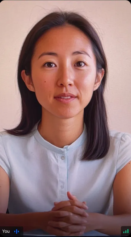
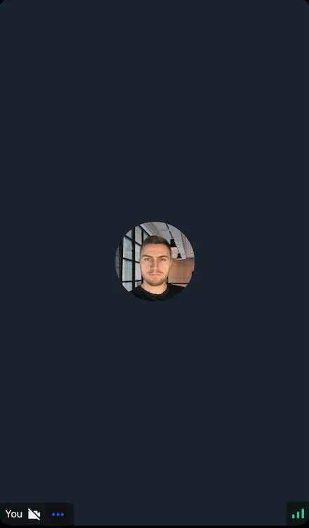
Renders participant video with info (name, mute state, reaction, network quality). Supports screen sharing view.
Features:
- Participant info - Name, audio/video state, reactions, network quality
- Video/avatar toggle - Based on participant's video state
- Action buttons - E.g., unpin participant
It is used as a building block to render individual item of participants in CallContent and CallParticipantsList.
General Usage
Standalone usage:
Props
participant
The participant to be rendered in the ParticipantView.
trackType
The type of the participant stream to be rendered. Eg: screen sharing or participant's video stream.
| Type | Default Value |
|---|---|
videoTrack | screenShareTrack | videoTrack |
style
This prop is used to override the root container style of the component.
| Type |
|---|
| ViewStyle |
isVisible
When set to false, the video stream will not be shown even if it is available.
| Type | Default Value |
|---|---|
boolean | true |
videoZOrder
The zOrder for the video that will be displayed.
| Type | Default Value |
|---|---|
number | 0 |
objectFit
Represents how the video view fits within the parent view.
| Type | Default Value |
|---|---|
'contain' | 'cover' |undefined | cover |
mirror
Forces participant's video to be mirrored or unmirrored. By default, video track from the local participant is mirrored, and all other videos are not mirrored.
| Type |
|---|
boolean |
supportedReactions
Supported reactions for the call. Default reactions:
- 🤣 Rolling on the floor laughing
- 👍 like
- 👎 Dislike
- 🎉 fireworks
- 🙌 Raised hands
- ✋ Raised hand
| Type |
|---|
StreamReactionType & { icon: string }[] |
ParticipantLabel
Component to customize the Label of the participant.
| Type | Default Value |
|---|---|
ComponentType| undefined | ParticipantLabel |
ParticipantReaction
Component to customize the participant reaction display.
| Type | Default Value |
|---|---|
ComponentType| undefined | ParticipantReaction |
ParticipantVideoFallback
Component to customize the video fallback of the participant, when the video is disabled.
| Type | Default Value |
|---|---|
ComponentType| undefined | ParticipantVideoFallback |
ParticipantNetworkQualityIndicator
Component to customize the network quality indicator of the participant.
| Type | Default Value |
|---|---|
ComponentType| undefined | ParticipantNetworkQualityIndicator |
VideoRenderer
Component to customize the participant video. Also displays the ParticipantVideoFallback.
The VideoRenderer accepts a mirror?: boolean prop to force mirroring on or off. When provided, it takes precedence over the default mirroring logic.
| Type | Default Value |
|---|---|
ComponentType| undefined | VideoRenderer |
Props
| Prop | Type | Default Value | Description |
|---|---|---|---|
participant | StreamVideoParticipant | The participant whose video or screenshare should be rendered. | |
trackType | videoTrack | screenShareTrack | videoTrack | The track to render. |
isVisible | boolean | true | When false, the video stream is not shown even if it is available. |
objectFit | 'contain' | 'cover' | undefined | undefined | How the video fits within its container. When omitted, a default is computed from the track dimensions. |
videoZOrder | number | 0 | The z-order to apply to the underlying RTC view. |
mirror | boolean | undefined | undefined | Forces mirroring on or off. When omitted, the default mirroring logic is used. |
ParticipantVideoFallback | ComponentType | null | undefined | ParticipantVideoFallback | Component to render when video is unavailable. Use null to disable the fallback. |
Customization
UI cookbook guides:
On this page: