Emoji Picker
Note that this guide is for versions lower than 11.0.0, the new API has slightly changed. See the "Dropping support for built-in EmojiPicker" release guide to help you transition smoothly to the new API.
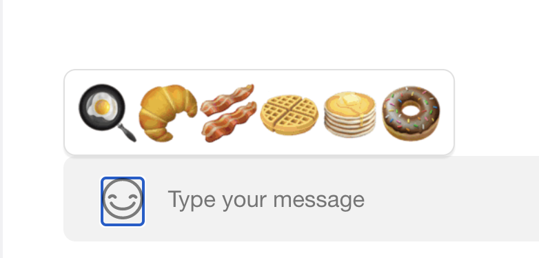
In this example, we will demonstrate how to create a custom Emoji Picker component that can be used in the MessageInput. This component will replace the default EmojiPicker with only breakfast food emojis.
Choose Your Emojis
The default EmojiPicker renders individual emoji objects using the NimbleEmoji component from emoji-mart. Our custom set of emojis will need to follow the same NimbleEmoji props. NimbleEmoji accepts an emoji prop, which pertains to either an object mapping of the emoji data or simply the ID (for IDs already existing in emoji-mart). The object mapping of the emoji prop has the following type:
export interface BaseEmoji {
  colons: string;
  emoticons: string[];
  id: string;
  name: string;
  native: string;
  skin: EmojiSkin | null;
  unified: string;
}
In this example we will use only the ID and select existing emojis. For a more detailed example of how to construct these emoji objects, please see the Reactions Selector and List section. Below is the array of breakfast emojis we will use:
const customEmojis = ['fried_egg', 'croissant', 'bacon', 'waffle', 'pancakes', 'doughnut'];
For help getting emoji object data, you can index search the default emojiData loaded into the component library.
Create the Custom Component
To construct our component, we will utilize the EmojiContext to get our emojiConfig data. This config object contains the emojiData we need for the data prop on the Emoji component. Using the onSelectEmoji method from the MessageInputContext, we can add the onClick functionality to our custom picker.
The Emoji component needs to be wrapped in React's Suspense component because it is lazy loaded.
This is what our final code will look like:
export const CustomEmojiPicker = () => {
  const { Emoji, emojiConfig } = useEmojiContext();
  const { onSelectEmoji } = useMessageInputContext();

  const { emojiData } = emojiConfig || {};
  const customEmojis = ['fried_egg', 'croissant', 'bacon', 'waffle', 'pancakes', 'doughnut'];

  return (
    <div className='wrapper'>
      {customEmojis.map((emoji) => (
        <Suspense fallback={null} key={i}>
          <Emoji onClick={onSelectEmoji} emoji={emoji} size={40} data={emojiData} />
        </Suspense>
      ))}
    </div>
  );
};
.wrapper {
  display: flex;
  align-items: center;
  background: #ffffff;
  border-radius: 8px;
  box-shadow: 0 2px 1px 0 rgba(0, 0, 0, 0.07);
  border: 1px solid #e0e0e0;
  padding: 8px;
}
From here all we need to do is override the default component in Channel at the App.tsx level:
<Channel EmojiPicker={CustomEmojiPicker}>{/* children of Channel component */}</Channel>
The Result