Reaction Selector and List
If you're moving from older versions to 11.0.0 then make sure to read "Introducing new reactions" release guide to help you transition to the new implementation.
In this example, we will demonstrate how to override the library's default reaction set, which can be found stored as the
defaultMinimalEmojis
variable. We will replace the default set with up and down arrows, simulating an up/down voting feature.
Choose Your Reactions
Under the hood, our ReactionSelector, ReactionsList, and SimpleReactionsList components render individual emoji objects
using the NimbleEmoji component
from emoji-mart. Therefore, the object type of our custom reactions needs to
conform to NimbleEmoji props.
NimbleEmoji accepts an emoji prop, which pertains to the object mapping of your custom reaction. The emoji prop has
the following type:
export interface BaseEmoji {
  colons: string;
  emoticons: string[];
  id: string;
  name: string;
  native: string;
  skin: EmojiSkin | null;
  unified: string;
}
Therefore, you'll need to similarly construct the emoji objects for the custom reactions you choose to render in our default
components. For this demo, we're going to replace the default set with 'arrow-up' and 'arrow-down'.
Mirroring the BaseEmoji type, we assemble our emoji objects into the below custom reactions array:
const customReactions = [
  {
    colons: ':arrow_up:',
    emoticons: [],
    id: 'arrow_up',
    name: 'Upwards Black Arrow',
    native: '⬆️',
    skin: null,
    unified: '2b06-fe0f',
  },
  {
    colons: ':arrow_down:',
    emoticons: [],
    id: 'arrow_down',
    name: 'Downwards Black Arrow',
    native: '⬇️',
    skin: null,
    unified: '2b07-fe0f',
  },
];
For help getting emoji object data, you can index search the default emojiData loaded into the component library.
const { emojiConfig, EmojiIndex } = useEmojiContext();

const emojiIndex = new EmojiIndex(emojiConfig.emojiData);
const results = emojiIndex.search('arrow'); // returns an array of emoji object results
Override the Default Set
To override the default set of reactions, add your custom set to the reactionOptions prop on both the
ReactionSelector component and your list component,
either ReactionsList or
SimpleReactionsList if using one of the library defaults.
const customReactions = [
  {
    colons: ':arrow_up:',
    emoticons: [],
    id: 'arrow_up',
    name: 'Upwards Black Arrow',
    native: '⬆️',
    skin: null,
    unified: '2b06-fe0f',
  },
  {
    colons: ':arrow_down:',
    emoticons: [],
    id: 'arrow_down',
    name: 'Downwards Black Arrow',
    native: '⬇️',
    skin: null,
    unified: '2b07-fe0f',
  },
];

<ReactionSelector reactionOptions={customReactions} />
<SimpleReactionsList reactionOptions={customReactions} />
If custom reactionOptions are supplied to the selector component, then the same data set needs to be delivered to the list component so the display for processed reactions has the same emoji objects.
The Final Code
Putting all the pieces together and building upon the custom message in the General Customization section, we are left with the following code for our Message UI component:
import React, { useRef } from 'react';
import {
  Attachment,
  Avatar,
  messageHasReactions,
  MessageOptions,
  MessageRepliesCountButton,
  MessageStatus,
  MessageText,
  MessageTimestamp,
  ReactionSelector,
  SimpleReactionsList,
  useMessageContext,
} from 'stream-chat-react';

import './CustomMessage.scss';

const customReactions = [
  {
    colons: ':arrow_up:',
    emoticons: [],
    id: 'arrow_up',
    name: 'Upwards Black Arrow',
    native: '⬆️',
    skin: null,
    unified: '2b06-fe0f',
  },
  {
    colons: ':arrow_down:',
    emoticons: [],
    id: 'arrow_down',
    name: 'Downwards Black Arrow',
    native: '⬇️',
    skin: null,
    unified: '2b07-fe0f',
  },
];

export const CustomMessage = () => {
  const {
    showDetailedReactions,
    isReactionEnabled,
    message,
    reactionSelectorRef,
  } = useMessageContext();

  const messageWrapperRef = useRef(null);

  const canReact = isReactionEnabled;
  const hasReactions = messageHasReactions(message);

  return (
    <div className='message-wrapper'>
      <Avatar image={message.user?.image} />
      <div className='message-wrapper-content'>
        <MessageOptions messageWrapperRef={messageWrapperRef} />
        <div className='message-header'>
          <div className='message-header-name'>{message.user?.name}</div>
          <div className='message-header-timestamp'>
            <MessageTimestamp />
          </div>
        </div>
        {showDetailedReactions && canReact && (
          <ReactionSelector reactionOptions={customReactions} ref={reactionSelectorRef} />
        )}
        <MessageText />
        <MessageStatus />
        {message.attachments && <Attachment attachments={message.attachments} />}
        {hasReactions && <SimpleReactionsList reactionOptions={customReactions} />}
        <MessageRepliesCountButton reply_count={message.reply_count} />
      </div>
    </div>
  );
};
The Resulting UI
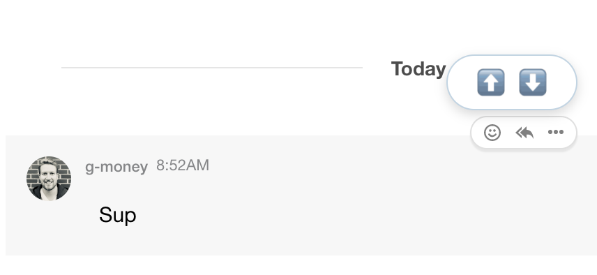
The ReactionSelector component:
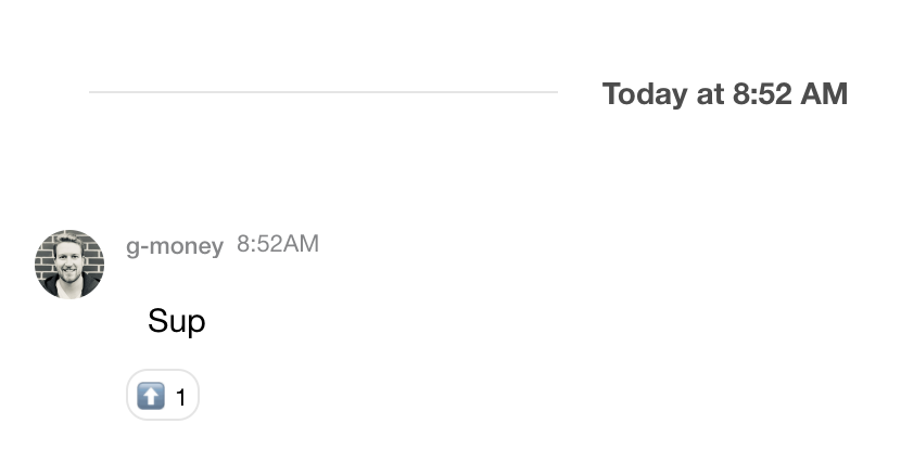
The SimpleReactionsList component: