Suggestion List
In this example, we will demonstrate how to customize the autocomplete suggestion list items that
appear above the MessageInput component when one of the supported autocompleteTriggers
is entered into the text input.
Commands translations
The default strings for command suggestion items are in English. To define your custom translations, please, provide these under the following keys in the JSON file corresponding to the language mutation. For example, override the German translations in your de.json file, you would target these defaults:
{
  ...
  "ban-command-args": "[@Benutzername] [Text]",
  "ban-command-description": "Einen Benutzer verbannen",
  "ban-command-name": "Verbannen",
  ...
  "giphy-command-args": "[Text]",
  "giphy-command-description": "Poste ein zufälliges Gif in den Kanal",
  "giphy-command-name": "Giphy",
  ...
  "mute-command-args": "[@Benutzername]",
  "mute-command-description": "Stummschalten eines Benutzers",
  "mute-command-name": "Stumm schalten"
  ...
  "unban-command-args": "[@Benutzername]",
  "unban-command-description": "Einen Benutzer entbannen",
  "unban-command-name": "Entbannen",
  ...
  "unmute-command-args": "[@Benutzername]",
  "unmute-command-description": "Stummschaltung eines Benutzers aufheben",
  "unmute-command-name": "Stummschaltung aufheben",
Where:
- name is the name of the command
- description a phrase describing what the command does
- args format notation in which the following strings will be considered as inputs for the given command
The SDK's default English translation sheet (en.json) does not contain the above keys, as the displayed strings are taken directly from the channel data queried from the Stream's back-end.
Custom suggestion list item components
The Channel component accepts three props that adjust the look and feel of the autocomplete
suggestion list:
Below we show how to create custom header and list items, while leaving the list container unchanged.
Suggestion Header
By default, the component library handles autocomplete suggestions for user mentions @, commands /,
and emojis :. The header component receives the text value of the MessageInput via props. The current trigger
is the first character in the value string, so we condition the UI of our header component based on the
currently entered trigger.
const SuggestionHeader: React.FC<SuggestionListHeaderProps> = (props) => {
const { value } = props;
const initialCharacter = value[0];
switch (initialCharacter) {
case '@':
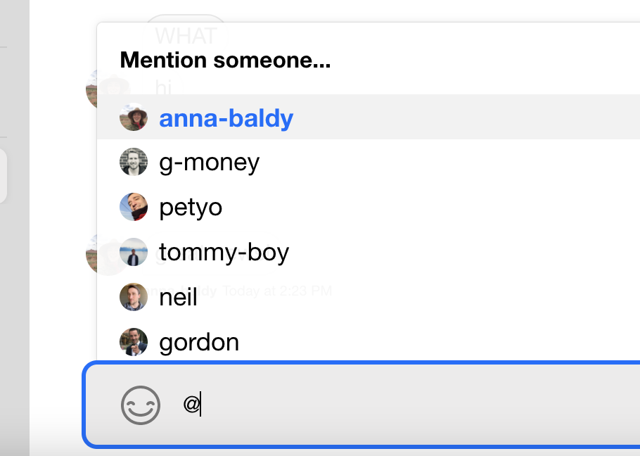
return <div className='suggestion-header'>Mention someone...</div>;
case '/':
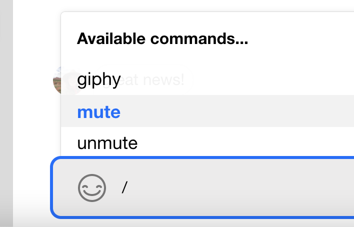
return <div className='suggestion-header'>Available commands...</div>;
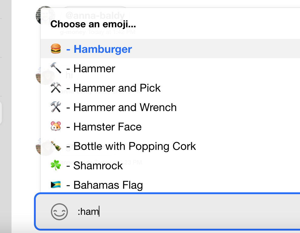
case ':':
return <div className='suggestion-header'>Choose an emoji...</div>;
default:
return null;
}
};
To customize autocompleteTriggers, pass your own TriggerProvider
component to Channel.
Suggestion List Items
Similar to our header component, we will conditionally render the list items based on the item type
received by our custom component. The SuggestionItem type represents a union of type options
for the various autocompleteTriggers.
Since our component can receive three potential item types, we must construct a few type guards to
ensure proper typing and prevent TypeScript errors. We check if the received item is an emoji, a mention,
or both. Each case will trigger slightly different UI in our component.
type SuggestionItem = BaseEmoji | SuggestionUser | SuggestionCommand;

const isEmoji = (output: SuggestionItem): output is BaseEmoji =>
  (output as BaseEmoji).native != null;

const isMention = (output: SuggestionItem): output is SuggestionUser =>
  (output as SuggestionUser).id != null && (output as SuggestionUser).native == null;

const isEmojiOrMention = (output: SuggestionItem): output is BaseEmoji | SuggestionUser =>
  (output as BaseEmoji | SuggestionUser).id != null;
Once we've aligned our types, we pull necessary data off props and assemble a component that
on click interacts with the MessageInput and properly selects data. The type guards are necessary
since the received items do not conform to a common type with shared object keys.
const SuggestionItem = React.forwardRef(
  (props: SuggestionItemProps, ref: React.Ref<HTMLDivElement>) => {
    const { item, onClickHandler, onSelectHandler, selected } = props;

    const selectItem = () => onSelectHandler(item);

    const itemName = isEmojiOrMention(item) ? item.name || item.id : item.name;
    const displayText = isEmoji(item) ? `${item.native} - ${itemName}` : itemName;

    return (
      <div
        className={`suggestion-item ${selected ? 'selected' : ''}`}
        onClick={onClickHandler}
        onMouseEnter={selectItem}
        ref={ref}
        role='button'
        tabIndex={0}
      >
        {isMention(item) && <Avatar image={item.image} size={20} />}
        {displayText}
      </div>
    );
  },
);
Implementation
Now that each individual piece has been constructed, we can assemble all of the snippets into the final code example.
The Code
.suggestion-header {
  font-weight: 700;
  font-size: 16px;
}

.suggestion-item {
  display: flex;
  align-items: center;
  height: 32px;
  font-size: 18px;
  padding-left: 16px;
}

.suggestion-item.selected {
  background: var(--white-smoke);
  color: var(--primary-color);
  font-weight: 700;
  cursor: pointer;
}
const SuggestionHeader: React.FC<SuggestionListHeaderProps> = (props) => {
  const { value } = props;
  const initialCharacter = value[0];

  switch (initialCharacter) {
    case '@':
      return <div className='suggestion-header'>Mention someone...</div>;

    case '/':
      return <div className='suggestion-header'>Available commands...</div>;

    case ':':
      return <div className='suggestion-header'>Choose an emoji...</div>;

    default:
      return null;
  }
};

type SuggestionItem = BaseEmoji | SuggestionUser | SuggestionCommand;

const isEmoji = (output: SuggestionItem): output is BaseEmoji =>
  (output as BaseEmoji).native != null;

const isMention = (output: SuggestionItem): output is SuggestionUser =>
  (output as SuggestionUser).id != null && (output as SuggestionUser).native == null;

const isEmojiOrMention = (output: SuggestionItem): output is BaseEmoji | SuggestionUser =>
  (output as BaseEmoji | SuggestionUser).id != null;

const SuggestionItem = React.forwardRef(
  (props: SuggestionItemProps, ref: React.Ref<HTMLDivElement>) => {
    const { item, onClickHandler, onSelectHandler, selected } = props;

    const selectItem = () => onSelectHandler(item);

    const itemName = isEmojiOrMention(item) ? item.name || item.id : item.name;
    const displayText = isEmoji(item) ? `${item.native} - ${itemName}` : itemName;

    return (
      <div
        className={`suggestion-item ${selected ? 'selected' : ''}`}
        onClick={onClickHandler}
        onMouseEnter={selectItem}
        ref={ref}
        role='button'
        tabIndex={0}
      >
        {isMention(item) && <Avatar image={item.image} size={20} />}
        {displayText}
      </div>
    );
  },
);

const App = () => (
  <Chat client={client}>
    <ChannelList />
    <Channel
      AutocompleteSuggestionHeader={SuggestionHeader}
      AutocompleteSuggestionItem={SuggestionItem}
    >
      <Window>
        <ChannelHeader />
        <MessageList />
        <MessageInput />
      </Window>
      <Thread />
    </Channel>
  </Chat>
);
The Result
Mentions UI:
Commands UI:
Emojis UI: