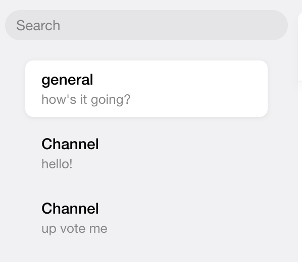
Channel List and Preview
How-to Guide for Customizing the ChannelList UI
To customize the UI for the ChannelList you need to focus on the two components that dictate the UI, the list and preview components. These are set via the optional List and Preview props, and if nothing is provided they default to
ChannelListMessenger
and ChannelPreviewMessenger.
Here is a guide to build these two UI components to override the defaults.
The List Prop Component
The list component used by ChannelList receives the same props as the default and is a container that renders the list of channels via the children prop. The return block in the code below is an example of the minimum necessary elements
needed for a custom list component.
return <div>{props.children}</div>;
Using the default ChannelListMessenger component as a model, let's incorporate the other props to render the list conditionally.
if (props.error) {
  return <div>Warning! Error Message!</div>;
}

if (props.loading) {
  return null;
}
The items we're rendering in those conditionals are not very helpful for the user, so let's take advantage of several of the library's status indicator components via the LoadingErrorIndicator and LoadingIndicator
props and assign the default values for each, ChatDown and LoadingChannels. This assignment is necessary here to satisfy TypeScript since these props are optional.
import { ChatDown, LoadingChannels } from 'stream-chat-react';

const { LoadingErrorIndicator = ChatDown, LoadingIndicator = LoadingChannels } = props;

if (error) {
  return <LoadingErrorIndicator type={'connection'} />;
}

if (loading) {
  return <LoadingIndicator />;
}
To use a custom component (or a different library component) for either the LoadingErrorIndicator or LoadingIndicator props here (and in the default list component, too),
you can utilize the props of the same names on ChannelList. If either of these props are provided, then the assignment mentioned in the above step is not necessary.
const CustomErrorIndicator = (props: ChatDownProps) => {
  return <div>So much error when rendering.</div>;
};

<ChannelList
  LoadingErrorIndicator={(props) => <CustomErrorIndicator {...props} type={'connection'} />}
/>;
This is a basic example, but possibilities are endless for adding additional UI items, not using all the props, and incorporating other logic that fit your requirements.
The Final Code:
const CustomList = (props: PropsWithChildren<ChannelListMessengerProps>) => {
  const { children, error, loading, LoadingErrorIndicator, LoadingIndicator } = props;

  if (error) {
    return <LoadingErrorIndicator text='Loading Error - check your connection.' type='connection' />;
  }

  if (loading) {
    return <LoadingIndicator />;
  }

  return <div>{children}</div>;
};

const CustomErrorIndicator = (props: ChatDownProps) => {
  const { text } = props;

  return <div>{text}</div>;
};

const CustomLoadingIndicator = () => {
  return <div>Loading, loading, loading...</div>;
};

<Chat client={client}>
  <ChannelList
    List={CustomList}
    LoadingErrorIndicator={CustomErrorIndicator}
    LoadingIndicator={CustomLoadingIndicator}
  />
  <Channel>
    <MessageList />
    <MessageInput />
  </Channel>
</Chat>;
The Preview Prop Component
The component set via the Preview prop (or the default) dictates the design and click functionality of an individual channel in the list that we built above.
Ultimately, these UI components are rendered via the ChannelPreview wrapper component.
Here is a guide to build a custom UI component to override the default using the large variety of props provided. The code snippet below includes the bare minimum code that would be required for standard preview functionality (click handler and active channel selection), and anything additional would be to satisfy unique requirements.
import { ChannelPreviewUIComponentProps } from 'stream-chat-react';

export const CustomPreview = (props: ChannelPreviewUIComponentProps) => {
  const { channel, setActiveChannel, watchers } = props;

  return (
    <div onClick={() => setActiveChannel(channel, watchers)}>
      <span>{channel.data.name || 'Channel Preview'}</span>
    </div>
  );
};
Let's take advantage of the SDK's CSS classes for styling. We'll import the bundled CSS into the file where the application is instantiated then apply a class to the button element.
import 'stream-chat-react/dist/css/v2/index.css';

<div
  className={'str-chat__channel-preview-messenger'}
  onClick={() => setActiveChannel(channel, watchers)}
>
Next, let's add a bit more useful information to the component using more of the default props and a value pulled from the ChatContext, as well as some styling using custom CSS.
This context also exposes the client which makes it possible to use API methods.
For a complete overview of the available props in the custom component, take a look at the ChannelPreview UI props section.
The Final Code:
import { ChannelPreviewUIComponentProps, useChatContext } from 'stream-chat-react';
import './CustomPreview.scss';

export const CustomPreview = (props: ChannelPreviewUIComponentProps) => {
  const { channel, setActiveChannel } = props;

  const { channel: activeChannel } = useChatContext();

  const selected = channel?.id === activeChannel?.id;

  const renderMessageText = () => {
    const lastMessageText = channel.state.messages[channel.state.messages.length - 1].text;

    const text = lastMessageText || 'message text';

    return text.length < 60 ? lastMessageText : `${text.slice(0, 70)}...`;
  };

  if (!channel.state.messages.length) return null;

  return (
    <div
      className={selected ? 'channel-preview__container selected' : 'channel-preview__container'}
      onClick={() => setActiveChannel(channel)}
    >
      <div className='channel-preview__content-wrapper'>
        <div className='channel-preview__content-top'>
          <p className='channel-preview__content-name'>{channel.data?.name || 'Channel'}</p>
          <p className='channel-preview__content-name'>{channel.data?.subtitle}</p>
        </div>
        <p className='channel-preview__content-message'>{renderMessageText()}</p>
      </div>
    </div>
  );
};
.channel-preview__container {
  height: 56px;
  margin-bottom: 8px;
  margin-left: 20px;
  margin-right: 20px;
  border-radius: 8px;
  cursor: pointer;
  display: flex;
  justify-content: space-between;
  align-items: center;
  padding-left: 8px;
}

.channel-preview__container:hover {
  background: #ffffff;
  box-shadow: 0px 1px 5px rgba(0, 0, 0, 0.07);
  transition: background 0.1s ease-in-out;
}

.channel-preview__container.selected {
  background: #ffffff;
  box-shadow: 0px 1px 5px rgba(0, 0, 0, 0.07);
  transition: background 0.1s ease-in-out;
}

.channel-preview__content-wrapper {
  display: flex;
  flex-direction: column;
  justify-content: center;
  margin-left: 8px;
  margin-right: 8px;
  width: 100%;
}

.channel-preview__content-top {
  display: flex;
  justify-content: space-between;
  align-items: center;
  margin: 0;
  height: 18px;
  margin-bottom: 4px;
}

.channel-preview__content-name {
  font-family: Helvetica Neue, sans-serif;
  font-weight: 500;
  font-size: 15px;
  color: #000000;
  margin: 0;
  max-width: 158px;
  overflow: hidden;
  text-overflow: ellipsis;
  white-space: nowrap;
}

.channel-preview__content-message {
  font-family: Helvetica Neue, sans-serif;
  font-size: 13px;
  line-height: 16px;
  margin: 0;
  color: #858688;
  height: 16px;
  max-width: 200px;
  overflow: hidden;
  text-overflow: ellipsis;
  white-space: nowrap;
}
<Chat client={client}>
  <ChannelList Preview={CustomPreview} showChannelSearch />
  <Channel>
    <Window>
      <ChannelHeader />
      <MessageList />
      <MessageInput />
    </Window>
    <Thread />
  </Channel>
</Chat>
Result: