Channel Search
How-to Guide for Customizing ChannelSearch
In this example, we will customize the ChannelSearch component. Though this component can be used standalone, we will do our customization when it's established in the ChannelList. Here is a guide that outlines how to
override the default DropdownContainer, SearchResultItem, and SearchResultsHeader components, as well as use several other useful props.
A complete override of this component is possible by utilizing the ChannelSearch prop on ChannelList.
Step 1 - Setting Up For Success
To make the search component visible in the ChannelList, you need to use the showChannelSearch prop. At this point, the search component is ready to go with all of the default UI and functionality.
Let's allow the query to search for channels in addition to the default query of just users by setting the searchForChannels prop. You'll notice that all props for ChannelSearch
are drilled to the component via the additionalChannelSearchProps prop on ChannelList. With just this one additional prop, the search functionality is fully functional and expanded from just the default search of users.
<ChannelList showChannelSearch additionalChannelSearchProps={{ searchForChannels: true }} />
Step 2 - Customizing the DropdownContainer
Since we've enabled the search to also search for channels, let's customize the dropdown results container to fit a design that separates the result by type.
const CustomDropdown = (props: SearchResultsListProps) => {
  const { results, focusedUser, selectResult, SearchResultItem } = props;

  let items: ChannelOrUserResponse[] = results.filter((x) => x.cid);
  let users: ChannelOrUserResponse[] = results.filter((x) => !x.cid);

  return (
    <div>
      <p>Channels</p>
      {!items.length && <p>No Channels...</p>}
      {items.map((result, index) => (
        <SearchResultItem
          focusedUser={focusedUser}
          index={index}
          key={index}
          result={result}
          selectResult={selectResult}
        />
      ))}
      <p>Users</p>
      {!users.length && <p>No Users...</p>}
      {users.map((result, index) => (
        <SearchResultItem
          focusedUser={focusedUser}
          index={index}
          key={index}
          result={result}
          selectResult={selectResult}
        />
      ))}
    </div>
  );
};
const DropDown = (props: SearchResultsListProps) => <CustomDropdown {...props} />;
const additionalProps = {
  DropdownContainer: DropDown
  searchForChannels: true,
}

<ChannelList
  additionalChannelSearchProps={additionalProps}
  showChannelSearch
/>
Step 3 - Customizing the Result Component
The separation by the type of result, is a huge UI improvement for users, but the above code is still using the default component for each result. Let's create our own component with more information. We've also added a Type Guard so we know what type we're displaying.
  const isChannel = (
    output: Channel | UserResponse,
  ): output is Channel =>
    (output as Channel).cid != null;

  const CustomResultItem = (props: SearchResultItemProps) => {
    const { focusedUser, index, result, selectResult } = props;

    const focused = focusedUser === index;

    if (isChannel(result)) {
      const channel = result;
      const { member_count } = channel?.data;

      return (
        <div
          className={`str-chat__channel-search-result ${focused ? 'focused' : ''}`}
          onClick={() => selectResult(result)}
        >
          <div className='result-hashtag'>#</div>
          <p className='channel-search__result-text'>{channel?.data?.name}, ({member_count} member{member_count === 1 ? '' : 's'})</p>
        </div>
      );
    } else {
      return (
        <div
          className={`str-chat__channel-search-result ${focused ? 'focused' : ''}`}
          onClick={() => selectResult(result)}
        >
          <Avatar image={result.image} />
          {result.id}
          {result.online && <p className='user-online'> Online Now!</p>}
        </div>
      );
    }
  }
const SearchResult = (props: SearchResultItemProps) => <CustomResultItem {...props} />;

const additionalProps = {
  searchForChannels: true,
  SearchResultItem: SearchResult
}

<ChannelList
  additionalChannelSearchProps={additionalProps}
  showChannelSearch
/>
Step 4 - Changing the Positioning and Adding A Header
For fun, let's add the popupResults prop to change the dropdown to be absolutely positioned instead of inline. Let's also add a quick header component.
const SearchResultsHeader = () => {
    return <div className='channel-search-header'>So many search results!</div>
}

const additionalProps = {
  popupResults: true,
  searchForChannels: true,
  SearchResultsHeader: SearchResultsHeader,
}

<ChannelList
  additionalChannelSearchProps={additionalProps}
  showChannelSearch
/>
Step 5 - The Final Code
.channel-search__result-user {
  display: flex;
  align-items: center;
  margin-left: 12px;
}

.result-hashtag {
  margin: 12px;
  display: flex;
  justify-content: center;
  font-family: Helvetica Neue, sans-serif;
  font-weight: bold;
  color: #005fff;
}

.channel-search__result-text {
  width: 100%;
  font-family: Helvetica Neue, sans-serif;
  font-weight: 500;
  font-size: 14px;
  line-height: 120%;
  color: #2c2c30;
}

.user-online {
  color: red;
  font-size: 10px;
  padding-top: 2px;
  padding-left: 5px;
}

.channel-search-header {
  font-weight: 700;
  font-size: 16px;
}
  const CustomDropdown = (props: SearchResultsListProps) => {
    const { results, focusedUser, selectResult, SearchResultItem } = props;

    let items: ChannelOrUserResponse[] = results.filter(x => x.cid);
    let users: ChannelOrUserResponse[] = results.filter(x => !x.cid);

    return (
      <div>
        <p>Channels</p>
        {!items.length && <p>No Channels...</p>}
        {items.map((result, index) => (
          <SearchResultItem
            focusedUser={focusedUser}
            index={index}
            key={index}
            result={result}
            selectResult={selectResult}
          />
        ))}
        <p>Users</p>
        {!users.length && <p>No Users...</p>}
        {users.map((result, index) => (
          <SearchResultItem
            focusedUser={focusedUser}
            index={index}
            key={index}
            result={result}
            selectResult={selectResult}
          />
        ))}
      </div>
    );
  };

  const isChannel = (
    output: Channel | UserResponse,
  ): output is Channel =>
    (output as Channel).cid != null;

  const CustomResultItem = (props: SearchResultItemProps) => {
    const { focusedUser, index, result, selectResult } = props;

    const focused = focusedUser === index;

    if (isChannel(result)) {
      const channel = result;
      const members = channel?.data?.member_count;

      return (
        <div
          className={`str-chat__channel-search-result ${focused ? 'focused' : ''}`}
          onClick={() => selectResult(result)}
        >
          <div className='result-hashtag'>#</div>
          <p className='channel-search__result-text'>{channel?.data?.name}, ({members} member{members === 1 ? '' : 's'})</p>
        </div>
      );
    } else {
      return (
        <div
          className={`str-chat__channel-search-result ${focused ? 'focused' : ''}`}
          onClick={() => selectResult(result)}
        >
          <Avatar image={result?.image} />
          {result.id}
          {result.online && <p className='user-online'> Online Now!</p>}
        </div>
      );
    }
  }

  const SearchResultsHeader = () => {
    return <div className='channel-search-header'>So many search results!</div>
  }
  const DropDown = (props: SearchResultsListProps) => <CustomDropdown {...props} />;
  const SearchResult = (props: SearchResultItemProps) => <CustomResultItem {...props} />;

  const additionalProps = {
    DropdownContainer: DropDown,
    popupResults: true,
    searchForChannels: true,
    SearchResultsHeader: SearchResultsHeader,
    SearchResultItem: SearchResult
  }

  return (
    <Chat client={chatClient}>
      <ChannelList
        additionalChannelSearchProps={additionalProps}
        showChannelSearch
      />
      <Channel>
        <Window>
          <ChannelHeader />
          <MessageList />
          <MessageInput />
        </Window>
        <Thread />
      </Channel>
    </Chat>
  )
};
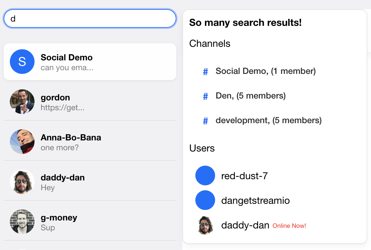
Result:
The searchFunction Prop:
By default, the ChannelSearch component searches just for users. Use the searchForChannels prop to also search for channels.
To override the search method, completely use the searchFunction prop. This prop is useful, say, when you want to search just for channels
and for only channels that the current logged in user is a member of. See the example below for this.
const customSearchFunction = async (
  props: ChannelSearchFunctionParams,
  event: { target: { value: SetStateAction<string> } },
  client: StreamChat,
) => {
  const { setResults, setSearching, setQuery } = props;
  const value = event.target.value;

  const filters = {
    name: { $autocomplete: value },
    members: { $in: client.userID },
  };

  setSearching(true);
  setQuery(value);
  const channels = await client.queryChannels(filters);
  setResults(channels);
  setSearching(false);
};
const { client } = useChatContext();

<ChannelList
  additionalChannelSearchProps={{
    searchFunction: (params, event) => {
      return customSearchFunction(params, event, client);
    },
  }}
  showChannelSearch
/>;
Adding menu
As of the version 10.0.0, users can add app menu into the SearchBar. In case you would like to display menu button next to the search input, you can do that by adding AppMenu component to the ChannelSearch props. The display of AppMenu is then toggled by clicking on the menu button. AppMenu can be rendered as a drop-down or even a modal. In our example we will render a drop-down menu.
The SDK does not provide any default AppMenu component and so you will have to write your CSS for it to be styled correctly.
import React, { useCallback } from 'react';
import type { AppMenuProps } from 'stream-chat-react';

import './AppMenu.scss';

export const AppMenu = ({ close }: AppMenuProps) => {
  const handleSelect = useCallback(() => {
    // custom logic...
    close?.();
  }, [close]);

  return (
    <div className='app-menu__container'>
      <ul className='app-menu__item-list'>
        <li className='app-menu__item' onClick={handleSelect}>
          Profile
        </li>
        <li className='app-menu__item' onClick={handleSelect}>
          New Group
        </li>
        <li className='app-menu__item' onClick={handleSelect}>
          Sign Out
        </li>
      </ul>
    </div>
  );
};
.str-chat__channel-search-bar-button.str-chat__channel-search-bar-button--menu {
  position: relative;
}

.app-menu {
  &__container {
    position: absolute;
    top: 50px;
    left: 10px;
    background-color: white;
    border-radius: 5px;
    box-shadow: 0 0 8px var(--str-chat__box-shadow-color);
  }

  &__item-list {
    list-style: none;
    margin: 0;
    padding: 0;
  }

  &__item {
    list-style: none;
    margin: 0;
    padding: 0.5rem 1rem;

    &:hover {
      background-color: lightgrey;
      cursor: pointer;
    }
  }
}
import { AppMenu } from './components/AppMenu';

const App = () => (
  <Chat client={chatClient}>
    <ChannelList
      additionalChannelSearchProps={{ AppMenu }}
      showChannelSearch
    />
    <Channel>
      <Window>
        <ChannelHeader />
        <MessageList />
        <MessageInput />
      </Window>
      <Thread />
    </Channel>
  </Chat>
);