 React
React iOS
iOS Android
 Flutter
 Angular
 JavaScript
 Unity
Unity Unreal
 Node
Node Python
 Ruby
Ruby PHP
PHP Java
Java .NET
.NET Go
Go REST
REST<Channel
...
DateHeader={undefined}
>This is documentation for Stream Chat React Native SDK v8, which is no longer actively maintained. For up-to-date documentation, see the latest version (v9).
Overview
The core of Stream Chat React Native is its flexibility. Many apps only need the theme. For deeper changes or new behavior, build a custom component.
Best Practices
- Start with theming; only create custom components when behavior/layout must change.
- Replace components via
Channelprops to keep integration consistent. - Return
nullto remove UI features cleanly. - Use the right context for your component’s scope; avoid message-level re-renders.
- Keep custom components lightweight, especially inside
MessageList.
When to use a custom component
Build a custom component when you need to insert custom UI, significantly change layout, or modify behavior. With few exceptions, what you see is what you get.
Exceptions
- Padding, fonts, colors, borders, etc. can all be altered from the theme as styles are passed to most components and sub-components.
- Messages can be aligned to one side using the
forceAlignMessagesprop on theChannelcomponent. - Message content can be reordered using the
messageContentOrderprop onChannel; but you may want to adjust the theming to account for changes to border alignments if you alter this order.
Changes beyond these tweaks require custom components. To remove a UI feature, replace it with a component that returns null.
How to use a custom component
Most custom components are passed as props on Channel (with a few exceptions on OverlayProvider, MessageList, and ChannelList).
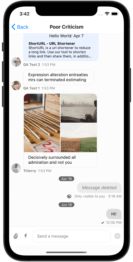
To remove the fixed DateHeader, pass undefined:
Your custom component replaces the default everywhere it is used. Most components read from context; some also receive props. DateHeader receives a dateString prop.
const MyNewComponent = ({ dateString }) => <Text>{`Hello World: ${dateString}`}</Text>;

<Channel
  ...
  DateHeader={MyNewComponent}
>
Using contexts
Custom components typically read from SDK contexts. Use the hooks within their provider scope. Some contexts, like MessageContext, are only available inside a Message, so you can't use them in DateHeader.
Example: replace DateHeader with a component that reads PaginatedMessageListContext and displays the last sender.
const MySenderComponent = () => {
  const { messages } = usePaginatedMessageListContext();
  const latestMessageSender = messages[messages.length - 1]?.user?.name;

  return <Text>{`Last Sender: ${latestMessageSender}`}</Text>;
};

<Channel
  ...
  DateHeader={MySenderComponent}
>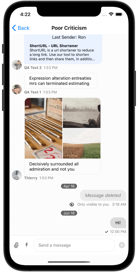
This lets you tailor both UI and the information you show.
Custom components within a Message should draw from mostly static contexts, except their own MessageContext. ThemeContext, MessagesContext, and TranslationContext are safe in most cases.
Memoizing values from contexts above the FlatList inside a row does not work well when those contexts update. Reading PaginatedMessageListContext inside each Message will cause the whole list to re-render.
Common customization patterns
Here are some frequently requested customization examples:
Custom message bubble
Replace the default message appearance with a custom design:
import { View, Text, StyleSheet } from "react-native";
import { Channel, useMessageContext } from "stream-chat-react-native";

const CustomMessageContent = () => {
  const { message, isMyMessage } = useMessageContext();

  return (
    <View
      style={[
        styles.messageContainer,
        isMyMessage ? styles.myMessage : styles.theirMessage,
      ]}
    >
      {!isMyMessage && (
        <Text style={styles.username}>{message.user?.name}</Text>
      )}
      <Text style={styles.messageText}>{message.text}</Text>
    </View>
  );
};

const styles = StyleSheet.create({
  messageContainer: {
    padding: 12,
    borderRadius: 16,
    maxWidth: "80%",
    marginVertical: 4,
  },
  myMessage: {
    backgroundColor: "#007AFF",
    alignSelf: "flex-end",
  },
  theirMessage: {
    backgroundColor: "#E5E5EA",
    alignSelf: "flex-start",
  },
  username: {
    fontSize: 12,
    color: "#666",
    marginBottom: 4,
  },
  messageText: {
    fontSize: 16,
  },
});

// Usage
<Channel MessageContent={CustomMessageContent} />;
Custom send button
Create a send button with custom styling or behavior:
import { TouchableOpacity, StyleSheet } from "react-native";
import { useMessageInputContext, SendIcon } from "stream-chat-react-native";

const CustomSendButton = () => {
  const { sendMessage } = useMessageInputContext();

  return (
    <TouchableOpacity style={styles.sendButton} onPress={sendMessage}>
      <SendIcon />
    </TouchableOpacity>
  );
};

const styles = StyleSheet.create({
  sendButton: {
    backgroundColor: "#007AFF",
    borderRadius: 20,
    padding: 8,
    marginLeft: 8,
  },
});

// Usage
<Channel SendButton={CustomSendButton} />;
Remove a UI element
To completely remove a UI element, pass a component that returns null:
// Remove the typing indicator
<Channel TypingIndicator={() => null} />;

// Remove the date header
<Channel DateHeader={undefined} />;

// Remove message avatars
<Channel MessageAvatar={() => null} />;