 React
React iOS
iOS Android
 Flutter
 Angular
 JavaScript
 Unity
Unity Unreal
 Node
Node Python
 Ruby
Ruby PHP
PHP Java
Java .NET
.NET Go
Go REST
RESTclass ChannelPage extends StatelessWidget {
const ChannelPage({
super.key,
});
@override
Widget build(BuildContext context) {
return Scaffold(
appBar: const StreamChannelHeader(),
body: Column(
children: <Widget>[
Expanded(
child: StreamMessageListView(
threadBuilder: (_, parentMessage) {
return ThreadPage(
parent: parentMessage,
);
},
),
),
StreamMessageInput(),
],
),
);
}
}This is beta documentation for Stream Chat Flutter SDK v10. For the latest stable version, see the latest version (v9).
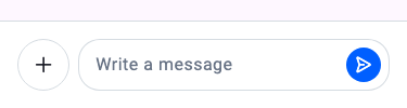
StreamMessageInput
A Widget Dealing With Everything Related To Sending A Message
Find the pub.dev documentation here
Background
In Stream Chat, we can send messages in a channel. However, sending a message isn't as simple as adding
a TextField and logic for sending a message. It involves additional processes like addition of media,
quoting a message, adding a custom command like a GIF board, and much more. Moreover, most apps also
need to customize the input to match their theme, overall color and structure pattern, etc.
To do this, we created a StreamMessageInput widget which abstracts all expected functionality a modern input
needs - and allows you to use it out of the box.
Basic Example
A StreamChannel is required above the widget tree in which the StreamMessageInput is rendered since the channel is
where the messages sent actually go. Let's look at a common example of how we could use the StreamMessageInput:
It is common to put this widget in the same page of a StreamMessageListView as the bottom widget.
Make sure to check the StreamMessageInputController documentation for more information on how to use the controller to manipulate the StreamMessageInput.
Adding Custom Actions
Custom actions can be added to the composer using the component builder system via StreamComponentFactory. The messageComposerInputLeading slot is empty by default and is designed for adding custom action buttons inside the text input field — to the left of the text area.
Register a custom builder using streamChatComponentBuilders and pass it to StreamChat (or StreamComponentFactory if scoped to a single screen):
StreamChat(
  client: client,
  componentBuilders: StreamComponentBuilders(
    extensions: streamChatComponentBuilders(
      messageComposerInputLeading: (context, props) {
        return IconButton(
          icon: Icon(
            Icons.location_on,
            color: StreamChatTheme.of(context).colorTheme.textLowEmphasis,
          ),
          onPressed: () {
            // Do something here
          },
        );
      },
    ),
  ),
  child: MyApp(),
)
If you only want the custom action on a specific screen, wrap that screen with StreamComponentFactory instead:
StreamComponentFactory(
  builders: StreamComponentBuilders(
    extensions: streamChatComponentBuilders(
      messageComposerInputLeading: (context, props) {
        return IconButton(
          icon: Icon(
            Icons.location_on,
            color: StreamChatTheme.of(context).colorTheme.textLowEmphasis,
          ),
          onPressed: () {
            // Do something here
          },
        );
      },
    ),
  ),
  child: StreamMessageInput(),
)
The props parameter (of type MessageComposerInputLeadingProps) exposes the full composer state, including the controller, onAttachmentButtonPressed, focusNode, and other callbacks you may need in your custom action.
Disable Attachments
To disable attachments being added to the message, set the disableAttachments parameter to true.
StreamMessageInput(
    disableAttachments: true,
),
Changing Position Of MessageInput Components
You can change the position of the send button and actions by using componentBuilders via StreamComponentBuilders.
For example, to move the send button outside the TextField (to the trailing position), use messageComposerInputTrailing to remove it from inside the input, and messageComposerTrailing to render it outside:
StreamComponentFactory(
  builders: StreamComponentBuilders(
    extensions: streamChatComponentBuilders(
      messageComposerInputTrailing: (context, props) =>
          const SizedBox.shrink(),
      messageComposerTrailing: (context, props) =>
          DefaultStreamMessageComposerInputTrailing(props: props),
    ),
  ),
  child: StreamMessageInput(),
)
Thread: "Also Send to Channel" Checkbox
The parameter that controls the "also send to channel" checkbox in threads was renamed from hideSendAsDm to canAlsoSendToChannelFromThread. Note that the logic is inverted:
| Old | New |
|---|---|
hideSendAsDm: true | canAlsoSendToChannelFromThread: false |
hideSendAsDm: false (old default) | canAlsoSendToChannelFromThread: true (new default) |
// Hide the "also send to channel" checkbox
StreamMessageInput(
  canAlsoSendToChannelFromThread: false,
)
StreamChatMessageComposer (UI-only)
StreamChatMessageComposer is a pure UI component that renders the composer layout using design system primitives, with no built-in business logic.
Use this when you want the new design system visuals with custom send logic. If you want the full out-of-the-box experience (send, edit, attachments, mentions, commands, etc.), use StreamMessageInput instead.
StreamChatMessageComposer(
  onSendPressed: () => _sendMessage(),
  onAttachmentButtonPressed: () => _openAttachmentPicker(),
  placeholder: 'Type a message...',
  controller: _messageInputController,
)
Sub-components of StreamChatMessageComposer can be replaced via StreamComponentFactory:
StreamComponentFactory(
  builders: StreamComponentBuilders(
    extensions: streamChatComponentBuilders(
      messageComposer: (context, props) => MyCustomComposer(props: props),
    ),
  ),
  child: ...,
)