import "stream-chat-react/dist/css/index.css";
import "./App.css";Legacy
This page contains information about the old theming system (v1) of the chat UI, this is now deprecated and will be removed in a future release. Please refer to our new theming guide.
While the components in the React Chat library come with basic styling, the look and feel can easily be adjusted to fit your specifications. For small and precise changes, individual CSS classes can be overridden.
For larger, theme-related adjustments, the Chat component accepts customStyles
and customClasses props. The customStyles prop allows you to toggle
a large selection of CSS variables and the customClasses prop allows you to provide your own classes that override the
default container CSS.
Overriding CSS
To override pre-defined library styles, follow this simple process:
- Import our bundled CSS into the file where you instantiate your chat application. We maintain a separate repository,
@stream-io/stream-chat-css, which houses all the SCSS files for the components. This CSS is bundled with thestream-chat-reactSDK.
Use the browser inspector or view the library code and locate default styles you wish to override
Add selectors to your local CSS file to override our defaults
Import your local CSS file after Stream's bundled CSS
Importing scss Files
As an alternative to importing our entire style sheet (perhaps, due to it's size), there's also the option to easily assemble only what you need by importing individual scss files. The imports should happen in the file where you instantiate your application.
Here's a complete list of scss files broken down by size and with the option of filtering by SDK version.
If not importing our entire bundled CSS, individually importing the SDK's scss files is the better alternative to copy and pasting our stylesheets and then customizing that code in your application. The CSS in the library does change occasionally, and you want to keep up to date with these to ensure no problems arise by falling behind in important styling updates.
Theming Your App
Custom Container Classes
Many of the high level React components in the library come with predefined CSS container classes that inject basic display styling.
To remove or replace these wrapper classes entirely, the Chat component takes a customStyles prop. This prop accepts a mapping
of overridable container classnames.
In the below example we will replace two of the default container classes, str-chat (maps to the chat key) and
str-chat-channel (maps to the channel) key. Once replaced, add whatever styles you want in your own stylesheets.
const customClasses: CustomClasses = {
  chat: "custom-chat-class",
  channel: "custom-channel-class",
};

const App = () => (
  <Chat client={client} customClasses={customClasses}>
    <ChannelList />
    <Channel>
      <Window>
        <ChannelHeader />
        <MessageList />
        <MessageInput />
      </Window>
      <Thread />
    </Channel>
  </Chat>
);
The accepted object keys and the default classnames they override are as follows:
- chat -
str-chat - chatContainer -
str-chat__container - channel -
str-chat-channel - channelList -
str-chat-channel-list - message -
str-chat__li str-chat__li--${groupStyles} - messageList -
str-chat__list - thread -
str-chat__thread - threadList -
str-chat__list--thread - virtualMessage -
str-chat__virtual-list-message-wrapper - virtualizedMessageList -
str-chat__virtual-list
Be careful overriding the default styles on the VirtualizedMessageList component, as our defaults handle much of the logic
that makes the list UI perform optimally.
CSS Variables
To make more sweeping stylistic changes to the default CSS, the library exposes a variety of
CSS variables that can be
adjusted with props. The Chat component accepts a customStyles prop, an object type with keys as the CSS variables
you wish to change and values for the corresponding, adjusted CSS.
In the below example, we demonstrate how to change four of the library's global CSS variables:
- Primary color
- Medium font size
- Extra small margin
- Extra small padding
const customStyles: CustomStyles = {
  "--primary-color": "green",
  "--md-font": "1.2rem",
  "--xs-m": "1.2rem",
  "--xs-p": "1.2rem",
};

const App = () => (
  <Chat client={client} customStyles={customStyles}>
    <ChannelList />
    <Channel>
      <Window>
        <ChannelHeader />
        <MessageList />
        <MessageInput />
      </Window>
      <Thread />
    </Channel>
  </Chat>
);
The first screenshot shows an app running with the default library styling. In the second, we've supplied a
customStyles object to the Chat component to create a more zoomed-in user experience with a green primary
color.
Default Styles

Custom CSS Variables

Simple Dark Mode
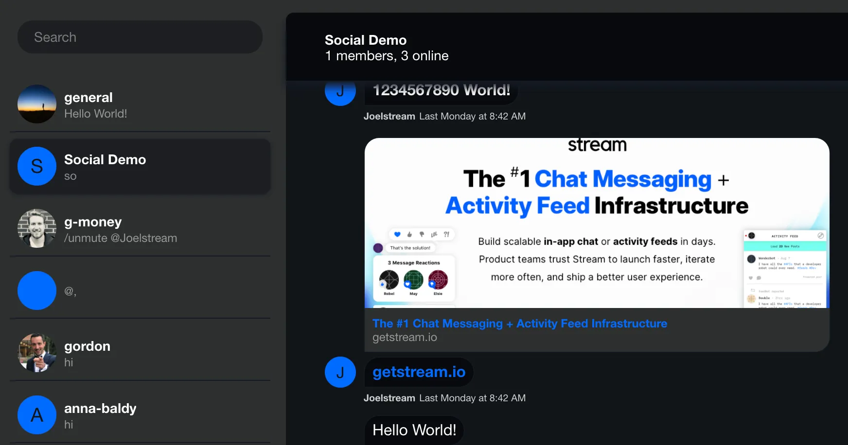
The Chat component also accepts a darkMode boolean prop that toggles the app into a basic dark mode setting.
The dark mode toggle is meant to point you in the right direction for building a custom theme into your app.
Adding the darkMode prop is equivalent to supplying to following object to customStyles:
const darkModeTheme: CustomStyles = {
  "--bg-gradient-end": "#101214",
  "--bg-gradient-start": "#070a0d",
  "--black": "#ffffff",
  "--blue-alice": "#00193d",
  "--border": "#141924",
  "--button-background": "#ffffff",
  "--button-text": "#005fff",
  "--grey": "#7a7a7a",
  "--grey-gainsboro": "#2d2f2f",
  "--grey-whisper": "#1c1e22",
  "--modal-shadow": "#000000",
  "--overlay": "#00000066",
  "--overlay-dark": "#ffffffcc",
  "--shadow-icon": "#00000080",
  "--targetedMessageBackground": "#302d22",
  "--transparent": "transparent",
  "--white": "#101418",
  "--white-smoke": "#13151b",
  "--white-snow": "#070a0d",
};
The result

Variables Reference
A complete reference of all supported CSS variables, as well as their default values, can be found within our
SCSS variables file.
Any of the CSS variables (prepended with --) can be overridden via the customStyles approach detailed
above.