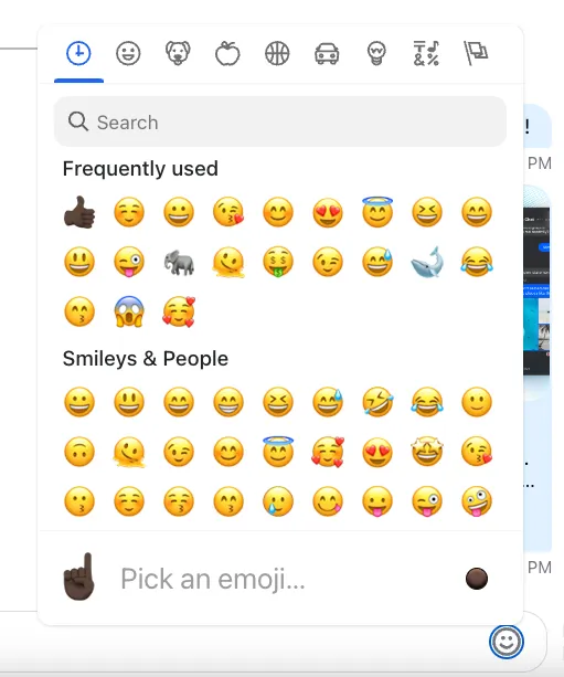
Emoji Picker
The SDK comes with the EmojiPicker component which is built on top of the emoji-mart and is disabled by default but can be easily enabled by installing emoji-mart related packages, importing the component from stream-chat-react/emojis and forwarding it to the Channel component, see the Basic Usage section of the customization guide for more information.

Props
ButtonIconComponent
The icon component to be rendered within open/close button.
| Type | Default |
|---|---|
| React.ComponentType | EmojiPickerIcon |
buttonClassName
The className to be used in the open/close button instead of the default one.
| Type | Default |
|---|---|
| string | 'str-chat__emoji-picker-button' |
pickerContainerClassName
The className to be used in the picker container element instead of the default one.
| Type | Default |
|---|---|
| string | 'str-chat__message-textarea-emoji-picker-container' |
wrapperClassName
The className to be used in the wrapper element of the whole component instead of the default one.
| Type | Default |
|---|---|
| string | 'str-chat__message-textarea-emoji-picker' |
closeOnEmojiSelect
The flag which specifies whether the emoji picker component should close after an emoji has been selected.
| Type | Default |
|---|---|
| boolean | false |
pickerProps
Untyped properties to be passed down to the emoji-mart Picker component.
| Type |
|---|
| Partial<{ theme: 'auto' | 'light' | 'dark' } & Record<string, unknown>> |
popperOptions
React Popper options to be passed down to the react-popper usePopper hook.
| Type |
|---|
| Partial<Options> |