 React
React iOS
iOS Android
 Flutter
 Angular
 JavaScript
 Unity
Unity Unreal
 Node
Node Python
 Ruby
Ruby PHP
PHP Java
Java .NET
.NET Go
Go REST
REST<Channel channel={channel} thread={thread} threadList>
<Thread />
</Channel>This is documentation for Stream Chat React Native SDK v4, which is no longer actively maintained. For up-to-date documentation, see the latest version (v9).
Upgrading from V3
Add a required threadList prop
Add a threadList prop on Channel component which wraps the Thread component as following:
(This change is only required if you use Thread component within your application. )
Updates on Channel props
Some of the props have been dropped since v4 release.
mutesEnabled
This prop was used to configure visibility of "Mute User" action within message overlay, and has been removed in v4. Please check Mute User Action section for details.
handleMute
This prop was used to add non-interruptive function call when "Mute User" action on message gets called, and has been removed in v4. Please check Mute User Action section for details.
quotedRepliesEnabled
This prop was used to configure visibility of "Reply" action within message overlay.
In v4 you can provide a prop overrideOwnCapabilities on Channel component to achieve the same result.
<Channel
  overrideOwnCapabilities={{
    quoteMessage: false
  }}
>
reactionsEnabled
This prop was used to configure visibility of reaction selector within overlay.
In v4 you can provide a prop overrideOwnCapabilities on Channel component to achieve the same result.
<Channel
  overrideOwnCapabilities={{
    sendReactions: false
  }}
>
readEventsEnabled
This prop was used to configure visibility of read receipts for message.
In v4 you can provide a prop overrideOwnCapabilities on Channel component to achieve the same result.
<Channel
  overrideOwnCapabilities={{
    readEvents: false
  }}
>
threadRepliesEnabled
This prop was used to configure visibility of "Thread Reply" action within message overlay.
In v4 you can provide a prop overrideOwnCapabilities on Channel component to achieve the same result.
<Channel
  overrideOwnCapabilities={{
    sendReply: false
  }}
>
typingEventsEnabled
This prop was used to configure visibility of "Typing Indicator" within MessageList.
In v4 you can provide a prop overrideOwnCapabilities on Channel component to achieve the same result.
<Channel
  overrideOwnCapabilities={{
    sendTypingEvents: false
  }}
>
uploadsEnabled
This prop was used to configure visibility of AttachButton within MessageInput.
In v4 you can provide a prop overrideOwnCapabilities on Channel component to achieve the same result.
<Channel
  overrideOwnCapabilities={{
    uploadFile: false
  }}
>
animatedLongPress
This prop was used to disabled the pop-in-out animation of message bubble when long pressed. Support for this prop has been dropped from v4 of SDK for performance reason. For more details, please take a look at description of PR #987
onDoubleTapMessage
This prop was used to add double tap handler for message component. Support for this prop has been dropped from v4 of SDK for performance reason. For more details, please take a look at description of PR #987
For implementing double tap handler on message bubble please take a look at example mentioned in our docs
messageActions
This prop is used to customize the actions available on message within overlay. Its a function which return an array of actions. Since v4 this function won't receive following properties on its parameter object:
canModifyMessagemutesEnabledreactionsEnabledthreadRepliesEnabledquotedRepliesEnabled
Instead a new property has been added - ownCapabilities to check availability of feature for current user
Please check the docs of message action customization for example.
blockUser
This prop was used to remove "Block User" action from message actions, and has been removed in v4. Please check the guide for disabling certain message action in v4
copyMessage
This prop was used to remove "Copy Message" action from message actions, and has been removed in v4. Please check the guide for disabling certain message action in v4
deleteMessage
This prop was used to remove "Delete Message" action from message actions, and has been removed in v4. Please check the guide for disabling certain message action in v4
editMessage
This prop was used to remove "Edit Message" action from message actions, and has been removed in v4. Please check the guide for disabling certain message action in v4
flagMessage
This prop was used to remove "Flag Message" action from message actions, and has been removed in v4. Please check the guide for disabling certain message action in v4
quotedReply
This prop was used to remove "Reply" action from message actions, and has been removed in v4. Please check the guide for disabling certain message action in v4
retry
This prop was used to remove "Resend" action from message actions, and has been removed in v4. Please check the guide for disabling certain message action in v4
threadReply
This prop was used to remove "Thread Reply" action from message actions, and has been removed in v4. Please check the guide for disabling certain message action in v4
legacyImageViewerSwipeBehaviour
Default value for this prop has been switched to false for performance reason.
Mute User Action
In v4 "Mute User" action has been removed from the SDK, since its not exactly an action on message and is not
the right place for it.
If the business requirements of application needs this message action, then please add it by customizing messageActions
prop as mentioned in example
Update The Dependencies
- Since v4, peer dependency
react-native-blurhas been removed from the SDK. Blur background of overlay has been replaced with opacity based background instead. So unless this dependency is used explicitly within application, it can be safely removed.
yarn remove react-native-blur
npx pod-install- Minimum required version of
stream-chatis 6.0.0. So if you have installedstream-chatdependency explicitly, please make sure to upgrade it tov6.0.0
Refactor Typescript Generics
Until now StreamChat client and Chat components accepted 7 different generics as provided in following example:
const client = StreamChat.getInstance<
  ChatAttachment,
  ChatChannel,
  CustomCommands,
  ChatEvent,
  UserMessage,
  CustomReaction,
  ChatUser
>("YOUR_API_KEY", "API_KEY_SECRET");
These 7 generics have been replaced now with 1 single generics for the sake of simplicity.
const client = StreamChat.getInstance<StreamChatGenerics>("YOUR_API_KEY");Please refer to our typescript guide for details of Generics.
Whats new in v4?
Optimized Image Attachments
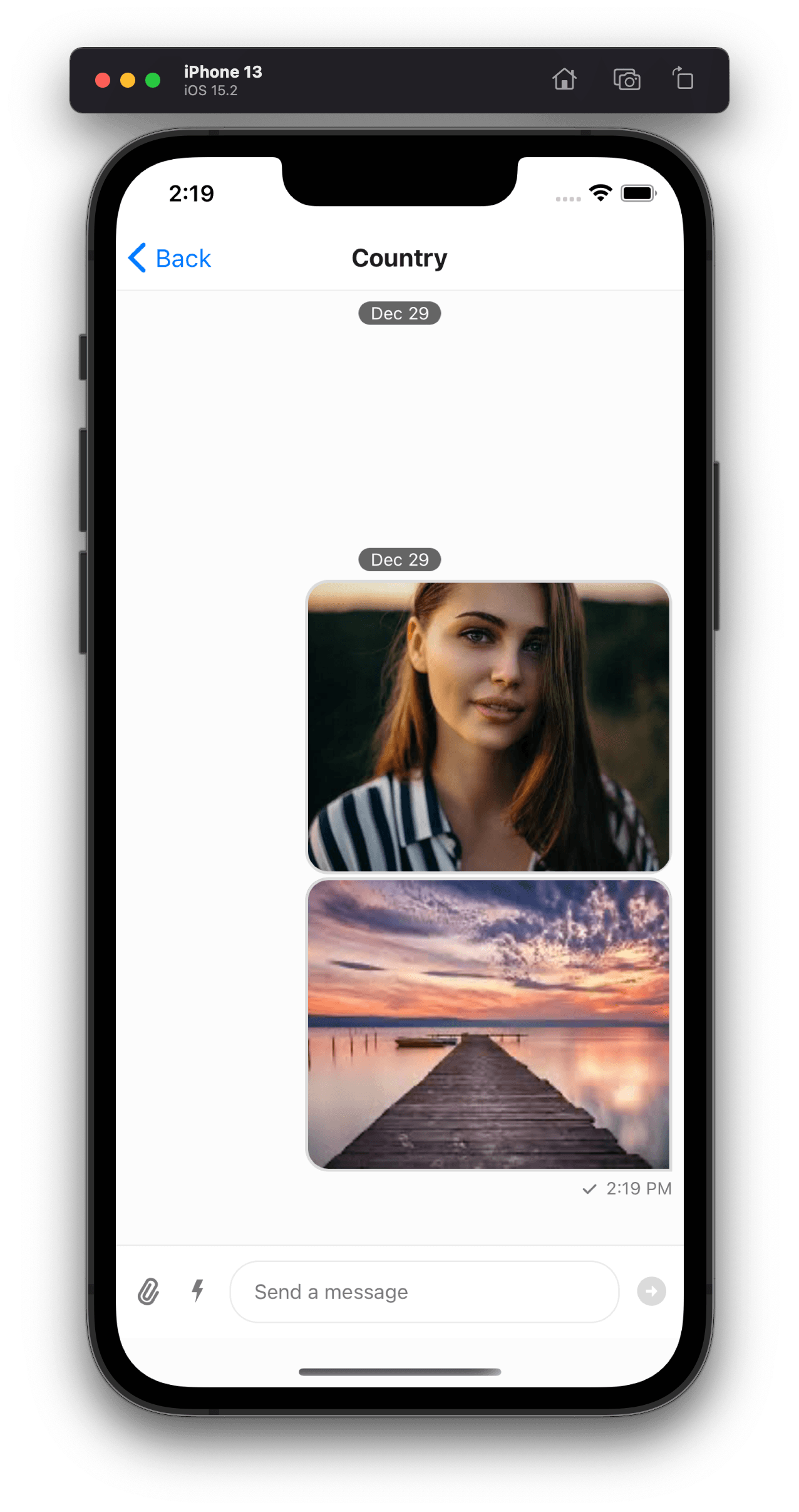
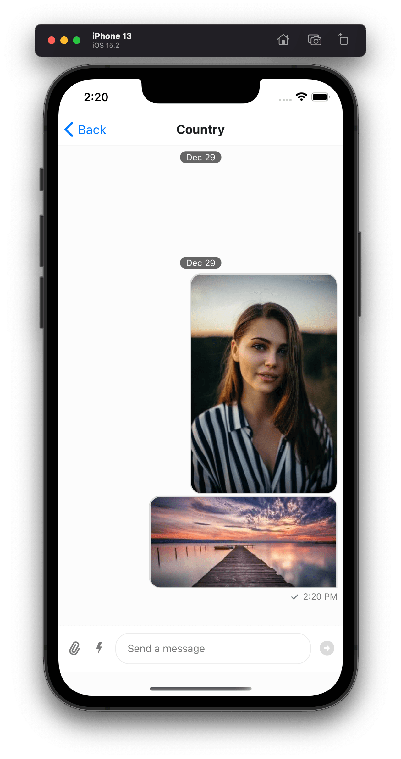
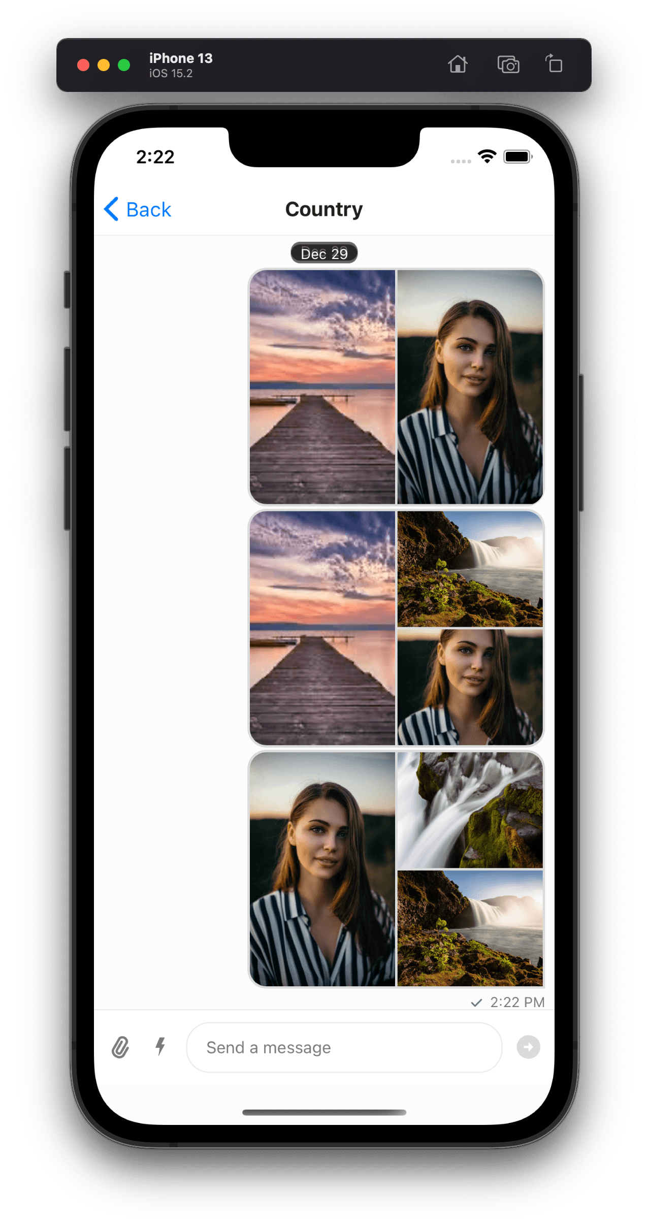
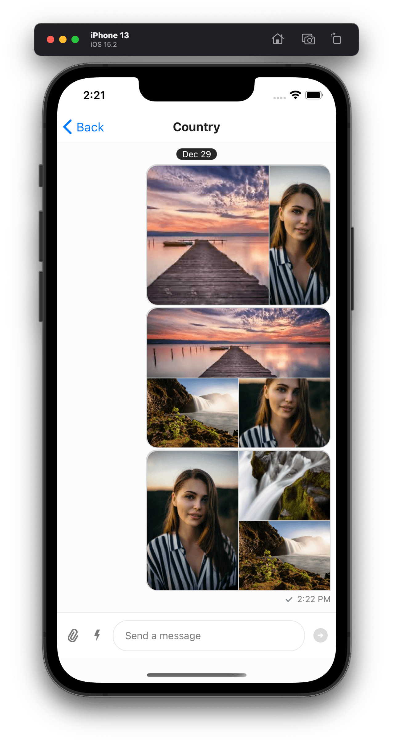
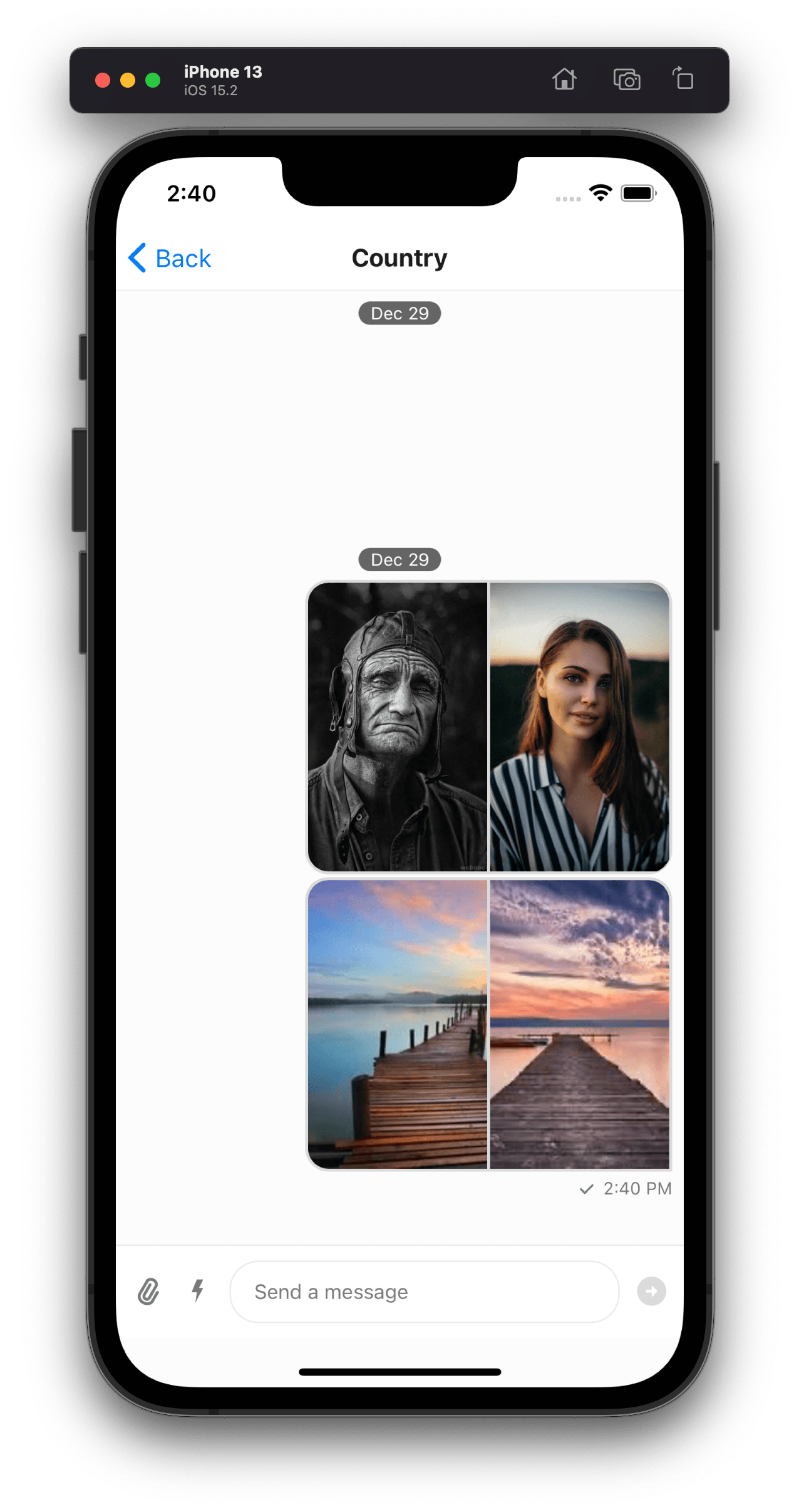
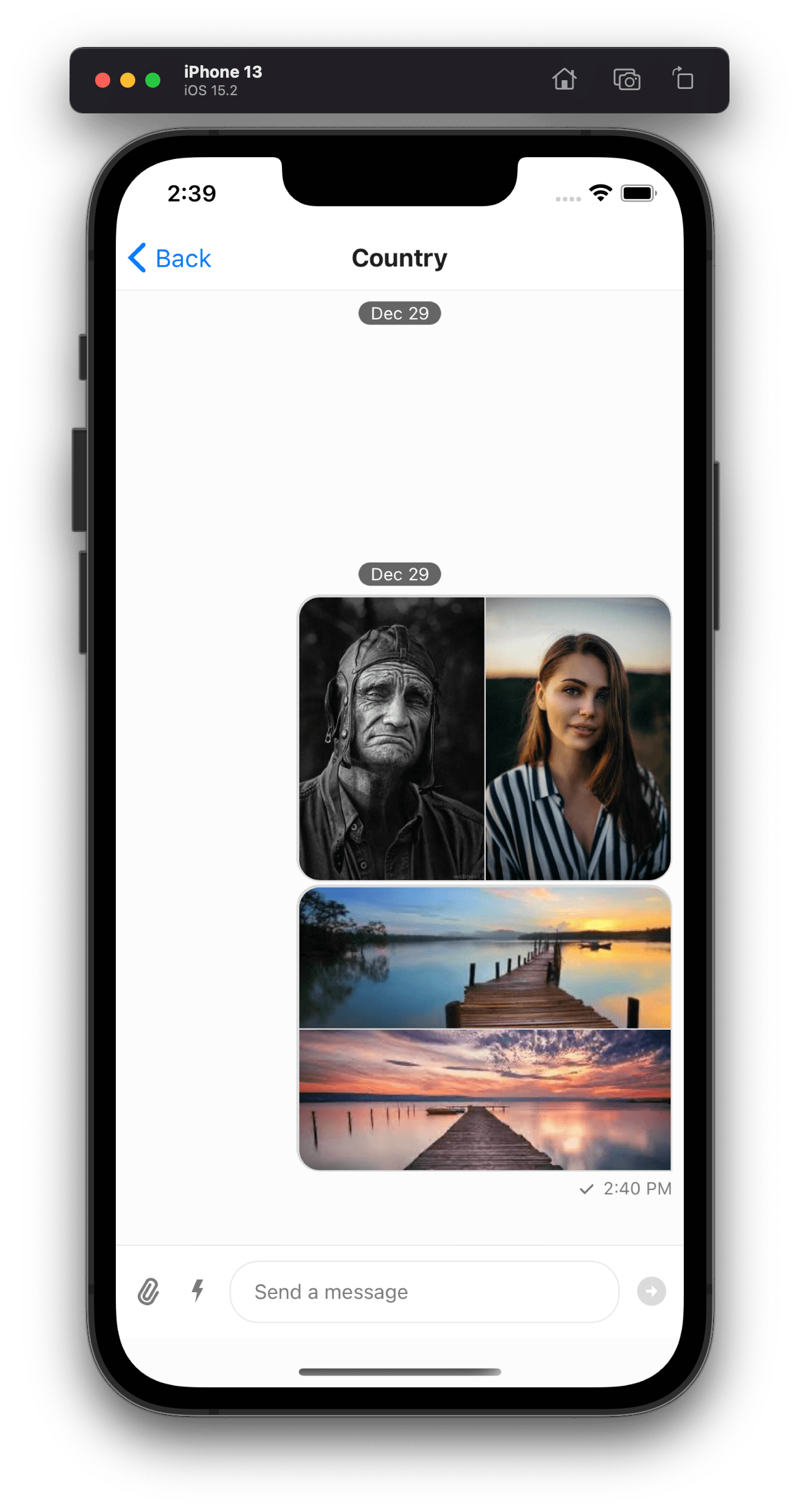
Gallery component has been revamped to be more performant and more responsive. Heavy images have been one of the crucial reasons previously for slow performance on low RAM devices. In this version of SDK, resized version of images (depending on DP ratio of device) will be requested from new CDN to avoid rendering heavy images on UI.
Also previously all the image attachments used to be rendered in fixed size container, which was not ideal for portrait or landscape images since user won't be able to see a cropped image on UI. In this version, we render images in dynamic size container, depending on aspect ratio of image.
| Before | After |
|
|
Refactor Generics to a Single Generic
The Typescript generics have been simplified to a single generic instead of 7 different generics (as in previous versions of SDK) which should be passed to the component or StreamChat client.
const client = StreamChat.getInstance<StreamChatGenerics>("YOUR_API_KEY");where StreamChatGenerics can be defined as;
type StreamChatGenerics = {
  attachmentType: LocalAttachmentType;
  channelType: LocalChannelType;
  commandType: LocalCommandType;
  eventType: LocalEventType;
  messageType: LocalMessageType;
  reactionType: LocalReactionType;
  userType: LocalUserType;
};LocalAttachmentType, LocalChannelType etc. are type definitions for their respective key as per your application types necessities.
Eg:
type LocalAttachmentType = {
  file_size?: number;
  mime_type?: string;
};
type LocalChannelType = Record<string, unknown>;
type LocalCommandType = string;
type LocalEventType = Record<string, unknown>;
type LocalMessageType = Record<string, unknown>;
type LocalReactionType = Record<string, unknown>;
type LocalUserType = {
  image?: string;
};
A separate guide has been added to documentation for details of Generics
Slow Mode Feature
Slow mode helps reduce noise on a channel by limiting users to a maximum of 1 message per cool-down interval. Slow mode is disabled by default and can be enabled/disabled via the Dashboard, using the Chat Explorer.
For more details, please check the documentation for slow mode
When cool-down interval kicks in, SendButton (to send message) will be replaced with a countdown timer
This countdown timer can be customized using a prop on Channel component - CooldownTimer
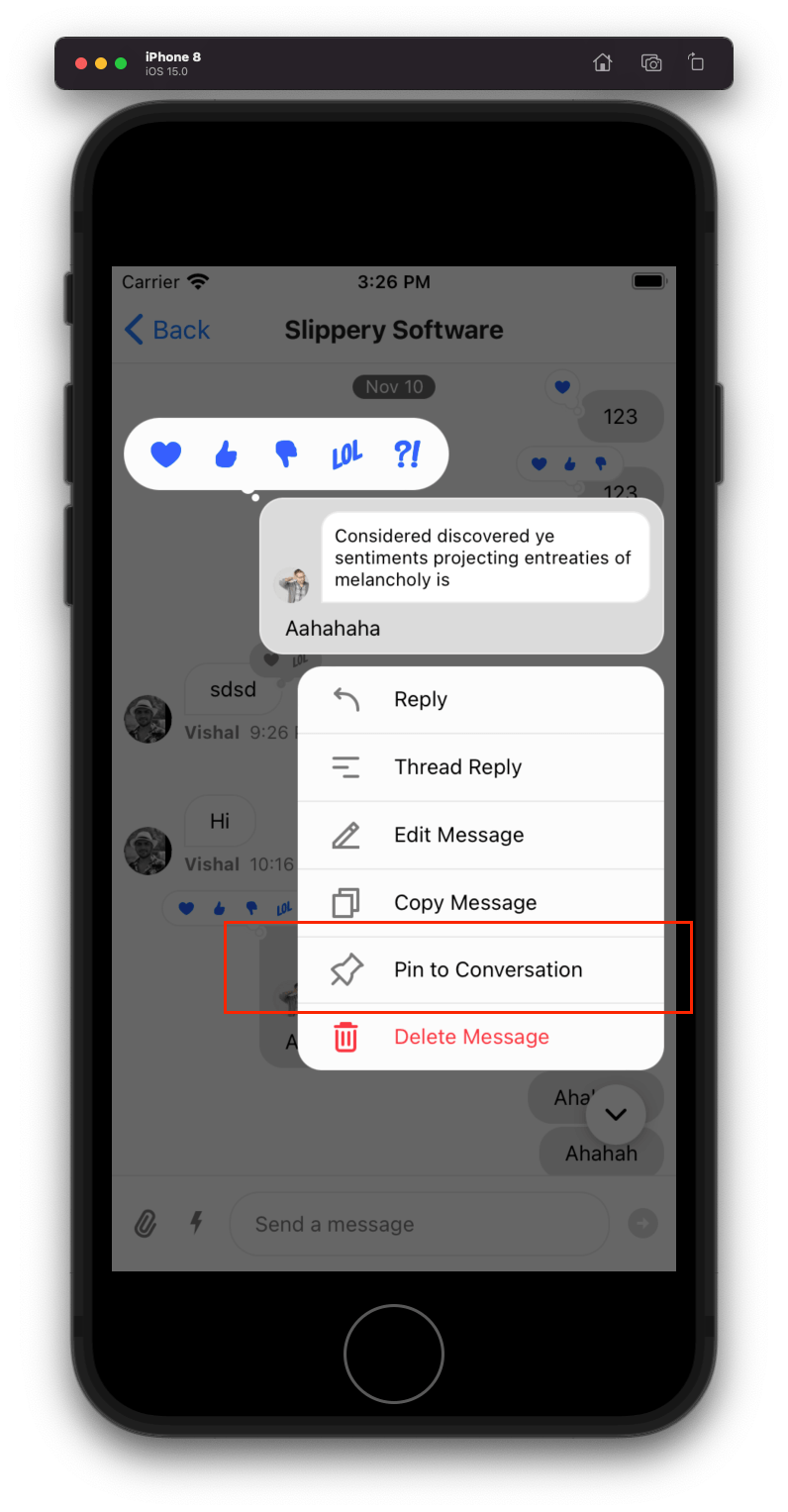
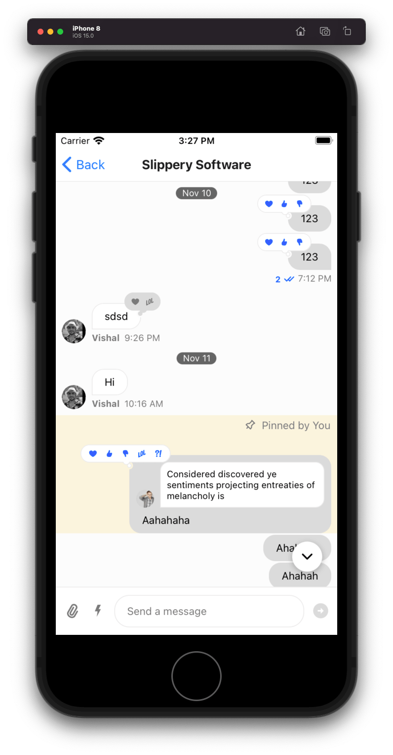
Pin Message Feature
"Pin Message" action within overlay now allows you to pin a message to channel.
Pinned messages allow users to highlight important messages, make announcements, or temporarily promote content. Pinning a message is, by default, restricted to certain user roles, but this is flexible. Each channel can have multiple pinned messages and these can be created or updated with or without an expiration.
To read more about how to retrieve pinned messages or search pinned messages, please read the documentation on Pinned Messages.
Better Handling Of User Capabilities on Channel
Features and UI components have been configured to use the own_capabilities returned by backend, improving the consistency
between SDK features and permissions/config/settings applied on application. To read more about these capabilities, please follow the documentation - /chat/docs/javascript/chat_permission_policies/
You can override these capabilities on UI level by providing overrideOwnCapabilities prop on Channel component:
<Channel
  overrideOwnCapabilities={{
    banChannelMembers: false, // hides "Block User" message action.
    deleteAnyMessage: false, // hides "Delete Message" action for received message.
    deleteOwnMessage: false, // hides "Delete Message" action for own message.
    flagMessage: false, // hides "Flag Message" action.
    pinMessage: false, // hides "Pin Message" action.
    quoteMessage: false, // hides "Reply" action.
    readEvents: false, // hides read receipts.
    sendLinks: false, // disallows sending links with message.
    sendMessage: false, // disallows sending a message.
    sendReaction: false, // hides reaction selector in overlay.
    sendReply: false, // hides "Thread Reply" message action.
    sendTypingEvents: false, // disallows sending typing events
    updateAnyMessage: false, // hides "Edit Message" action for received message.
    updateOwnMessage: false, // hides "Edit Message" action for own message.
    uploadFile: false, // hides attach button on message input.
  }}
Replaced next/prev Giphy Navigation With Shuffle
Next and previous buttons on Giphy message have been replaced with shuffle button, since Giphy API doesn't support pagination and it resulted into confusing user experience.
Dropped BlurView Package
- Background for the overlay which opens up when user long-presses on a message, has been replaced with opacity based background instead of BlurView #874 This dependency caused a lot of issues due to its underlying native BlurView dependency. Thus we decided to get rid of this hurdle by dropping this peer dependency.
Performance Improvements
react-native-reanimatedbased animations have been removed from Message component for performance reason #987.- Long press animation on message UI has been removed
animatedLongPressprop has been removed fromChannelcomponent.
- Redundant HTTP requests for downloading image attachments have been fixed #1010
- Performance intensive legacy image viewer behaviour has been turned off by default #1006. Please take a look at description of the prop legacyImageViewerSwipeBehaviour for details.
Improved Customizability
Autocomplete suggestions
The following three new props on Channel component allows customizing UI for autocomplete suggestions list:
For details please read the docs on Autocomplete Suggestions Customizations
Message Actions
Following two new props on OverlayProvider component allows customizing UI for message actions:
Additionally styles of the message actions can be customized using following new theme keys:
overlay: {
  messageActions: {
    actionContainer: ViewStyle;
    icon: ViewStyle;
    title: TextStyle;
  }
}
A separate guide has been added to documentation for details of How To Customize Message Actions UI
Deleted Messages
Visibility of deleted messages can be configured using a prop deletedMessagesVisibilityType on Channel component.
<Channel deletedMessagesVisibilityType={"never"} />This prop has following 4 possible values:
always: The deleted messages in the channel will be visible to both the sender and receiver.never: The deleted messages will not be visible to anyone.sender: The deleted messages in the channel will only be visible to sender.receiver: The deleted messages in the channel will only be visible to receiver.
Overlay Reactions User Avatar
Avatar of users (shown in OverlayReactions component) who reacted to message, can now be customized
using a prop on OverlayProvide component - OverlayReactionsAvatar.
Fixes Issues
Warning about virtualized List wrapped inside ScrollView
Following warning from v3 of SDK has been fixed now.
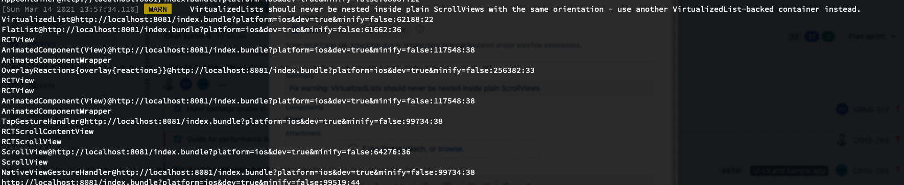
This warning was a result of ScrollView wrapped around FlatList inside overlay. Purpose of the wrapping ScrollView was to make overlay scroll-able in case
message text content is too long. The UX and this warning has been fixed by removing the ScrollView and truncating the text content of message within overlay.
You can customize the truncation length of message text by providing a prop messageTextNumberOfLines (number) on OverlayProvider.
<OverlayProvider messageTextNumberOfLines={300}>
  {/** child components */}
</OverlayProvider>
ChannelList ignores updated filters if API call is in progress
https://github.com/GetStream/stream-chat-react-native/issues/678
If the screen which creates the filter prop for ChannelList quickly renders two or more different filters, only the first filter will be fetched, with the subsequent filters being discarded. This results in a stale ChannelList until it is manually refreshed.
Failed messages can't be deleted
Delete action on failed message would result in error previously, which has been fixed in this release.
Mentioned users get removed after editing message
https://github.com/GetStream/stream-chat-react-native/issues/1023
URL parsing crashes the app when text contains special character
Application would crash if the message text contains special character and someone replies to the message. This has been fixed in this release.
On this page: